At the start of September, I had the chance to deliver a live, online Tableau session to around 150 Data and AI master's students at Imperial College. My job was to build a dashboard with them from scratch and explain everything as I went — what each chart was doing, why we were making the choices we were making, and how Tableau works under the hood.
Because it was online, a lot of the work happened before the session ever started: planning exactly how to build the dashboard step by step, working out the clearest way to explain each piece, and thinking hard about how to keep 150 people engaged through a screen rather than a room. A live build only looks smooth because of everything you sort out beforehand.
Two of us, two jobs
I ran the session alongside a colleague from the Data School, and we split it cleanly. She opened by giving an overview of who we are as a company — the Data School, what we do, how the training works, the kind of careers it leads into. That framing matters more than people think. Before anyone cares about how to build a dashboard, they want to know why this particular group of people is worth listening to.
Once she'd set the scene, I took over for the part I love: everything Tableau. What it is, how it turns raw data into interactive visualisations, and why it's such a powerful tool for anyone who wants to actually understand their data rather than just stare at a spreadsheet.
Building it live, together
The core of my part was building a dashboard live on screen, in real time, with the whole cohort following along. Not showing a finished product — actually assembling it, sheet by sheet, and talking through every decision as it happened.
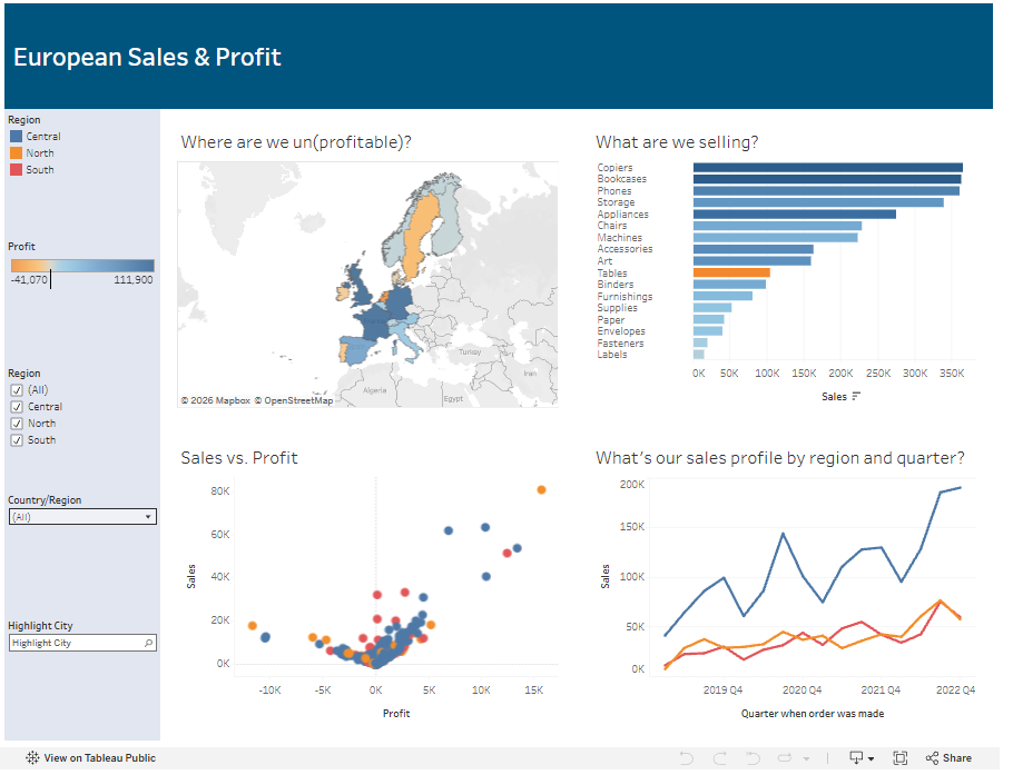
The dashboard we created was a European Sales & Profit view, and it pulled together the pieces you'd want any analyst-in-training to understand:
- A map answering "Where are we un(profitable)?", with countries shaded from loss to profit so the pain points jump straight out.
- A ranked bar chart for "What are we selling?", sorted by sales so the top categories — copiers, bookcases, phones — sit right at the top, with an underperformer highlighted in orange.
- A scatter plot of Sales vs. Profit, the classic view for spotting the products that sell a lot but make you nothing.
- A line chart showing the sales profile by region and quarter over several years, so you can read the trend and the seasonality at a glance.
- And down the side, the interactive furniture that makes it a dashboard rather than four static charts: region filters, a profit legend, a country selector, a city highlighter.
Watching it come together live, with the students building along on their own machines, is worth ten polished screenshots. They saw the messy middle — the moment a chart looks wrong, and the two-second fix that sorts it.
What that kind of session actually teaches you
Here's the honest part. Building something live in front of 150 master's students — over video, no less — is not something you can wing, and it taught me (or re-taught me) a lot about preparing to teach:
Rehearse far more than feels necessary. A live build has a hundred tiny steps, and any one of them can trip you up. I ran through the whole thing repeatedly until the clicks were muscle memory, precisely so that when something did go slightly off-script, I had the spare mental capacity to handle it calmly instead of freezing.
Anticipate the questions before they're asked. Sitting down beforehand and genuinely trying to think, "If I were a smart, slightly sceptical student, what would I poke at here?" is one of the highest-value things you can do. Half the questions I got, I'd already imagined and had a clean answer ready for. That's not luck — it's just doing the anticipating in advance rather than on the spot.
Have notes. Even when you know the material cold, having notes to glance at keeps you on track, stops you skipping a step, and quietly reassures you. You don't have to read from them; you just have to know they're there.
Bring more than you'll use, because you never know the level of the audience. With 150 people, you're never facing one audience — you're facing several. Some students had barely opened Tableau; others were already fluent and wanted the advanced stuff. So I made sure to have extra material and deeper detail in my back pocket. Prepping for a range, rather than for a single imagined "average" attendee, is what lets you actually meet people where they are.
Always have a fallback for when the tech betrays you. Live software plus a live connection plus 150 people is a recipe for at least one thing going wrong. I had a finished version of the dashboard saved and ready, plus screenshots, so that if the live build fell over I could keep teaching without dead air. You hope you never touch the backup — you prepare it anyway.
Check in with the audience as you go. This matters even more online, where you can't read the room the way you would in person — no nods, no confused frowns, no glances between people. So you have to ask. Little check-ins — "everyone got the map on screen?", "does that make sense before I move on?" — turn a one-way broadcast into something closer to a conversation, and they stop half the cohort from quietly falling behind while you carry on.
Have a colleague working the chat while you present. This was one of the best decisions we made. When you're mid-build, you physically cannot watch the chat and keep the dashboard moving at the same time — and in a session of 150, the chat fills up fast. Having my colleague answer questions in the chat in real time meant nobody's query got lost, quick clarifications got sorted instantly, and I could stay focused on building and explaining out loud. It also meant we could flag the genuinely good questions and pull them out for everyone to hear, rather than losing them in the scroll.
Slow down — then slow down again. Nerves make everyone speed up, and when you're building live, a rushed click is a click nobody could follow. I made a conscious effort to narrate what I was doing before I did it, then pause. What feels painfully slow to you is usually about right for the audience — especially when they're trying to replicate it on their own screens.
Make sure everything is readable on a shared screen. What looks fine on your own laptop can be tiny and unreadable once it's compressed through a video call. Bump up the Tableau interface zoom and your workbook font sizes, and keep your screen uncluttered so people can follow every click without squinting.
Share the data so people can build alongside you. Following on your own screen beats watching someone else's every time. Having the dataset ready to hand out turns a demo into a workshop, and that's where the real learning happens.
Agree the handoffs with your co-presenter. When two people share a session, the seams are where it gets awkward — and online, an awkward silence during a handover feels twice as long. A quick beforehand chat about exactly where her overview ends and my Tableau part begins kept the transition smooth.
Teach the story, not just the clicks. It's tempting to narrate every button press, but people remember why far longer than how. Framing each chart around the question it answers — where are we losing money, what's selling — gives the mechanics something to hang on, and it's a habit that makes their own future dashboards better.
The takeaway
The dashboard was the visible output, but the real product of the session was showing a big group of talented students that data visualisation is approachable — that with the right tool and a bit of guidance, they can build something genuinely useful.
And for me, it was a good reminder that the confidence to teach live — especially online — doesn't come from being naturally unflappable. It comes from the boring stuff: rehearsing, anticipating, note-making, over-preparing, having a backup, and having someone in your corner working the chat. Do that work quietly beforehand, and the session gets to feel effortless — even when it isn't.