


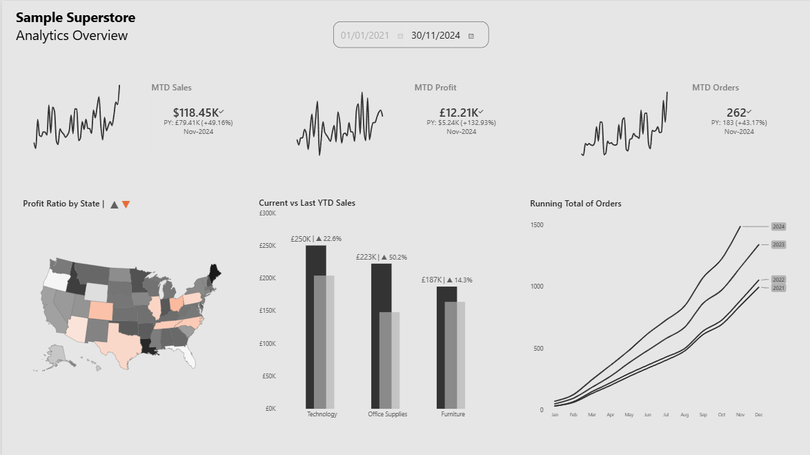
I built an "Analytics Overview" dashboard on the Superstore dataset in Power BI — KPI cards with sparklines, a profit-ratio choropleth map, a current-vs-last-year YTD bar chart, and a running-total-of-orders line chart split into small multiples by year. Before rebuilding it in Tableau, I wanted to understand not just "which menu do I click" but why the two tools produce the same visual output through fundamentally different computation paths.
The short version: Power BI's engine (VertiPaq) and its language (DAX) are built around filter context — a set of active filters that every measure re-evaluates against on the fly. Tableau's engine generates SQL-like queries against the source, then layers table calculations on top of the returned result set. That distinction sounds academic until you try to port a running total or a YTD comparison across, at which point it stops being academic and starts being the entire task.
Architectural differences, before we even open a chart
It's worth naming the underlying differences up front, because every calculation-level quirk below is a symptom of these:
- Query model. Power BI's VertiPaq engine is an in-memory columnar store; DAX measures are evaluated by manipulating filter context over that in-memory model at query time. Tableau, by contrast, is primarily a query-generation layer — it compiles your view into a SQL (or MDX, or its own query language for extracts) statement sent to the data source or to its own Hyper extract engine, and gets back an aggregated result set.
- Where calculation happens. In DAX, most interesting logic (time intelligence, ratios, running totals) happens inside the query, because
CALCULATEcan reshape the filters the query runs under. In Tableau, row-level and aggregate calculations happen in the query, but table calculations happen after the query returns — they operate on the grid of already-aggregated marks, addressed and partitioned by whichever dimensions you've placed on the view. - Modeling philosophy. Power BI pushes you toward a star schema with an explicit date table and relationships, and DAX measures are written once and reused anywhere in the model. Tableau calculated fields are more often written in the context of a specific worksheet's grain, and LOD (Level of Detail) expressions exist specifically to let you break out of that grain when needed.
- Language paradigm. DAX is a functional, context-aware expression language — the same formula returns different results depending on filter/row context, which is powerful but famously non-intuitive at first (
CALCULATEis arguably the single hardest concept in the BI tooling space to teach). Tableau's calculation language is more conventional and closer to spreadsheet/SQL logic for basic row- and aggregate-level work, but table calculations introduce their own non-obvious concept — addressing and partitioning — that has no real DAX analog.
Okay, let's come back to the dashboard. What translates almost 1:1?
KPI cards with sparklines. A card visual with an inline trend line has a direct Tableau equivalent — a single-value worksheet with a small line chart, or a KPI-style layout using a dashboard object.
The choropleth map. Filled maps colored by a computed ratio (profit ÷ sales) are native to both. Tableau's geocoding and map rendering are more polished by default; Power BI needs more manual formatting to match, but the underlying request — "shade each state by this aggregate ratio" — is a simple aggregate calculation in both tools, not a context-dependent one.
Where the engines start to diverge: YTD and prior-period comparisons
My YTD measure in DAX:
Sales YTD = TOTALYTD([Total Sales], _date[Date])
TOTALYTD is syntactic sugar over:
CALCULATE(
    [Total Sales],
    DATESYTD(_date[Date])
)
DATESYTD returns a table of dates from January 1st of the year in context through the last date in context, and CALCULATE uses that table to override the filter context the date column would otherwise be under. Critically, this requires _date to be a real date dimension table, ideally marked as a Date Table in the model, with a contiguous, gap-free calendar — DAX time intelligence functions assume that structure and silently produce wrong results if it's violated (e.g., a date table missing rows for days with no transactions).
Layering the prior-year comparison:
Sales LY = CALCULATE([Sales YTD], SAMEPERIODLASTYEAR(_date[Date]))
SAMEPERIODLASTYEAR shifts the entire date filter back exactly one year and re-evaluates [Sales YTD] under that shifted context. Note the composition here — a measure (Sales YTD) invoked inside CALCULATE with a modified filter argument, itself producing another measure. This kind of measure-referencing-measure composition, each layer manipulating context further, is idiomatic DAX and one of its real strengths: you write the YTD logic once and reuse it under arbitrary filter shifts.
Tableau has no CALCULATE-equivalent context-override mechanism. The nearest idiomatic approach is an LOD expression:
{FIXED [Year] : SUM([Sales])}
FIXED computes the aggregation at the specified level of detail regardless of what dimensions are present in the view — it's declaring a fixed scope, not modifying an ambient filter. To get a genuine YTD-to-date cutoff (not just "full year"), you typically also need a DATEDIFF or DATETRUNC comparison against TODAY() inside the aggregation, and prior-year comparisons usually mean either a second LOD expression parameterized on [Year]-1, or a self-join/union of the data against a shifted date axis. It's fully achievable, but there's no single function doing the date-shifting for you — you're assembling the equivalent of SAMEPERIODLASTYEAR from more primitive parts each time.
The running total: same visual, genuinely different computation
Power BI:
Per Year Running Total of Orders =
CALCULATE(
    [Total Orders],
    _date[Year] = YEAR(MAX(Orders[Order Date])),
    _date[Date] <= MAX(Orders[Order Date])
)
Unpacked: for each point the visual iterates over (each month, in context), take the max order date in that context, filter the date table down to that same year, filter it further to dates on or before that max date, and sum orders under those combined filters. This is manual — no TOTALYTD-style shorthand exists for an arbitrary running total, so you compose the filter arguments to CALCULATE by hand. Every point on the chart triggers a fresh re-evaluation of [Total Orders] against a re-filtered model. Conceptually it's a correlated subquery re-run per row.
Tableau's running total is a table calculation:
RUNNING_SUM(SUM([Orders]))
but the formula is the easy part. The behavior is governed by two settings that have no DAX equivalent whatsoever:
- Addressing — the dimension the calculation "moves along" (here, Month) — determines the direction of accumulation.
- Partitioning — the dimension that causes the calculation to reset (here, Year) — determines where the running sum starts over.
Here's the easiest way to think about it: Tableau runs the query first — it fetches a simple table of totals, like "Jan 2024: 120 orders, Feb 2024: 95 orders, Mar 2024: 130 orders" — and only after that table exists does RUNNING_SUM walk down it, adding each row to the one before. It's not going back to the original data at each step; it's just adding up numbers in a grid it already has in front of it.
That makes it fast, but it also means the running total is only as correct as the grid it's walking across. If that grid changes shape — say you filter the data after it's already been aggregated instead of before, or you reorder the fields on Rows/Columns, or you stack a second running total on top of the first — the calculation doesn't know anything went wrong. It just keeps adding up whatever rows are now in front of it, in whatever order they're now in. So the running total can quietly reset at the wrong point, add things up twice, or land on completely different numbers than before — with no error message, because as far as Tableau is concerned, the calculation worked fine. It just worked over a grid that wasn't shaped the way you thought it was.
This is the crux of the practical difference:
| Power BI (DAX) | Tableau (table calc) | |
|---|---|---|
| Computed | Inside the query, per context | After the query, over the result grid |
| Mechanism | Filter context manipulation (CALCULATE) |
Addressing + partitioning over materialized marks |
| Reusability | Measure defined once, referenced anywhere | Tied to the specific view's structure unless recreated |
| Common failure mode | Wrong/missing filter arguments, non-contiguous date table | Wrong addressing/partitioning, filter applied at wrong stage (before vs. after aggregation) |
| Debugging aid | DAX Studio / Performance Analyzer, inspect filter context | "Edit Table Calculation" dialog, inspect compute-using settings |
Takeaway
Rebuilding this specific dashboard in Tableau, the KPI cards and map are a near-direct transliteration — you're mostly relearning which panel does what. The YTD comparisons and especially the running total are where you're not translating syntax, you're translating computation models: DAX resolves ambiguity by explicitly re-filtering a model per evaluation; Tableau resolves it by requiring you to specify, structurally, how a calculation walks across an already-aggregated result. Neither approach is strictly harder, but conflating them — writing Tableau table calcs as if they were re-filterable measures, or writing DAX as if context flowed the way a table calc's addressing does — is exactly the kind of mismatch that produces dashboards that look right and are quietly wrong.