


KPIs (Key Performance Indicators) help organizations measure performance against business goals. In Power BI, a KPI is only useful when it provides context—showing not just the value, but also whether performance is improving, declining, or meeting a target. A standalone number without a benchmark is rarely actionable.
Why Context Matters
A KPI such as "Revenue = $1.2M" tells you very little on its own. Is that good or bad? Is it higher than last month? Did it meet the target?
The most effective KPI visuals provide at least one of the following:
- A target or benchmark
- Historical trend
- Comparison to previous periods
- Status indicator (good, warning, bad)
KPI Visual Types in Power BI
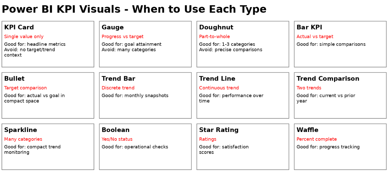
KPI Card
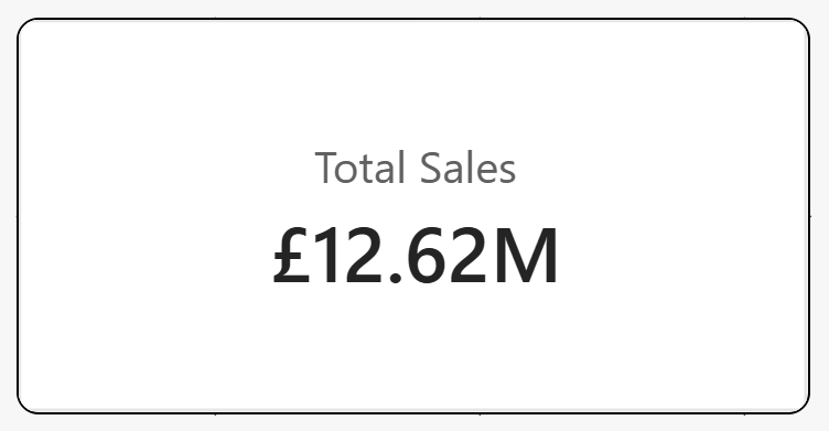
Best for: Headline metrics
Displays a single value such as revenue, profit, or customer count.
Good because:
- Simple and easy to read
- Perfect for executive dashboards
Limitation:
- Provides no context unless you add variance, trend, or target information
- A KPI card alone is often the weakest KPI format
KPI Gauge
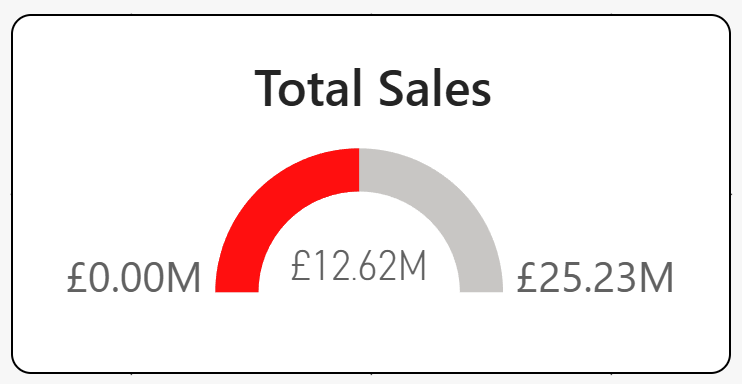
Best for: Progress toward a target
Shows actual performance against a predefined goal.
Good because:
- Instantly communicates target attainment
- Easy for users to interpret
Avoid when:
- Comparing multiple categories
- Space is limited
KPI Doughnut
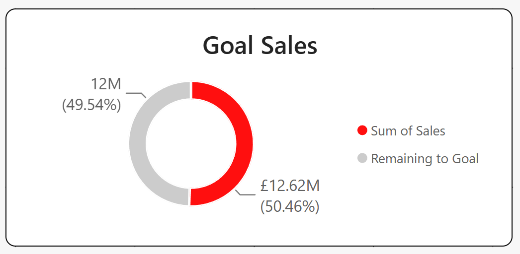
Best for: Part-to-whole relationships
Shows how one category contributes to the total.
Good because:
- Works well for 1–3 categories
- Easy way to highlight percentages
Avoid when:
- Users need precise comparisons
- Too many segments are involved
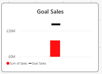
KPI Bar
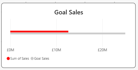
Best for: Actual vs. target comparisons
Displays performance against a benchmark using horizontal bars.
Good because:
- Easy to compare values
- More accurate than gauges or doughnuts
KPI Bullet (needs to be installed separately)
Best for: Compact target tracking
A bullet chart combines actual value, target, and performance ranges.
Good because:
- Extremely space-efficient
- One of the best KPI formats for dashboards
Ideal for:
- Executive scorecards
- Operational reporting
KPI Trend Bar
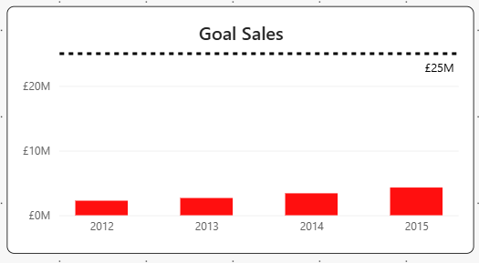
Best for: Non-continuous trends
Shows performance across discrete periods.
Good because:
- Highlights direction over time
- Simple alternative to line charts
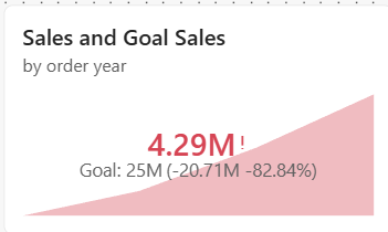
KPI Trend Line
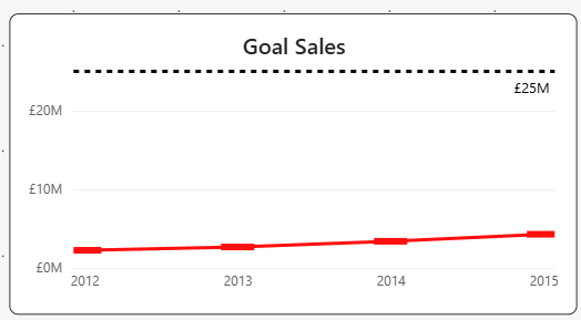
Best for: Continuous trends
Shows how a KPI changes over time.
Good because:
- Makes trends immediately visible
- Helps identify growth, seasonality, or decline
According to DataCamp, trend-based KPI visuals are ideal when historical performance matters.
KPI Trend Comparison
Best for: Comparing two trends
Displays current performance against a previous period or target trend.
Good because:
- Shows performance in context
- Excellent for YoY and MoM analysis
KPI Sparkline Trend
Best for: Multiple categories
Tiny trend lines displayed alongside metrics.
Good because:
- Shows trends without taking much space
- Perfect for KPI tables and scorecards
Power BI's newer Card visual supports native sparklines, making this one of the most effective modern KPI formats.
Boolean Conditional KPI
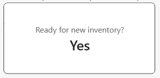
Best for: Yes/No business checks
Examples:
- Ready to deploy?
- SLA met?
- Inventory available?
Good because:
- Extremely clear
- Ideal for operational dashboards
Star Rating KPI
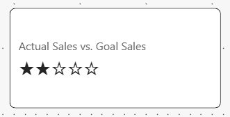
Best for: Customer satisfaction and quality metrics
Examples:
- Product ratings
- Service quality scores
Good because:
- Familiar to users
- Easy to understand at a glance
Waffle KPI
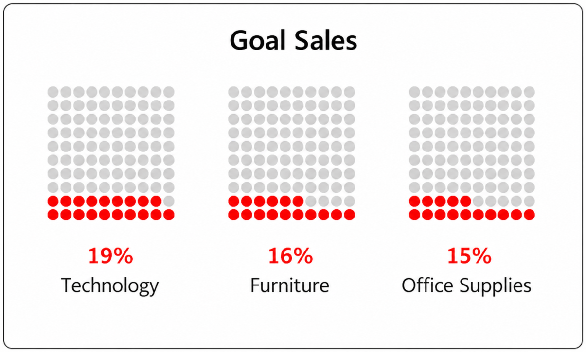
Best for: Percentage completion
Uses small squares to represent progress.
Good because:
- Engaging visual representation
- Useful for completion and adoption metrics
Avoid when:
- Precise values are required
Which KPI Visual Should You Choose?
Final Thoughts
The biggest KPI mistake in Power BI is displaying numbers without context. A KPI should answer a business question, not just show a value. Whenever possible, combine actual performance with a target, trend, or comparison period.
For modern Power BI dashboards, KPI Cards with conditional formatting and sparklines often provide the best balance of clarity, flexibility, and executive-friendly design.