One of my favourite (:D) days of dashboard week: API day. And this year we cranked it up a notch by bolting AI onto the end of it.
The brief was simple to say and deceptively deep to build: create an Alteryx Analytic App that takes a few inputs from a user and returns a polished, browser-ready HTML weather trend report — where the analysis and the writing are done by an LLM. The user shouldn't have to touch coordinates, JSON, or a single tool. They answer a handful of questions, hit run, and a report appears.
Here's how I built it, and — more interestingly — the two things I learned about prompting that I did not see coming.
What the app does
The app opens by asking the user four things:
- A city (a name like "London", not coordinates)
- A start date and end date (the recommendation is 6 months or more, so there's an actual seasonal story to tell)
- A report style — Professional or Funny
From those inputs it pulls historical weather data from the free Open-Meteo Historical Weather API, hands that data to Google Gemini via Alteryx's Prompt tool, and outputs a formatted HTML report that renders straight in the browser. Same data, two very different personalities depending on what the user picked.
The flow
The workflow breaks into a few clean stages.
Capturing the inputs. Interface tools (a Text Box, two Date tools, and a Drop Down) collect the answers, and each one is wired through an Action tool that injects the user's choice into a Text Input at the front of the workflow. That's the bit that turns an ordinary workflow into an app that actually prompts you at runtime.
Turning a city name into coordinates. The weather API only speaks latitude/longitude, so the first real step is geocoding. A Formula builds a call to Open-Meteo's geocoding endpoint, a Download tool fetches it, and a quick JSON parse pulls out the coordinates. This is what lets a user type "London" instead of hunting down 51.5, -0.13.
Calling the weather API. With coordinates and dates now sitting on one row, a Formula builds the archive URL and a Download tool pulls the historical data back as JSON.
Handing it to the AI. This is where I made my biggest design decision. Originally I parsed the JSON myself — exploding it into rows, cross-tabbing it back into a tidy table, the works (you can see it in the disabled containers). It functioned, but it was a lot of tools for not much benefit. In the end I let the AI read the JSON directly. The Open-Meteo daily payload is compact enough to drop straight into a prompt, and the model is perfectly happy to do the aggregation and trend-spotting itself. Fewer tools, and the analysis moved to the layer that's actually good at analysis.
Building the prompt. A Formula tool constructs the instruction, with an IF statement on the report style: Funny gets a witty, playful brief; Professional gets a formal analytical one. Both embed the weather JSON and ask for clean HTML back, including Chart.js graphs for monthly, weekly, and daily trends.
Generating and outputting. The Prompt tool sends it to Gemini, a final Formula strips the stray code fences the model likes to wrap around HTML, and an Output tool writes it to a .html file you can open in a browser.
Finding #1: the "better" prompt didn't make the better report
Here's the thing I genuinely didn't expect.
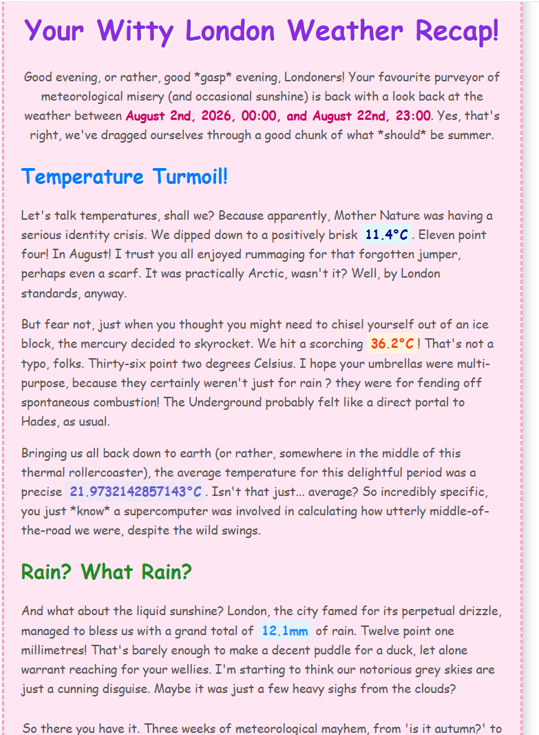
My first attempt used a looser, shorter prompt that basically said "be witty and make it look fun." And it was fun — playful headers, jokes, personality all over it — but it was missing the substance I actually needed. No charts, no proper trend sections, just vibes.
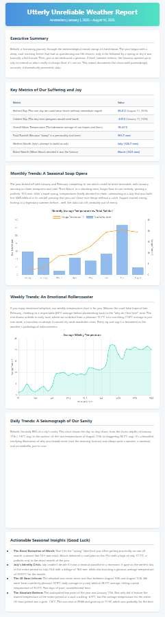
So I went the other way and wrote a longer, heavily structured prompt — spelling out every section, every metric, every chart I wanted. That's when the report grew up: gradient header banners, card-style sections, a monthly temperature-vs-rainfall combo chart, a weekly line chart, a daily "seismograph." It finally looked like a polished dashboard instead of a stand-up routine.
The lesson that's easy to state and hard to internalise: the model won't give you what you don't ask for. A loose prompt leaves room for personality but also room to skip the hard parts — my first version happily wrote jokes and quietly ignored the charts, because I never insisted on them. Being explicit about the sections, the metrics, and the visuals is what turned a fun little write-up into an actual report. With an LLM, the structure of your output is only ever as good as the structure of your ask.
Finding #2: the same prompt gave me a different report every time
This one is more important, and it's the one worth remembering.
With the longer professional prompt, I'd run the app, get a report, run it again with the exact same inputs and the exact same prompt — and get a different report. Different wording, sometimes different section emphasis, occasionally a chart that rendered one run and misbehaved the next.
This isn't a bug in my workflow. It's how large language models work. They generate text by sampling from a probability distribution, and unless that sampling is pinned down, the same input can produce different outputs on each run. The setting that controls this is usually called temperature — higher temperature means more randomness and variety, lower means more predictable and repeatable. At the default settings, a long open-ended "write me a professional report" prompt has an enormous number of equally-valid ways to be answered, so you get variation.
The practical implications are real, and worth thinking about before you put something like this in front of a user:
- Reproducibility isn't free. If a user runs the same report twice and gets two different documents, that can be unsettling — especially for anything "professional" or official-feeling. If you need consistency, look for a temperature (or determinism) setting on the Prompt tool and turn it down, and be aware that even then it may not be perfectly identical every time.
- Variety can be a feature, not a bug. For the funny report, the randomness is delightful — every run is a fresh set of jokes. So the "right" temperature actually depends on which of my two report styles the user picked. The formal one wants stability; the playful one wants surprise.
- The tighter you want the output, the more you constrain it — both in the prompt and in the model settings. Determinism is something you engineer for, not something you get by default.
What I'd tell someone starting this
Get the boring half rock-solid first: geocoding and the API call, tested with a hardcoded city, before you touch a single interface tool. Debugging the AI and the app inputs at the same time is where you lose an afternoon.
Then, when you reach the AI, resist the urge to write the longest, most detailed prompt you can. Start loose, look at what the model gives you, and add structure only where it's actually falling short. And go in knowing that "run it again and check" won't give you the same thing twice — that property is baked into the tool you're using, and half the skill is deciding when you want it and when you don't.
Two APIs, one LLM, and a genuinely fun app at the end of it. Not a bad way to spend day four.
First "funny" report (shorter prompt):
Second "funny" report 1st run attempt:
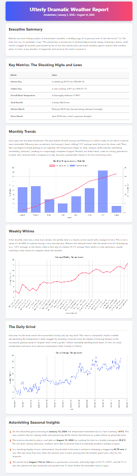
Second "funny" report 2nd run attempt: