So far in this Power BI Series we found out about Power BI's Ecosystem here and then we dove in Power BI's first tool, Power Query here.
Now it's time to explore the main tool for analyzing and visualizing data, Power BI Desktop.
Power BI Desktop is designed primarily for building data models, creating reports, and designing interactive visualizations. It allows us to connect to various data sources, including databases, files, online services, and other sources. We can import or directly query data from these sources to create datasets for analysis. We can create relationships between different datasets, build data models, and perform data shaping operations using Power Query. It provides a canvas for designing interactive and visually compelling reports. We can drag and drop visual elements, such as charts, graphs, tables, and maps, to create custom visualizations representing data insights.
When you start Power BI Desktop, you will see that the interface is very user-friendly and using it is quite intuitive.
First, we need to connect to our data.
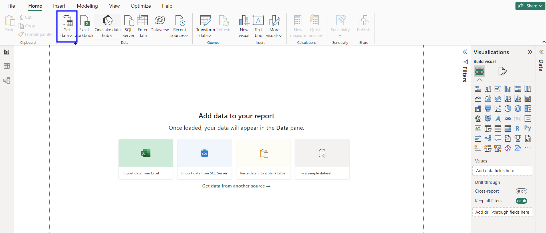
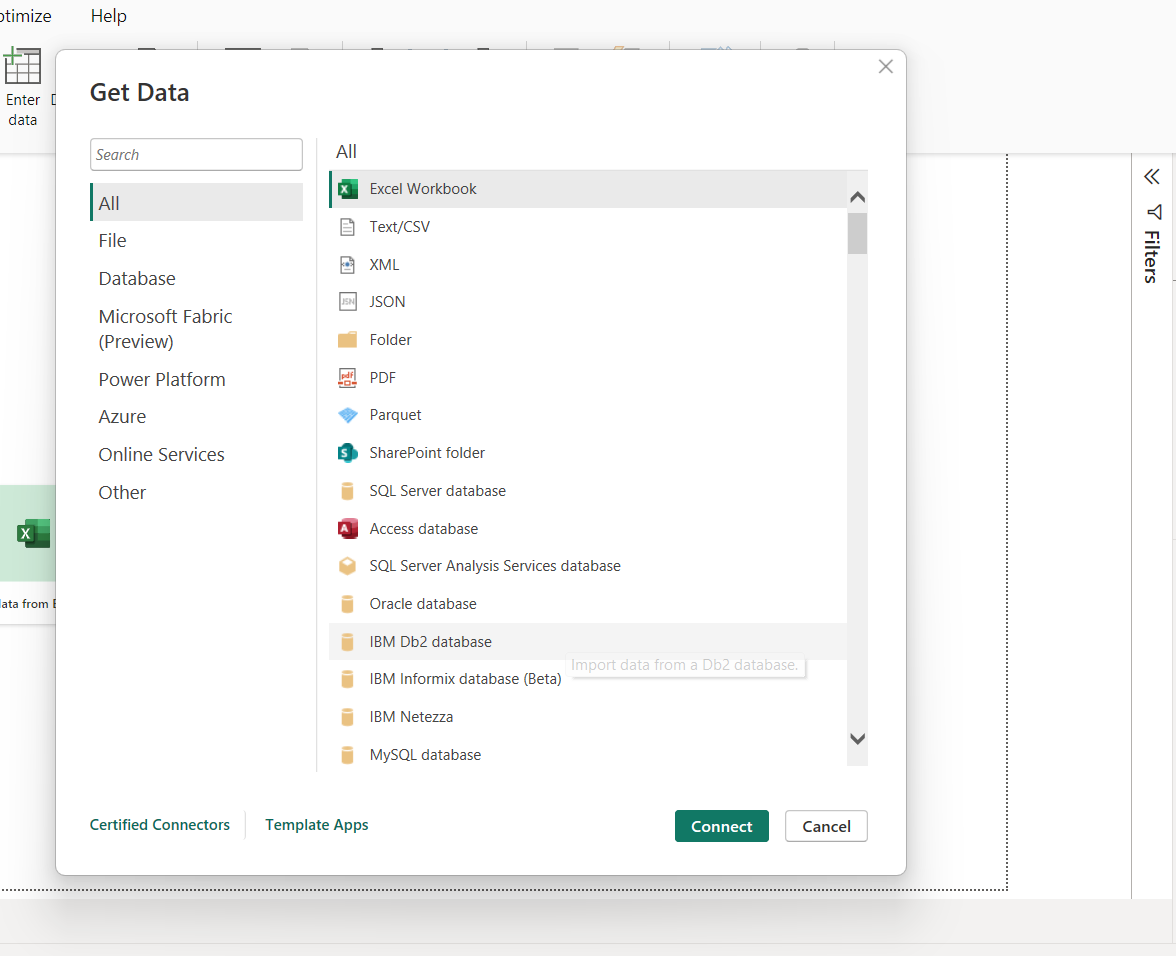
Power BI Desktop has a very extensive list of data types it can connect to.
Once connected and having prepped your data with Power Query, as shown here, it is important to understand what exactly the interface is showing us.
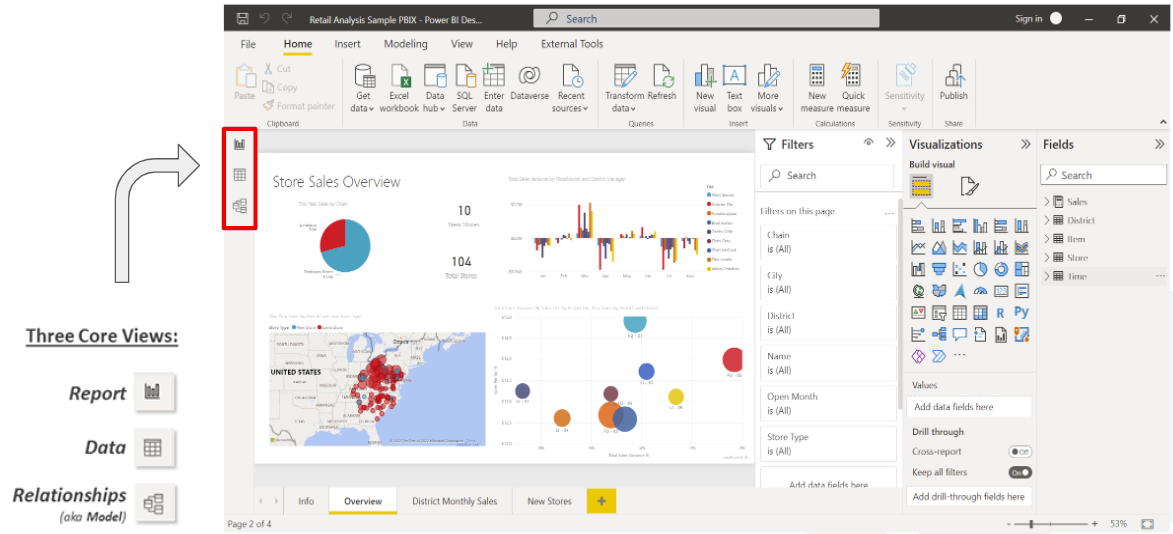
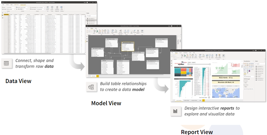
We are going to go into more details about these 3 views, what they are there for and how do we use them.
In the Data View or Table View, in the newer versions of Power BI Desktop, we can see the data in a table form and we can even perform some operations, though not as many as from the Report View, where all the visualisations (reports) are created and displayed.
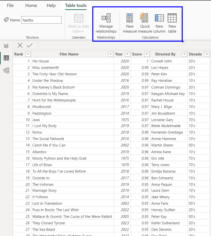
In Model View we can define all the relationships between our tables, in case we have several data sources. Here we can also make some operations.
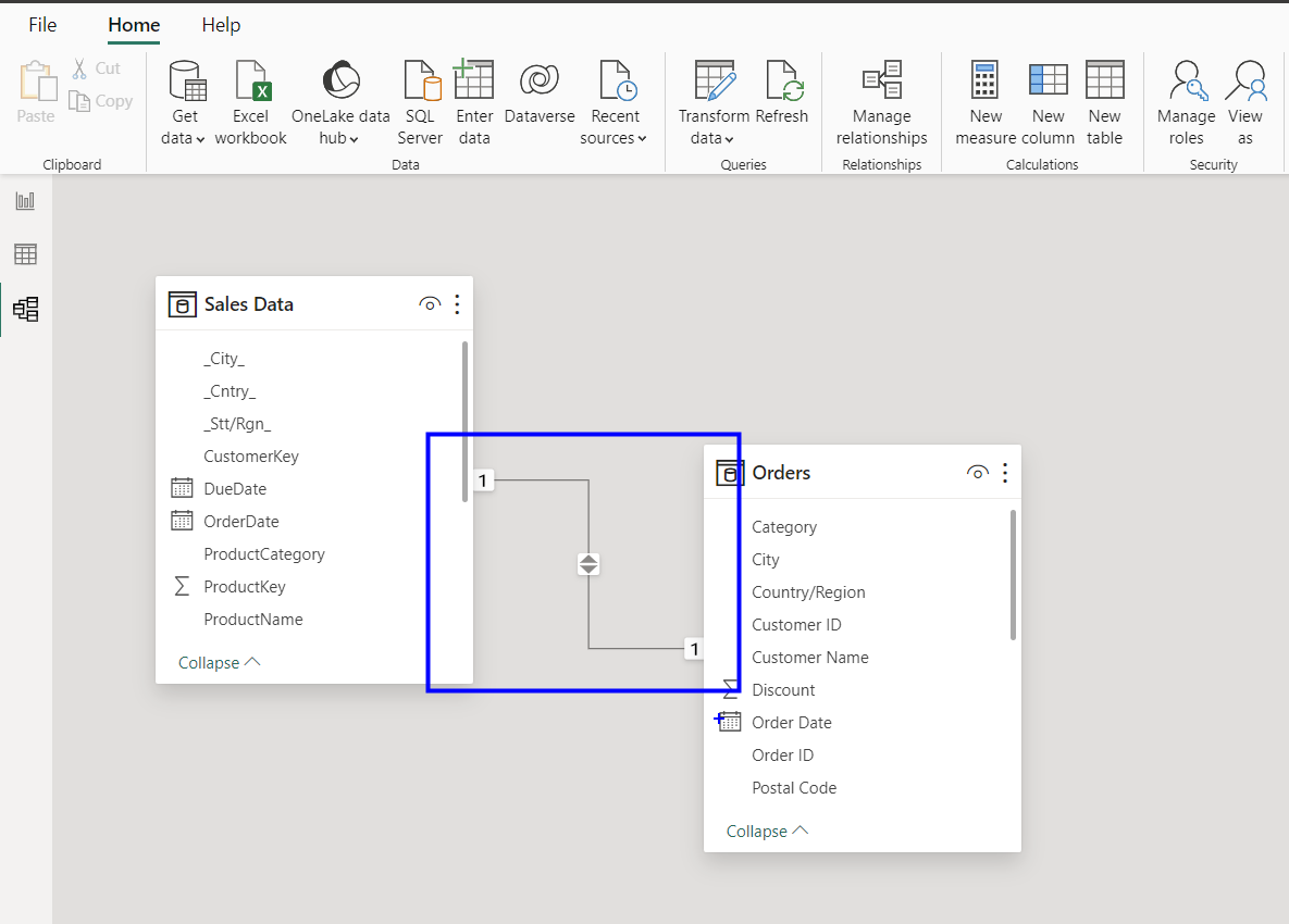
In the Report View is where we create all the visualisations after analyzing our data. It where we present our reports. You can use one page for several charts to present the message that you want to. You can use a new page to create a different report, where another message is presented, where one or more questions are being answered.
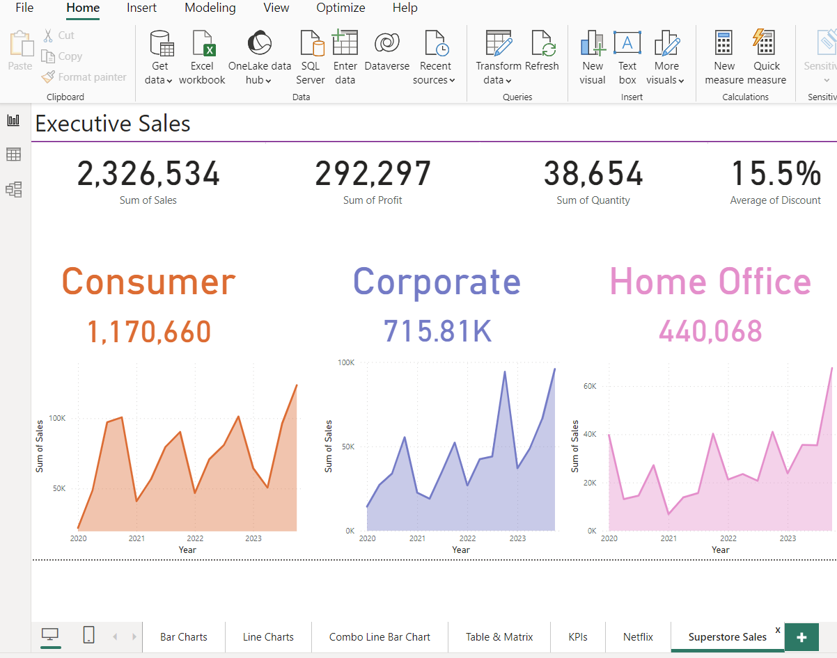
So far, I have shown you what you can create with Power BI Desktop, in my next post I will show you how to create beautiful reports which are easy to understand and also very interactive, if needed.
