The idea of a dashboard, especially in Tableau, is to help the user visualize the data. It is designed to assist the human eye in comprehending the information and making observations and decisions based on it. The most effective way to display deviations, changes over time, correlations, or any other significant aspects of the data is by utilizing pre-attentive attributes.
Pre-attentive attributes are elements that a person perceives without conscious effort. For instance, if a 5-foot-tall man stands next to a 6-foot-tall man, people will naturally notice that the 6-foot-tall man is significantly taller, without actively thinking about it. These attributes can be as straightforward as one bar in a bar chart being longer than another or the bars having different colors. The primary types of pre-attentive attributes include length/width, orientation, position, color, size, and shape.
Length/Width

The best attribute to use is length and width because they are the first things we notice in a chart. With length, in this context, we can easily discern that the top bar's magnitude is significantly greater than the bottom bar. Length can be effectively utilized in bar and lollipop charts to depict magnitude, deviation, distribution, and rank.

Orientation
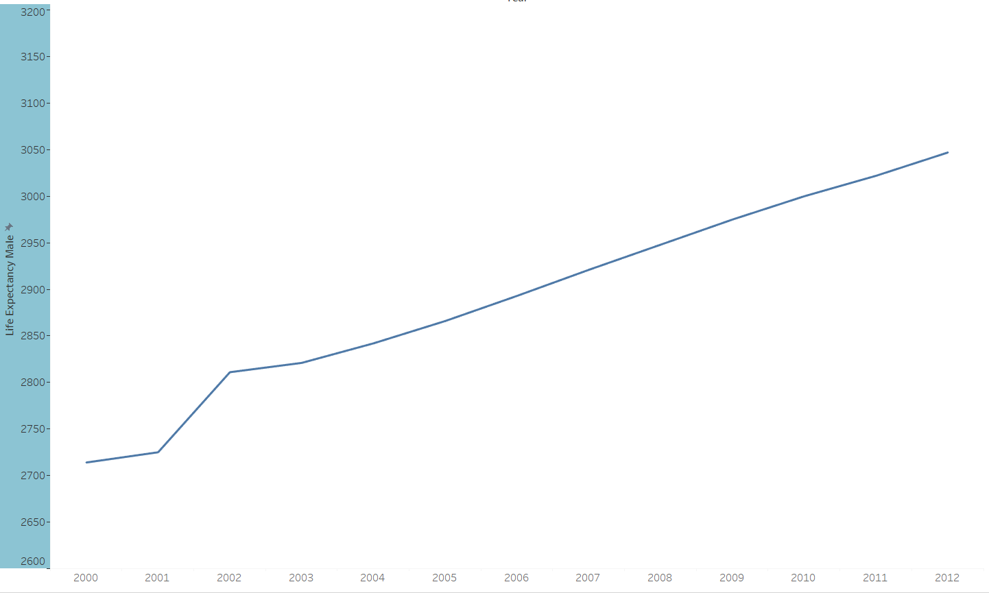
The next thing that a person might notice is the orientation of the graph. The most popular form of this is line graphs. When you look at a line chart, the first thing you notice is the upward slant, which could signify various things depending on the context of your chart. The primary aspects that orientation can convey are deviation and changes over time.
Color
Next in line is color. Using two distinct colors to represent different categories is a common feature in most graphs. It is typically noticed after length and width but can be applied in various ways. Color is employed to illustrate correlation, spatial data, ranking, magnitude, and components of a whole. It's a straightforward element to use, but caution is advised because an excessive use of color could potentially distract people from the dashboard's intended message.
Position

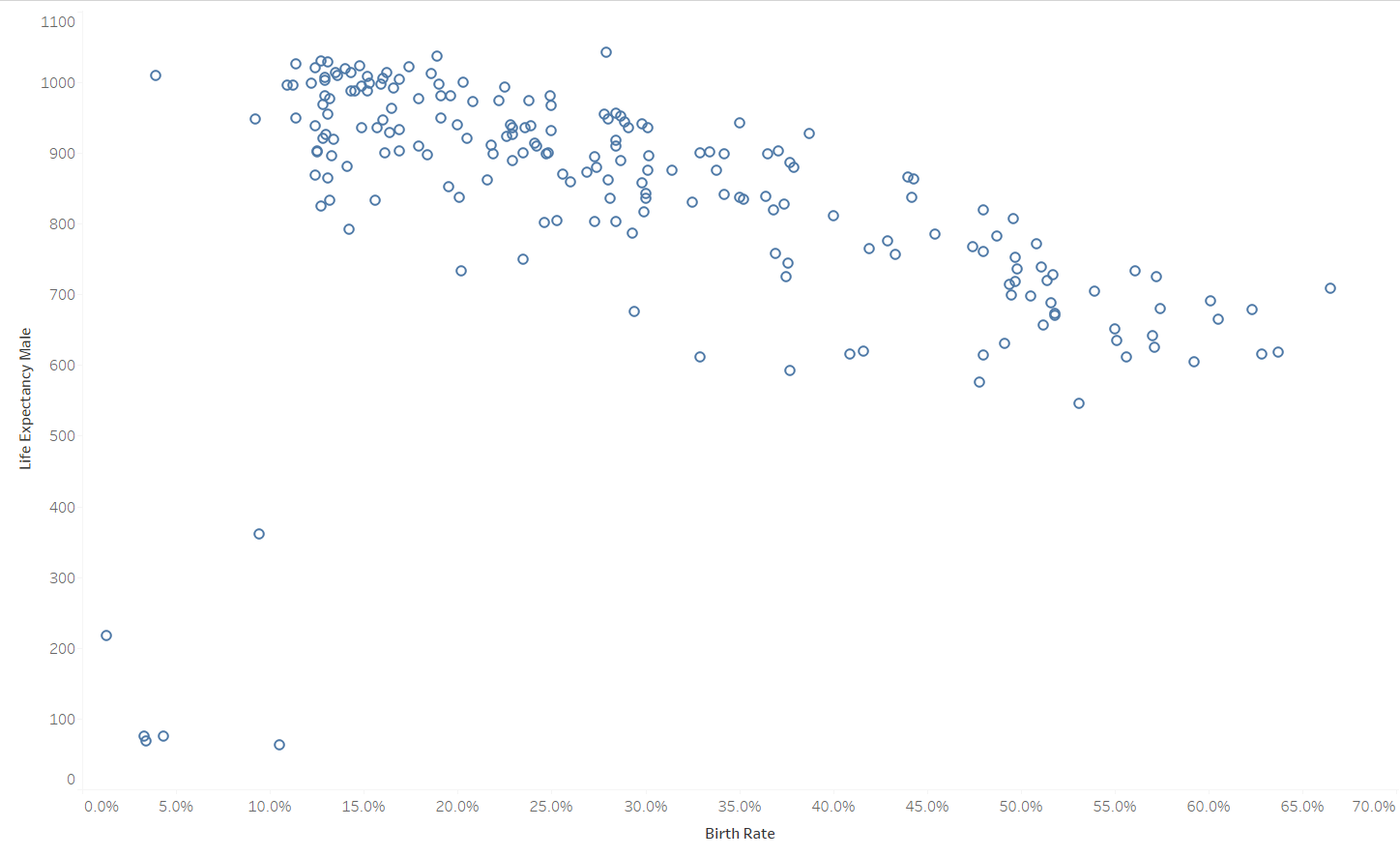
Next, a person is likely to notice the position and size of the chart. These two attributes are most commonly associated with scatter plots. People tend to observe the position of the dots and draw their own conclusions regarding trends. In the illustration above, you notice the position of each dot, and your brain naturally registers the trend. Position is useful for depicting correlation, changes over time, and ranking.
Size/Shape
These attributes in a graph are noticeable but typically come last in priority and should not be overused. The challenge with shape or size is that they don't add anything beyond what color already conveys. They can be employed for ranking and magnitude, but their value is most apparent when you're already using color to convey other information.
