In todays blog I shall be going through how to create an enclosed dot plot. To illustrate this I shall use the sales, region and sub-category fields from superstore. With this viz, we can see worse performing regions, best performing regions and regions which fall in between the two ends in terms of sales per product sub-category.
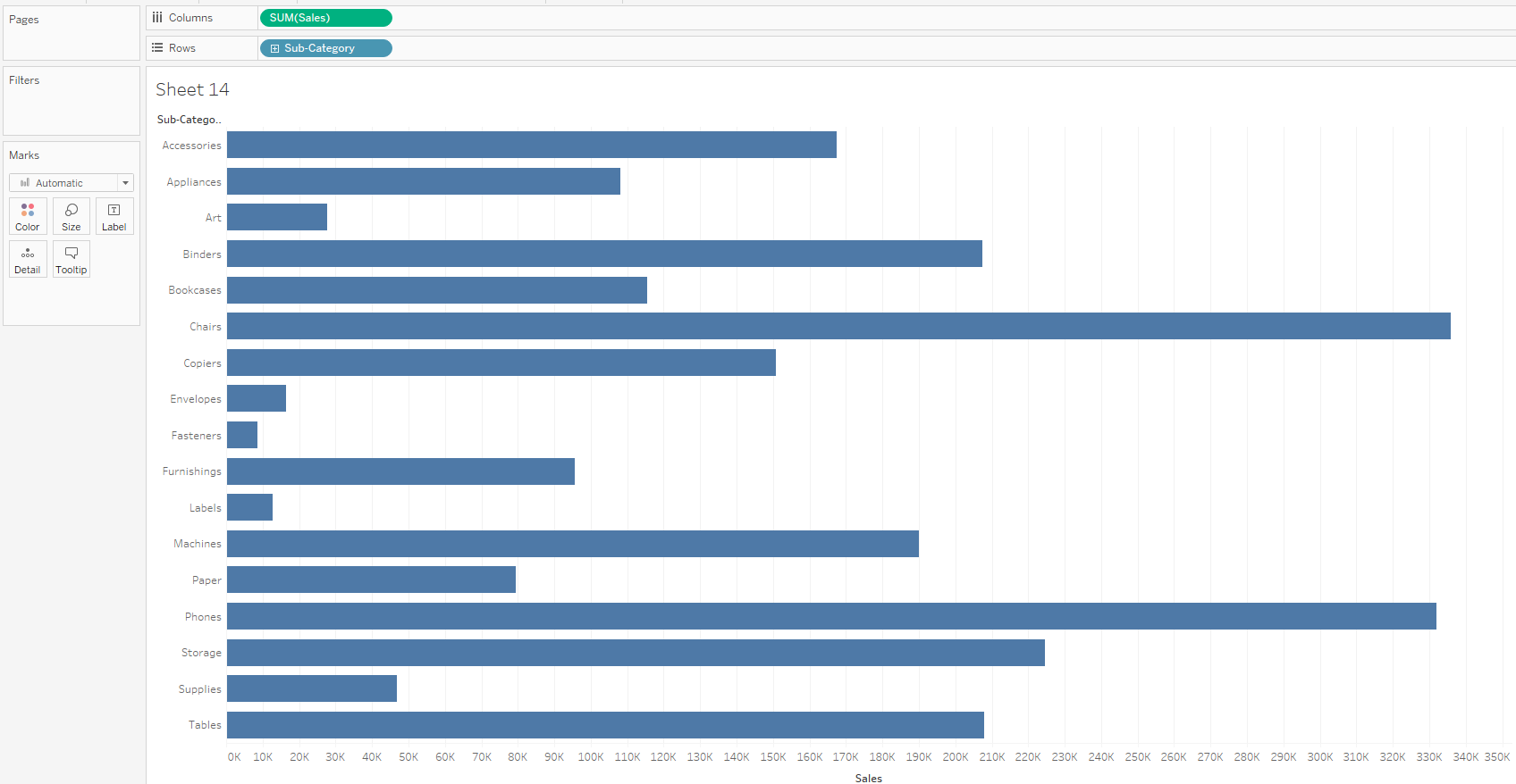
- Drag sales and subcategory to columns and rows respectively.
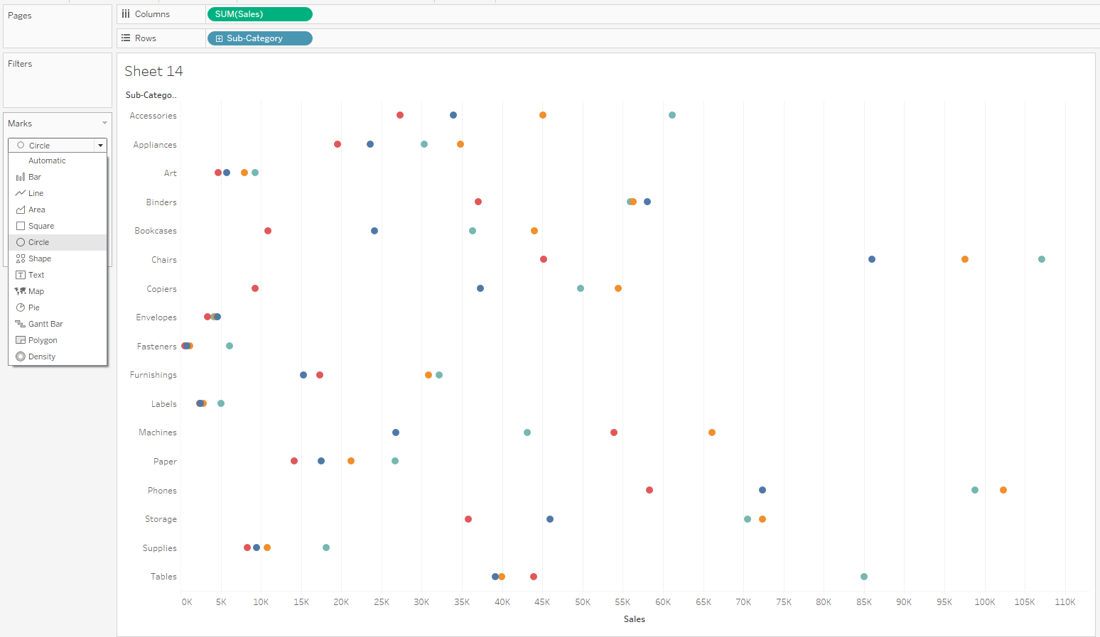
2. Drag region to colour and change marks to circle.
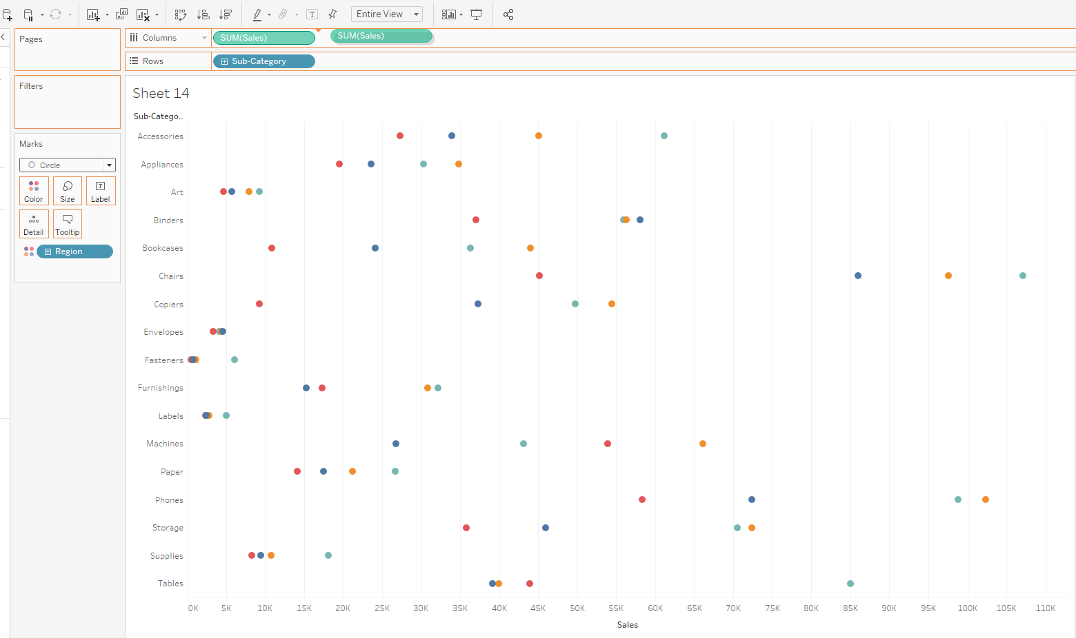
3. Duplicate the sales by controlling and dragging to to the right.
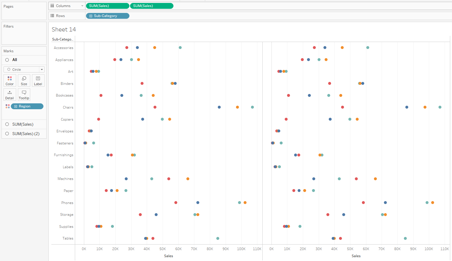
4. Go on the second sum of sales marks card and change mark from circle to line.
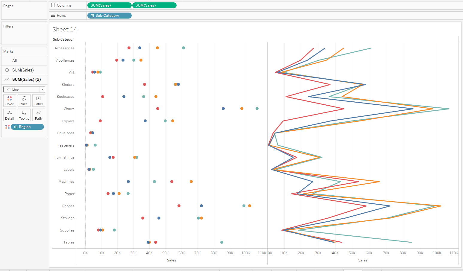
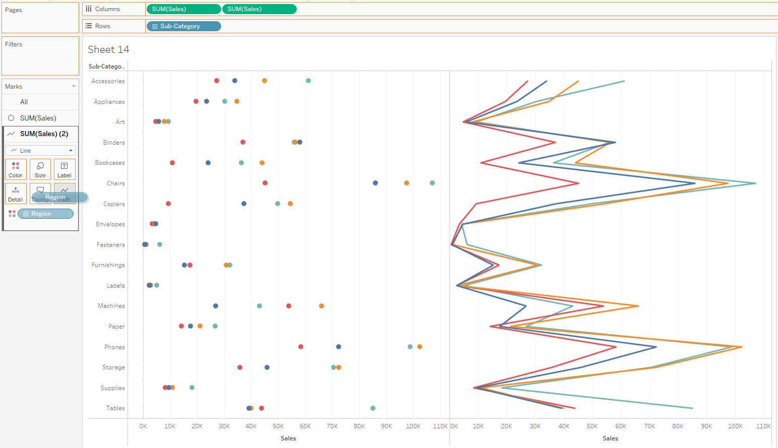
5. On the same marks card, drag regions form colour to path.

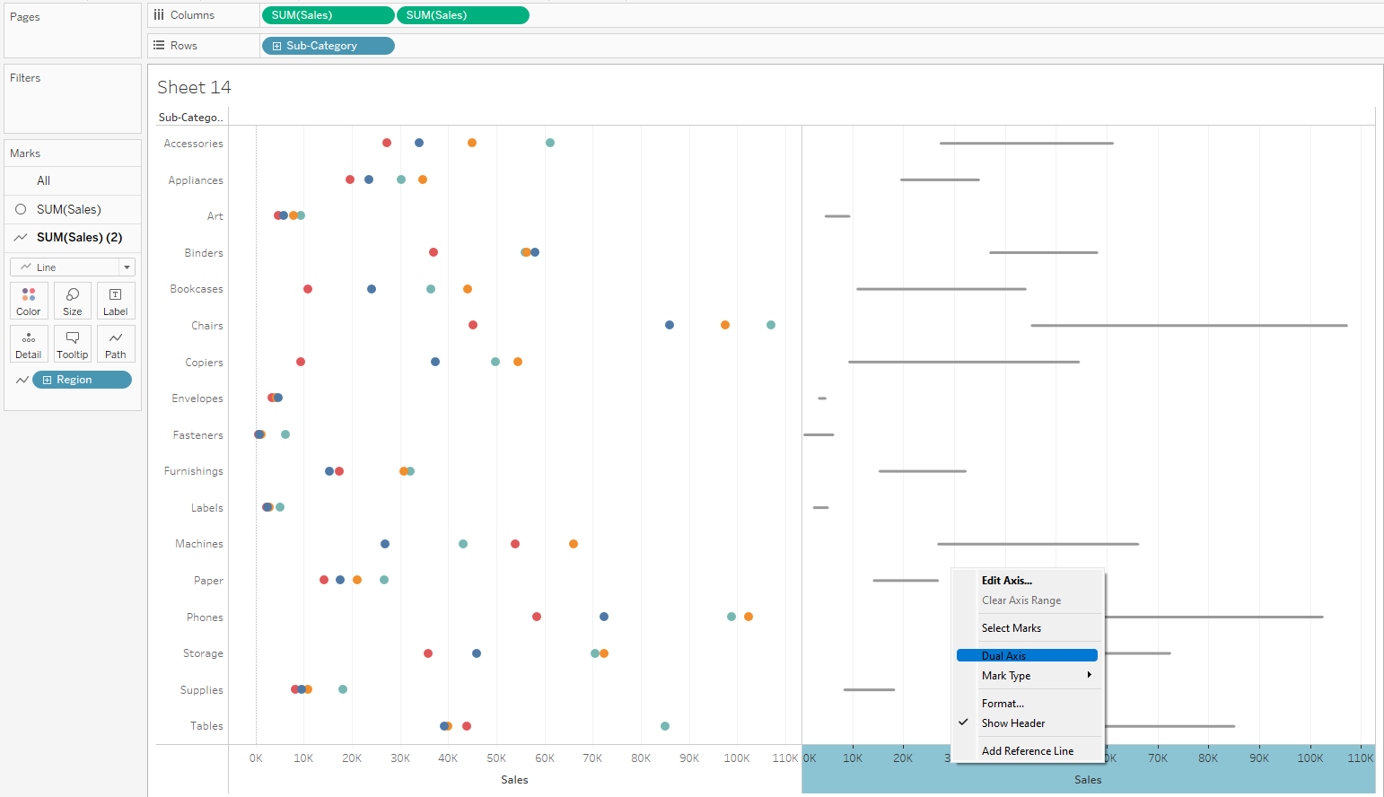
6. Right click on the second axis and select dual axis.
7. Right click on the bottom axis and synchronize.
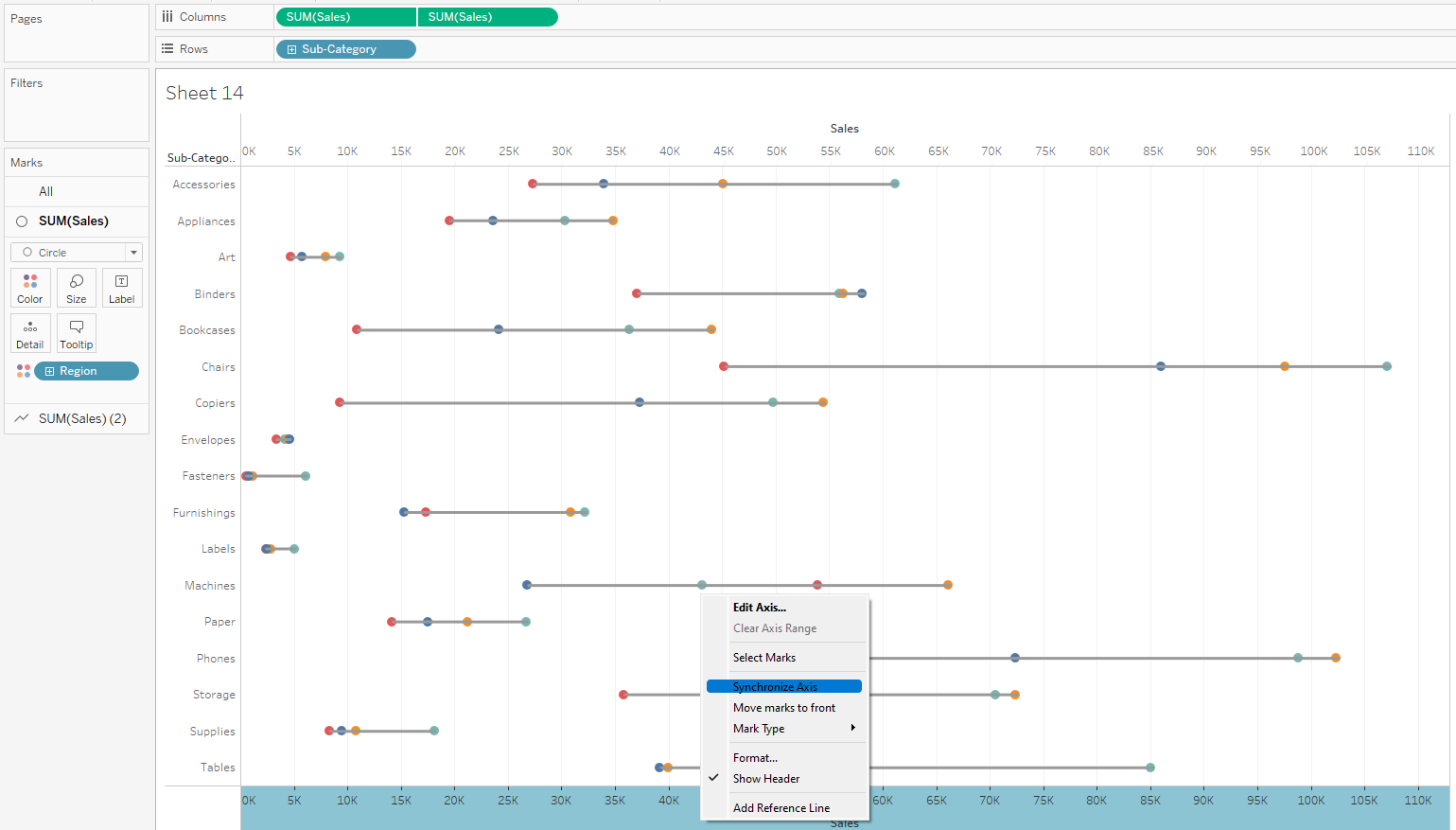
8. Right click on the bottom axis again nd select move marks to front
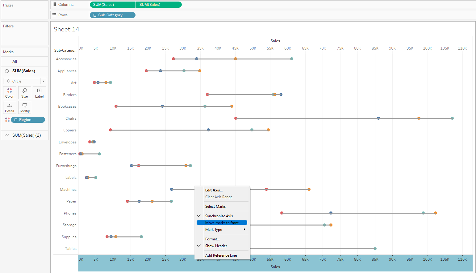
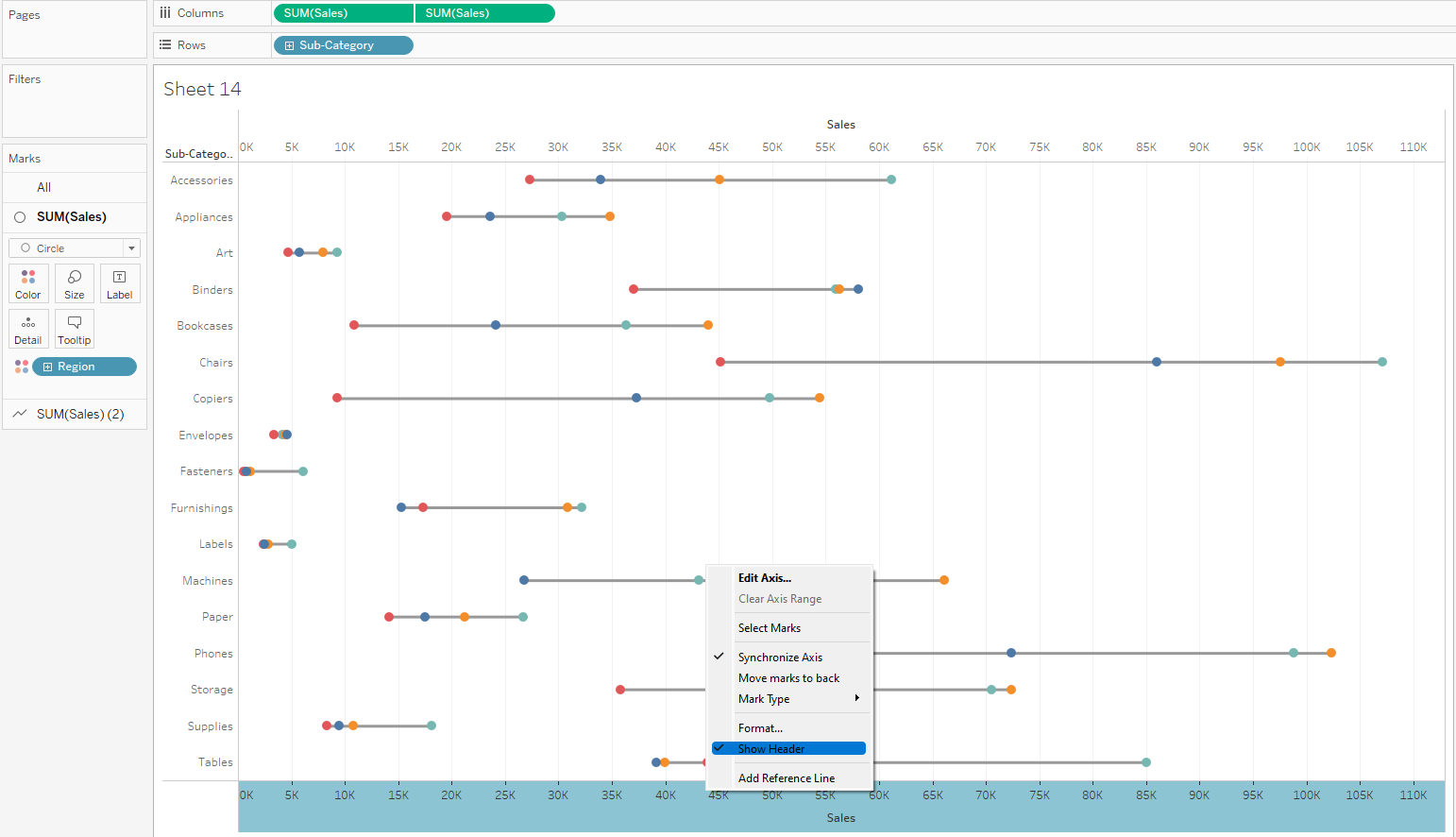
9. Right click on the bottom axis again and deselect show header
10. On the second sum of sales marks card, play with the size of the lines to get something reasonable and change the colour to a lighter shade of gray.
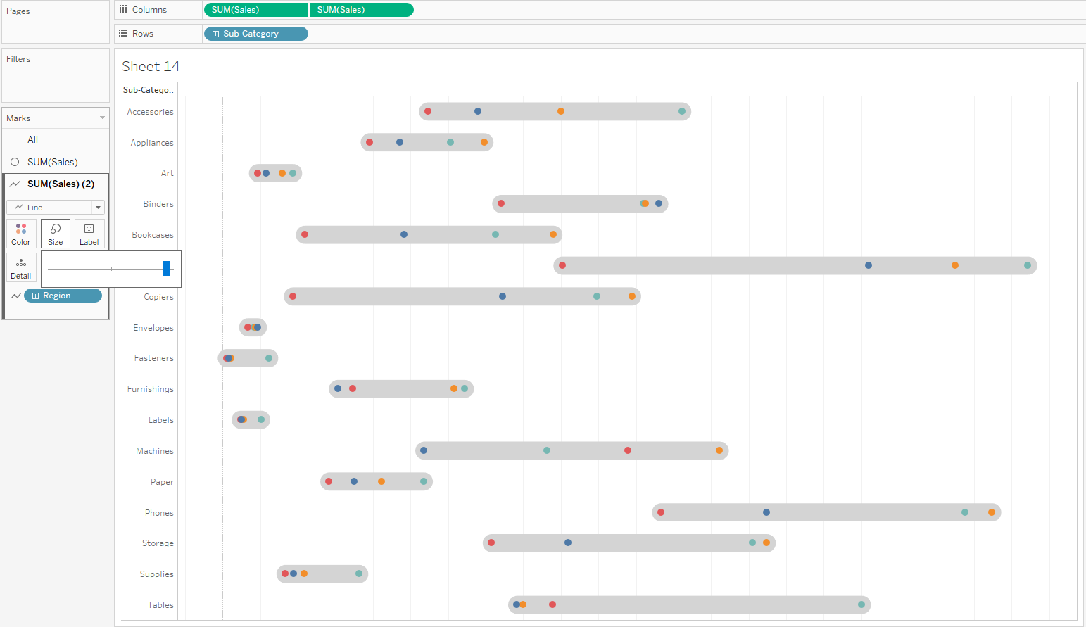
The circles can also be played with but in the nutshell, that's how to create an enclosed dot plot. Thanks for reading and I hope this helped.
