


In the creation of a scatter plot, we sometimes desire to create a 45 degree line instead of using our usual trend lines for the analysis. In this blog, I will show how that can be done.
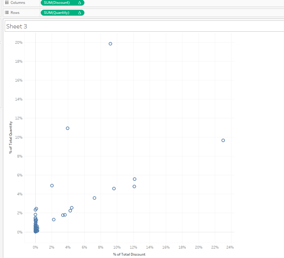
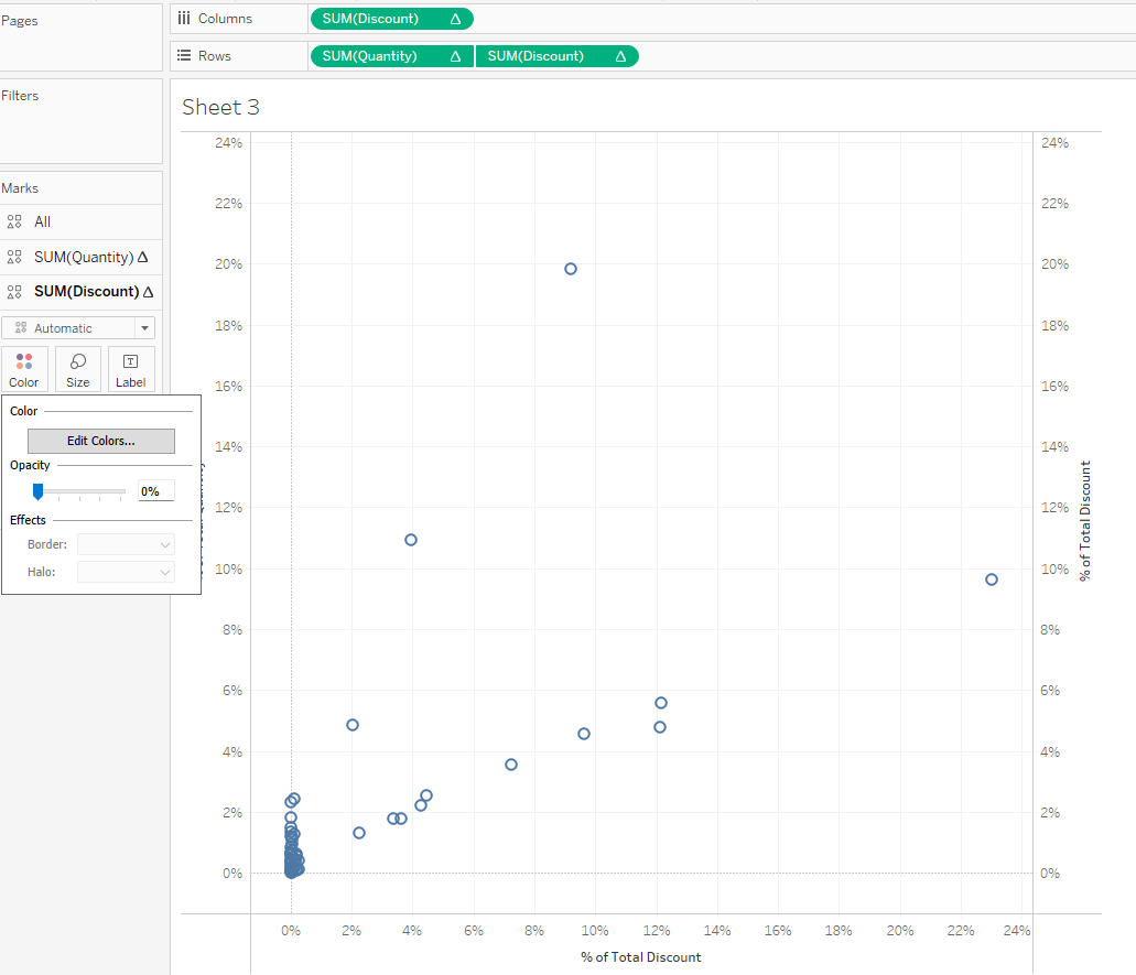
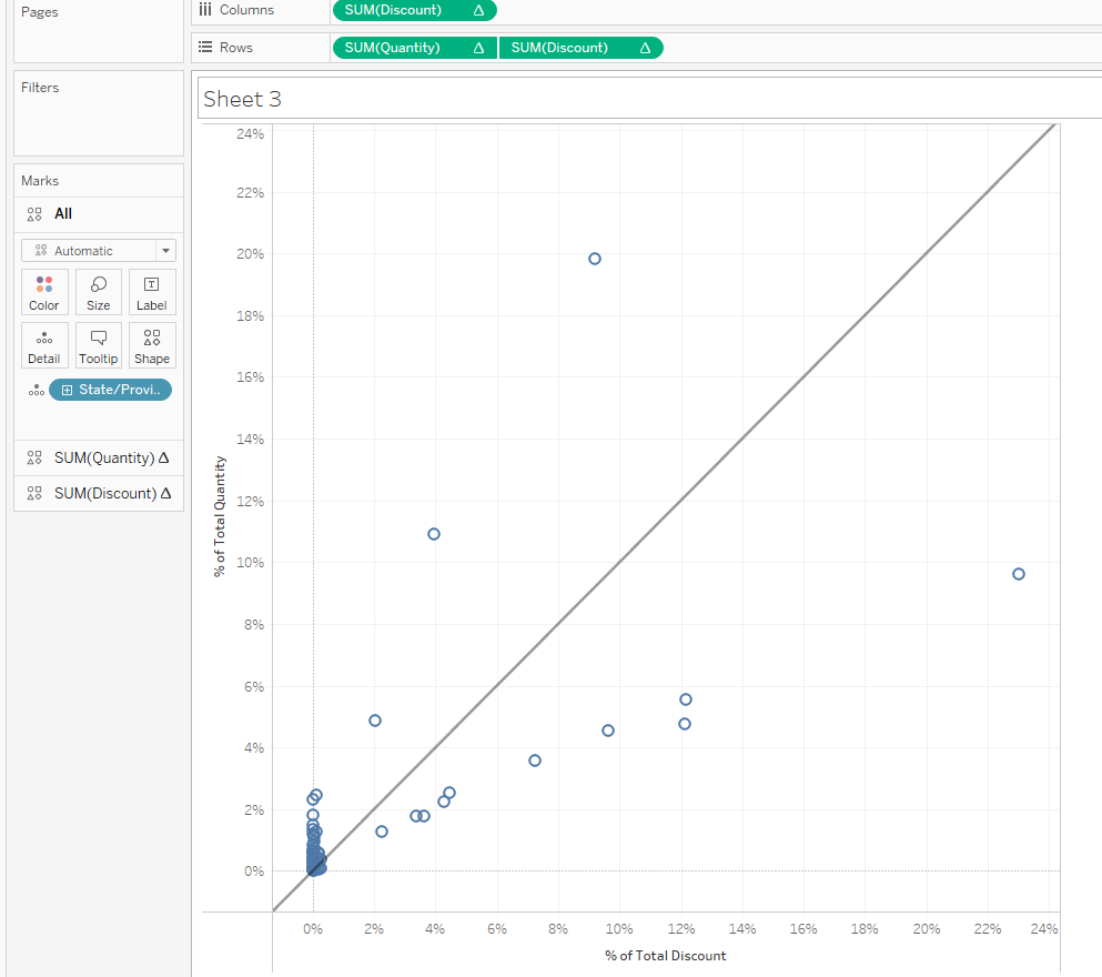
In this view I have a scatter plot of percent of total quantity against percent of total discount.
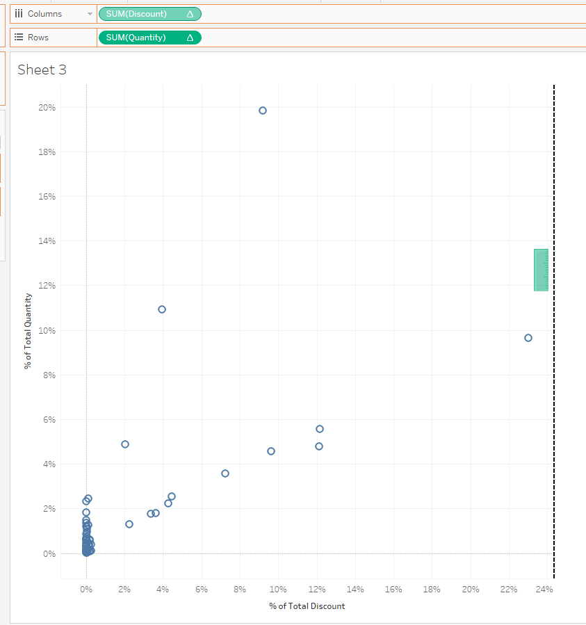
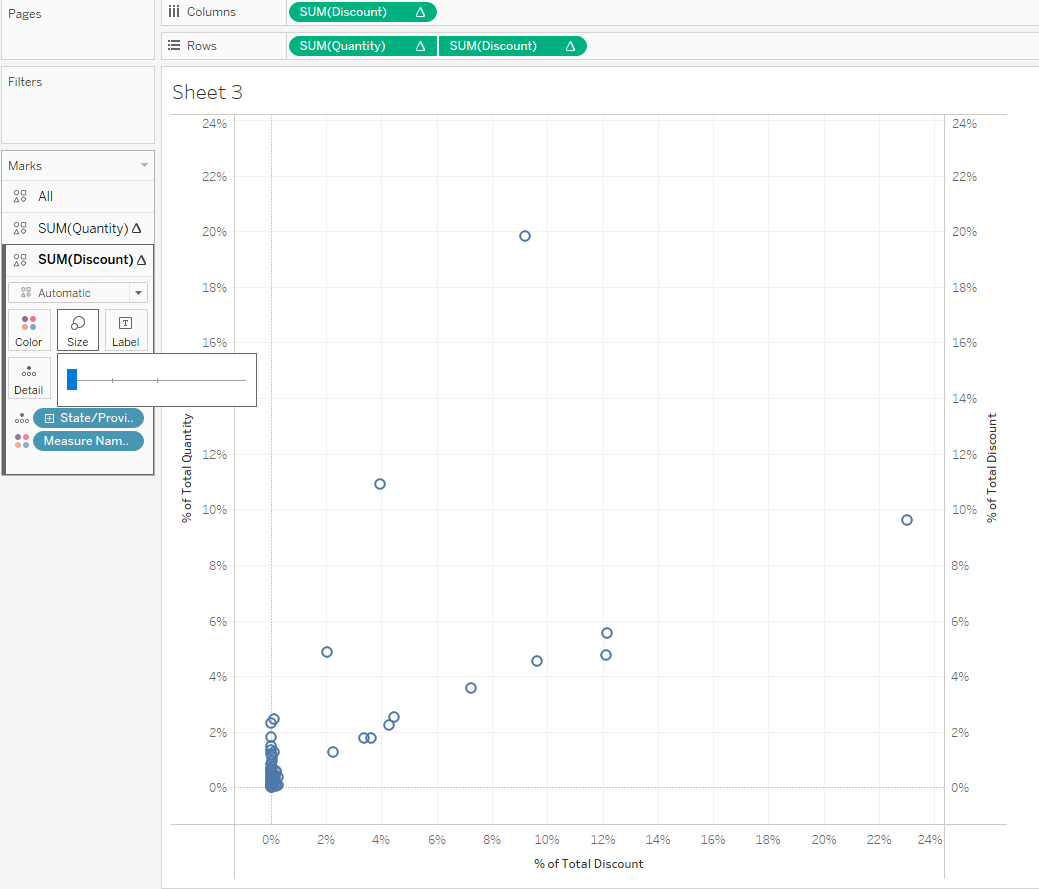
- We need to compare both axis to find the measure with a higher range which is discount in this example.
- Control and drag that measure to create a combined axis.
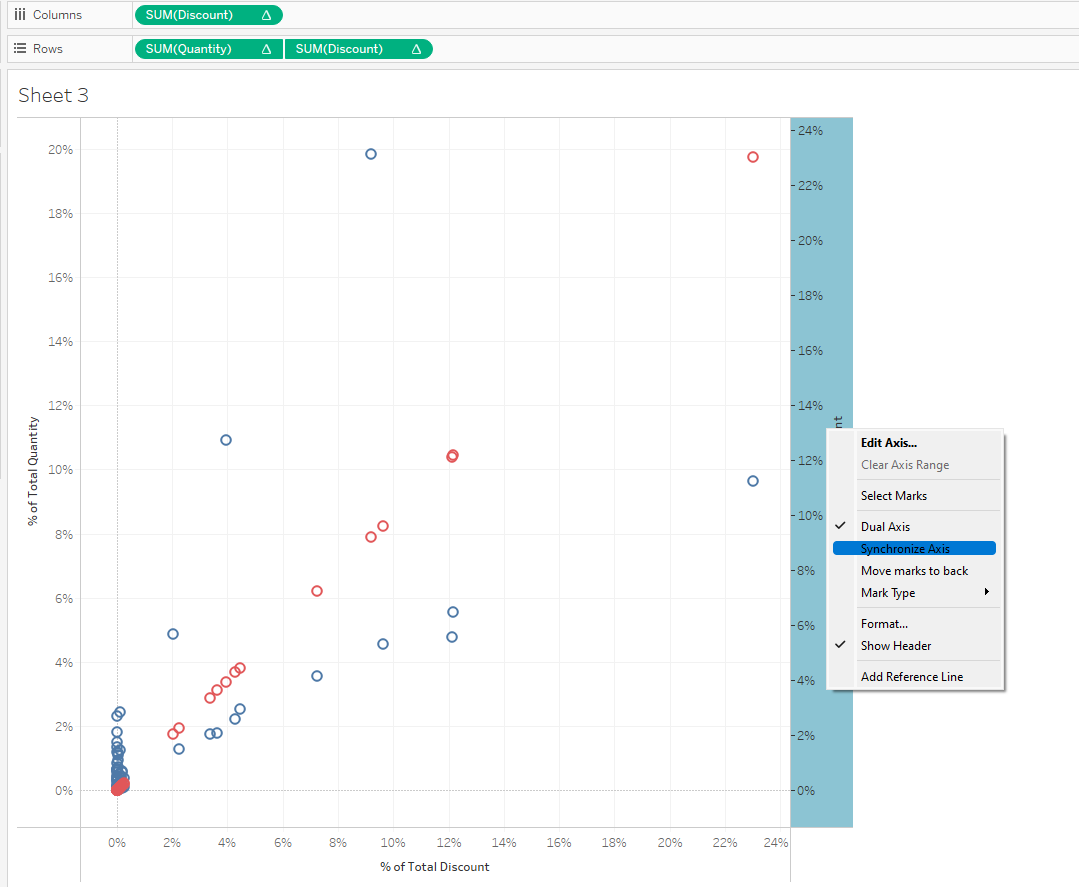
3. Synchronise the axis
4. Click on all marks card and take off measure names from colour.
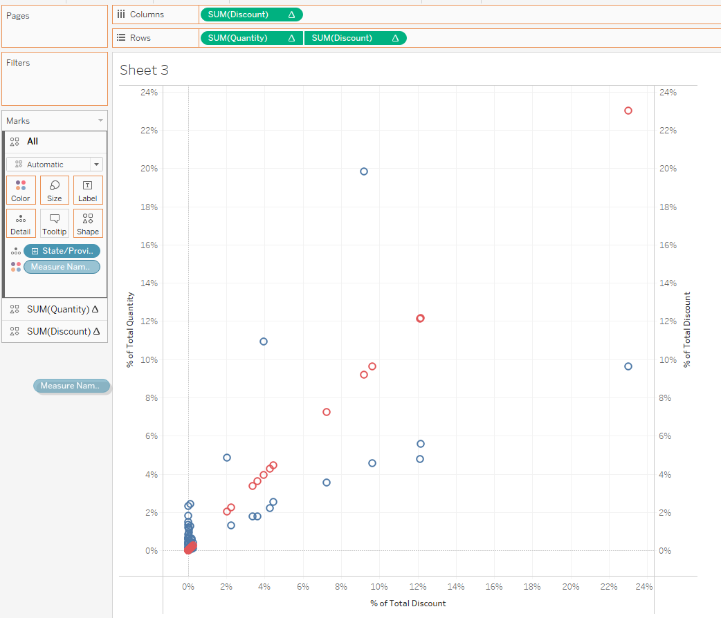
5. Click on the discount marks card and reduce colour opacity and size to the barest minimum.
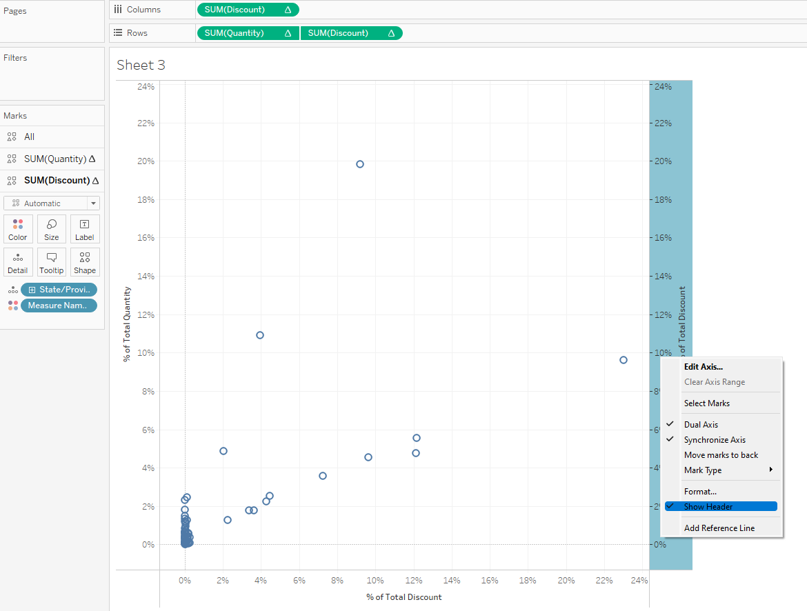
6. Click on the discount y-axis and untick show header
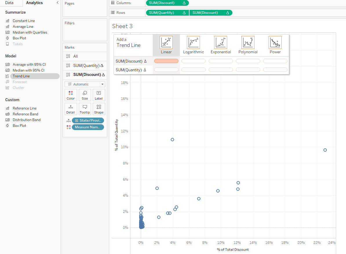
7. Open the analytics pane and drag on a linear trend line unto discount to give you a perfect 45 degree line.
I hope you found this tip helpful and thanks for reading.