A Gantt chart could be used to show how long an activity is planned to take or how long it has actually taken. The creation of this chart will be my focus on todays blog.
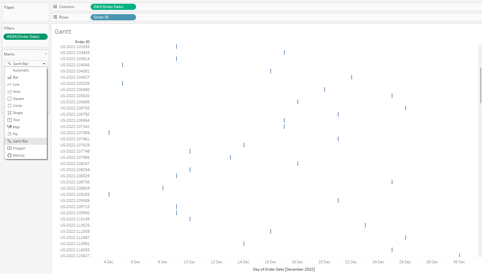
- Drag continuous order date to columns, order id to rows, filter to December 2022 for context and change marks to Gantt chart.
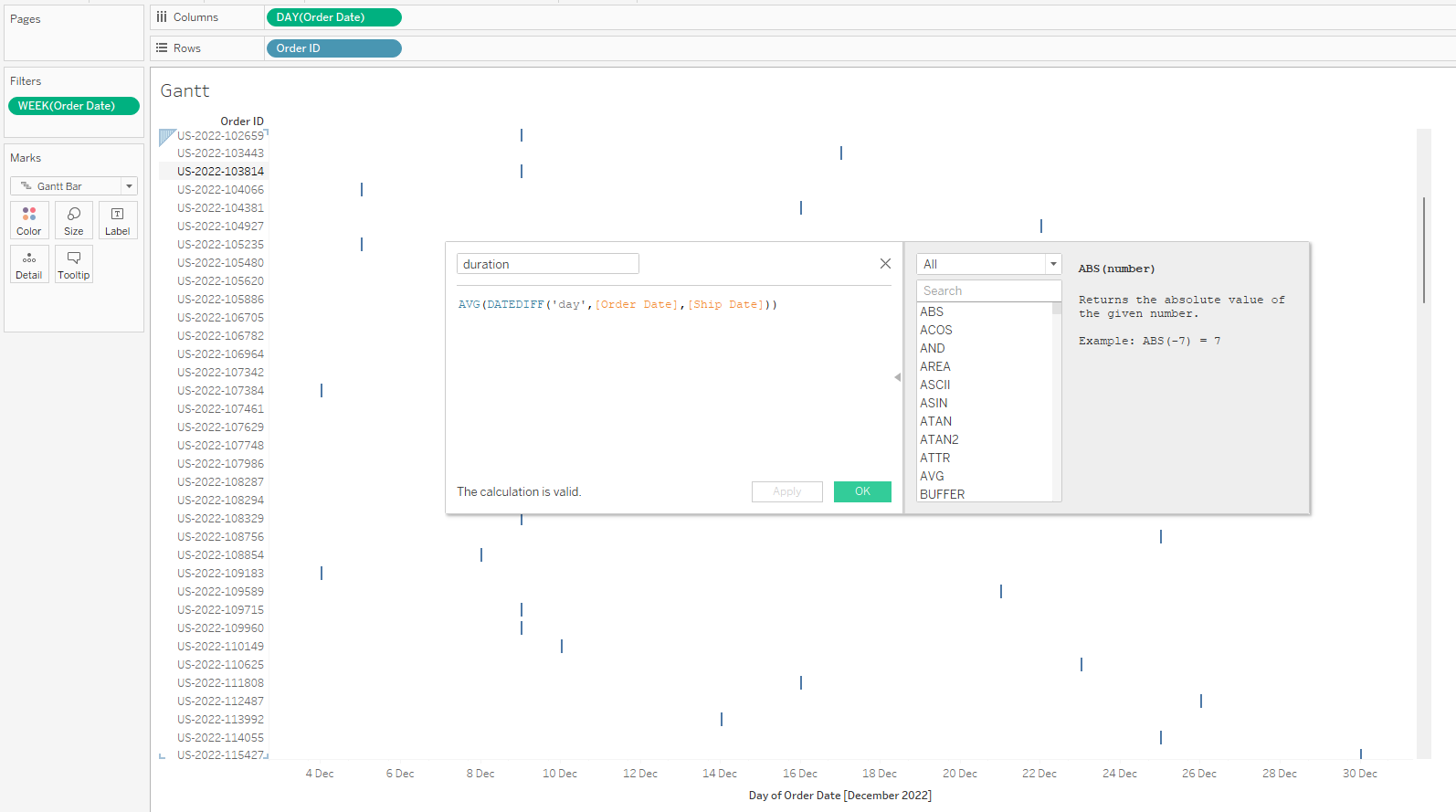
2. Create a calculated field to indicate duration with DATEDIFF function.
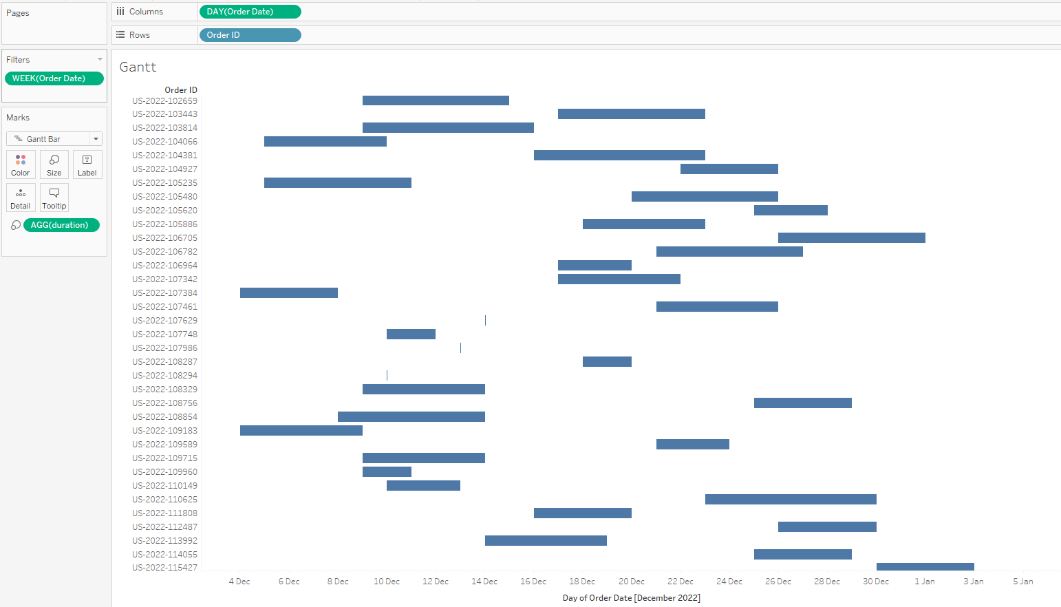
3. Drag duration to size on the marks card.
4. Drag duration to colour.
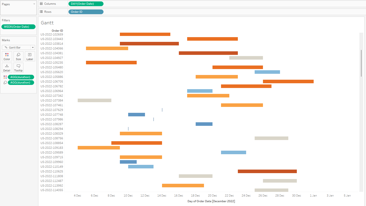
5. Set the maximum expected days to deliver as center. Example: 3 days max by clicking on colour in the marks card, edit colour, advanced, set center as 3 and click apply.
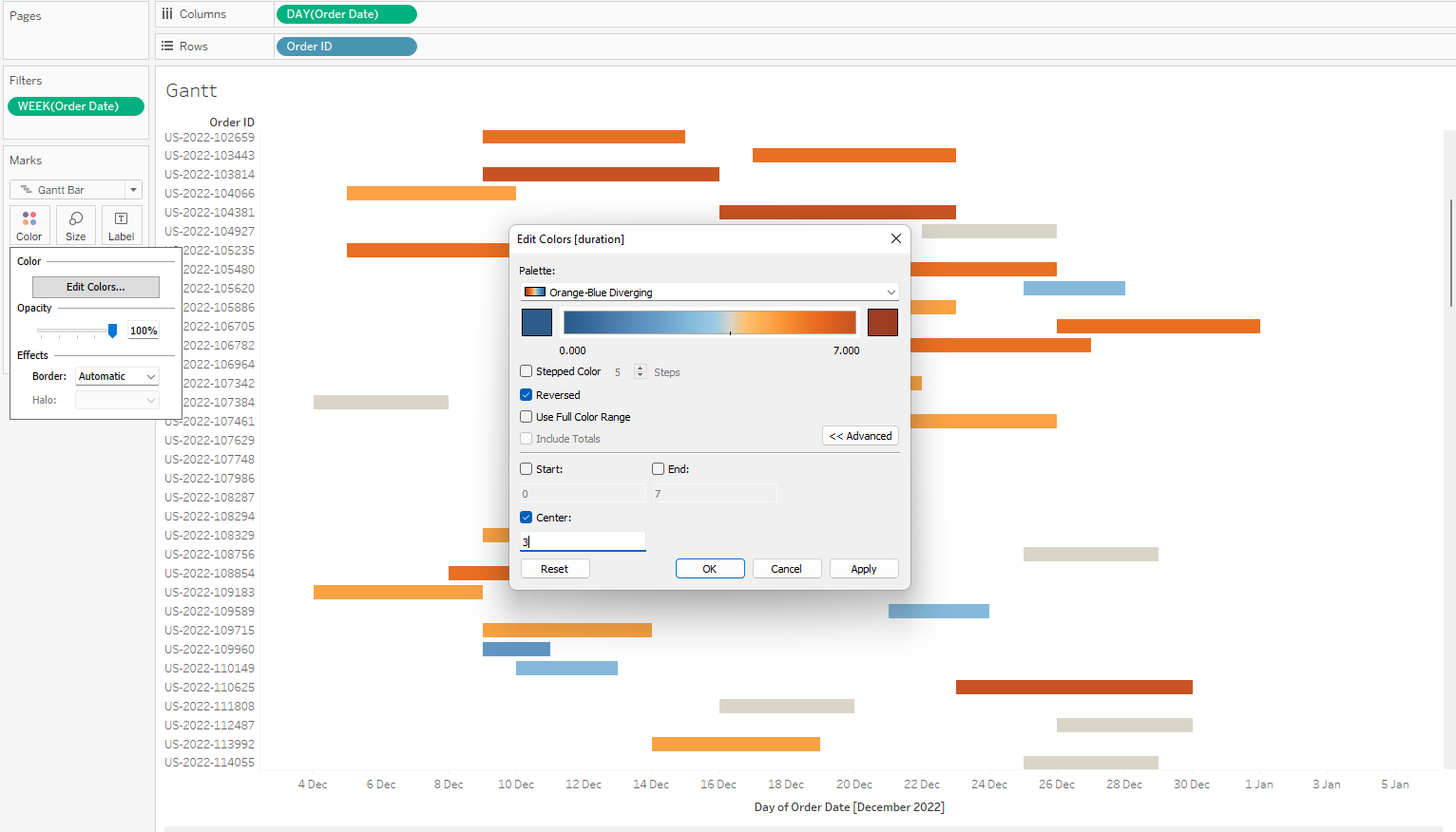
From the colours and tooltips, we can make out deliveries that took longer to deliver, same day deliveries and deliveries that took lesser days than the minimum. That's how to create a Gantt chart and I hope it was helpful. Thanks for reading.
