On the 4th day of dashboard week, we had a task to create KPI dashboards using Power BI.
The cohort was assigned datasets from which each person could make a choice. By random selection, the dataset I got was on Supply Quality from 2013-2014.
I started with a laid out plan in this order:
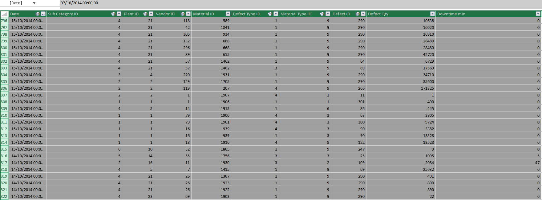
- Look at the dataset and check if there is the need for data cleaning: I initially thought I had to create some lookup calculations in excel or to use find and replace tool for restructuring based on the structure of my dataset.

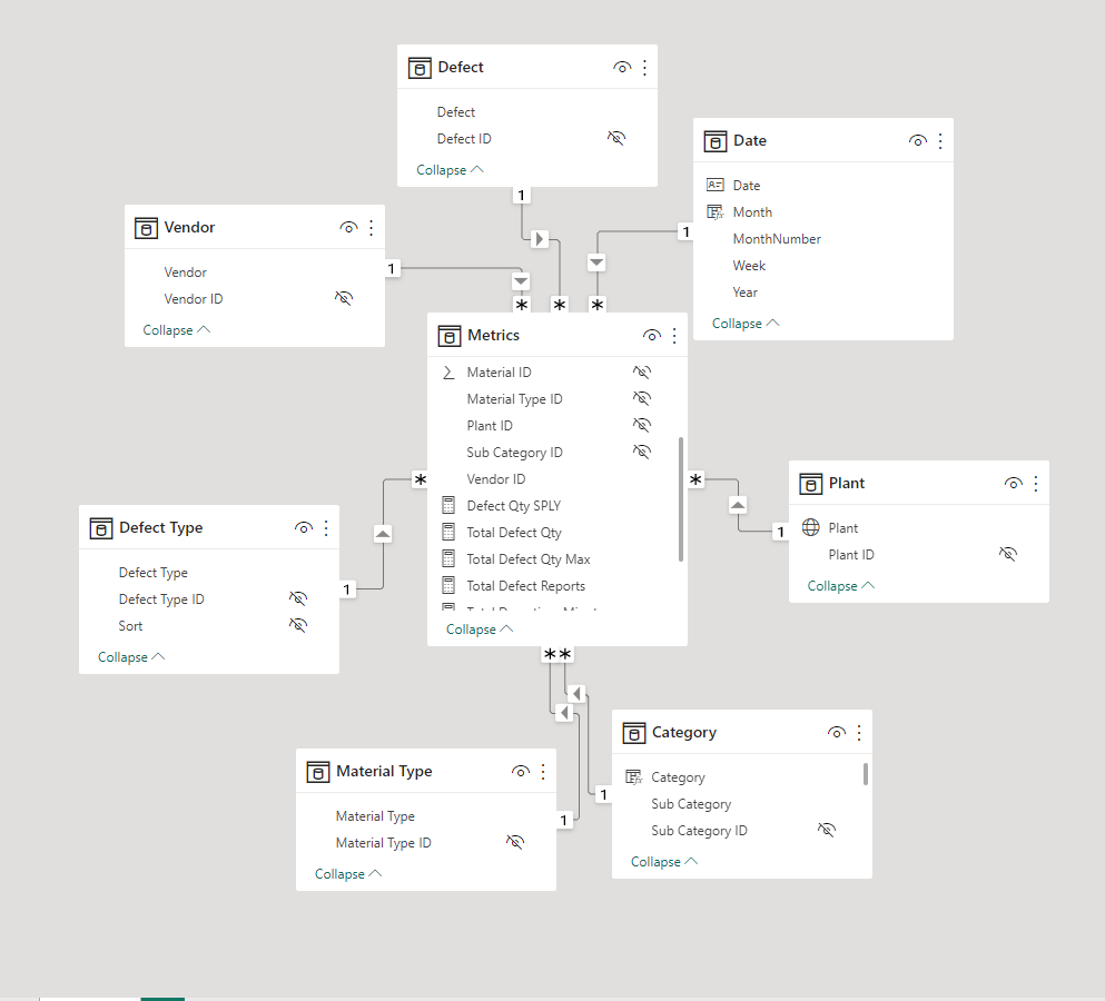
However, I noted Power BI would cater for that due to the data model available. All I had to do was to make visible the fields that I wanted in the main dataset from the lookup tables.

2. Set out questions that can be answered based on the data
a. What is the general trend of supplier quality along the year month and quarter
b. Which Vendor supplies more defected goods
c. Which category do we have more defected goods
d. Which Material types had more defects
d. Which plants made up and what material types
After stating these questions, I wrote a user story with a store manager as my focus.
As a store manager, when I look at the supply quality dashboard, I want to be able to look at the Total Quantity of defective goods supplied on a monthly level for both years as a comparison. For the bans, I want to be able to see the total reports for the current year and the percentage change against the previous year (these same calculations should hold for the total defective goods supplied and the total downtime). On the category and material level, I want to be able to see whic of these dimensions had the highest defective goods supplied. With all these metrics, I want to be able to filter on the plant and vendor levels in order to be flag worst performing vendors and also concentrate on affected plants of production.
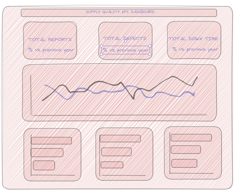
3. I created a sketch to give me an idea of what my final output will look like.

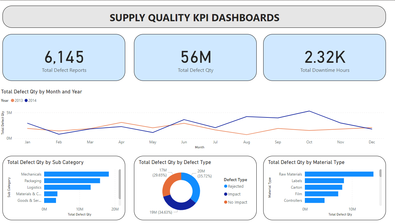
I set out to do what I planned but some of the charts had to change along the line. My percentage calculations for the BANs, worked for the yearly figures but I observed that the numbers were not matching up when I did filtering so I decided to take that out since I was out of time.
A snapshot of the final output can be found below.

