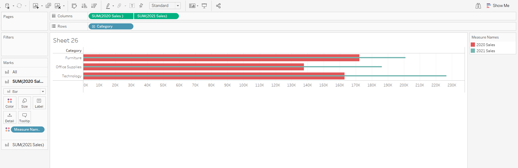
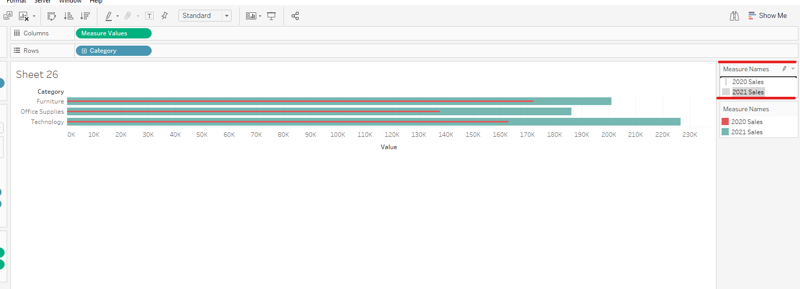
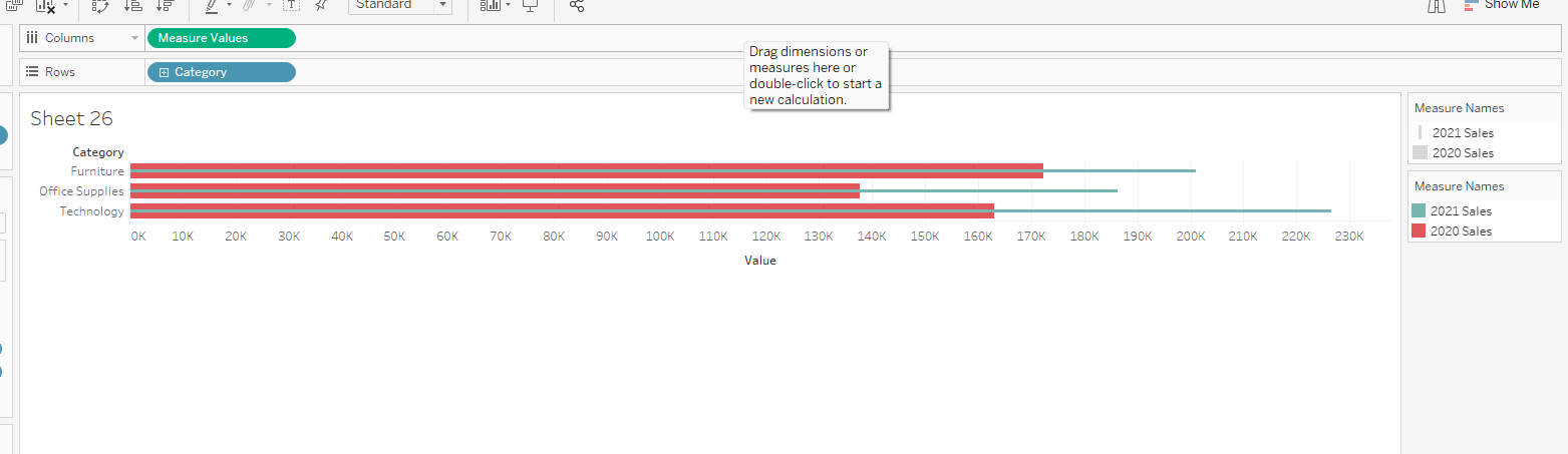
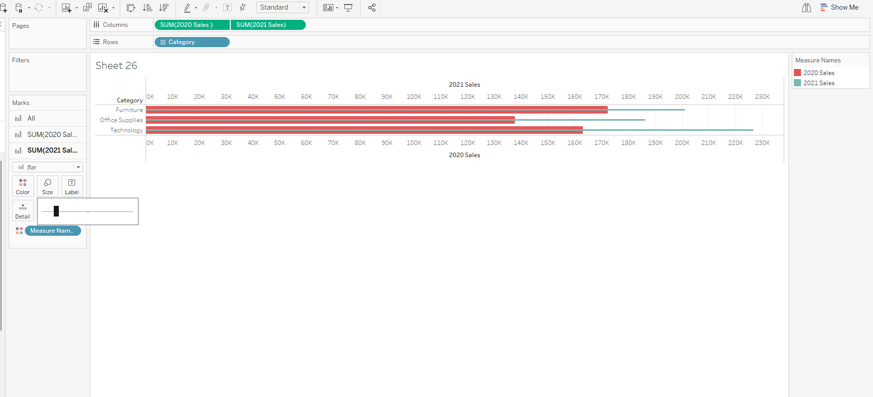
Bar in bar charts aid in comparing two numerical values based on the length of the individual bars. There are two ways to do this if I want to compare year 2020 sales to year 2021 sales based on each category.
The first method is by combining the axis.
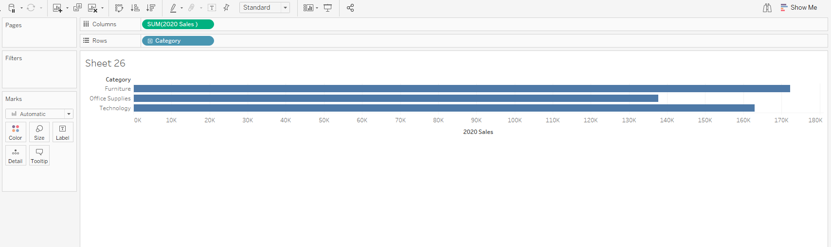
1 . Drag categories to rows and 2020 sales to columns
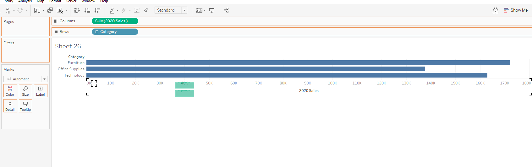
2. Drag 2021 sales to the sales axis for a combined axis.

3. Take measure names off rows unto size on the marks card.
4. Control drag measure names unto color.
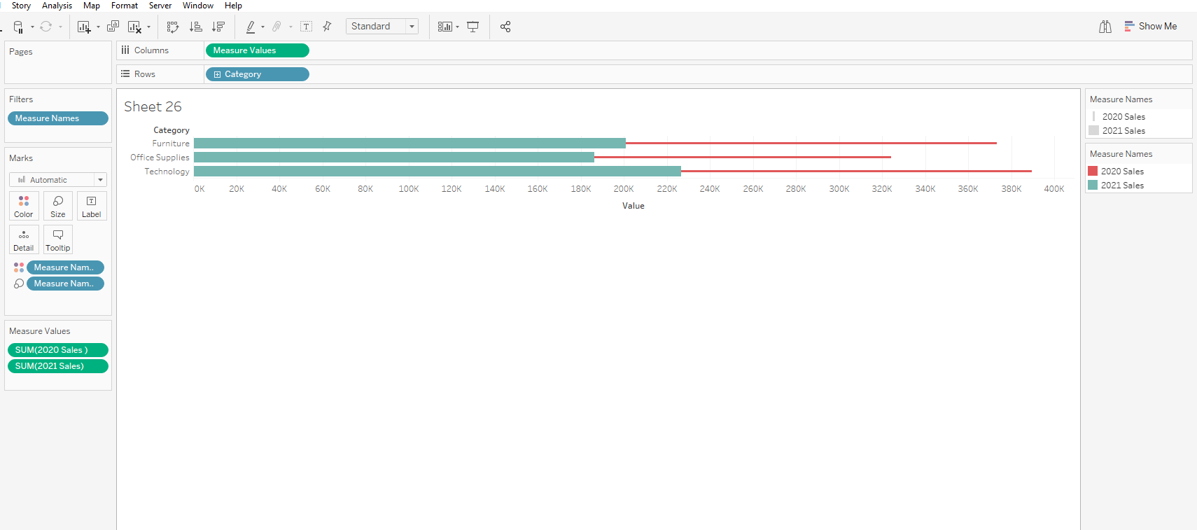
5. Go to analysis and put off stack marks
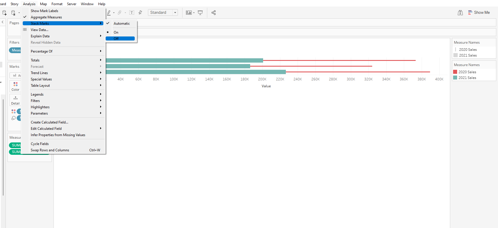
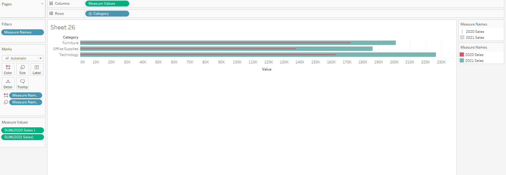
6. Reorder the sizes for a better view by dragging 2021 above 2020 in the size legend.
The second method is by using dual axis.
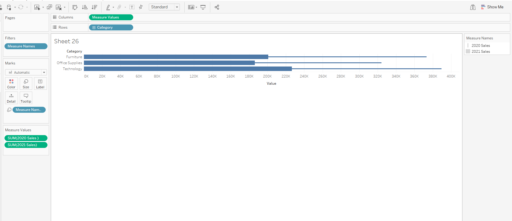
- Bring categories unto rows, both 2020 and 2021 sales unto columns and create dual axis.
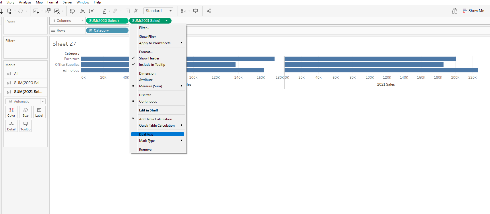
2. Synchronize axis
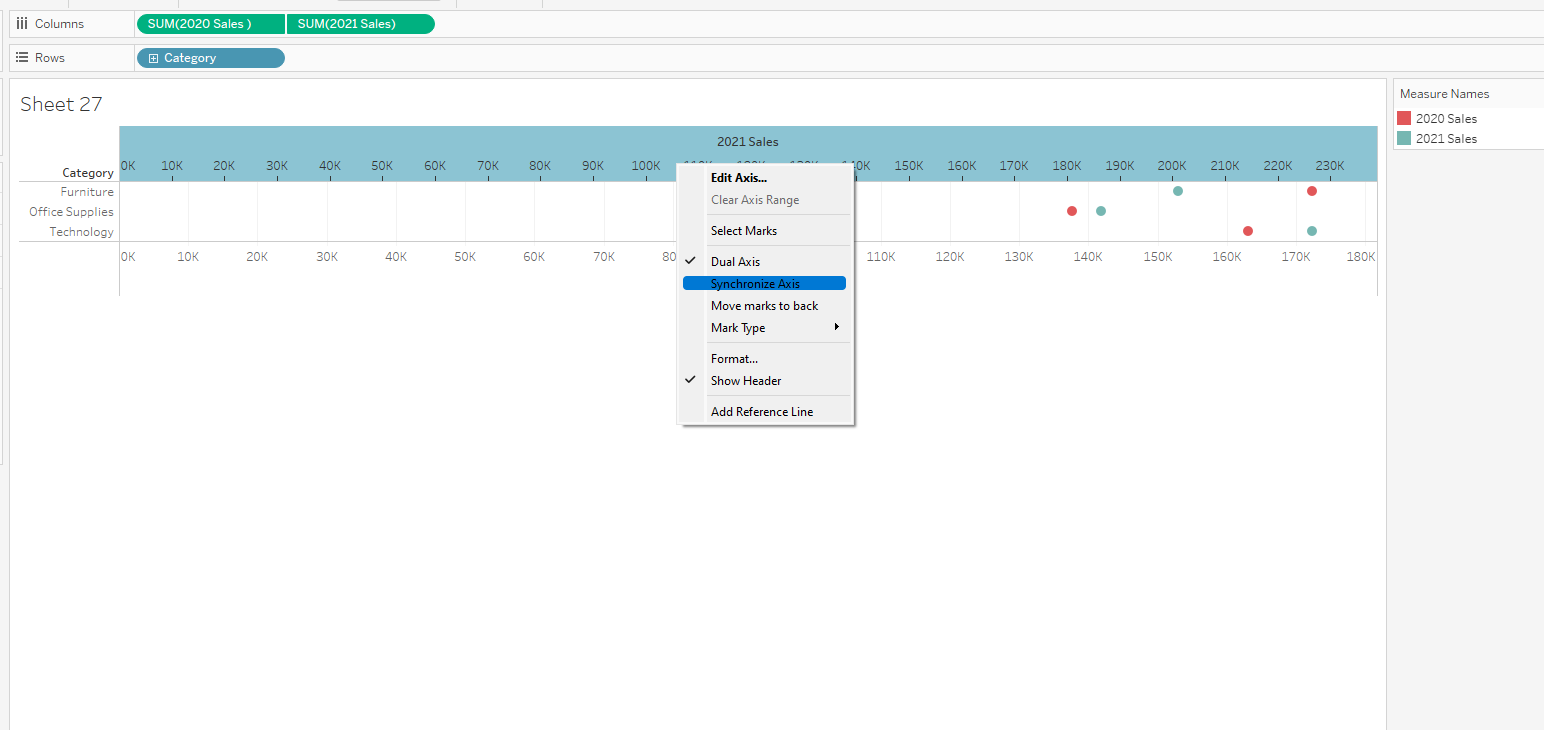
3. Click on All on the marks card and change mark type to bar.
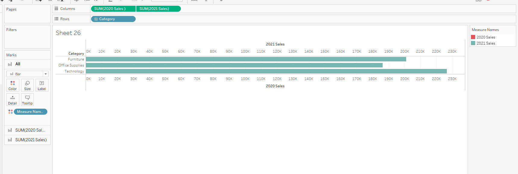
4. Click on 2021 Sales in the marks card and reduce its size to your liking
5. Further formatting can be done to suit your task