Accordion (or collapsible) charts can help keep dashboards clean by showing key information first and letting users expand sections for more detail when needed. This approach makes dashboards easier to read and more flexible for different users. In this example, we’ll be making an accordion chart that shows sales by category and sub-category using Tableau’s Superstore dataset. We’ll use parameters to allow users to reveal sub-categories when clicking on a category.
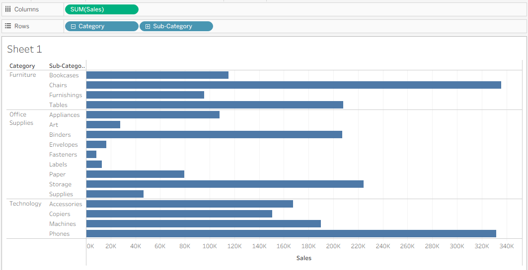
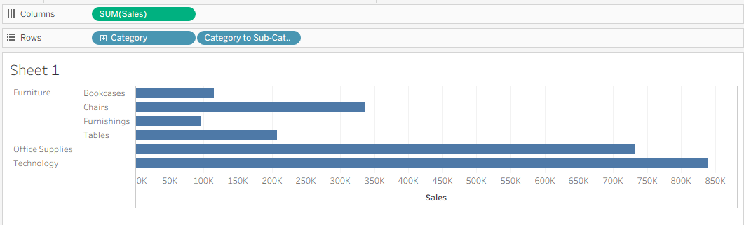
1) Let’s start by building the base table. Drag Category and Sub-Category onto Rows, and Sales onto Columns.
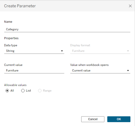
2) Next, we’ll create a parameter. Click the black arrow at the top of the Data panel and select Create Parameter. In the dialog box, name your parameter Category Parameter. Set the Data Type to String, the Current Value to any category (for example, Furniture), and Allowable Values to All.
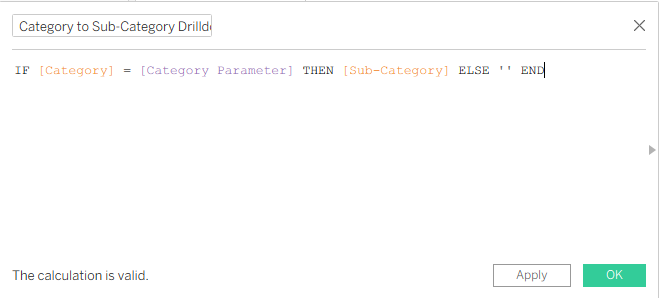
3) Next, we’ll create our sub-category drilldown. Click the black arrow at the top of the Data panel and select Create Calculated Field. Name the calculation Category to Sub-Category Drilldown. Set up the formula so that when the selected category matches the parameter, the sub-category is displayed; otherwise, it returns an empty string.
4) Then drag Category to Sub-Category Drilldown onto the Rows shelf, placing it directly above the Sub-Category pill to replace it. This will update your view so that only the category selected in your Category Parameter is expanded, while all other categories remain collapsed.
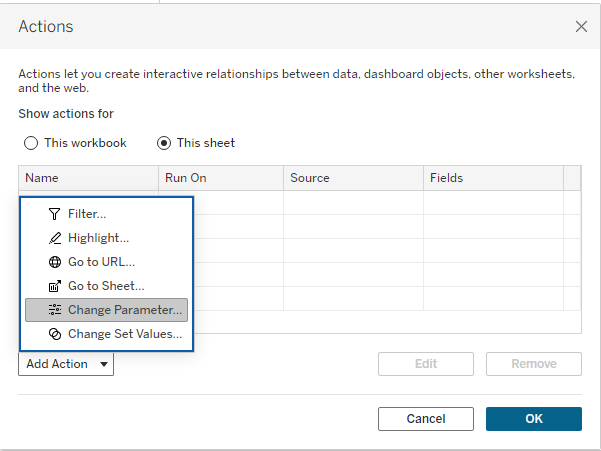
5) Now we’ll add interactivity. Go to the Worksheet tab and select Actions. Then, under Add Action, choose Change Parameter.
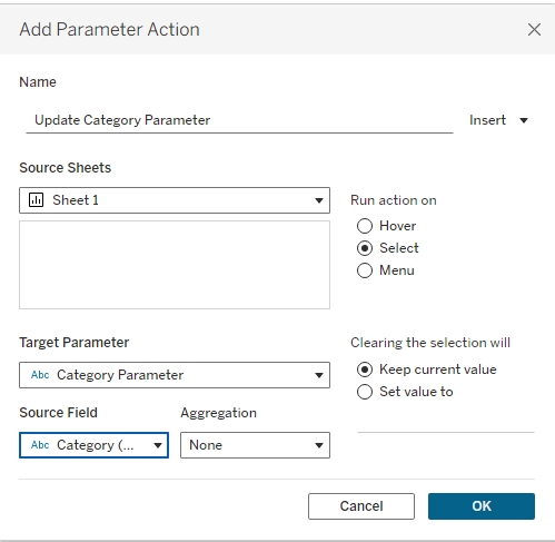
Name the parameter action Update Category Parameter. Set the Source Sheet to the sheet containing your chart (for example, Sheet 1). For the Target Parameter, select Category Parameter, and for the Source Field, choose Category and leave the aggregation as None.
Now, on your worksheet, try clicking different categories. Your drilldown should work, expanding the selected category to show its sub-categories while keeping the others collapsed.
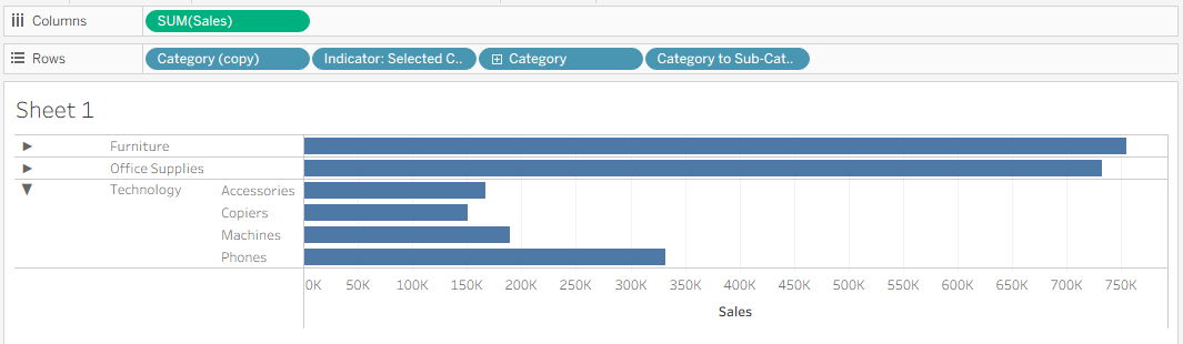
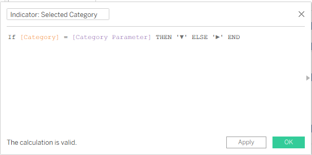
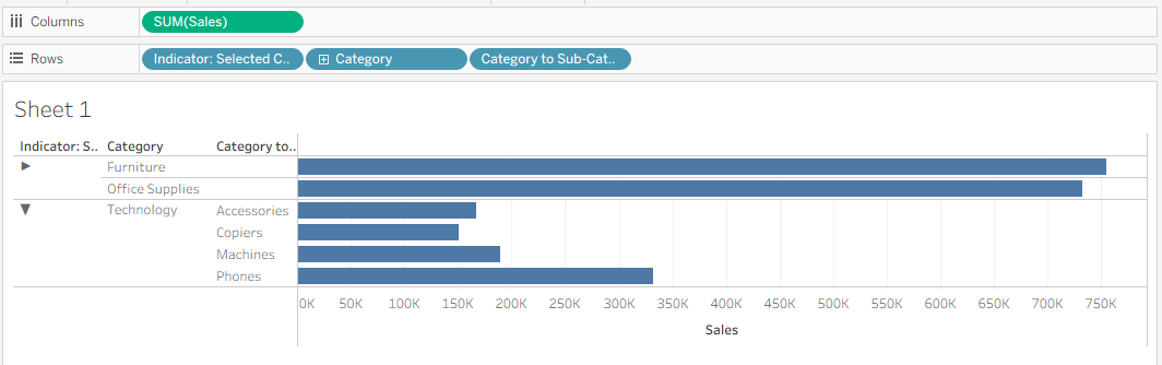
6) We can enhance this table by adding drilldown indicators. Click the black arrow at the top of the Data panel and select Create Calculated Field. Name the calculation Indicator: Selected Category. Set the formula box so that if the category matches the Category Parameter, it shows a downward-pointing arrow (indicating the table is open); otherwise, it shows a right-pointing arrow (indicating the table is closed).
Drag the Indicator: Selected Category field onto Rows, placing it before the Category field. Your table will now show two groupings: one collapsed (arrow pointing right) and one expanded (arrow pointing down).
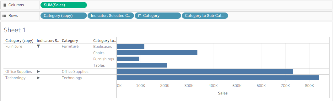
You may notice that the open category now jumps to the bottom of the table, while the closed categories appear at the top. To fix this, duplicate the Category pill and drag the new copy in front of the Indicator pill. This restores the table’s primary division by category and creates a drilldown indicator for each category.
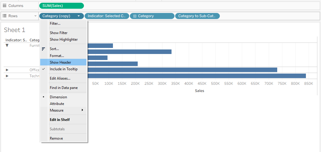
7) To finish up the table, we can clean it up visually. Hide the first Category column by clicking the Category (copy) pill and unchecking Show Header.
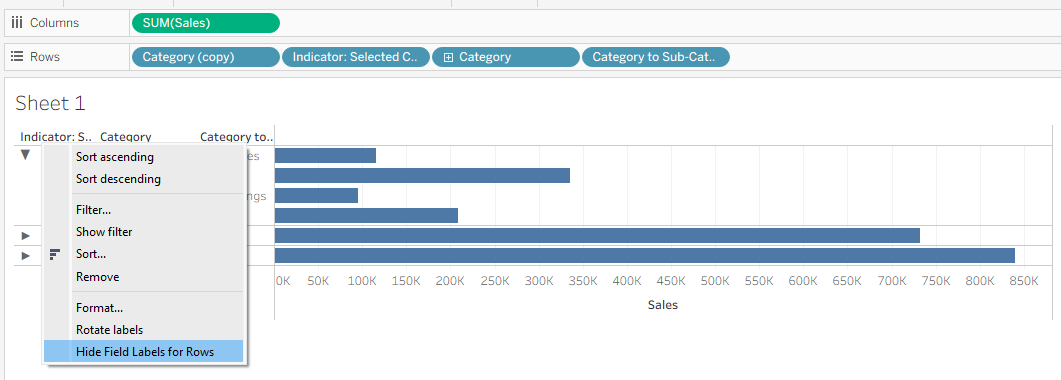
Finally, hide the header labels by right-clicking the header row and selecting Hide Field Labels for Rows.
And here is the final chart!