


For our second day of Dashboard Week, we were tasked with making a Power BI dashboard using data from the London Stock Exchange. We had 6 hours to go from receiving the data and the brief to presenting a fully finished dashboard. Here is how I went about it.
Data Preparation and Cleaning
The data came in 4,992 tables in text file format. I imported these into Power Query and performed a union to combine them into one table. Next, I changed data types as required, fixed an issue with the date column, and removed unnecessary fields. It was then time to move to Power BI to experiment with charts and create a sketch.
Sketching
I made some basic charts in Power BI to help me explore the dataset and understand what questions I could answer with the data. My plan was to make a dashboard for the following user type:
An investor or market analyst wants to monitor recent ETF trading activity and identify trends, momentum, and volatility across the London Stock Exchange over the last several years.
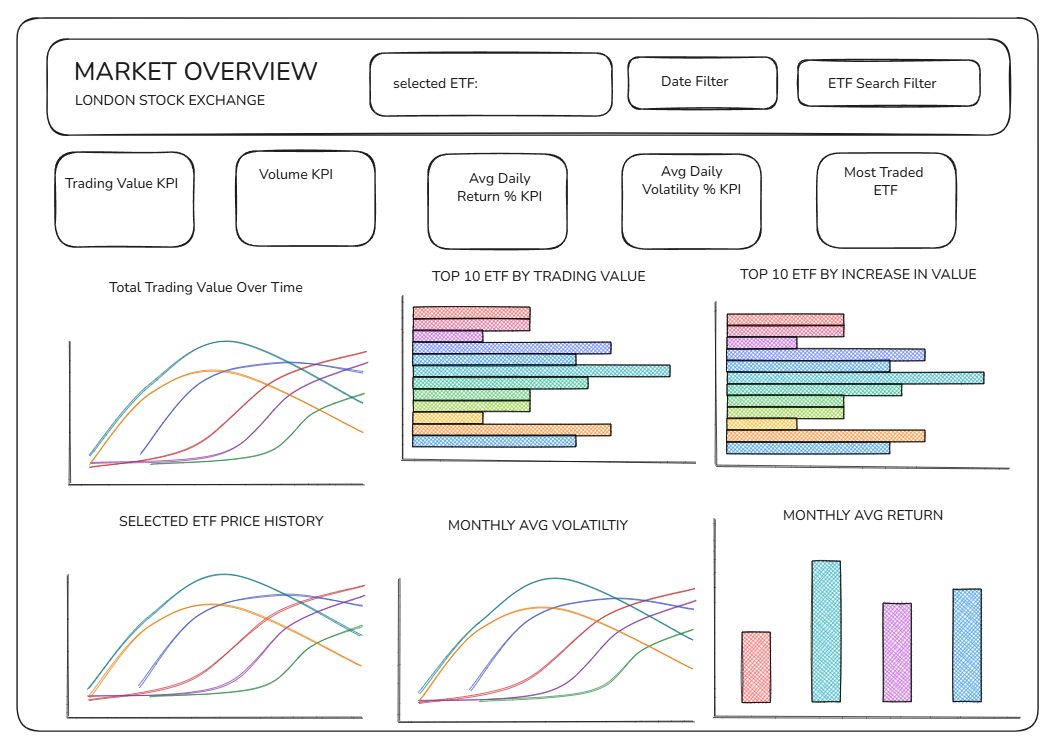
This planning gave me what I needed to create a sketch of what I would include on my final dashboard. As always, I used the excellent tool Excalidraw for sketching.
Building the Dashboard
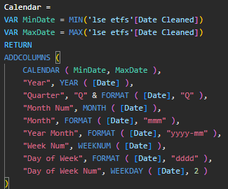
Now I was ready to build. First, I had to make a custom date table using DAX code in Power BI. This is due to Power BI not being able to fill in gaps in continuous dates by itself, which is one of its biggest flaws compared to Tableau in my opinion. To get around this issue, you must create your own date table based on the first and last dates in your data. This is how I did it.
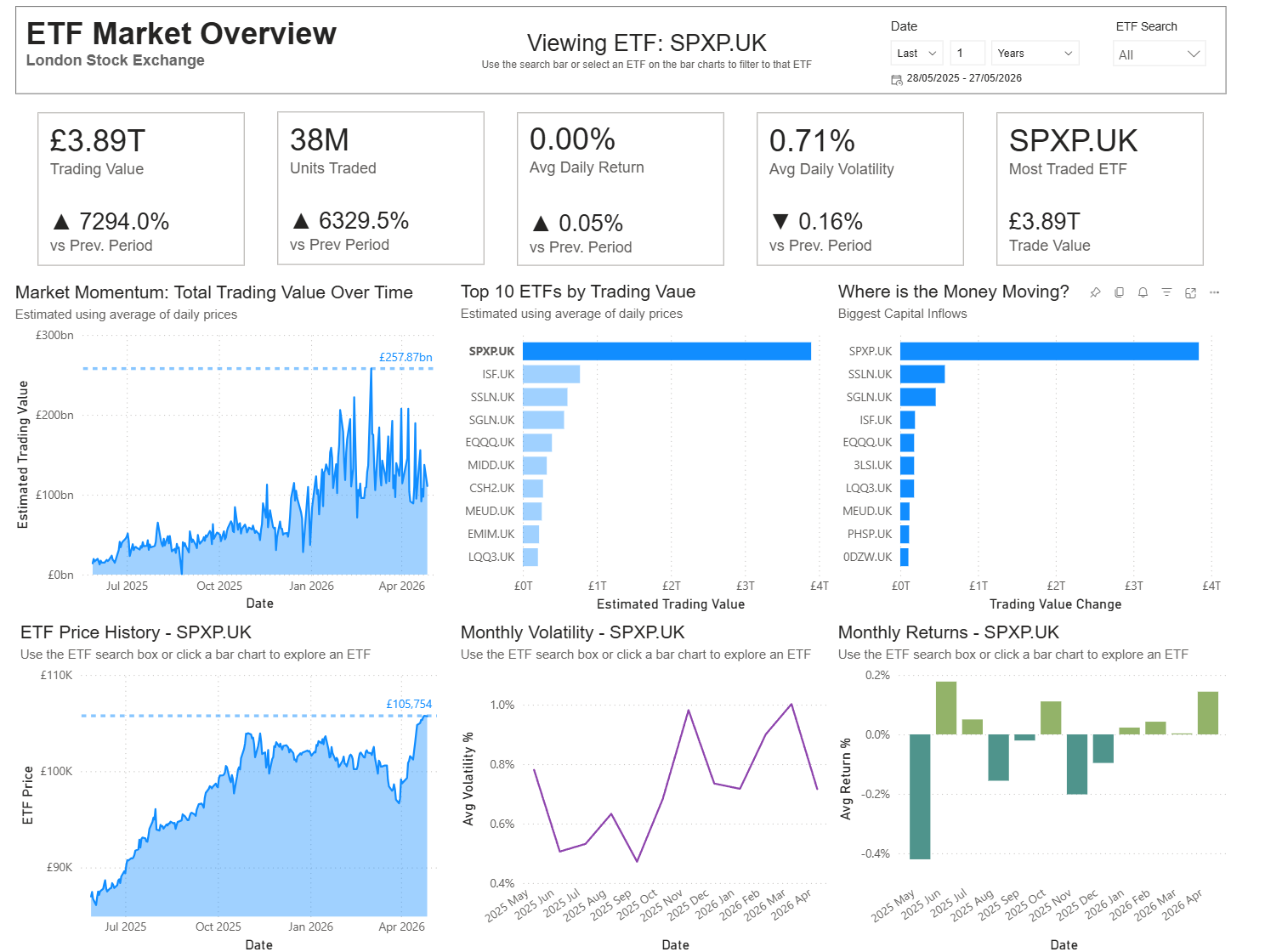
Now, I was finally ready to begin assembling my dashboard. I chose to have six charts. The top three showed a market overview. The bottom three showed data for individual ETFs, which could be filtered by choosing an ETF from the top two bar charts or selecting one in the search box in the top right. The selected ETF would then be displayed in the top bar of the dashboard. The lower three chart titles would update dynamically to show the user which ETF was being displayed.
Here is a look at how the dashboard appears with the SPXP ETF selected.
Final Thoughts
Overall, I'm pleased with my dashboard. Many people find Dashboard Week stressful, but I quite enjoyed the day. Given more time, I would like to separate the market overview and individual ETF views into two dashboards. This would allow me to include more exploratory charts to help the user drill down further into the data for individual ETFs and explore each metric more carefully. Explore it below.