


I will use the dataset Superstore.
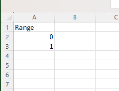
Before we started, we also needed to create a new table in Excel or Google Sheets, where we write names – Range and numbers 0 and 1. You can see it below in the screenshot.
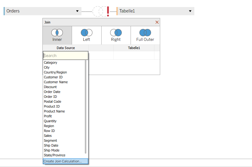
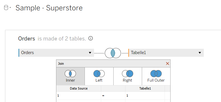
After that, we open our Tableau and add our first table – Superstore. Then you double-click on this table, and one window for relationships opens. We need to do an inner join with the newly created table Range. We click first on “Add new join clause” and choose “Create Join Calculation”, and write 1. After that, we need to do the same on the other side. After that, we have our join, and it means that our data is doubled. One field with range 0 and one field with range 1. This step is needed to create data densification between the points.
Now we go to Sheet 1 and edit the name. This is really important to do, so we don’t have Sheet 51 at the end if you build more visualizations in one workbook.
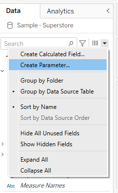
Now we start to create parameters.
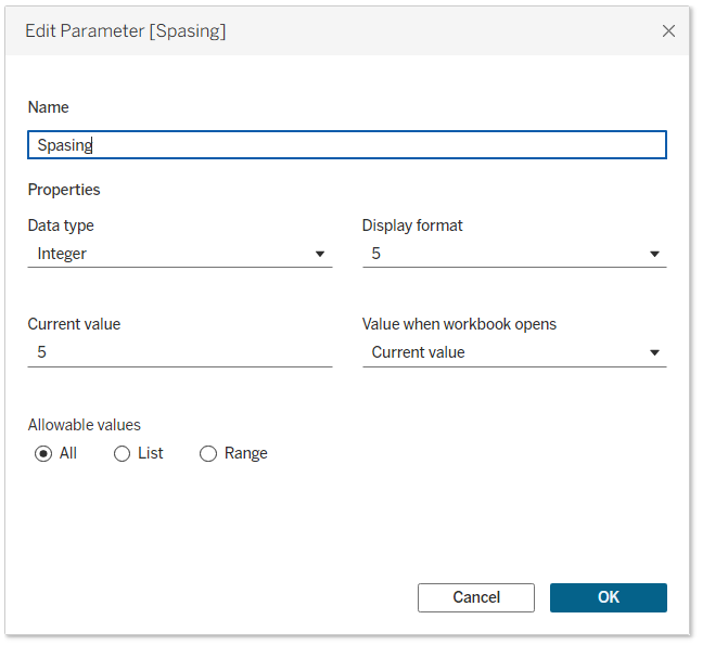
The first parameter will be called spacing and will be used to create space between different bars on the spiral. Data type I will choose integer, and for the current value you can use any value. In my case it will be 5.
The next parameter will be size, and again the data type will be integer, and I want to start the value from 100.

After creating parameters, we start to create calculations.
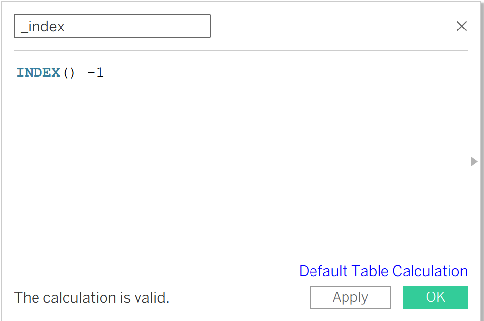
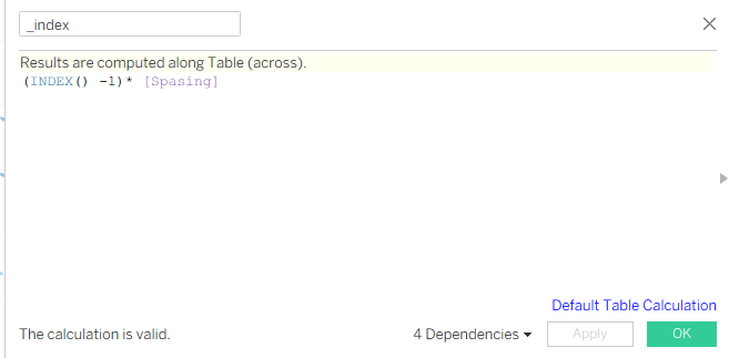
The first one will be _index. Below you can see the screenshot. In this case, we write INDEX() - 1, because we don’t want to start from 1, we want to start from 0.
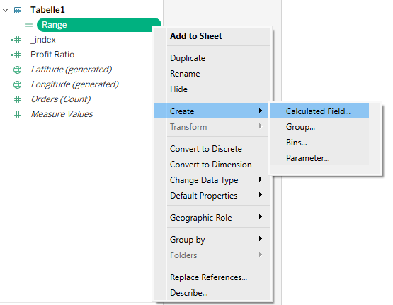
The second calculation will be for _range. You can click to create a new calculation, or you can click on the field Range in the data pane, right-click, and choose Calculated Field.
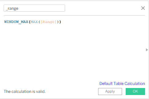
Below you can see the calculation we wrote. It is to be able to take the maximum value from 0 and 1.
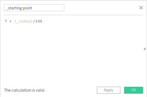
After that, we create a new calculation which will be the _starting point. We create this calculation because we don’t want to start our chart from 0,0 on the X and Y coordinates. We want to start from 7, but you can start with any number you want. It means that for every point we are adding a fraction as we increase every point in the spiral path.
Now we create two calculations for the X and Y axes.
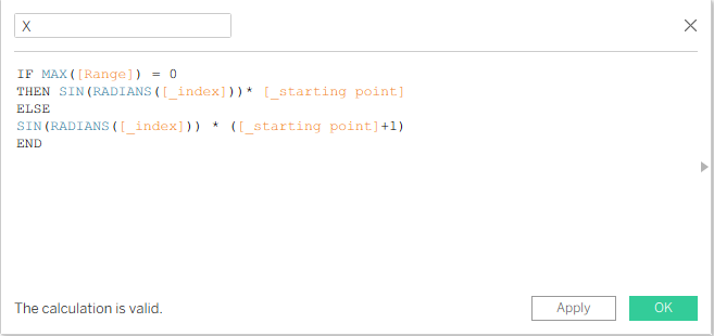
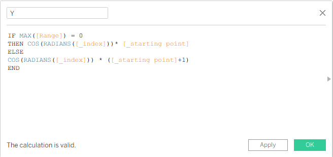
We do this to change the plotting values so that they are plotted in a spiral way. After creating the X calculation, we can duplicate it and change the name to Y, and instead of SIN we write COS.
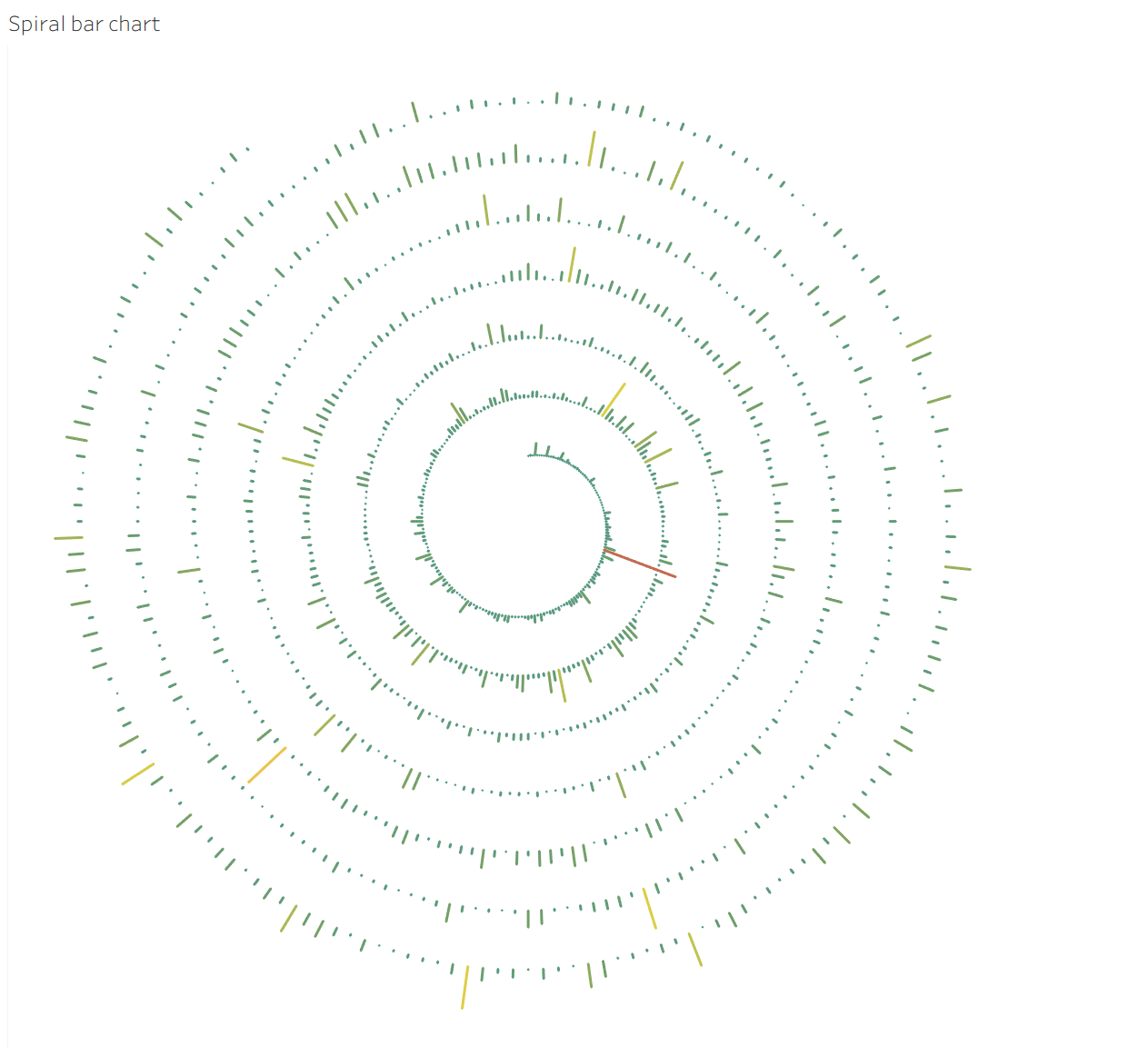
Now we can start to build our spiral chart, and at the end I can show where I use it as well.
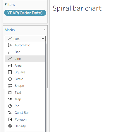
We drag Order Date to Filters and select all years you want to see on your dashboard. In my case, I will choose all of them. After that, we change the Marks card from Automatic to Line.
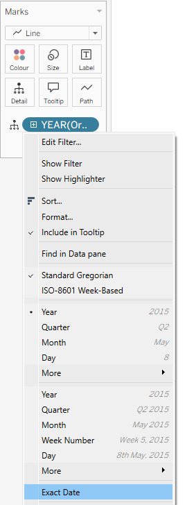
After that, we drag Order Date to Detail on the Marks card and choose Exact Date.
Then we drag Range value to Path on the Marks card.
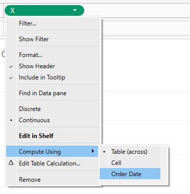
After that, we drag the X calculation to Columns and the Y calculation to Rows, and change Compute Using to Order Date for both axes.
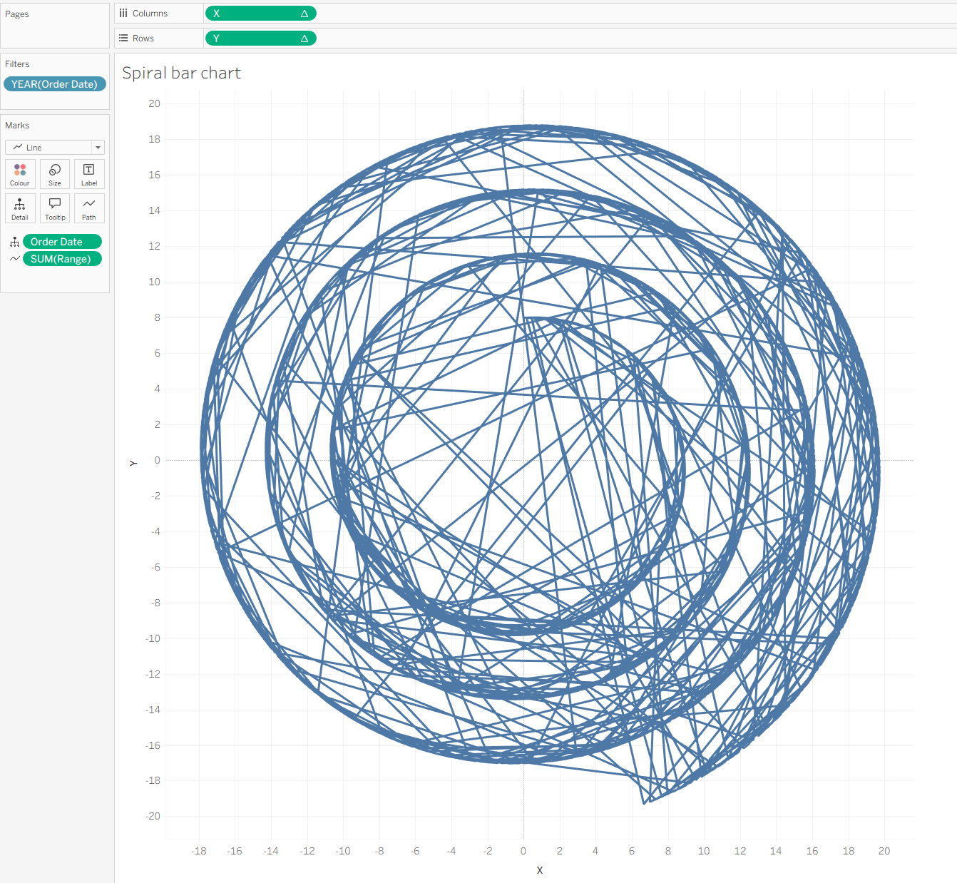
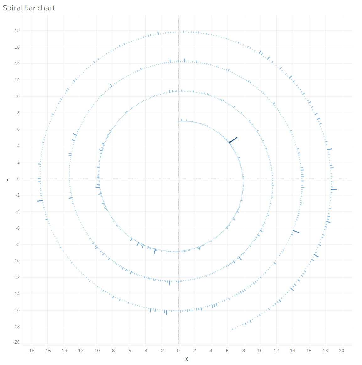
If you did all the steps, then you can see something like this:
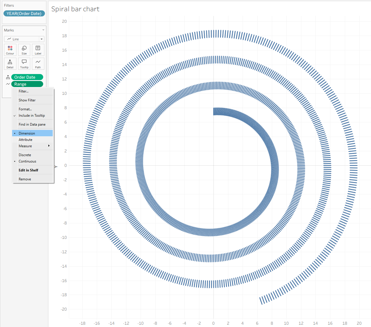
What we need to do as the next step is to click on Range, change it to Dimension, and you will have the result like in the screenshot.
For the beginning option, we need to do calculations.
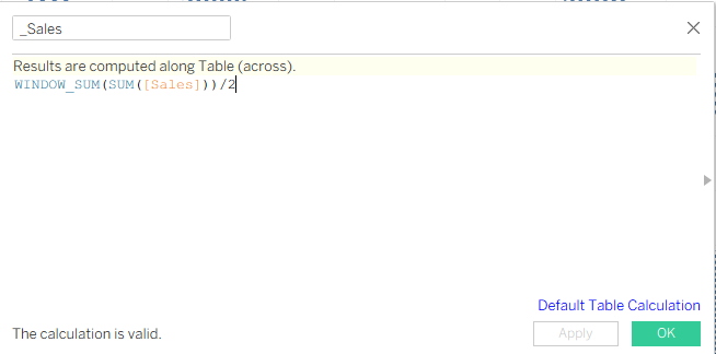
The first one is for _Sales, and it looks like in the screenshot below. We divide this by 2, because while doing the data densification we had two rows for each order, which are 0 and 1.
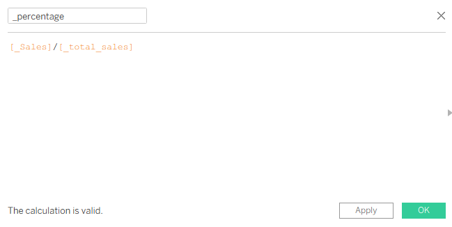
After creating the _Sales calculation, we can duplicate it, and it will be for _Total Sales. It is the same calculation, nothing changes. Next calculation will be _percentage.
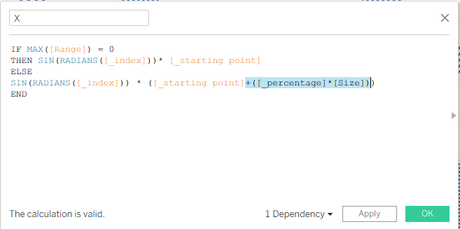
Now we can update our X and Y calculations. Instead of changing the value with +1, we will write this calculation.
And we do the same for the Y calculation.
After that, you can see something like this:
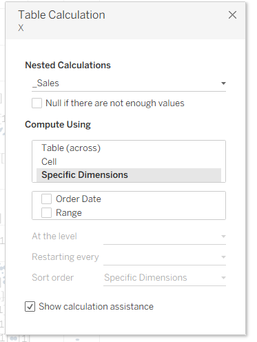
Earlier we set our X and Y axes to Compute Using – Order Date. Now we need to go to the X axis, click on Quick Table Calculation, select _Sales, and uncheck Order Date.
The next step will be to put _Sales on Color and change Compute Using to Range. You can see something like this:
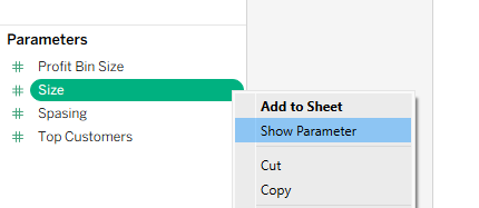
Now, as the last step, you can show your Size and Spacing parameters.
And last but not least, to use the Spacing parameter, we need to change the _Index calculation.
Now you can play with your size and color however you want 🙂
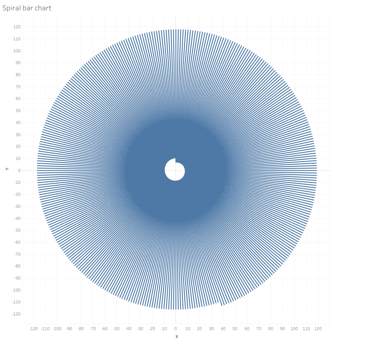
You can see my result, and after my result I want to show how I use it for my project Spotify.

Have fun with building 🙂