


Not so long ago, my colleague Janina invited me to share the journey behind my latest Viz, from initial idea to completion, in her Design Workshop. It was really interesting for me to reflect on how I created it and the steps I went through along the way.
So, I’d be happy to share my process here as well!
The Dashboard
First of all, I would like to show you my dashboard.
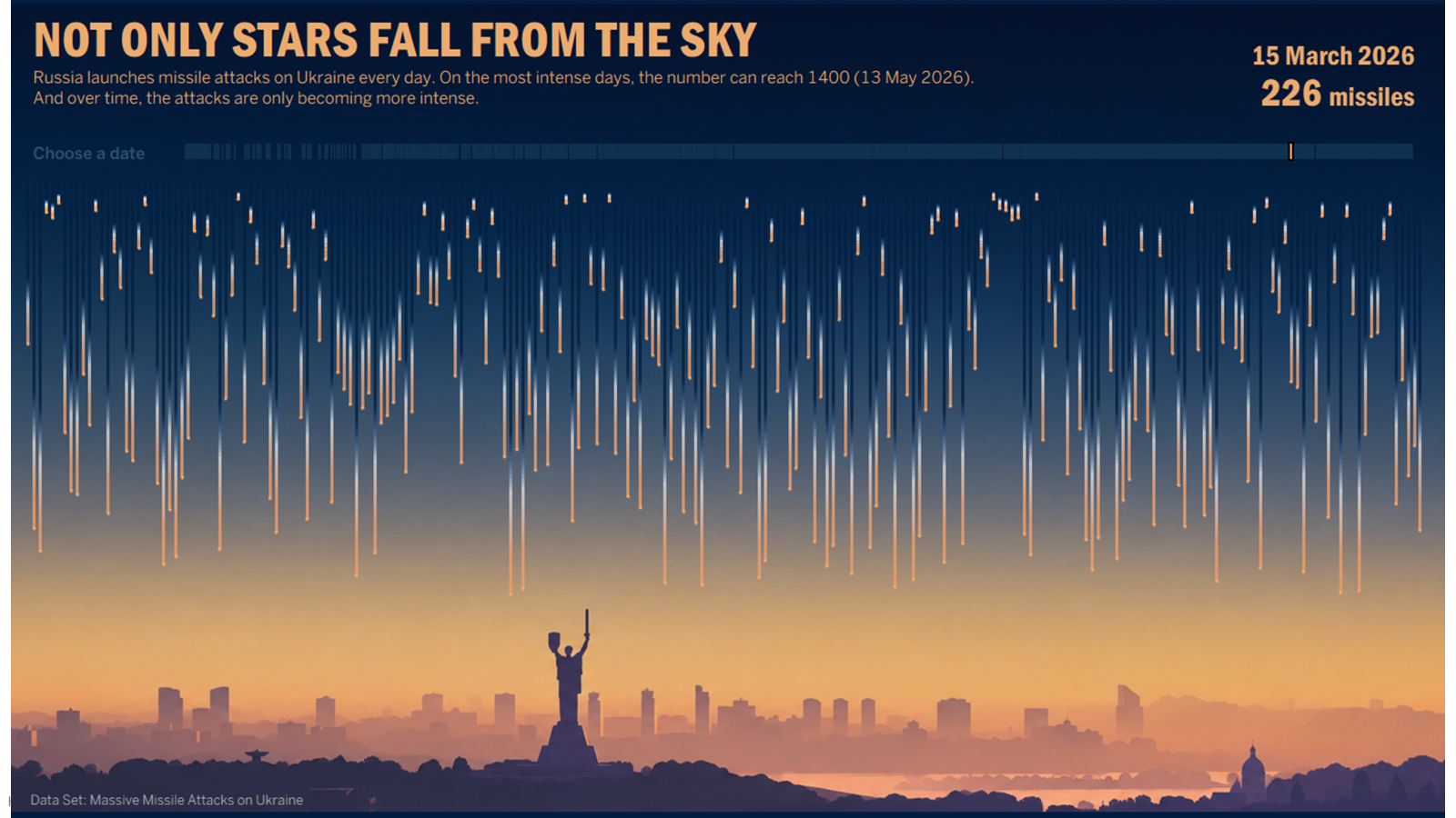
https://public.tableau.com/app/profile/mariia.pushakrova/viz/NotOnlyStarsFallFromTheSky/Dashboard
After I published it, I received a lot of feedback such as:
- "Your visualization really lurches you from 'wow, that's cool' to 'wow, that's truly, truly awful' very quickly."
- "It makes your heart skip a beat when you read it and realize what you are actually looking at."
- "Literally my reaction to seeing it the first time was, 'Oh! Shooting sta— oh, no...'"
Maybe you experienced similar feelings after first looking at this visualization.
That is how this storytelling works. You first see something beautiful, and only after that do you understand what lies behind the visualization.
But in the beginning, I didn't plan it that way at all.
Idea & Reference
The idea to create a dashboard about Ukraine has been with me ever since I opened Tableau for the first time. When we saw the 'Iraq's Bloody Toll' dashboard during our training phase a year ago, I realized crystal clear that I could adapt the concept for Ukrainian data.
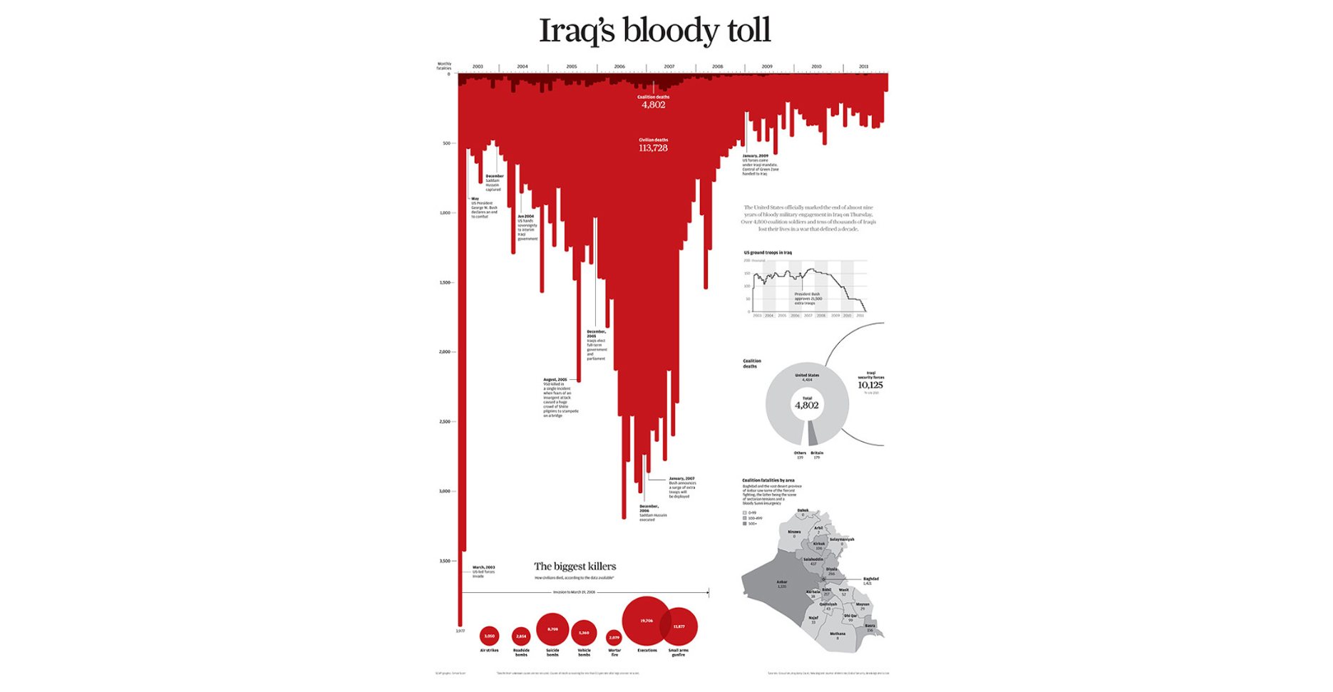
During the training phase, I couldn't create it because I didn't have enough time. More importantly, I couldn't find a complete dataset and realized that gathering all the data for every single day over the last four years, probably manually from different sources, would take too long. So, I put the idea on hold.
Data & Research
In July, I came back to this idea.
And surprisingly, I found a ready-made dataset on Kaggle. I was so glad I didn't end up having to collect it all myself!
I also searched a bit on Tableau Public because I actually thought recreating this dashboard idea wouldn't be unique, and I assumed someone else must have done it before. Surprisingly, no one had.
What's more, I discovered that there are almost no high-quality visualizations about Ukraine.

Here are a couple of links:
- UKRAЇNE by Vlad Horbachenko
- Air Alerts in Ukraine by Vlad Horbachenko
- 3 years of Full-Scale War in Ukraine: Air-raid sirens in Kyiv (2022-2025) by Iaroslava Mizai
- The Crimean Peninsula of Ukraine by Iaroslava Mizai
- Settlements of Ukraine: Territories in The War and Occupation by Iaroslava Mizai
Chart Exploration
So, feeling more confident with my idea, I set out to create this dashboard.
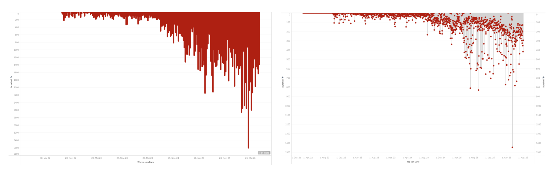
While I was building this bloody chart (number of missles per day), I accidentally ended up with this lollipop chart. And I love how it looks. I had no idea what to do with this chart, so I left it in my workbook and moved forward.
First Prototype
After a week, my social media feed was full of posts about the Perseid meteor shower. That's when I got a great idea: to create a simple viz in two hours max. I planned to take this lollipop chart, put it on a dark blue background with a simple title.
So, two hours later, I ended up with this chart.

I got this visualization, but I didn't like it. It doesn't work at all the way I wanted it to.
First of all, I realized that I wanted to use a more peaceful background—maybe a city skyline.
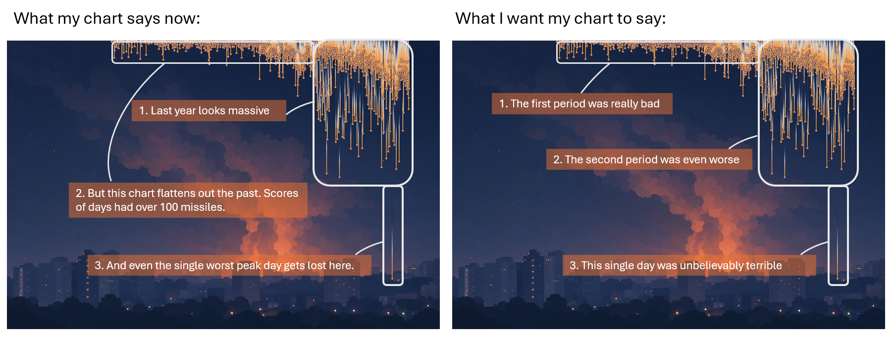
Second, which is even more critical, the lollipop chart doesn't present the information the way I want it to.
- Last part of chart makes it look like last year had a massive number of missiles every single day.
- However, it completely levels out the earlier years. Compared to the last year, those numbers look smaller, but there were actually many days with over 100 missiles—which is still a huge number.
- On top of that, the peak day doesn't stand out at all.
Instead, I wanted it to show something like this: I wanted to make it clear that the first years was really bad, the last year was even worse, and the peak day was unbelievably terrible.
The Final Storytelling
Only then did I realize: I don't want to aggregate the number of missiles per day; I want to show every single missile.
Then I played around a bit with AI and the background.
It was also a bit difficult to process the data because I used scaffolding twice. I expanded the dataset from 4,000 rows to 13 million. Maybe there's a better way, but I haven’t find it yet.
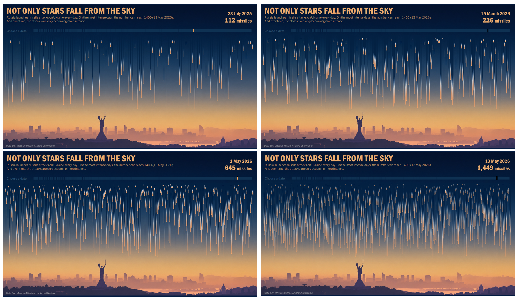
In the end, this chart conveys the exact story I wanted to tell.
When there are 100 missiles, it already looks massive. At 200 missiles, it looks even worse. At 600 missiles, it looks devastating. And reaching 1,500 captures the terrifying reality of the single most severe day of attacks on record.
Personal Reflection
We often see only the final visualization and rarely get a chance to look behind the scenes to see the process of creating it. But I feel that the process itself is often the most interesting part.
That is why I find it especially meaningful to reflect on this work: to look back at the path that led me here and realize just how nonlinear it was. One idea evolved into another, then into the next, and eventually ended up as something completely different. But perhaps that is simply how it works.
This was my first visualization about Ukraine, but it definitely won’t be my last. At the very least, I would like to finish recreating the dashboard where this whole journey began.
I sincerely wish I had never had these data or a reason to create a visualization like this.