


Ever needed to compare two states or points in time across multiple categories? While bar charts might be your go-to solution, dumbbell charts (also known as DNA charts or barbell charts) often provide a cleaner and more elegant alternative.
Dumbbell charts are particularly effective when you want to highlight the difference between two related measures. Think of them as a refined version of a grouped bar chart: instead of comparing bars side by side, you connect two points with a line, creating a clear visual of the gap between them. This approach reduces visual clutter while emphasizing the magnitude and direction of changes or differences.
To demonstrate how to create these charts in Tableau, we'll work with data from Statista (via MakeoverMonday) that compares gift preferences between US and UK consumers. For each gift category - from clothing to electronics - we'll visualize how preferences differ between these two countries, making it a perfect use case for a dumbbell chart.
The Data: A Tale of Two Christmas Lists
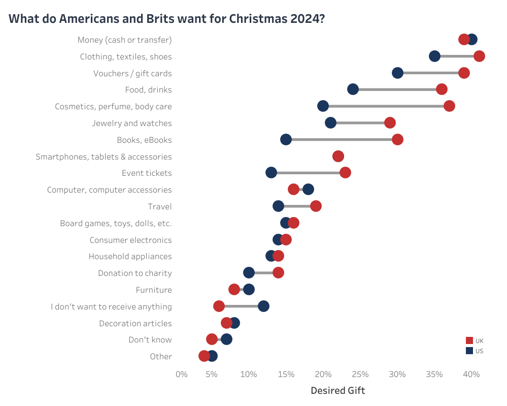
Let us take a look at the original visualizations:
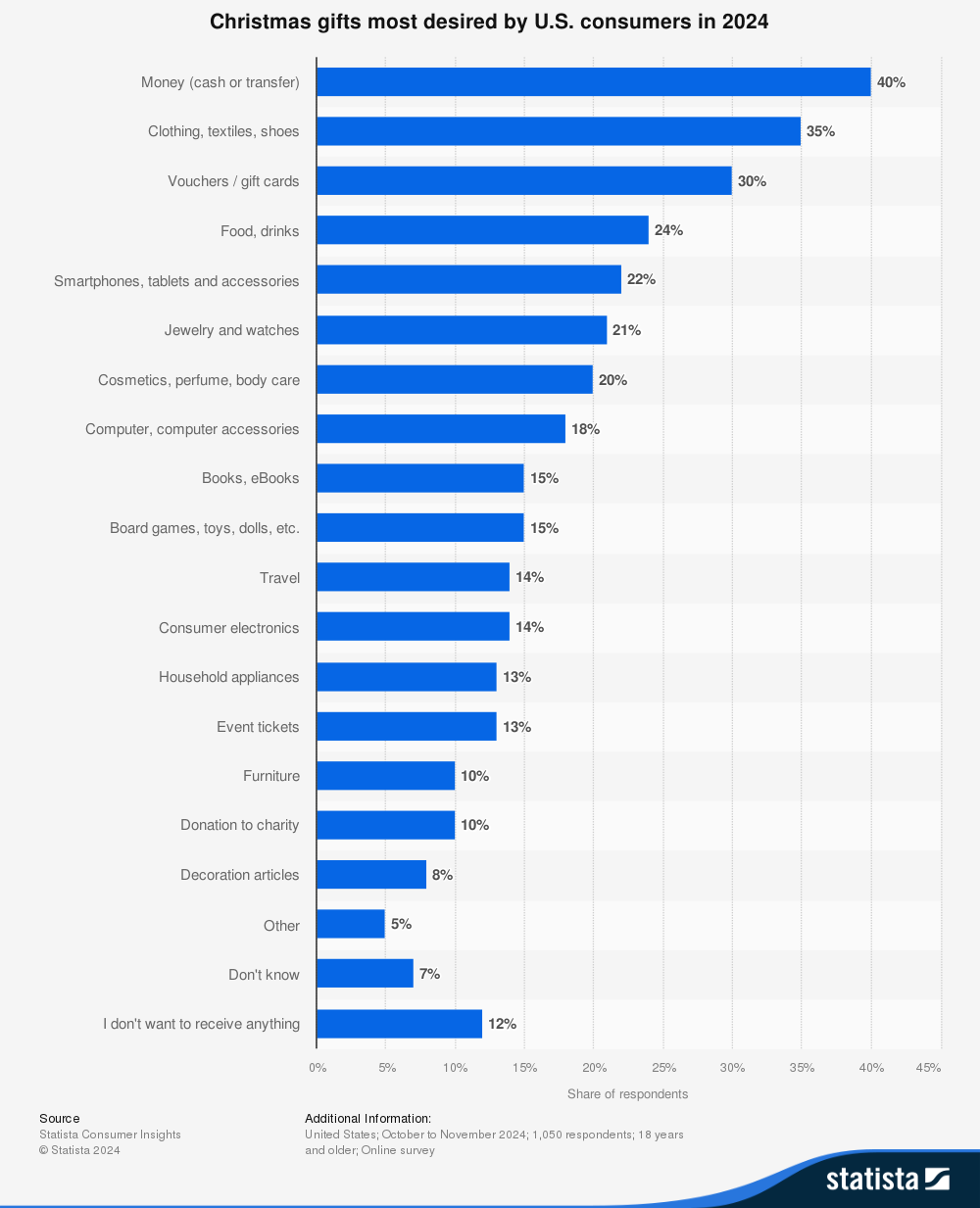
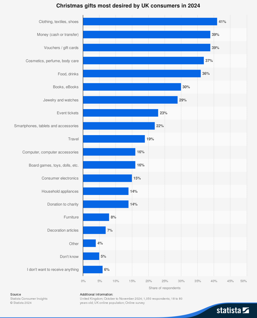
Original visualization showing most desired Christmas gifts in the US and UK. Source: Statista, 2024
As you can see, it shows gift preferences as two separate bar charts - one for the US and one for the UK. While these bar charts show the data, comparing preferences between countries requires a lot of back-and-forth eye movement. Our dumbbell chart will make these differences more immediately apparent while maintaining a clean, uncluttered look.
Looking at our data, we can see the percentages for US and UK preferences arranged side by side:
While this structure might look neat in a spreadsheet, it's not ideal for data analysis in general. Currently, our measure (gift preference) is split across two columns - one for each country. In data terms, we'd say our data is in a "wide" format. However, for most analytical work - not just our dumbbell chart - we want our data in a "long" format where each row represents a single measurement. This makes our data more flexible and easier to work with across different types of analyses and visualizations.
Let's walk through how to prepare this data and create our dumbbell chart in Tableau. We'll start with a simple pivot to reshape our data, and then move on to building the visualization step by step.
Preparing Our Data in Tableau
First, we need to reshape our data from wide to long format. This is easily done using Tableau's pivot feature:
- After connecting to your data source, find your columns
US Share (%)andUK Share (%) - Select both columns by clicking one, then Ctrl+clicking (⌘+click on Mac) the other
- Right-click and select "Pivot" from the menu
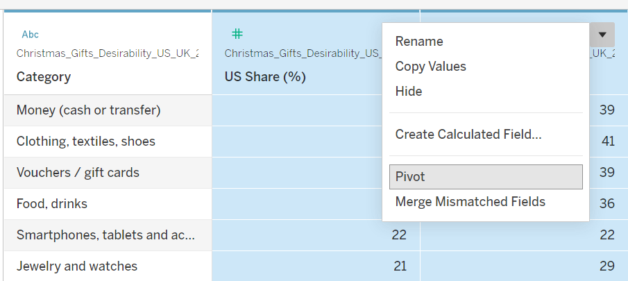
This will restructure the data and replace US Share (%) and UK Share (%) with two new columns:
Pivot Field Names- contains our original column namesPivot Field Values- contains the percentage values
Let's clean this up a bit:
- Rename
Pivot Field Valuesto "Gift Preference (%)" for clarity - Create a calculated field called "Country" with this simple formula:
REPLACE([Pivot Field Names], " Share (%)", "")This extracts just "US" or "UK" from the original field names.
After these steps, your data should look like this:
Now our data is properly structured for creating our dumbbell chart!
Creating the Dumbbell Chart
Now that our data is prepared, let's build our visualization. We'll create this step-by-step:
Basic Structure
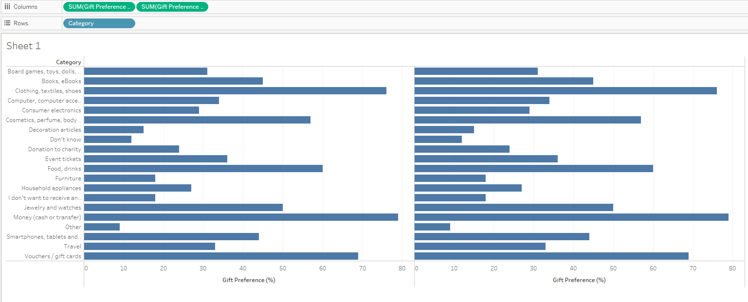
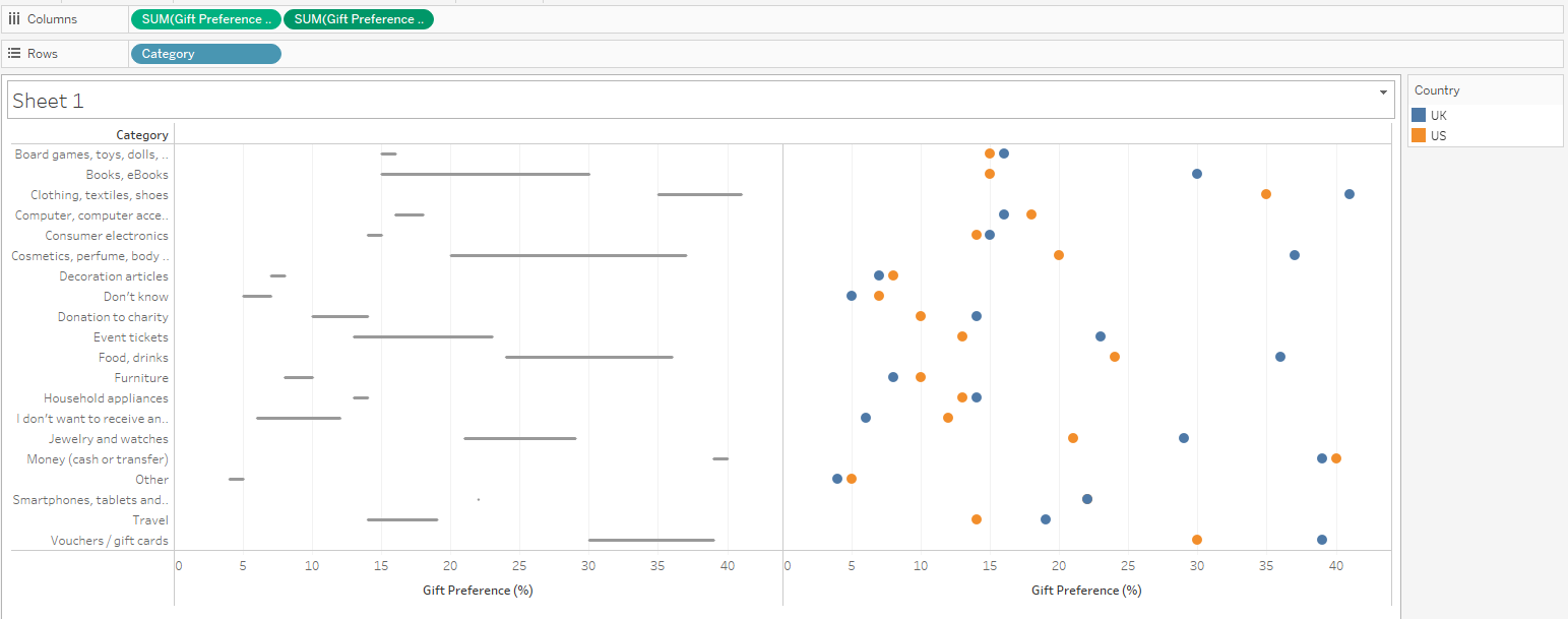
- From the Data pane, drag "Category" to Rows
- Drag "Gift Preference (%)" to Columns
- Create a second "Gift Preference (%)" pill by holding Ctrl (⌘ on Mac) while dragging the existing pill to its right in the Columns shelf
Adding the Lines and Points
- Select the first SUM(Gift Preference (%)) Marks card and:
- Change the Mark type to "Line"
- Drag "Country" to the Path card. (This tells Tableau to draw a line connecting the values for each category between US and UK points.)
- Select the second SUM(Gift Preference (%)) Marks card:
- Change the Mark type to "Circle"
- Drag "Country" to the Color card
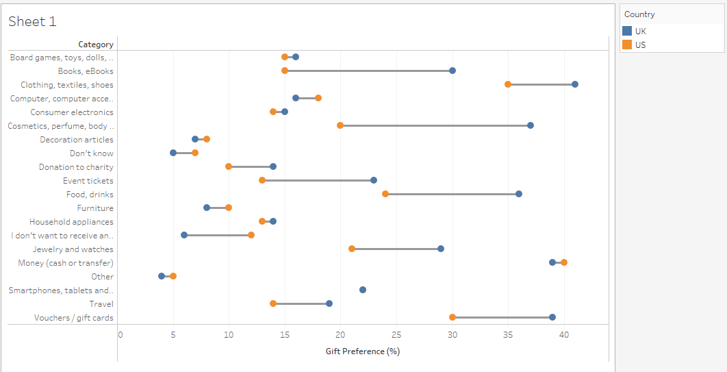
Creating the Dumbbell Effect
- Right-click the right axis and select "Dual Axis" - this will overlay the circles on top of the lines
- Right-click either axis and select "Synchronize Axis" to ensure both layers use the same scale
- Hide the right axis header by right-clicking it and unchecking "Show Header"
The visualization should now start looking like a proper dumbbell chart, with circles at each end connected by lines.
Fine-tuning
- Let's make our visualization more polished:
- Increase the circle size in the last Marks card
- Adjust colors if necessary - I used navy and red, which provides both good contrast and a hint of Christmas
- Format axis and labels as you see fit
Wrapping Up
And there you have it - a clean, effective dumbbell chart comparing gift preferences between US and UK consumers. While we used Christmas gift preferences as our example, this type of visualization works well whenever you want to compare two values across multiple categories, making differences immediately apparent without overwhelming your audience.