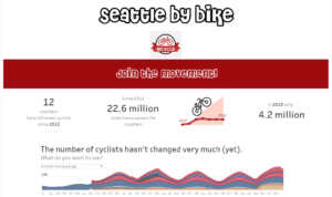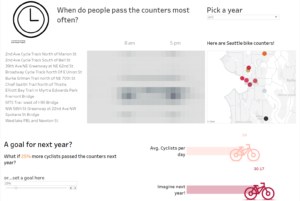
Dashboard Week, Day 4.
I loved this one!
Here’s Andy’s blog post.
Bikes, bikes, so many bikes
Let me start by saying this: as soon as I arrived in London, the first thing I bought was a bike.
I hadn’t even gone shopping at a supermarket yet and I already had a bike.
So when Andy shared the dataset today, I was very excited!
What was today’s dataset about? Bike…counters!
Andy picked a US dataset again, which is good for me since I am much more informed about US initiatives than what is available here in the UK.
We have been exploring a lot of Open Data platforms lately.
Today, it was the turn of the City of Seattle Open Data Portal.
Here’s the main data on bike counters by the Seattle Department of Transportation (SDOT).
“SDOT has 12 bike counters (four of which also count pedestrians) located on neighborhood greenways, multi-use trails, at the Fremont Bridge and on SW Spokane Street. The counters are helping us create a ridership baseline in 2014 that can be used to assess future years and make sure our investments are helping us to reach our goal of quadrupling ridership by 2030. Read our Bicycle Master Plan to learn more about what Seattle is doing to create a citywide bicycle network.”
Bike counters spreading everywhere
I have been following many initiatives aiming to spread the bike culture and create a big network of bike lovers. In Bologna, for example, bikes have always been around, but this movement has literally exploded in the past few years. And of course, we have our bike counters, too.
My idea
In the morning, I sketched a few ideas on paper. I had something very clear in mind. It was similar to what I had done in my web scraping project.
I wanted to allow the viewer to pick a location in the city and see all the bike sharing racks and bike counters within X miles.
I had quite a few issues loading the file on Alteryx and importing it in Tableau by 5 pm. However, I am going to add this feature in the next few days.
My idea was to create a promotional page to encourage bike use in the city and invite new people to join the movement.
Challenges
Let’s just say that I came across a few challenges along the way.
First, using Tableau Prep, then appending fields in Alteryx to show both the bike sharing racks and the bike counters in the map, and then making the right choices in terms of visualization, LODs, and calculations. I am still trying to figure out the most appropriate way to visualize some of the data.
For now…
Here’s my dashboard


Final thoughts
There are plenty of LODs and calculations that could be used to conduct a more sophisticated analysis. I might add something else soon.
I also thought about what I have quoted at the top. The purpose of the counters is to make sure the investments are helping the Department to reach its goal of quadrupling ridership by 2030. This is a question I wanted to explore. However, the data couldn’t provide us with the information to address it.
Stay tuned for the last day of Dashboard Week.
*****
