For the 1st day of Dashboard Week, we are using a dataset with the average price per product type, the monthly and annual increases, and chained indices.
I started out with the prep before any of the dashboard planning. I wouldn't usually do that, but the dataset only needed some quick reshaping necessary for data exploration and I didn't end up using extra datasets, so that was quickly out of the way.
I spent some time researching the metrics and how they're used, in particular the chained indices (or CPIH). I didn't end up using it, but it is documented in the above link.
The finished dashboard changes a few things:
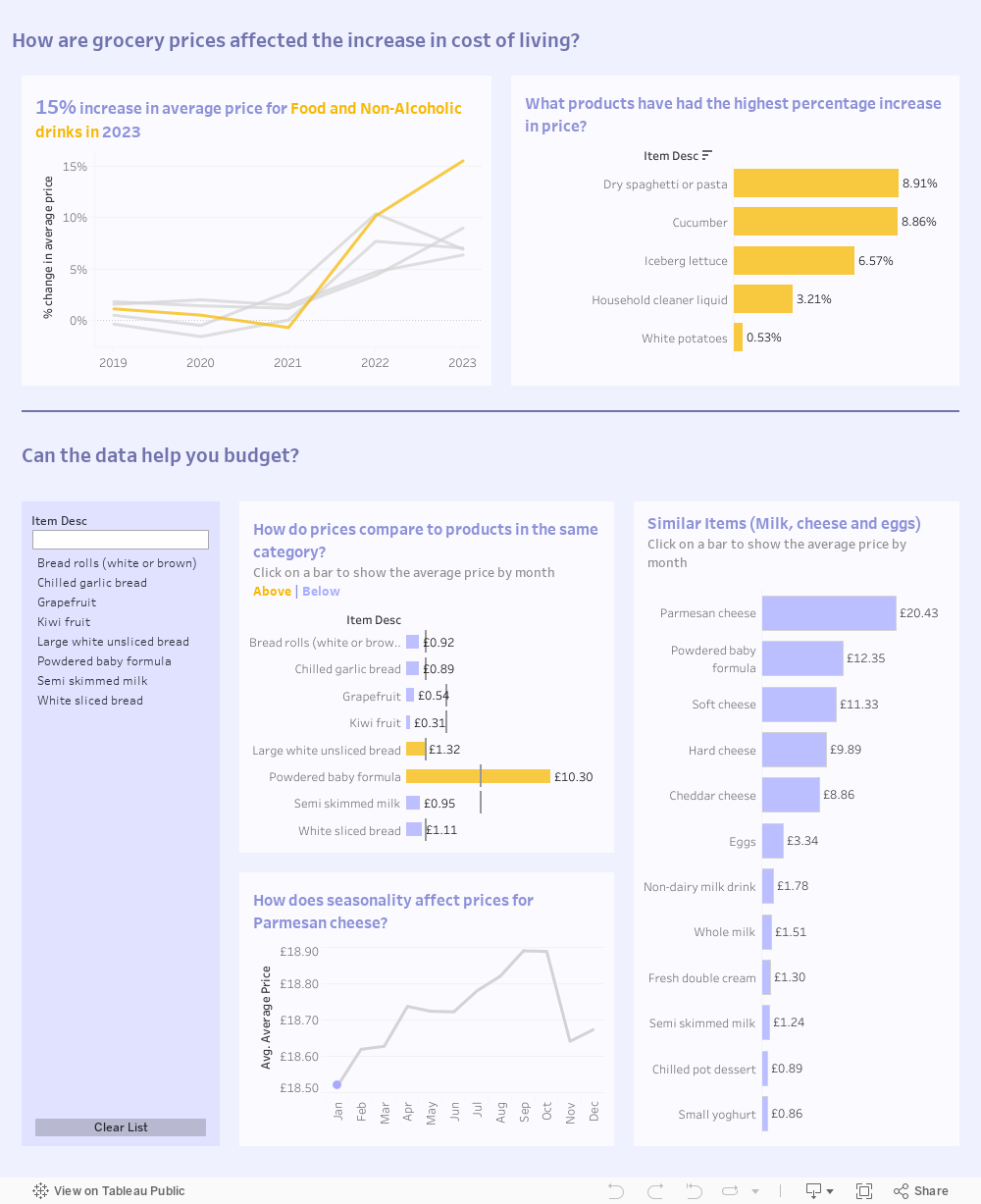
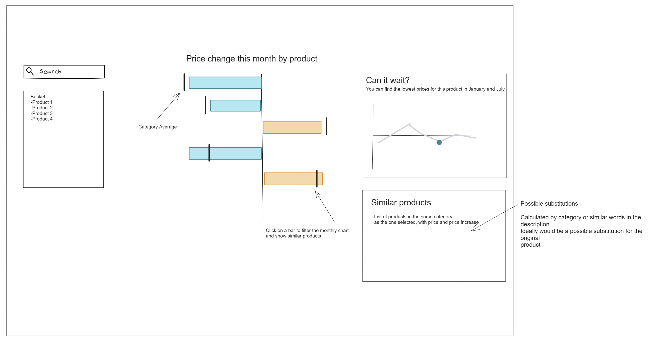
-The actual price is more important to the consumer than the changes alone, so the bar chart was modified to show that. The colours are based on whether or not the average price of the item is above or below that of the category it belongs to. This was done so that it would be easy to find substitutes (e.g. this month broccoli is in season and much cheaper, however aubergines are not, so if you're planning on making a vegetable dish you'll be able to quickly spot which veggies are more expensive than others).
-The list of similar products becomes a bar chart, so that it's easier to compare items.
-I also added some context to the dashboard, in the form of a line chart showing how food was the category with the highest price increase, and therefore highlighting the importance of having an effective budgeting tool.