Day 2 of dashboard week saw DS40 creating infographics about the Marvel comic books (and me passing my Tableau Data Analyst exam 🎉).
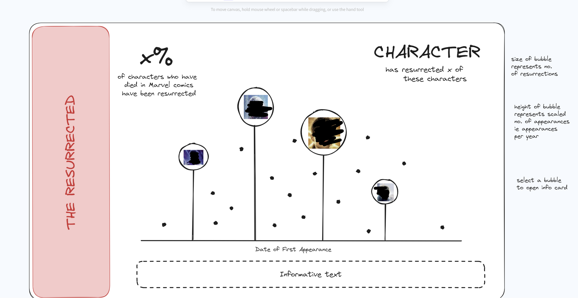
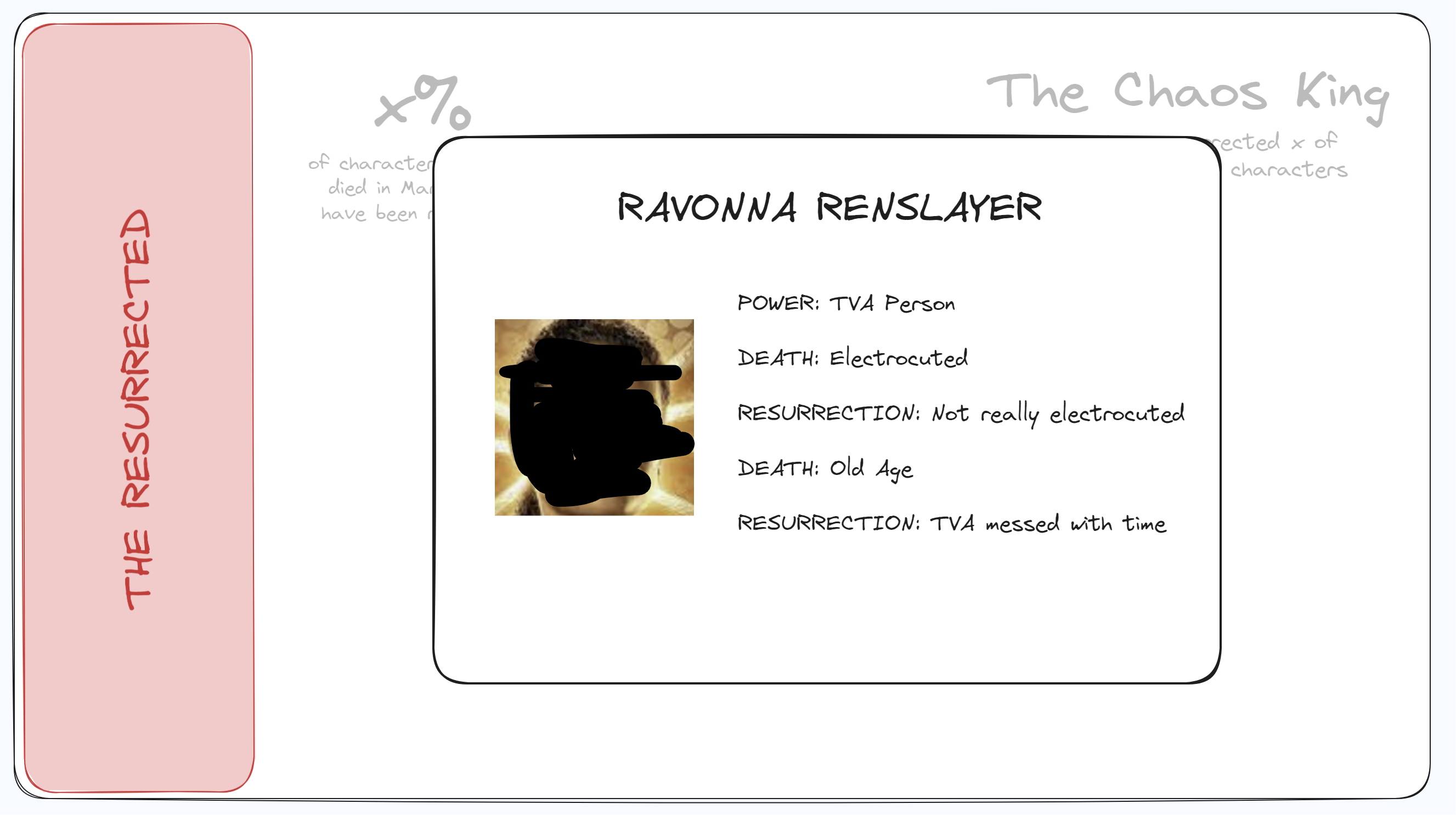
I've never been much of a designer before, and I've definitely never made an infographic before. I took to Pinterest to do some research and decided to keep my infographic as clean as possible. Here's my sketches:


And you can find the finished product here: https://public.tableau.com/app/profile/lydia.wren/viz/TheResurrecters/theresurrecters
There's two techniques I used which might interest some people:
1. Lollipop chart / Timeline
I wanted to be able to connect some of my points to the year axis and, unfortunately, there's no obvious way to do this. I did this by:
- add date to column shelf
- create a zero field (create a column with zeroes for every row you want the line for)
- add measure values to the rows shelf
- make sure the only measure values you have are the zero field and the measure of interest (for me this was appearances, but could be sales, profit etc.)
- change the mark type to line
- add the measure name pill to the path card
Then add the same measure of interest onto the rows shelf, create a dual axis and synchronise these, and change the mark type to circle.
2. Dynamic Zone Visibility
Dynamic zone visibility allows us to show different views depending on the value of a boolean field.
- add all of the sheets to a dashboard
- create a parameter that takes the same number of values as views you want to swap between - I use 1, 2, 3, 4, etc., out of ease (viewers won't see this!)
- create parameter actions which will update the above parameter (TIP you can add the parameter to the dashboard in the Analysis tab to check your actions are working)
- make fields for each of these values and add them to the detail card on sheets you want to use as your controls
- create as many boolean fields as you have views and values of your parameter - this should be [Parameter Name]=1, [Parameter Name]=2, [Parameter Name]=3, etc., I would suggest giving these names which mean you know which sheet its related to
- in your dashboard, select a sheet to be viewed dynamically
- go to the layout tab in the left hand pane and select 'Control visibility using value'
- a dropdown will appear which will have your boolean fields in as options
Good luck matching the right field to the right sheet! I still can't do that bit smoothly...
3. URL Objects
Did you know you can embed a website in your Tableau workbook? How about the fact you can use the value of a field in a URL? Well I didn't until about a month ago, and this dashboard is the first time I've used this in a dashboard.

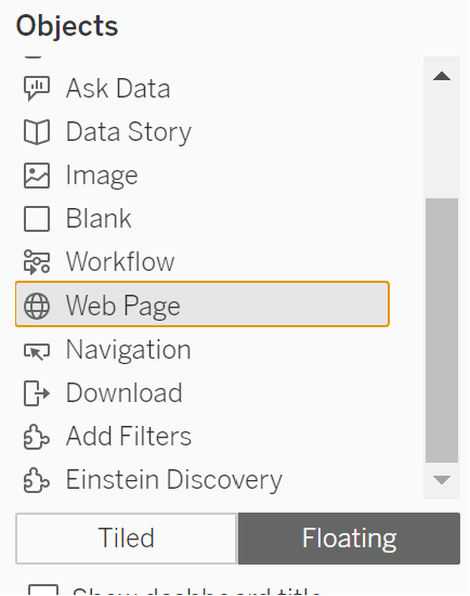
You can embed a specific website by adding a Web Page object to a dashboard and entering a URL. The URL must start with https:// to be seen on Tableau Public / Server / Cloud. Most websites don't want people to embed their websites so don't be surprised if a URL that works in Desktop doesn't work when you publish your dashboard.
Now we can make this dynamic, based on a value in the view. In the context menu of the Web Page object, select Add URL Action and a window will pop up. Select your source sheet and enter the URL. The insert button to the right of the text box contains values which can be used from the selected source sheet(s) which can be used in the URL. I suggest giving this a go with wikipedia.
