


Humankind has been collecting and analyzing data about the world for as long as we have existed. And although modern computing and business intelligence software such as Tableau are very recent developments, we have been honing our data analysis skills for much longer than most realize. In this and 3 subsequent blog posts, I will explore the history of data visualization in its varied forms, highlighting the gradual development of new technologies and methods.
Pinpointing the earliest instance of data visualization depends both on your definition of data visualization and interpretation of historical artifacts. For our purposes, we’ll keep it fairly broad and use Andy Kirk’s definition: “data visualization is the representation and presentation of data to facilitate understanding.”
Many historians theorize that Paleolithic cave paintings, such as those at Carricola and Altamira, illustrated hunting practices and the types of animals in the region, thus representing data points for other (perhaps younger) members of a group. At up to 40,000 years old, perhaps these are the first instances of data visualization, as hunter gatherers visually communicated both natural resources and human practices on the walls.
With the advent of writing, some humans began keeping detailed records, such as the ancient Sumerians who occupied modern-day Iraq. The clay tablet shown below is more than 4,000 years old, and has impressions written in cuneiform that document the distribution of grain to various individuals.

Similar tablets from the Sumerian civilization document tax rates on crops and other products, inventory of sheep and goats, or records of salaries paid to messengers and temple attendants. Though these tablets lack modern chart types or visuals, they can be thought of as early developments in data collection and analysis. Some cuneiform tablets are even broken up by horizontal or vertical lines, appearing like the rows and columns of a data table.
Other examples of cuneiform tablets: https://www.metmuseum.org/art/collection/search/329081 , https://www.spurlock.illinois.edu/collections/search-collection/details.php?a=1913.14.0543
Before the rise of charts and statistics, data visualization was most widely used in mapping, which could display the locations of cities, forts, resources, and other important markers. The Romans, for instance, created sophisticated maps of the road systems that spanned throughout their empire. Mapping became gradually more accurate with greater exploration and improved measurement techniques.
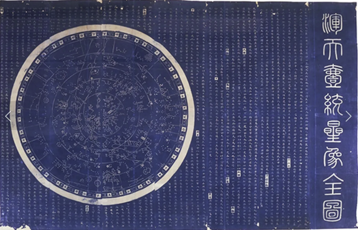
Early ways of visualizing data were also found in the field of astronomy, such as in the Suzhou star chart from China’s Song Dynasty pictured above. The chart was originally created in 1193 by Confucian scholar Huang Shang and etched into stone in 1247. The chart depicts 1,434 stars grouped into 280 asterisms (essentially patterns or constellations of stars), with accompanying text listing out the names of stars as a sort of legend.
Other early examples of visualizing quantitative information include quipu, collections of strings with coded knots that the Inca used to keep numeric records of taxes, census information, calendars, and military organization. Quipu flourished in Andean South America around the 12th-16th centuries AD, and similar stringed devices were used by other cultures such as ancient Chinese, Tibetan, and Japanese groups.

The people of the Marshall Islands also created maps of ocean currents using coconut fronds, which are called stick charts. The curved sticks represent ocean swells and the straight ones represent currents and waves that come near the islands.

In this post, I've highlighted some early examples of humans recording and analyzing the information around them, as well as the first ways data began to be visually displayed. In the next posts, I'll cover the rise of statistics and the development of modern charts and visuals, up to modern day analytics.
Sources:
https://www.yellowfinbi.com/blog/the-history-of-data-visualization
https://www.tableau.com/whitepapers/designing-great-visualizations
https://insightsoftware.com/blog/a-brief-history-of-data-visualization/
https://columns.wlu.edu/exquisite-in-its-simplicity/
https://www.skyatnightmagazine.com/space-science/chinese-astronomy
https://www.si.edu/newsdesk/snapshot/quipu
https://blogs.loc.gov/maps/2021/11/the-unique-seafaring-charts-of-the-marshall-islands/
Further Reading:
A History of Data Visualization and Graphic Communication by Michael Friendly and Howard Wainer