


As DS48 and I are approaching the end of our training, we've kicked off dashboard week with a session on Accessibility. This session focused on teaching us how to build our dashboards with accessibility in mind, and the vast range of accessibility needs there are to consider.
My Task: As accessible as possible
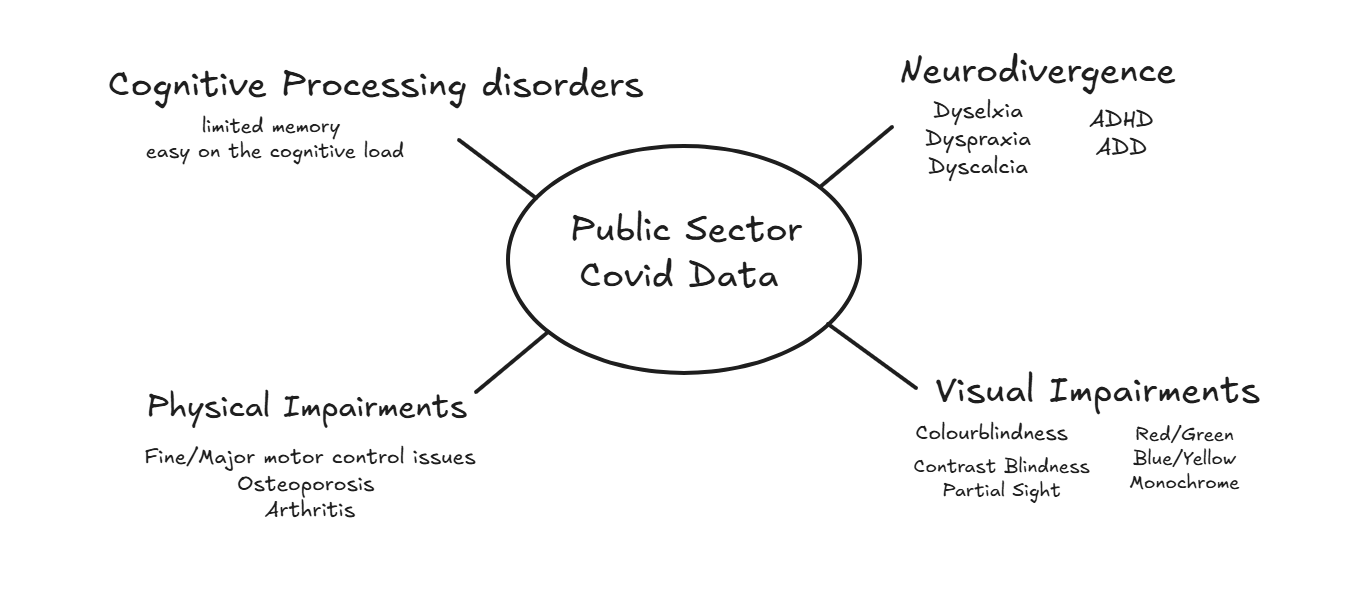
My task this week was quite broad and difficult to narrow down, considering how many impairments there are to account for. However I decided to 'narrow it' down as much as I could, and account for as many impairments as possible.
Accommodating Features
To accommodate for these impairments, I implemented the following features in my dashboard:
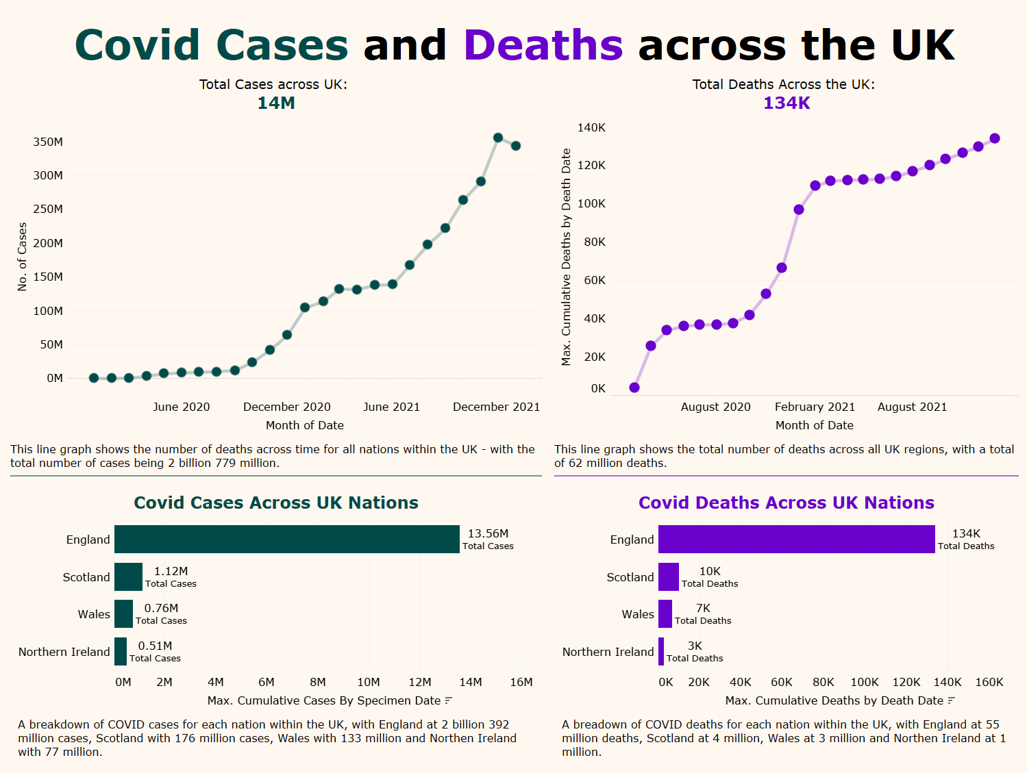
Colour Blind Friendly
- Used colours with distinct hues and tested with simulators
- Avoided red/green clashes
- #004b49 (deep teal)
- #6900cc (purple)
- #fff8f0 (beige background colour)
- Verified with WCAG contrast checkers
- WCAG Contrast Ratios: 8.06:1 and 9.98:1 — Pass (AA and AAA)
Passes Colour Contrast Test
- All text and UI elements pass WCAG AA and AAA standards
- High contrast ratios ensure readability for all users, including those with partial sight or contrast sensitivity
Accounts for Limb Differences
- Design works without requiring mouse clicks
- Fully keyboard navigable
- No reliance on hover effects or drag-and-drop
No Clicking Required
- Interactive elements designed to be accessible via keyboard/tabbing
- Clear focus indicators for assistive tech users
Dyslexia / Dyscalculia / Dyspraxia Friendly
- Minimalist layout with short, clear sentences and simplified numeric formats
- No unnecessary complexity or clutter
Few Sentences, Numbers Shortened
- Used plain English and avoided long paragraphs
- Reduced numerical overload and cognitive strain
No Distractions / Decorations
- Clean design with no animations, excessive styling, or background patterns
- Focus on clarity and function
Captions for Narration
- All visuals accompanied by clear, descriptive captions
- Context provided for screen readers or narrated content
Simple Layout for Navigation
- Intuitive structure with consistent layout
- Easy to navigate for users with cognitive, visual, or physical impairments.
The final dashboard
Future Steps
The future steps I'd have for this dashboard is to add narration to the dashboard, which reads the information in the correct order. I'd also like to get rid of the captions and add Alt. text for each chart & KPI to reduce cognitive load and minimise the amount of text.