If you’re a beginner at Tableau, it may be tempting to resort to hard-coding. After all, that’s easier than to create complicated calculations, right? I’m going to walk you through an example that demonstrates the downsides of this approach. That being said, let’s build a control chart!
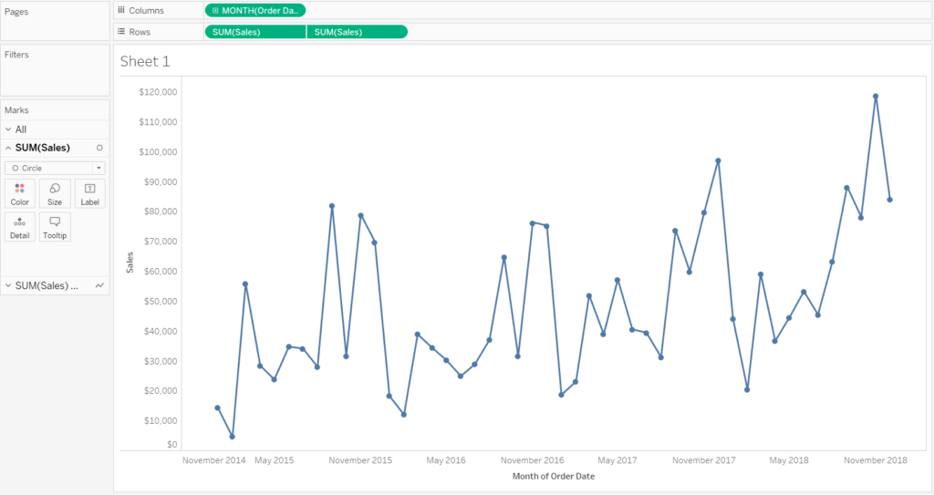
1) Open the Superstore dataset and create a view that shows sales over time. Create a dual axis for sales and change the mark type for one axis to circle.
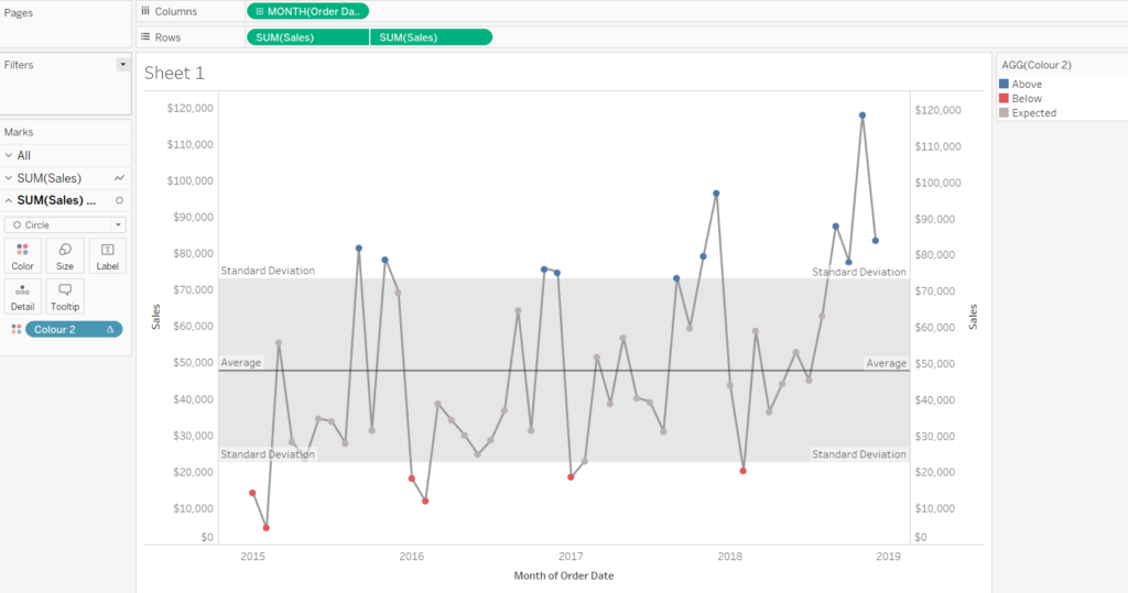
2) Add a distribution band with one standard deviation and add an average line. We want to colour all dots that are above one standard deviation blue. The ones below one standard deviation should be red and the ones within the standard deviation should be grey.
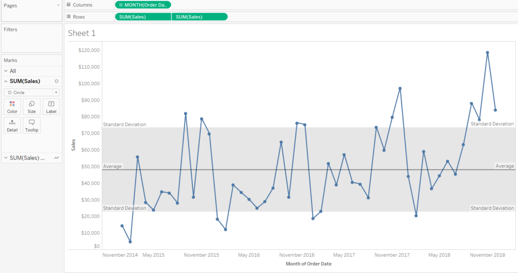
3) Hover over the distribution band to establish the values for one standard deviation above and below the average. In our case that’s $73,054 and $22,662. Create the following calculated field:
IF SUM([Sales])>73054 THEN ‘Above’
ELSEIF SUM([Sales])<22662 THEN ‘Below’
ELSE ‘Expected’
END
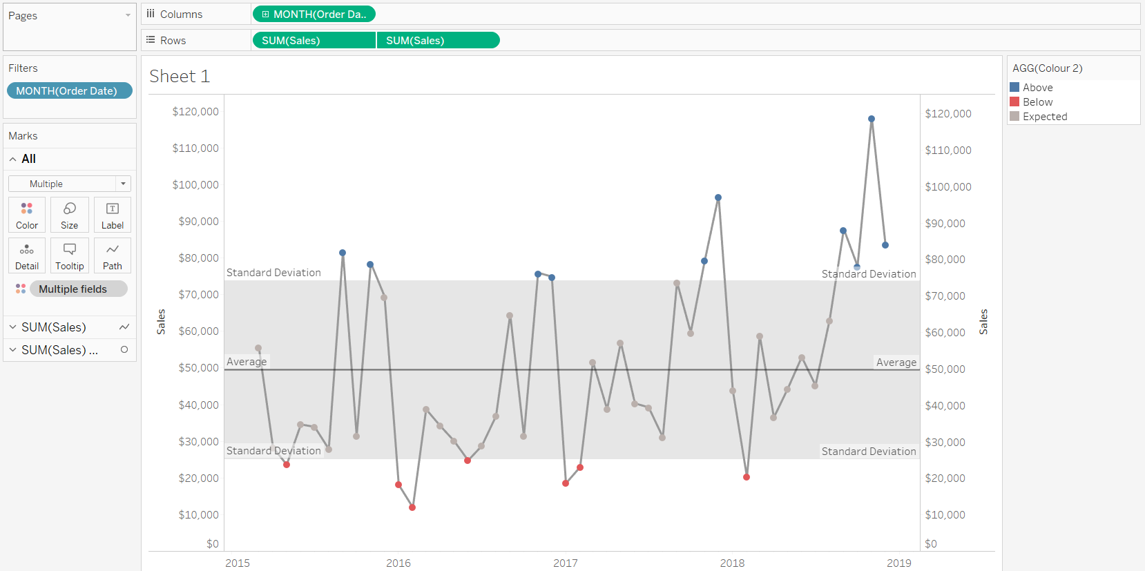
4) Drag your calculated field on colour. It works! Or does it? If you exclude the values for January and February 2015, some of your circles are no longer colour-coded correctly.
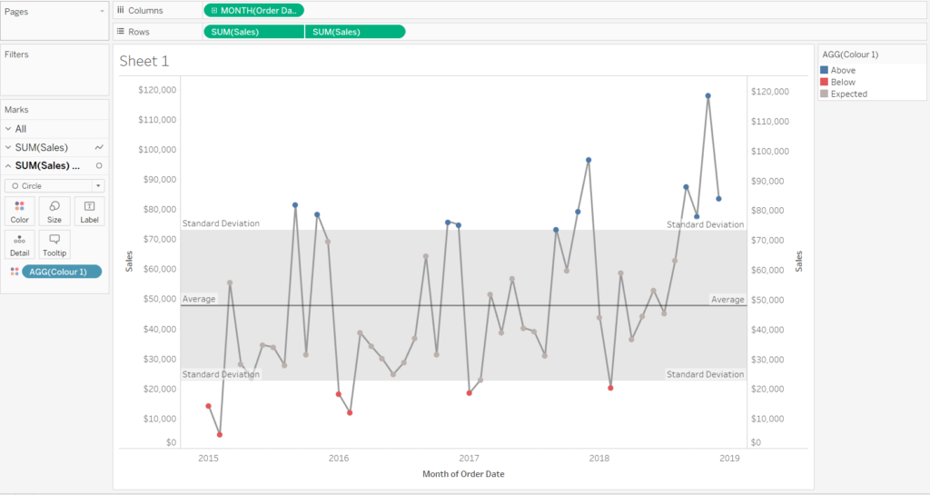
Looks good!
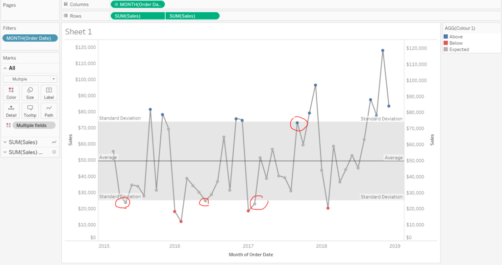
If you exclude values, your view breaks
5) That’s because your calculated field isn’t dynamic and doesn’t adjust if the standard deviation changes. Try the following calculation instead:
IF SUM([Sales])>(WINDOW_AVG(SUM(Sales))+WINDOW_STDEV(SUM([Sales]))) THEN ‘Above’
ELSEIF SUM([Sales])<(WINDOW_AVG(SUM(Sales))-WINDOW_STDEV(SUM([Sales]))) THEN ‘Below’
ELSE ‘Expected’
END
Exclude whichever value you want and your view will adjust!
Evn though the dynamic calculation may seem more intimidating, it’s best if you get used to this approach. Avoiding hard-coding will make your life easier in the long run!
