


For the fourth day of dashboard week, we were tasked with creating a KPI dashboard within PowerBI. We had to choose a dataset from the sample ones provided by PowerBI. I chose the customer profitability dataset.
Before getting started, I wrote out all the fields and how they interacted with each other, in order to determine the key questions I wanted to consider for my KPIs. I had a very rich dataset out of which I could likely have made several dashboards.
My initial areas of interest were:
Customer analysis:
- Which customers are most profitable?
- What state / city / region is generating the most profit / revenue?
- Which industry is most profitable / most revenue ?
- Are we hitting targets?
Products:
- Which products generate the most revenue / profit? Where do each product sell best?
- Which BU generate the most revenue?
- Which execs generate the most profit?
- Which execs are on target?
Time:
- How are sales trending?
- Are we up on the previous month / quarter / year?
Any one of these could’ve been a major focus, but I decided to try and give a general overview rather than drill down and focus in depth in one area.
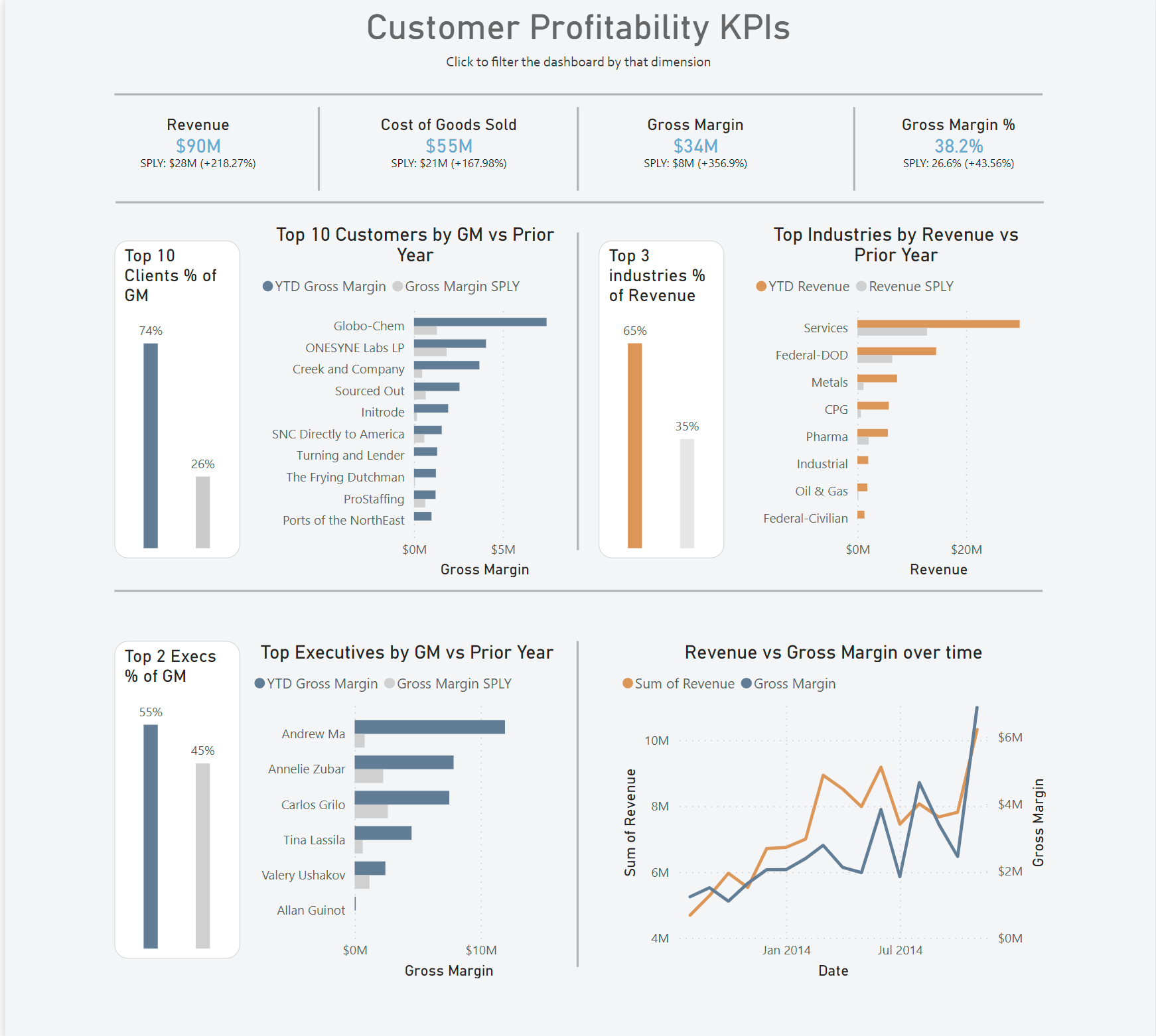
My main BANs across the top of my dashboard covered Revenue, the cost of goods sold, gross margin and gross margin %, all compared to the same period last year.
I then split off my dashboard to give a section to customer, industries and revenue, as well as a line chart showing revenue vs gross margin over time.
For the customer section of the dashboard, I looked at the top 10 by gross margin, and then had a bar showing the % of total gross margin those customers were responsible for. I did a similar thing for industries and executives however due to the smaller numbers in those categories I only considered the top 3 and 2 respectively.
This was my final result:
This was an interesting challenge as, relative to my exposure to tableau, I am a real rookie when it comes to Power BI, given that we only had one session with it. There were lots of small difficulties in terms of knowing exactly what I wanted to do, but not being sure how to do it within power BI. It took a lot of googling and asking around for certain things that seem intuitive within Tableau.
Throughout the day I became slightly more used to the Power BI UI and my speed and productivity certainly improved. I was relatively happy with my dashboard, however there were some things that I was unable to execute. For example, I was keen to add both a top n parameter and also a way to switch between revenue and gross margin. Unfortunately, given that I was comparing against the prior year, I could only change one measure at a time with a parameter, and when nothing was selected both GM and revenue would show, so I decided against this approach.
It was good to get some more exposure to Power BI as there is a distinct possibility I'll have to use it on placement, so it is always a positive to feel like an improvement is occuring. The actual bulk of the functions is very similar to tableau but the way of doing things is very different, however knowing what you need to do is a big advantage in terms of working out how to do it.
Some formatting elements like shapes and alignment are probably better than in Tableau, and given that it is becoming a part of DS curriculum, I am keen to get further exposure to Power BI.