For Dashboard week day 2, we were tasked with working IMDb data. We were free to do with what we want with the data.
First thing I found out was that the data was in a gzipped, TSV (tab-separated) file. So, to make it usable in tableau prep the data was extracted using 7-zip to get it into a TSV file and then into prep.
Understanding the Data
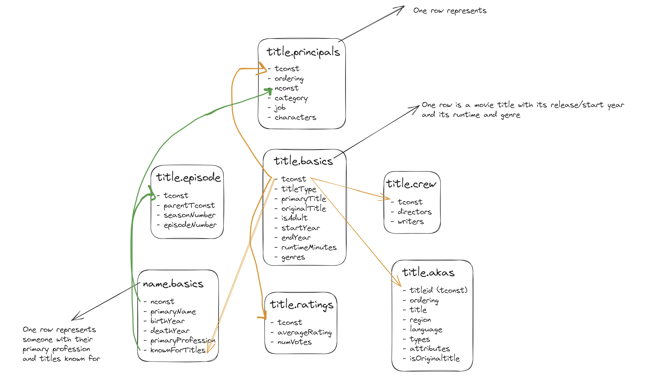
There were 7 datasets from IMDb, so I wanted to understand what I'm working with and how they all link together. The sketch below shows the schema I drafted to gain an overall understanding of the data:

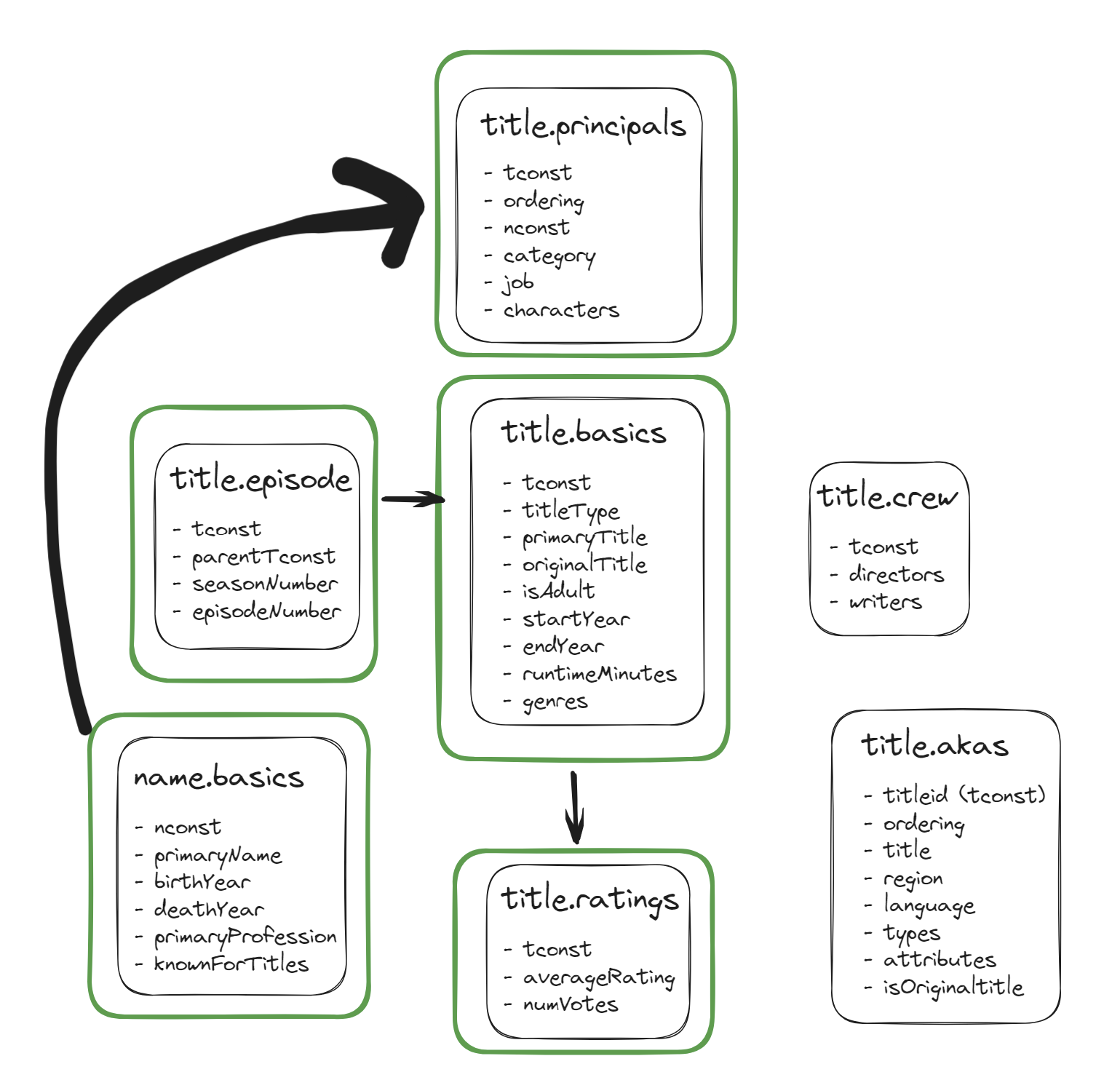
After gaining an understanding, I now needed to find a focus on what I wanted to do with it. I decided to focus on a tv series, in which I made up my mind to do a Breaking Bad rating dashboard since I've finished it recently. The next sketch shows which datasets I need and how I would join them together in Tableau Prep:

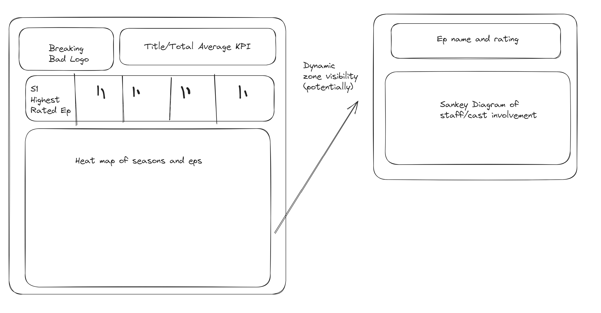
After joining these tables on Tableau prep, I then decided to start drafting and planning the dashboard:

I would have a total average for the show with KPI's showing the highest rated episode for each season. The real insight was the heatmap showing the average rating for every episode. I wanted to incorporate dynamic zone visibility where if you click on the heatmap it would show the episode name and rating, as well as a chart (not necessarily sankey) to show the split of staff involved in that episode. It was so that you could see which actors involved were also producers or had other roles. Unfortunately, I couldn't find time and figure out how to show this. Instead, I had just shown a bar chart of the category of staff involved but in the future could incorporate my original intention.
Here is the link to my Breaking Bad dashboard! https://public.tableau.com/app/profile/lorenz.nacilla/viz/BreakingBadRatingDashboard/BreakingBadDashboard
