


Do you need a chart to compare multiple measures or numeric numbers across a large amount of different members? Do you want to compare how someone ranks across different sub-scores compared to other members? Then a Parallel Coordinates Chart may be just the right chart choice for you. This blog article will talk about why we want to use Parallel Coordinate Charts and give you step-by-step instructions how to build them.
I first came across Parallel Coordinates Charts when my cohort and I were working on a 1-week client project for a financial firm. We wanted to visualize a total score and then the breakdown of multiple sub-scores for a ~400 members. While we only found out about Parallel Coordinates Chart at the end of the client project and didn't have time to implement it, I immediately fell in love with them and the ease of comparison they provide.
Here are a few examples:
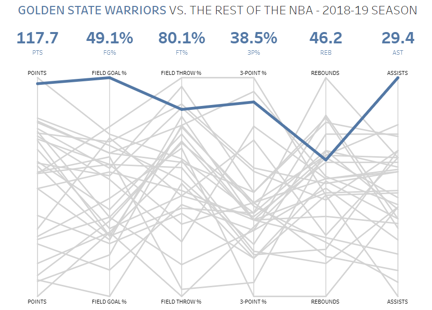
1) NBA Team Comparisons by Andy Kriebel
Our brilliant former Global Head Coach Andy Kriebel created a Parallel Coordinates Chart to compare the performance of various NBA basketball teams across a range of performance measures. Once you hover over a line, that team gets highlighted and you see how they perform in what metric compared to the other teams. Click here to interact with the visualization.
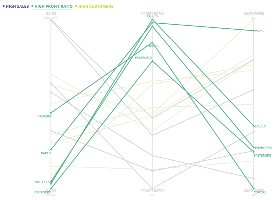
2) Subcategory Comparison by Ann Jackson
For a WorkoutWednesday, Ann Jackson (former Data School NYC Head Coach) compared Superstore Sub-Categories by different metrics such as Sales, Profit Ratio, and Customers. The color indicates those subcategories that are top performers within that metric.
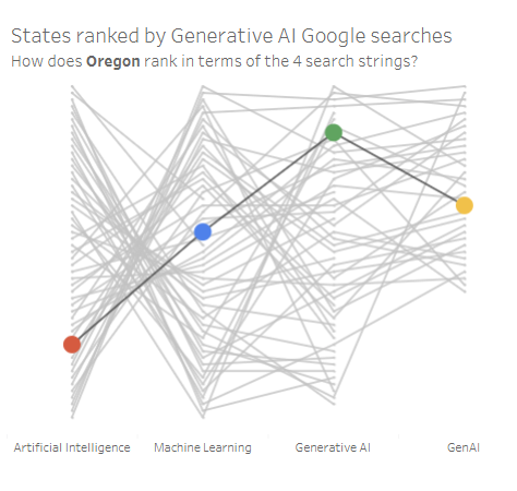
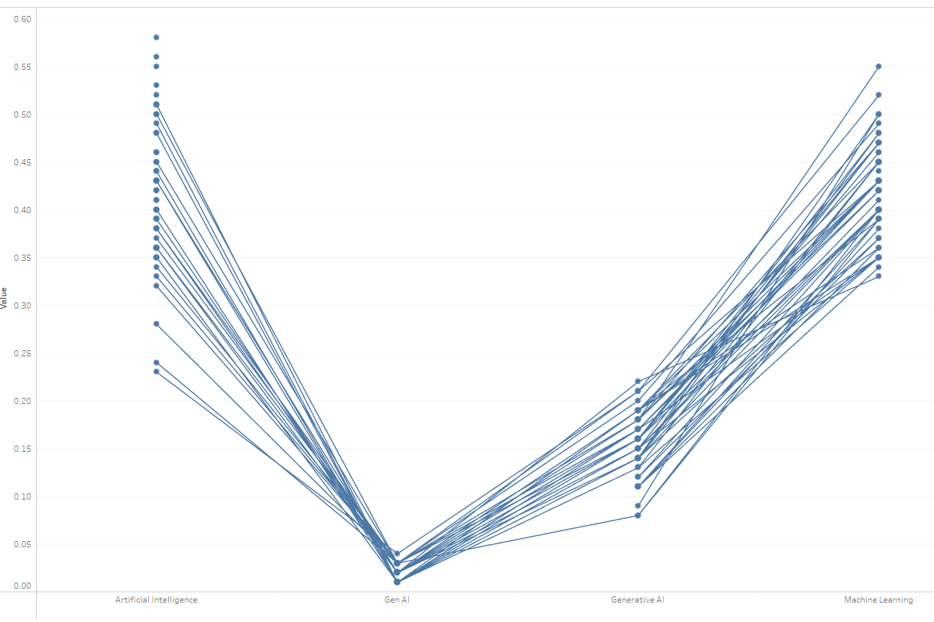
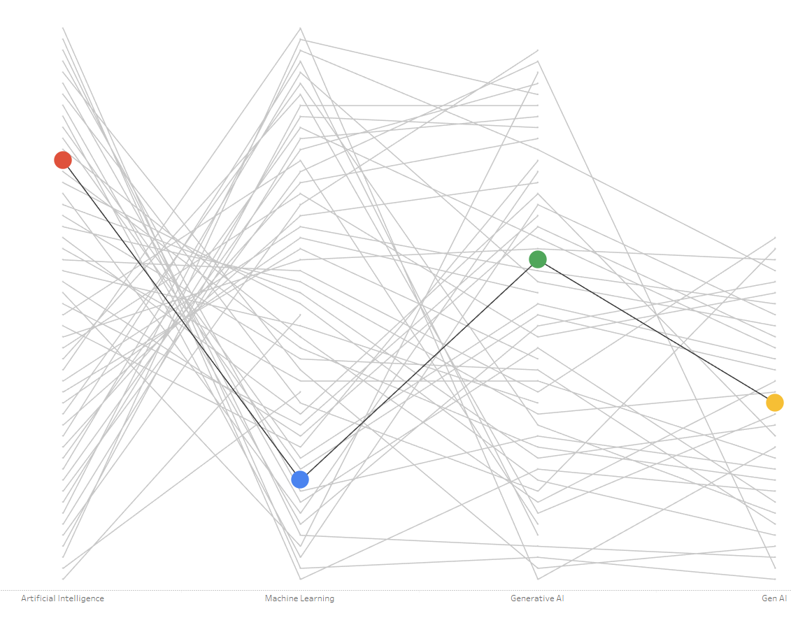
3) Google Search Trends for Generative AI Keywords by Lisa Hitch
For Makeover Monday 2024 W8 on Google Search Trends, I implemented a Parallel Coordinates Chart to rank different US states and which of 4 key words they are more likely to search for ("Generative AI", "GenAI", "Artificial Intelligence", or "Machine Learning").
So let's take that last example and walk through it step-by-step how to create it in Tableau.
If you want to follow along, you can download the dataset here.
Step 1: Build line chart
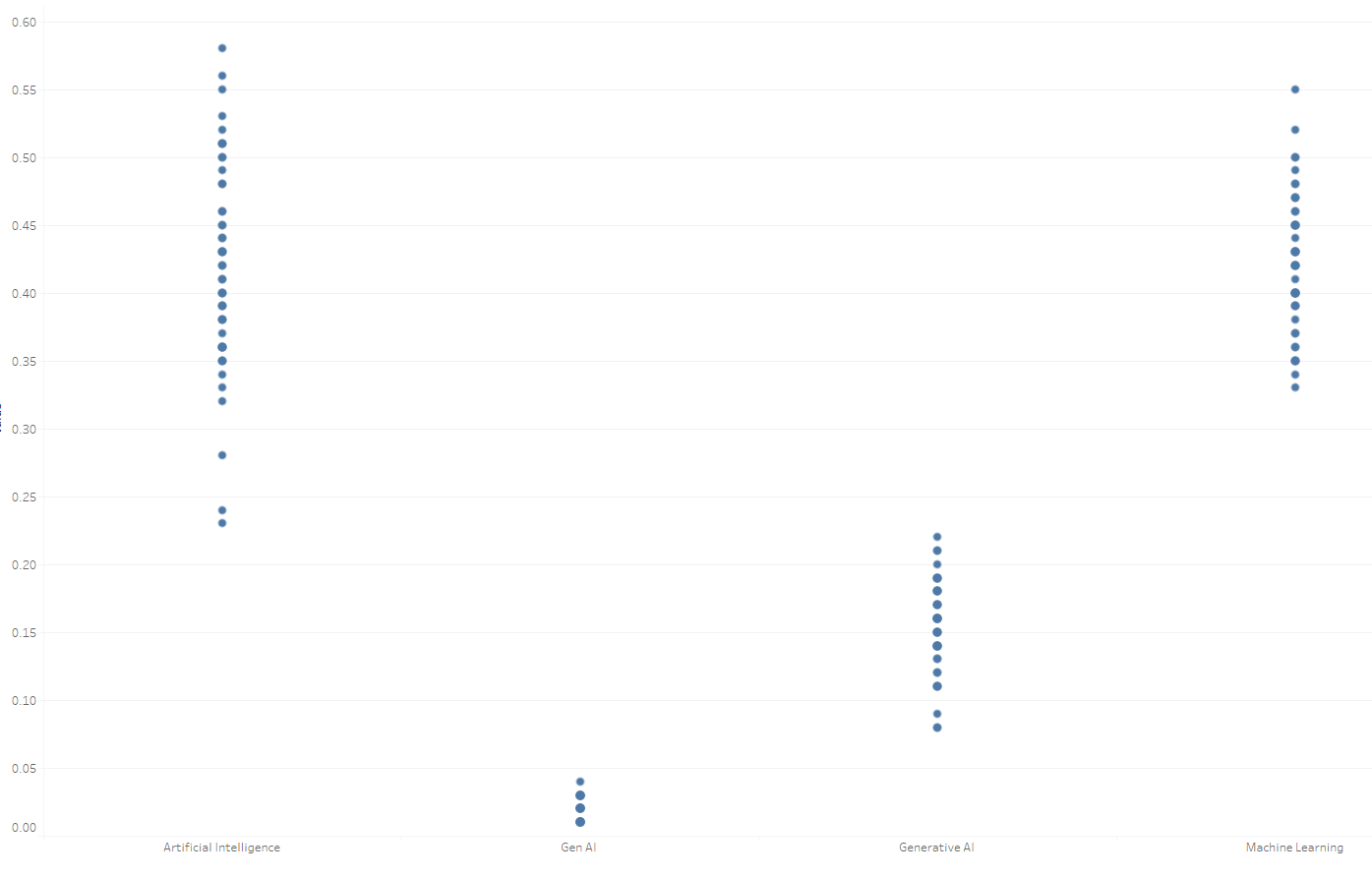
Since we want to use different measures on our X-axis, we need to drag Measure Values on the Rows shelf and Measure Names on the Columns Shelf, then switch the marks card to circles. Make sure to only keep the 4 measures of interest (Artificial Intelligence, Gen AI, Generative AI, and Machine Learning) on the left side where it says "Measure Values". Simply drag off the 5th measure. Now we have a circle for each measure. In the next step, we want to split up those circles for each US state (called "Region" in the dataset). Therefore, I drag Region onto the detail marks card. You may also want to change the View to "Entire View" and reduce the size of the circles. This is how it looks like for me now:
Now we want to connect the circles with lines. To do that, I duplicate the Measure Values pill on the Rows shelf by holding ctrl and dragging it right next to itself. Click on the arrow next to the second Measure Values pill and click "Dual Axis". Right-click on the right axis that appeared and click "Synchronize Axis". Then navigate to the second marks card on the left and select line.
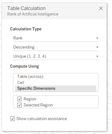
Step 2: Create Ranks with Table Calculations
While this step is not difficult, it involves some manual clicking. Right click on the first Measure under Measure Values on the left side under the Marks card and select "Add Table Calculation" and configure your it in the following way: Unique Rank, in descending order, do not restart for each Region.
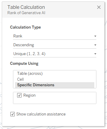
Repeat for your other 3 measures. Your line chart should then already look like a Parallel Coordinates Chart.
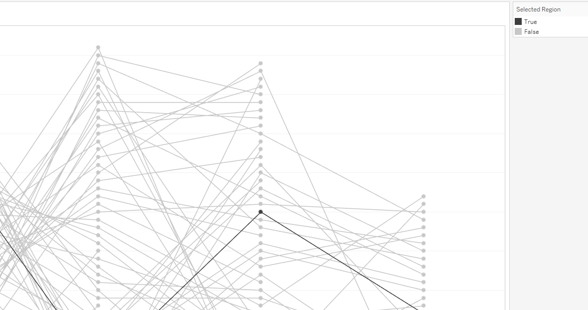
Step 3: Add color for selected region
In order for the user to hover over it and have the region highlighted in a color, we need to create a region parameter.
Click on the black arrow in the Data pane and click Create Parameter. I label it Region parameter, choose string as type, leave it as All, but type a US state where it says "Current Value", e.g. New York.
I then click on the black arrow again and click on "Create Calculated Field", label it as "Selected Region", and enter [Region Parameter] = [Region].
Click on the All Marks Card and drag it the Selected Region Field onto Color. You can change the color to grey and black (or any other color combination you would like).
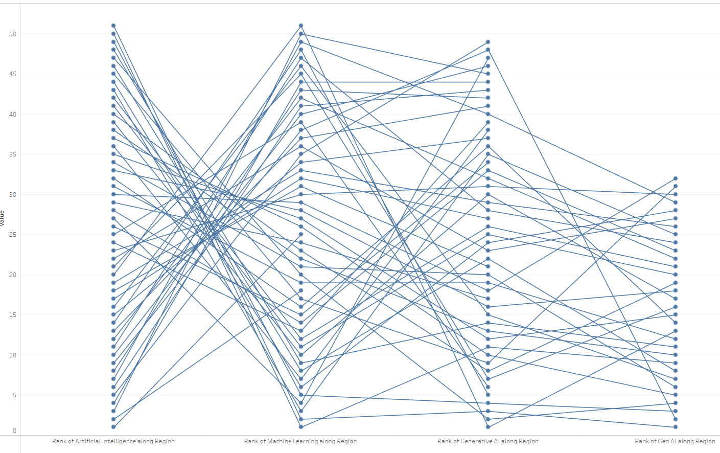
However, our selected region is now all the way at the bottom. This is because our Rank Table Calculation restart calculating for the selected region. So we have to go back into our rank configurations and also check of "Selected Region" under Specific Dimension.
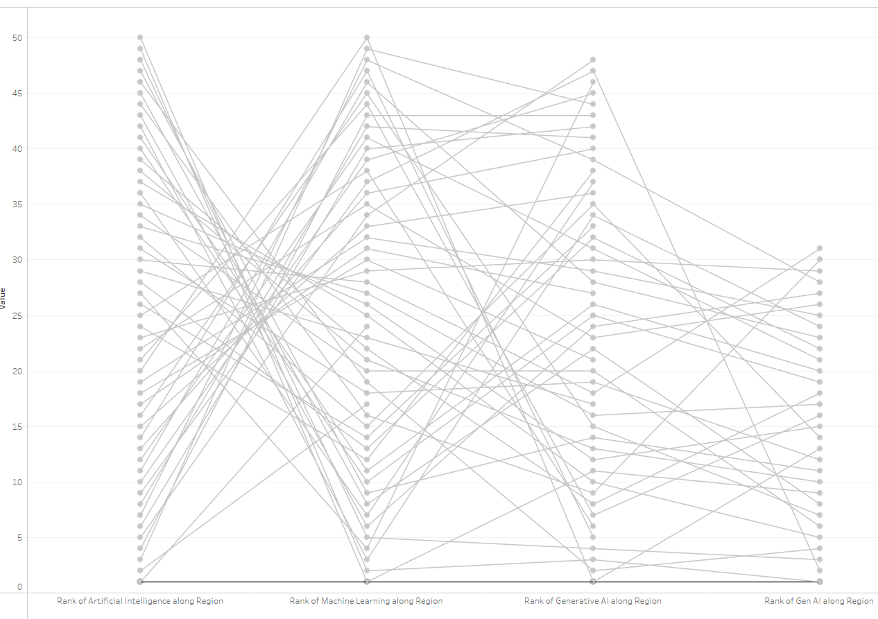
After repeating that for all of our rank calculations, your chart should look something like this. You can play around with color and size. To bring the black line into the foreground, you may also want to drag "True" to the top in your color legend on the right.
Step 4: Make it pretty
To create a prettier Parallel Coordinates Chart like I showed at the beginning, I removed gridlines, renamed the bottom X-axis, hid the Null warning. I then made the circles even smaller, and added the "Selected State" field to the size of the circles as well (don't forget to reverse the size legend). If you want each circle to have a different color based on the keyword on the bottom X-axis, you can add Measure names to detail on the circles marks card, and then switch it to color. This will give you 8 different color combinations (4 different measures and True/False for Selected Region for each of those 4 measures). I set the True's to my desired colors, and leave the others grey. If they appear behind your lines, you can show the headers, right-click on the axes, and click "move marks to front".
And there you go! This is the final product:
Want to learn more? Here are more resources for you:
- 5-Minute Youtube Tutorial by our amazing Consultant Support Erica Hughes
- WorkoutWednesday 2018 Week 49: Where do Subcategories Succeed?
Did you build a Parallel Coordinates Chart? Show me your work and let's connect on LinkedIn
First two Parallel Coordinates Chart Pictures by Andy Kriebel and Ann Jackson
Screenshots done in Tableau 2023.3, by Lisa Hitch
Feature Image by Lisa Hitch, created in Tableau 2023.3