


Disclaimer: This was my approach to working with a new dataset. This was the first time I had ever worked with a new dataset in such a short amount of time. If I were to do it over, I would do a lot of things similar, but I would also change/improve some things. So keep this in mind if you are preparing for your final interview! Also, I had the privilege of taking most of the week off of my previous work, so I could focus on the application.
If you are interested in how I prepared for my initial application dashboard without any previous Tableau background, check out my previous post "How to go from 0 to a Data School Application Dashboard in 40 days".
Working with a new dataset is always difficult, but it will be a part of your regular work as a Data Consultant. As part of the final stage of the application process to the Data School, you are given a dataset and have 1 week to explore, analyze, and visualize the data, in addition to preparing a 5-minute presentation and walk-through of your data. I felt very excited for this stage, as it would show me if I like this type of Data Consultancy work.
It can feel exciting, but also very overwhelming. Where to start? How do you go from an Excel table full of numbers to important insights and visualizations?
For me, it was all about planning out my week (including some buffer time in case of some unforeseeable circumstances, which I was glad I did as I got sick - more about this later), and allowing myself to play around before diving into building my dashboard.
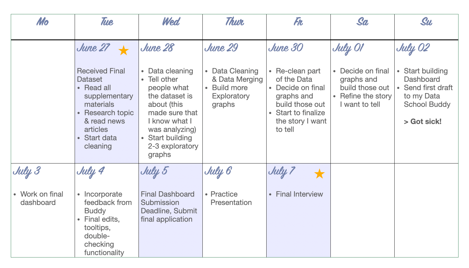
Here is an approximate timeline of that week. Note that I had certain days "assigned" to certain tasks such as getting familiar with the data, data cleaning, exploratory work, building graphs, and building my final dashboard. I pretty much stuck to those days throughout, but also allowed for some flexibility. For example, I had to do some data cleaning later on or go back to the drawing board regarding my final graphs.
First Stage: Getting Familiar with the Data
The first 2 days were really about getting extremely familiar with the dataset. Here is what I did and what may help you too:
- Read all the supplementary materials, including user guides or data dictionaries. In my case, the user guide provided some useful information on why to avoid time analysis due to data being excluded from the dataset.
- Research the topic! I did not know a lot about school cafeteria inspections and health code violations. So the first day I read newspaper articles, looked into the NYC health code, and found a document by the city that outlined how these inspections look like. This helped me a lot to understand what I actually want to analyze.
- First glimpse at the data: I also looked at the Excel sheet and uploaded the dataset to Tableau Prep to see some of the distributions of the individual columns.
- Take notes! All throughout this phase I would take brainstorming notes if I thought of something interesting, if I saw an outlier, or if I had an idea. Here are some of the notes I jotted down.
Inspections: annually, unannounced (look into NYC Health Code Article 81)
Data Size: 11.1 (Inspections) x 25 (Columns), Last Updated: June 26th, 2023
Out of 11.1k inspections, 3118 were not violations --> remove those
NOT appropriate for direct year-to-year comparison (because if cafeterias ceased to exist or failed multiple times, the whole cafeteria was taken out of the dataset)
Maybe merge economic/income data?
What causes violations? Where did they occur? Split by Private/Public?
Also, in this stage I talked to others about the dataset and explained what the dataset is about, why this could be important, and my initial ideas. This was helpful because it made me realize where I need to understand the data better and where I already have a grasp on it.
Second Stage: Data Cleaning
Once I was somewhat familiar with the data, I realized that I had to clean it quite substantially. For example, the school names were all in CAPITAL letters, and some rows had missing data for some of the columns (e.g. for the Community District). But since that was only a small number of schools, I was able to look up the Community District online and fill it in. Some schools also had a different ID number starting with letters instead of numbers, so I made sure that each ID number is similar, but still unique. Lastly, I excluded inspections that did not result in violations as I wanted to focus on the reasons for violations.
At this point, I was not familiar with Alteryx and only had basic knowledge of Tableau. I knew that data cleaning in Excel would be tedious, so I decided to use Tableau Prep instead. If you don't know, Tableau Prep is Tableau's Data Cleaning software and makes certain things a lot easier. For example, with only a few clicks you can remove punctuation. Also, the interface is somewhat similar to Tableau and the way calculated fields work is also the same. I only had used it once or twice before and I learned a lot as I went along.
Also important to mention: I did have to go back to the Data Cleaning Stage after I already started to build graphs, because I realized that I had used a wrong column. I also had a new idea to merge another dataset with economic needs data for the school's neighborhoods, which is why on Day 4, I took some time to take a step back to join and re-clean my data.
Third Stage: Data Exploration
For 1.5-2 days, I explored the data by building graphs. I plotted different metrics, searched for patterns and made notes along the way if any graph stood out. I also tried different charts for the same fields/patterns to see which graph would convey the key message the best.
At this stage, I did not have a story yet. I had a faint idea that I wanted to focus on violations and it seemed like facilities and vermin were the most often cited reasons, but I tried to not box myself into a story at this point. I tried to stay open-minded and let the data exploration guide me in my story-building.
I also took notes of any outliers. In my case, the Bronx and Community Board 483 were often outliers.
It's also okay to scrap graphs that are not working at this point. As a perfectionist, I had to tell myself to let something go if it did not turn out the way I wanted it or it was too complex.
Fourth Stage: Building out Final Graphs & Story-building
For about 2 days, I then built out my final graphs and put them into a bigger story. What were the key takeaways from each graph I wanted the reader to go home with? What was the overall key takeaway?
Storytelling is an important aspect of being a Data Consultant and the way you structure your dashboard will also determine how you present the data. For example, you don't want to scroll around a lot and go to the bottom, then the top, and then the bottom again. I would say to try and avoid dashboards that simply show an overview/summary of the data. Rather, lead the viewer through an interesting story.
Fifth Stage: Building Dashboard & Submit
The last 2-3 days were mostly about building my Dashboard. I also wanted to send it to my Data School Buddy for feedback before submitting it, which is why I had a first draft done 2 days before the deadline. This stage was mostly about cleaning everything up, deciding on a design for my final dashboard, formatting, tooltips etc.
During this stage I caught a cold and spent a lot of time in bed. It was stressful and I tried to work from bed, but I was very limited in my concentration span. However, because I had invested a lot of time into the data exploration and graph building phase, I was confident that building the dashboard would take less time. So I took some intentional time to recover, work whenever I felt good enough for it, and then also accepted that the final dashboard version will probably never look as perfect as I want it to be (and this will be true no matter whether you got sick or not - at some point you just have to be proud of the work you put in and be okay with 'good enough'... Another lesson that is very important to learn if you want to become a Data Consultant!).
Sixth Stage: Rehearse!
I cannot emphasize this stage enough! You only have 5 minutes and you will be nervous. If you do not rehearse, you may ramble or lose focus. 5 minutes is not a lot for all of the information on your dashboard and you will have to prioritize what to focus on. Also, I felt that rehearsing helped with my nervousness.
I did not use notes, but you are definitely welcome to use them if that helps you with your presentation and staying on track what you want to convey.
One more important aspect for the presentation: Storytelling! Don't simply describe every single graph, but tell a story that the user would find interesting.
These are called user stories and something you will do quite a lot when in the Data School and as a Data Consultant. For example, for training presentations, I would open my dashboard, briefly describe what can be seen and then I use the filters to show highlights and outliers and what that could mean for the user or stakeholder. Part of my final interview presentation went something like this:
"As you can see here with this bar chart, the Bronx is a clear outlier with more schools with economic need. Now the question is whether cafeteria inspections were different for this school. In order to find the answer, I can click on the bar that represents the Bronx and the bottom chart filters to the Bronx. Now we can see that the schools in the Bronx actually show a much higher proportion of violations that involved facility issues as compared to other boroughs. This shows that there is more investment in Bronx school cafeterias needed".
When you presented an insight, ask yourself either "Why?" or "So what?". Then use your other graphs to answer these questions.
What I would do differently:
- Organize my files better: Even though it seems quite organized, my files on my computer were actually not organized. I had like 3 files that ended in _cleaned, _cleanedfinal, _cleanedfinalfinal.
- Keep a more detailed "Data Diary": I actually started it at the beginning, but then stopped it closer to the deadline. A Data Diary is basically where you record your process. Each day I would write down 3-4 bullet points what I was working on, anything that is not resolved, or any major ideas I had. This was the first I had ever done a Data Diary before, and I really liked it. It enabled me to look back on the previous day, recap how far I have come, and recognize where my "road blocks" are. It also helped me to start with the most difficult part first thing the next morning. However, after the data cleaning phase, I stopped doing it, and I think it would have been helpful to look back at some of the insights I had while I was building graphs.
- Learn basics of data cleaning in Tableau Prep or Alteryx BEFORE the final interview: Since the data will probably not be very clean, you will need some basics in data cleaning. This can be in Excel, Tableau Prep, Alteryx, or any other software. While I did data cleaning before in statistical software, coding it felt very cumbersome and I wanted to avoid that with such a short timeframe. So I learned Tableau Prep as I went along which was time-intensive. If I were to do it over, I would use some time to practice data cleaning before the final interview stage, e.g. when doing Makeover Mondays or other personal projects. This way you will save time on that during the final interview stage.
Calendar picture illustrated by Lisa Hitch.