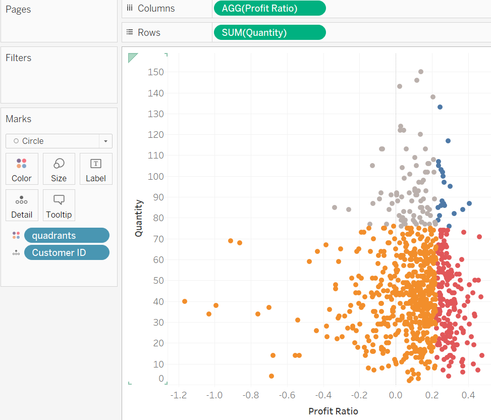
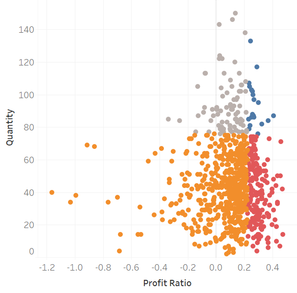
Let's use Sample Superstore data to create a scatter plot divided into quadrants using sets.
This chart shows the quantity and profit ratio of each customer. The upper right quadrant is customers in the top 200 for profit ratio and top 100 for quantity.
Step 1. Create Profit Ratio
Create a calculated field: SUM([Profit])/SUM([Sales])
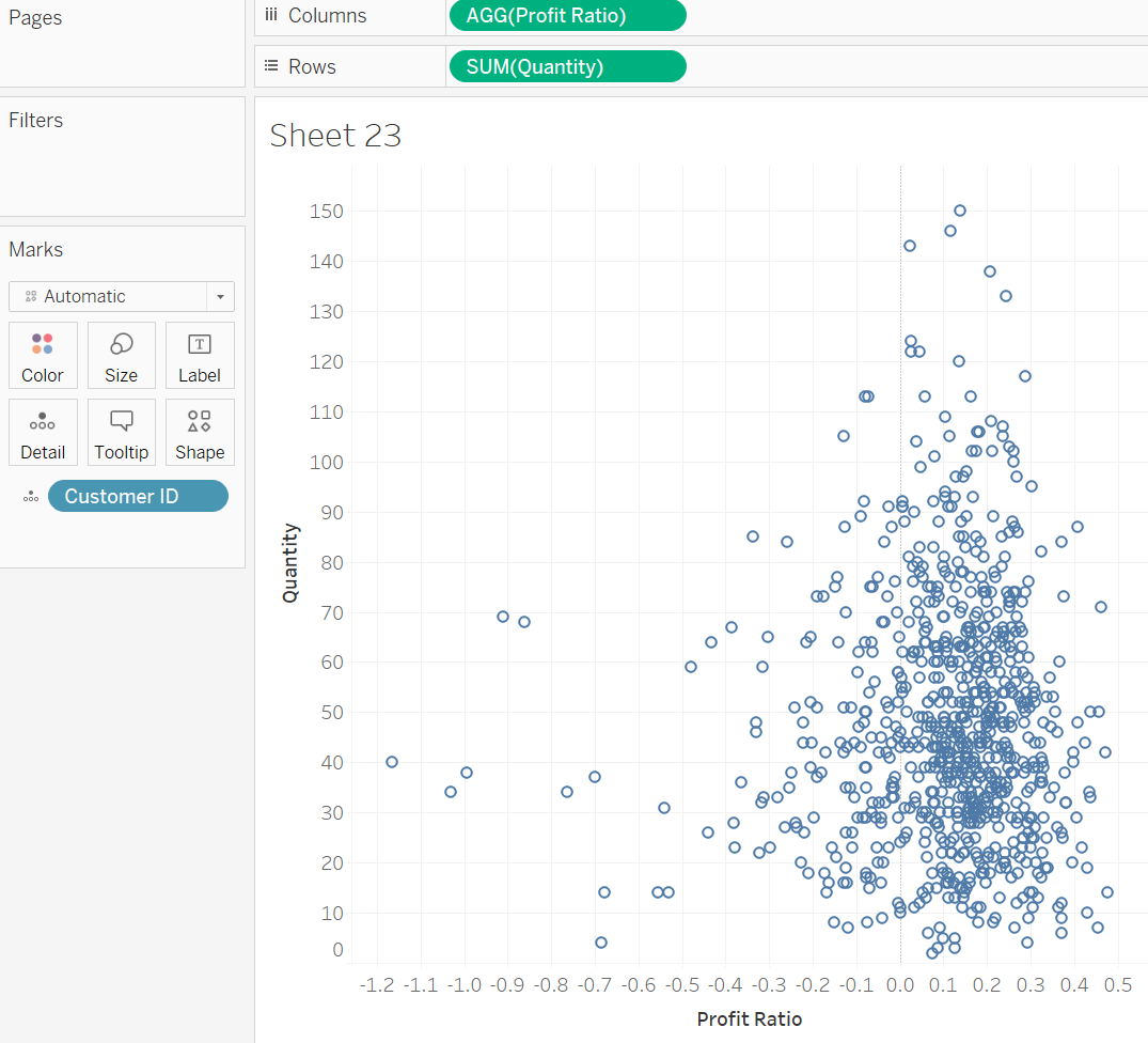
Step 2. Drag on fields
Drag on Profit Ratio into Columns, Quantity into Rows, and Customer Name into Detail Marks.
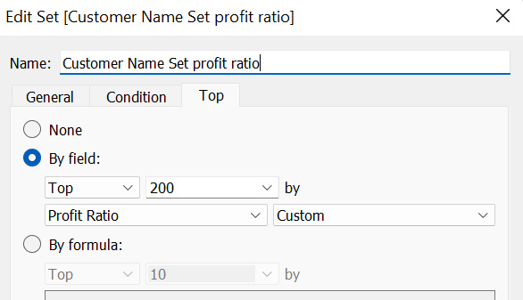
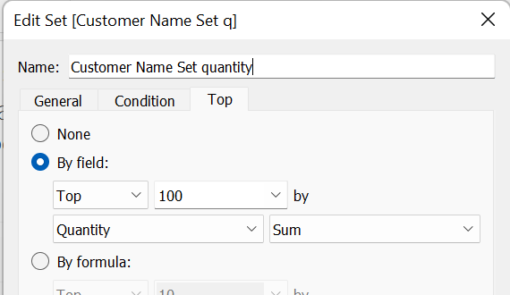
Step 3. Create 2 sets
- Top 200 based on profit ratio set: use Customer Name to create set, and set the top 200 based on profit ratio.
- Top 100 based on quantity set: Customer Name to create set, and set the top 100 based on quantity.
Step 4. Create a Quadrants field
Create a calculated field to create the quadrants. Use the following expression:
if [Customer Name Set quantity] and [Customer Name Set profit ratio] then 'Upper Right'
ELSEIF [Customer Name Set quantity]=FALSE and [Customer Name Set profit ratio] then 'Upper Left'
ELSEIF [Customer Name Set quantity] and [Customer Name Set profit ratio]=FALSE then 'Lower Right'
ELSE 'Lower Left'
END
Step 5. Drag the Quadrants field into the color marks.