In the second training week, I learned about the data visualization about what users should do and should not do in visualization. There are many rules and principles, but I like the Gestalt Principles and useful to apply them into the visualization. In this blog, I will share about what are Gestalt Principles and digging into each principle to see how it is useful in design or visualization.
What are Gestalt Principles?
According to the page interaction-design.org, Gestalt in German means "unified whole". In the 1920s, German psychologist Max Wertheimer, Kurt Koffka and Wolfgang Kohler identified a set of laws to see how human finds order in disorder. Gestalt Principles includes Proximity, Similarity, Closure, Enclosure, Continuity, Connection, Figure & Ground.
1/ Proximity
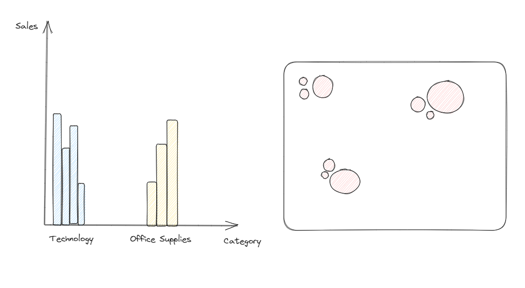
Proximity Principle is about things are close to each other as belonging together. For example: paired column chart or paired bar chart,...
2/ Similarity
In Similarity Principle, things appear to be similar to each other. It could similar about the color, size, shape and orientation.

In the image above, my eyes can distinguish the similarity and difference in each case. For color, there are 3 pink circles. For size, there are 3 big circles and 6 small circles. For the shape, there are 6 rectangles and the rest are circles. For the orientation, there are 5 vertical bars and the rest are horizontal bars.
3/ Closure
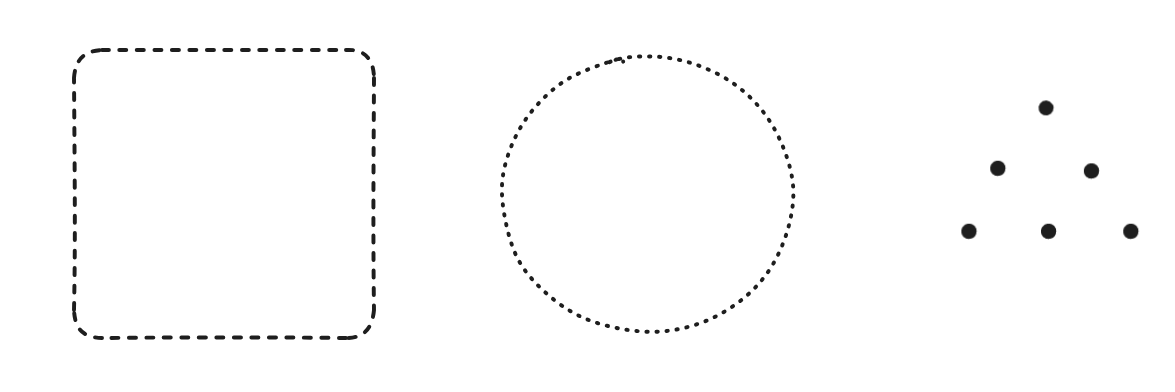
We prefer the complete shape, but our eyes can automatically fill out the gap between elements. For example, in the image below, there are dot lines in the rectangle, the circle and the triangle but we can recognize each shape.
4/ Enclosure
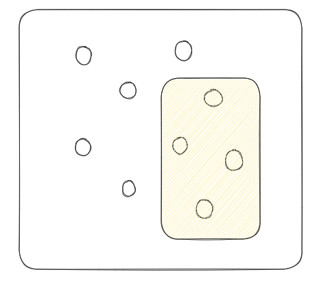
In this principle, the objects related to each other will be grouped by a visual border as they belong together.
5/ Continuity
In this principle, the human eyes can follow the lines, curves of the shape to determine if they have relationship or align with another.
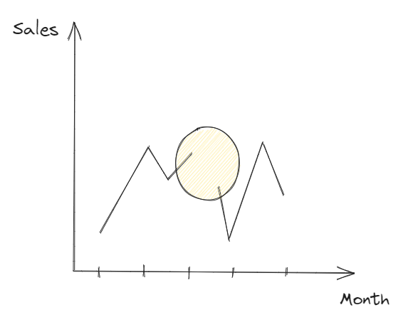
In the image above, there is a gap in the yellow shading circle. The line is not continuous.
6/ Connection
In this principle, elements are connected together as they are related to a group.
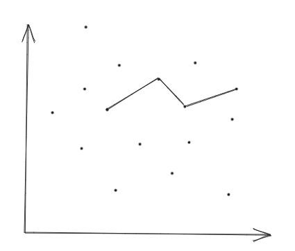
In the image above, the 4 dots related together, so the line connected 4 dots together.
7/ Figure and Ground
The human brain can perceive the object in the foreground of an image and the background.

In the image above, there is a right arrow in the Fedex logo between E and x.
The data visualization is important because it will help the data analyst or the designer communicate with the audience by visualization. Those principles help the audience focus on what the data analyst would like the audience understands.
