


In some cases, I would like to build a visualization to see how the metric changes in time series. However, there are many metrics in the dataset, but I don't want to build each visualization for one metric. In this case, I need to find a way to change the metric dynamically, so I only need one visualization for all metrics.
In this blog, I will show how to build a dynamic metric, so the user can choose any metrics for the visualization. I also share how to change the axis title and axis range in 2 ways. One way for the new version from Tableau (from Tableau 2023.1 and beyond) and one way for the old version(before Tableau 2023.1).
1/ Build visualization with dynamic metrics
2/ Dynamic Axis Title and Dynamic Axis Range in the new version (2023.1 and beyond)
3/ Dynamic Axis Title and Dynamic Axis Range in the old version (Before 2023.1)
Are you ready? Let's get started!
1/ Build visualization with dynamic metrics
I use the sample SuperStore dataset in Tableau. There are 4 metrics in the dataset that I could use: Sales, Profit, Discount, and Quantity. I would like to compare those metrics by the month of Order Date continuously.
First of all, I need to create a parameter to store all of those metrics. I created a parameter called the "Metrics Parameter" type string and listed all those metrics (Image 1).

Then, I create a calculated field called "Selected Metrics" to control the metric when the user chooses from the Metrics Parameter (Image 2).
Note that I used the aggregate function in the calculated field because I used the Average function for the Discount metric. If all metrics use the same aggregate function, you can eliminate the aggregate function. Then, when you drag it to the Rows or Columns, you can choose the aggregate function.

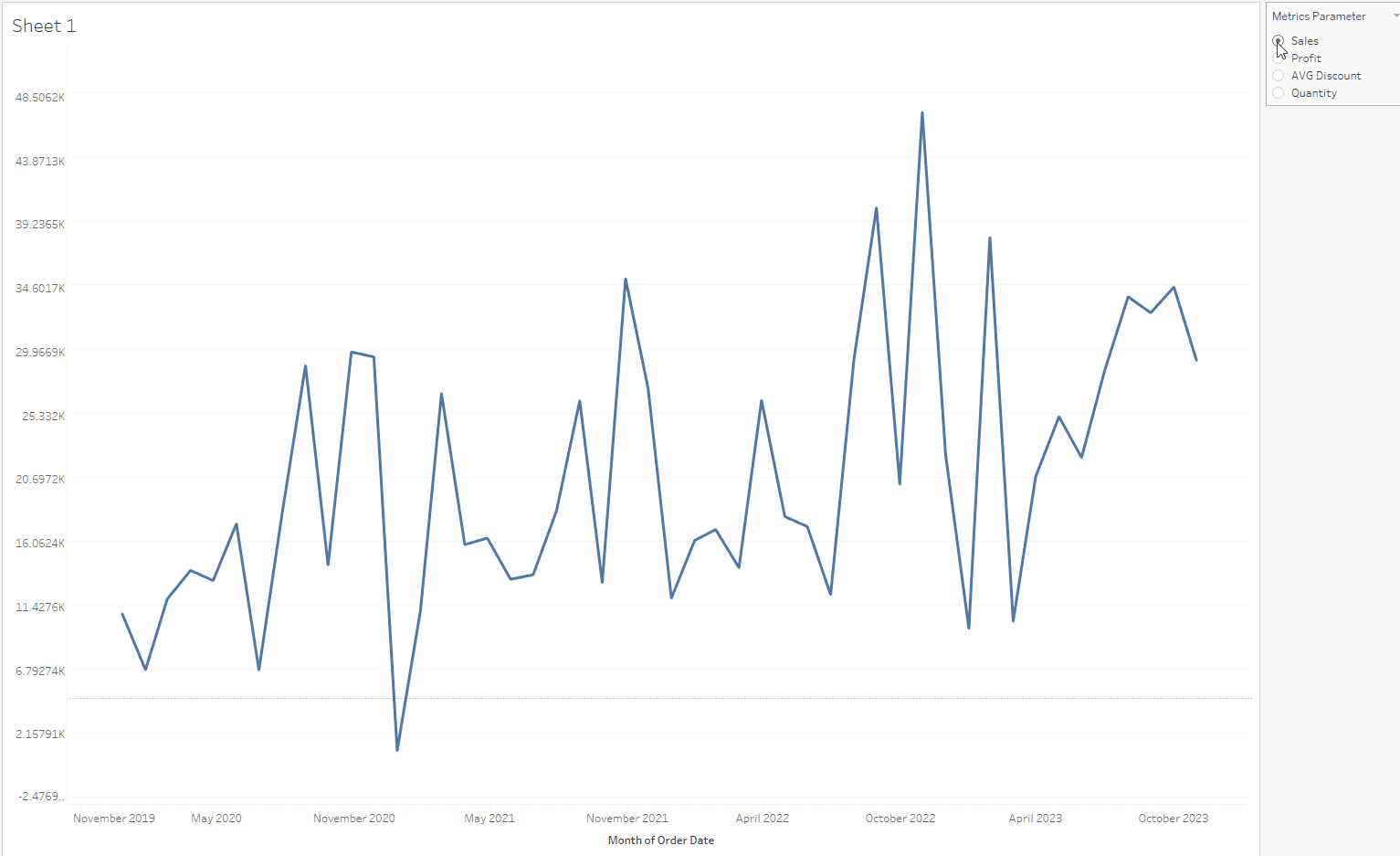
Now, I drag the Selected Metrics pill into Rows, and the continuous month of Order Date to the Columns. I also show the Metrics Parameter. I can switch the metric from the parameter (Image 3).

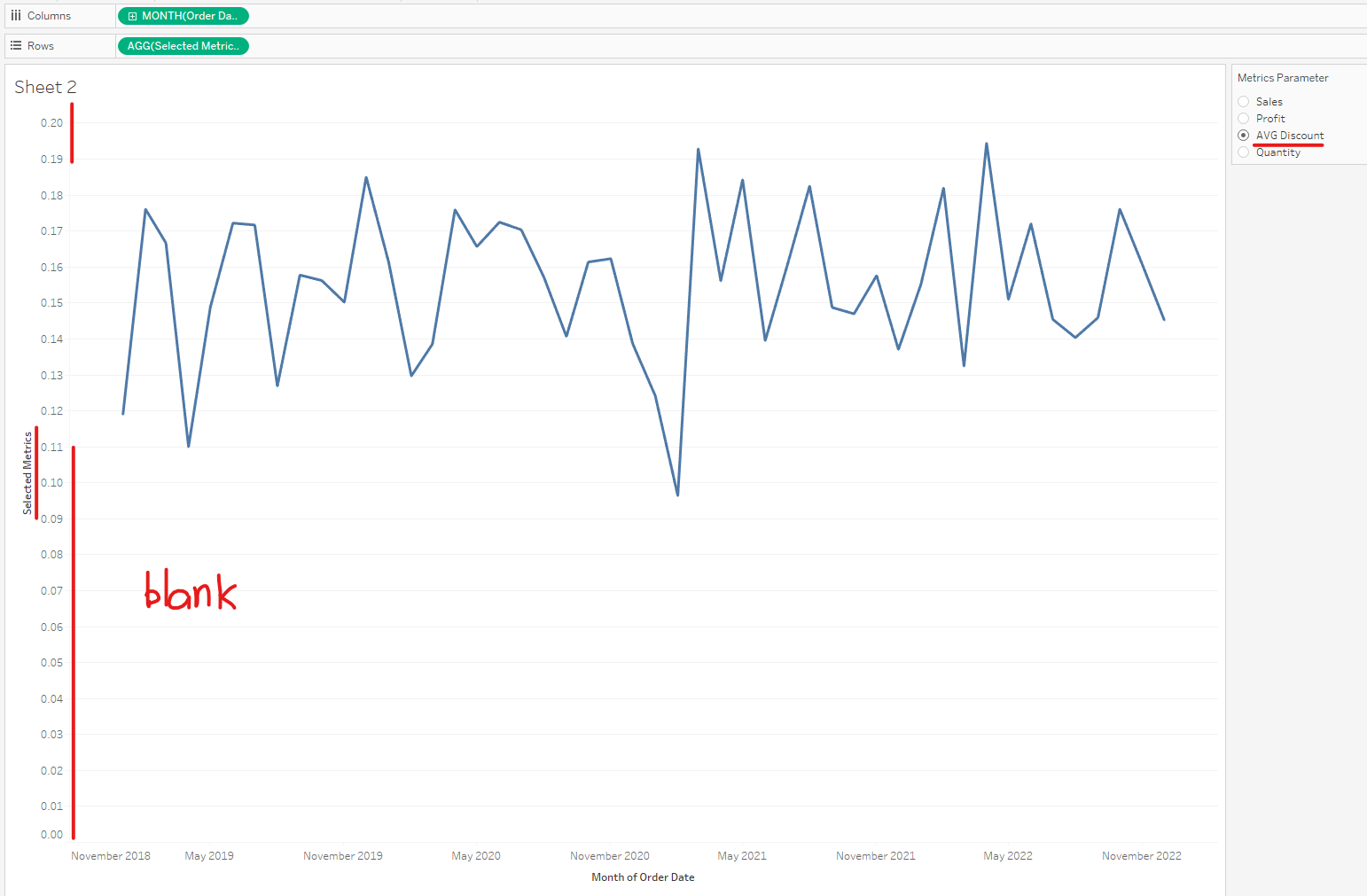
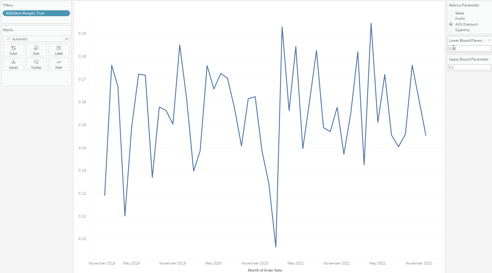
However, if I click on the AVG Discount option, the view is not very nice. There is a blank space at the bottom of the line chart. Also, the y-axis title does not change to the metric that I chose (Image 4). I want to manually edit the axis range.
In this blog, I am going to share how to fix the axis title and axis range when you have the same situation.
2/ For the new Tableau versions (2023.1 and beyond)
If you are using Tableau from version 2023.1 and beyond, the dynamic axis title and dynamic axis range features had been added. It takes a few steps to do it.
- Dynamic Axis Title
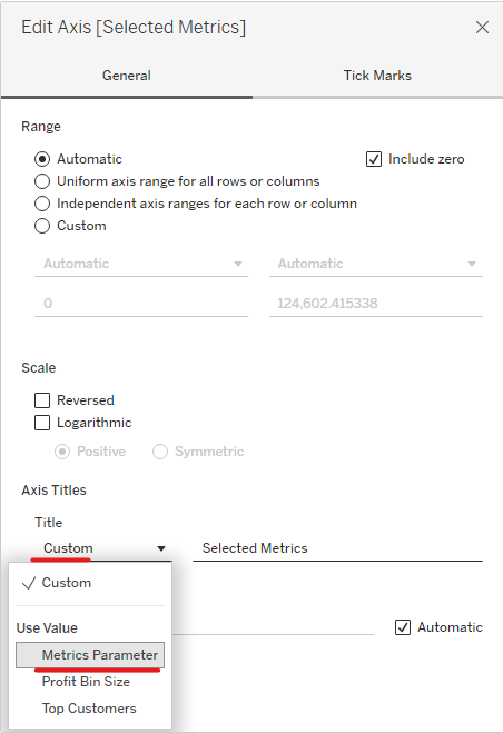
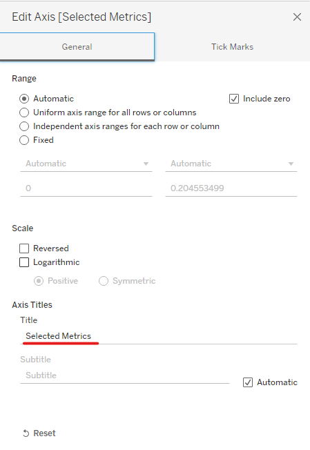
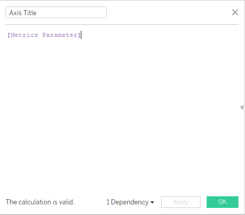
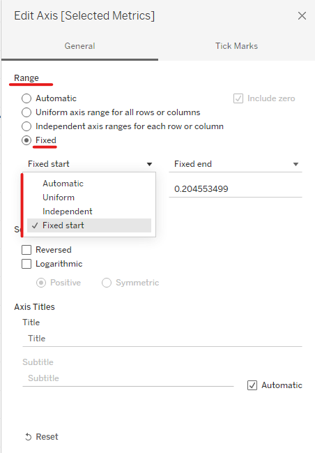
To change the axis title dynamically, right-click on the Selected Metrics title and choose Edit Axis... At the Axis Titles section, drop down the Title and choose Metrics Parameter (Image 5).
Now the axis title will be updated if I change the value in the Metrics Parameter (Image 6).
- Dynamic Axis Range
As you can see from Image 4 above, there is a blank space in the view. I want to get rid of the blank space. In case I want to zoom in with the axis range, I can input the lower bound and upper bound values.
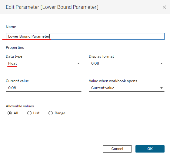
I create 2 parameters. One parameter is the "Lower Bound Parameter". Another parameter is the "Upper Bound Parameter" with type Float (Image 7).
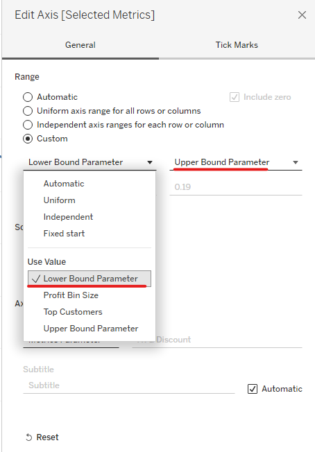
Then, I right-click on the Selected Metrics header again and choose Edit Axis... In the Range section, I choose Custom. Then, select Lower Bound Parameter on the left drop-down menu and Upper Bound Parameter on the right drop-down menu (Image 8).
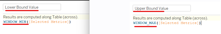
Then, I created 2 new calculated fields called "Lower Bound Value" and "Upper Bound Value". I used table calculations to find the minimum and maximum values of the view (Image 9).
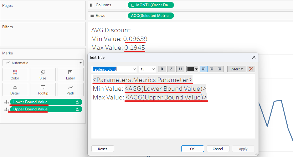
Then I dragged 2 of those calculated fields into the Detail Marks. I edited the title by showing the metric title and min/max values (Image 10).
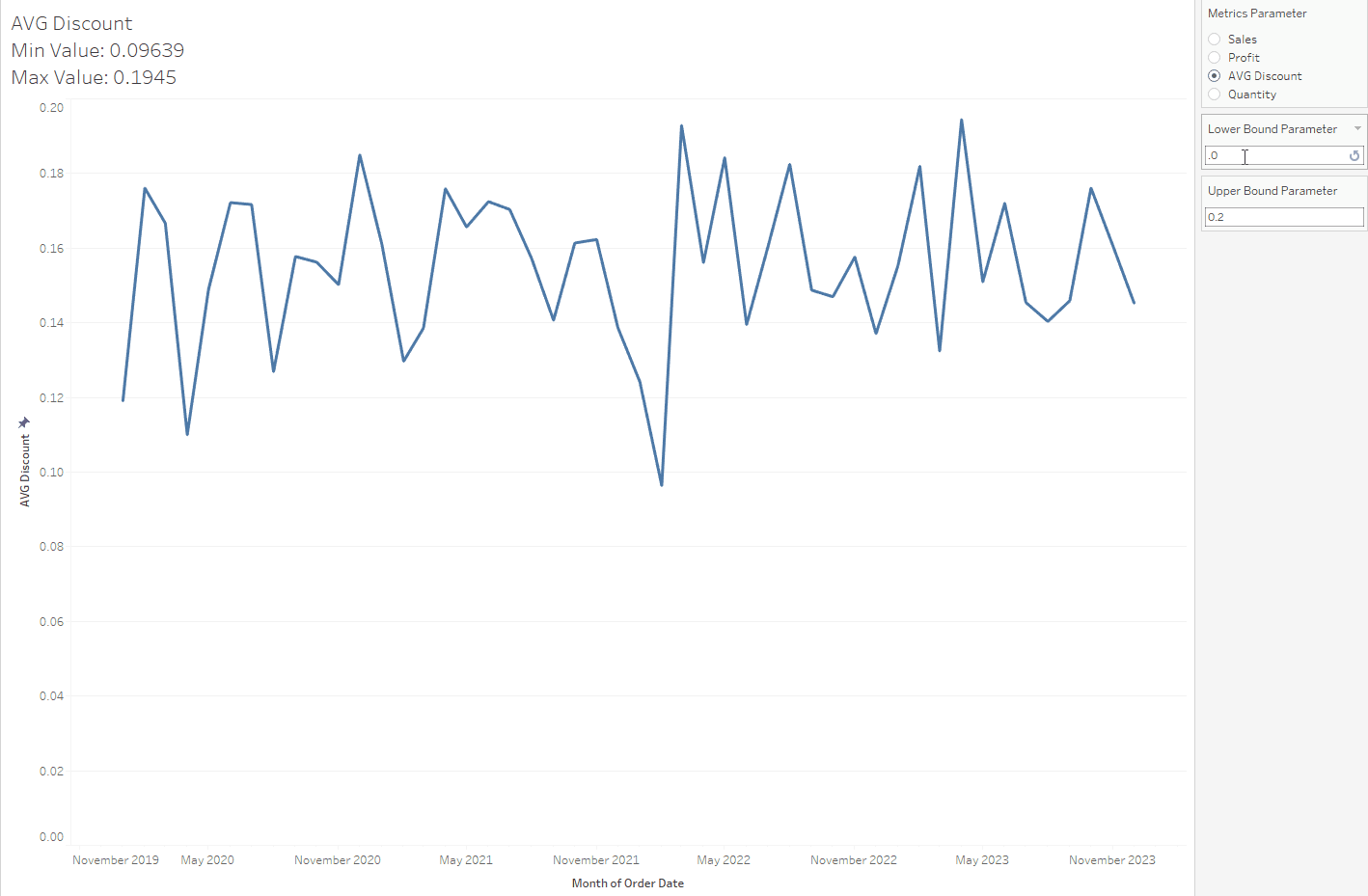
Now, let's test the result.
3/ For the old Tableau versions (Before 2023.1)
For the old versions, there are no features for the user to use a dynamic axis or dynamic range (Image 12). However, there are some ways to do it.
- Dynamic Axis Title
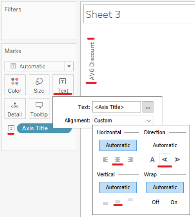
To change the axis title dynamically, I opened a new sheet. I created a new calculated field called Axis Title and dragged the Metrics Parameter in (Image 13). Every time I switch the metric in the parameter, this Axis Title will be changed.
Then, drag the Axis Title pill to Text Mark and click on the Text Mark. Click on the Alignment drop-down button. I choose the center option for Horizontal and Vertical. In Direction, I choose the middle A option (Up). (Image 14)
I opened a new dashboard and used the container for the visualization. I sketched the containers in Excalidraw first. The red frame represents the horizontal container in Tableau. The blue frame represents the vertical container in Tableau (Image 15).

To build the container, I will go from the outside layer to the inner layer.
+ The first outside container is the Vertical container (Blue color).
+ Visualization Title:
+ A horizontal Container (Red color)
+ Axis Title
+ Line Chart
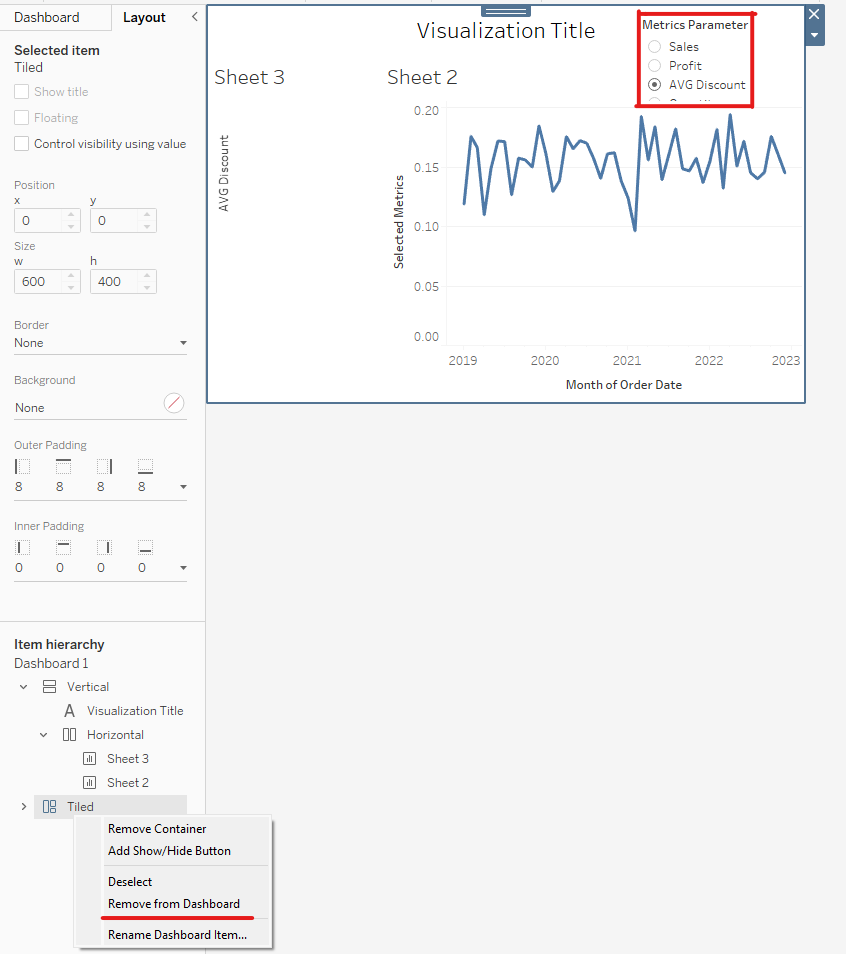
Now, I know the order of containers. I open the Tableau dashboard again to start building it. It also shows the Metrics Parameter. In the Item hierarchy on the bottom left, right-click on the Tiled and choose Remove from dashboard.
Then, right-click on the Selected Metrics title and choose Edit Axis... I deleted the title (Image 17). I would like to keep the metric value, so we cannot uncheck the Show Header option.

Then, click on the line chart to adjust the Left Outer Padding to 0 and hide the title of the line chart (Image 18).
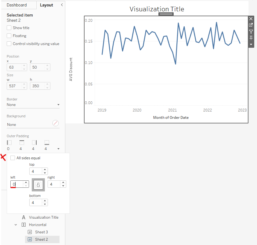
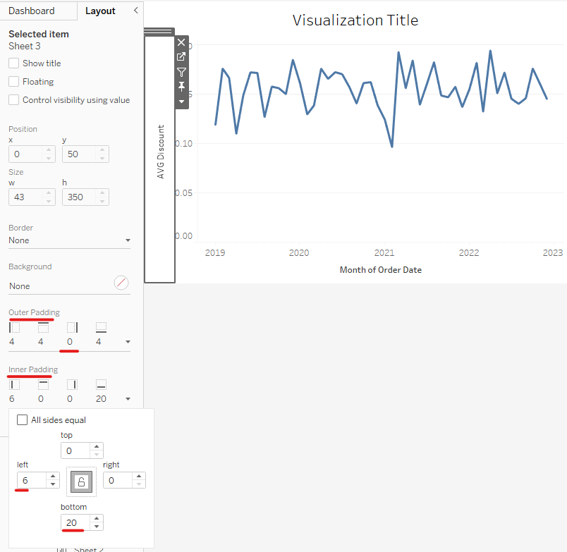
Then, click on the Axis Title (Y-axis) to adjust the padding size. I set the Right Outer Padding to 0, the Left Inner Padding is 6 and the Bottom Inner Padding is 20. Depending on your design, you can set any number you like. Make sure that the space between the Axis title and the visualization is the same as the other axis. (Image 19)
Now the outline of the visualization looks good. However, the axis range needs to be fixed (Image 20).

- Dynamic Axis Range
For the old versions, we cannot add the parameter values for the Range Axis (Image 21).
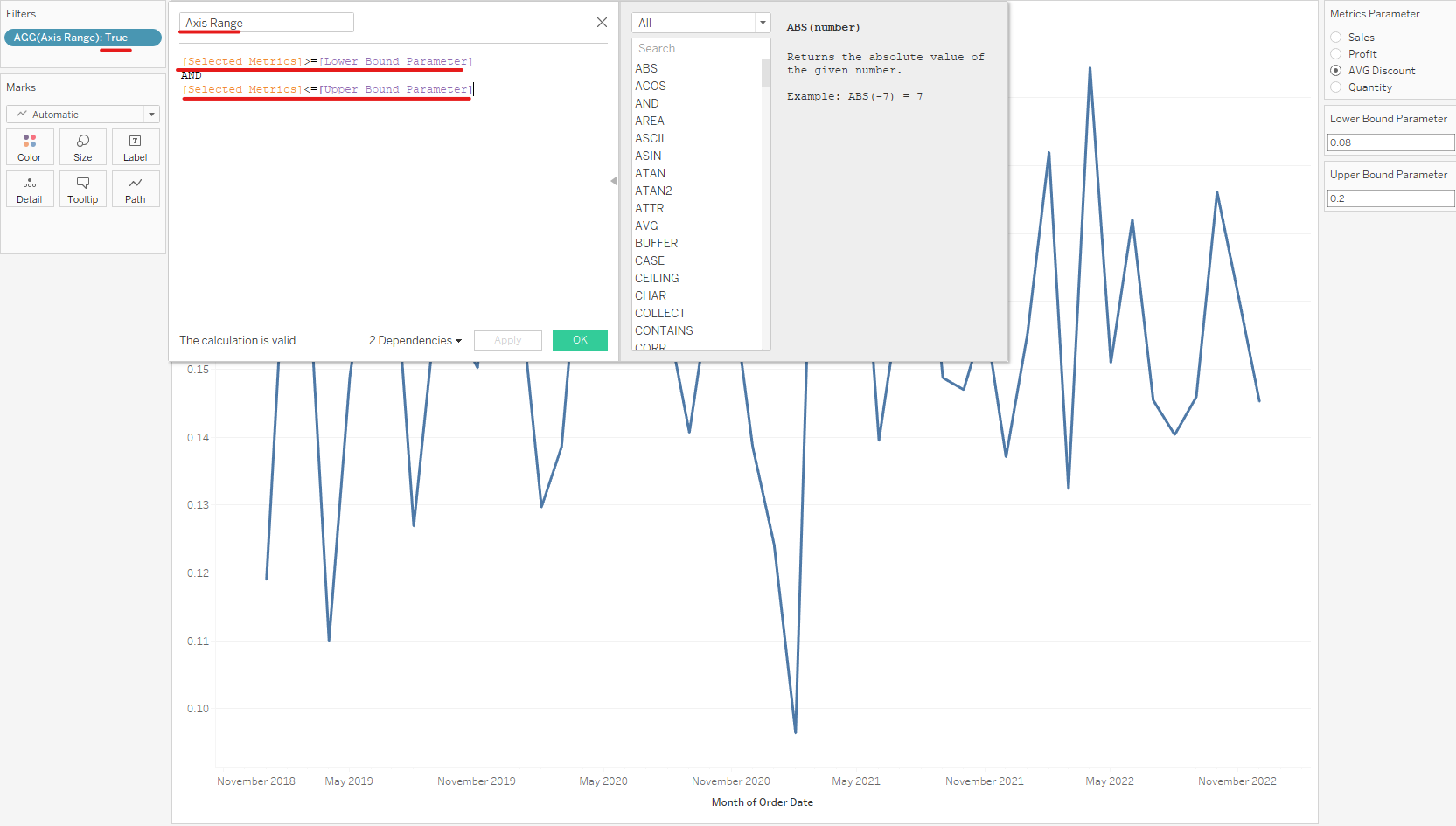
Therefore, I need to do it another way. I also create 2 parameters (Lower Bound Parameter and Upper Bound Parameter) same as in Image 7 above. However, I created a new calculated field called Axis Range. The condition of the axis range is the selected metrics should be greater or equal to the Lower Bound parameter and less or equal to the Upper Bound Parameter (Image 22). Then I drag that calculated field to Filter and choose True.
Now, let's test it.
I hope this blog is useful to you if you are working on a project with the dynamic axis. In some cases, when we have multiple metrics but cannot show all visualizations on the dashboard. Using dynamic metrics is very helpful. It will help us to save space on the dashboard and also increase the performance. Instead of showing all 4 visualizations on the dashboard, now I only need 1 visualization but I can show all 4 visualizations by changing the metric in the parameter.
I hope you enjoy this blog and hope to see you soon in the next blog!