


Since I came to the data school almost 2 weeks ago, I have learned so much! I have prepared data in both Tableau prep and Alteryx, learned about data Architecture and why it is so important, and to go back to what we started with…we learned best practice of building dashboards in Tableau.
If you would like to see my dashboard prior to these changes, you can look here: The Data School - What did it take to get into DS34?
Our project this week, was to see how far we had come, and in order to do that, we had to rebuild our final dashboard. The one that got us into the Data School.
With mine, I decided purely to focus on how I could best use sets and parameters.
Let us start with the first graph on my dashboard, number of accidents per year.
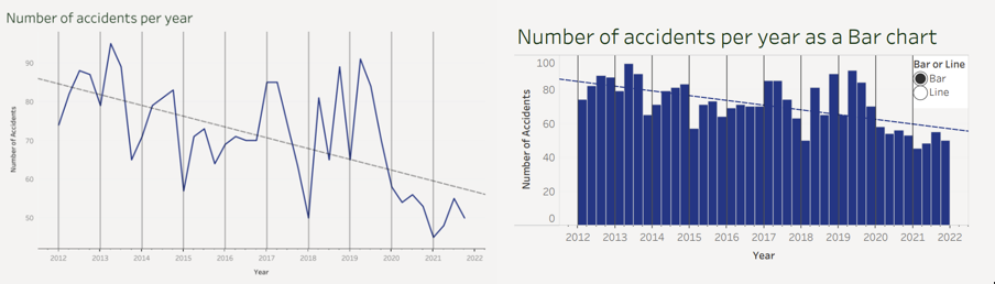
During Tableau training, we were taught that you can change the graph type of your data using parameters. I felt that having the ability to choose between a bar chart and a line chart allows the user to better visualise the individual quarter types for when they need exact data.
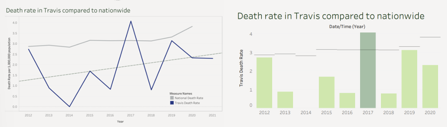
Another change I made was more drastic. By using custom dates and references lines, I was able to create the bar chart on the left. Although, it is more difficult to see the overall trend (cannot include the trend line due to custom dates), you are better able to compare each individual years Travis and Nationwide rates. The colour changes to make the years were Travis death rate is greater than Nationwide rate, stand out.
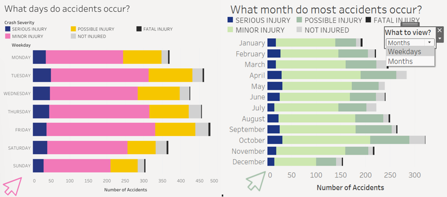
On the top right, you can see a drop down menu that states 'What to view?'. This allows you to change between weekdays and months. Giving the user another way of seeing the data.
You may also notice the change in colour scheme. The feedback I was given after my interview/presentation, was that the colours were too bright. During training, after being shown multiple visualisations to compare, I noticed how off-putting very bright (even neon) colours can be. That is why I went for a softer and more natural colour scheme, going with the idea that cycling is healthy and green.
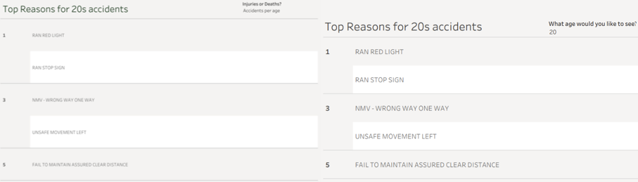
For my final change, initially I had it so, when changing between injuries or deaths, as 20s and 30s had the most injuries or deaths, the top reasons would change with it. In my new version, you can put your age (or whatever age you want to check) in were it says 'What age would you like to see?'. This will then give you the top reasons for the age given, as a range (e.g 24 = 20-29). The only issue is the data only has ranges between 10-69, so anything over and under gives no results.
Thank you for reading and I look forward to seeing how I can further improve both my visualisations after the 4 months of training.