


After a short one month of training, I was shown many different examples of data visuals we can create in Tableau. I've been shown countless examples and how it could be utilized in our dashboards.
Here are some examples of the many different types of visualizations we can create (surprisingly easily)!
*The dataset used is: Sample - Superstore
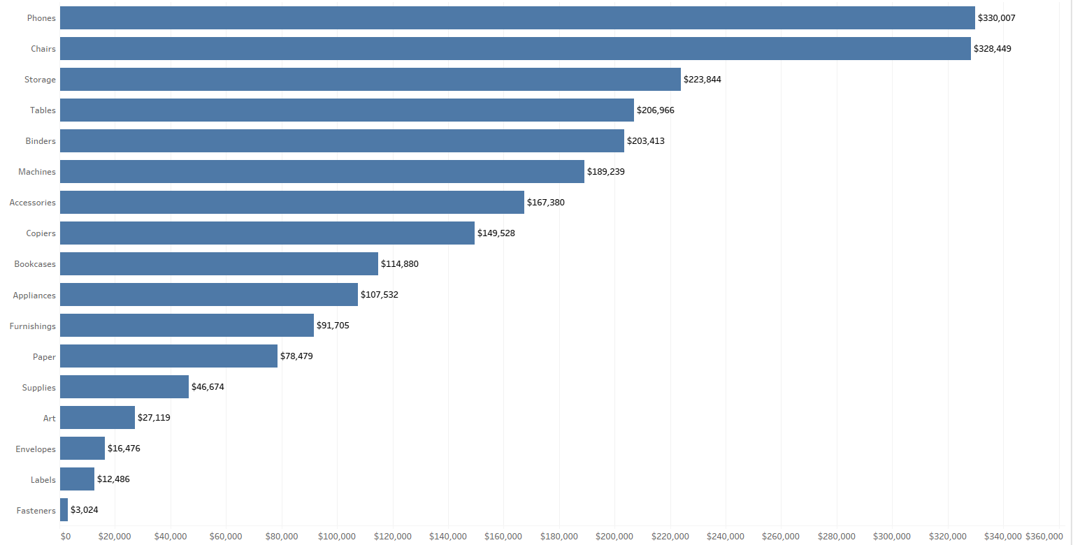
The Bar Chart
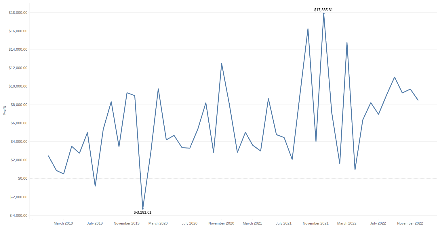
The Line Chart
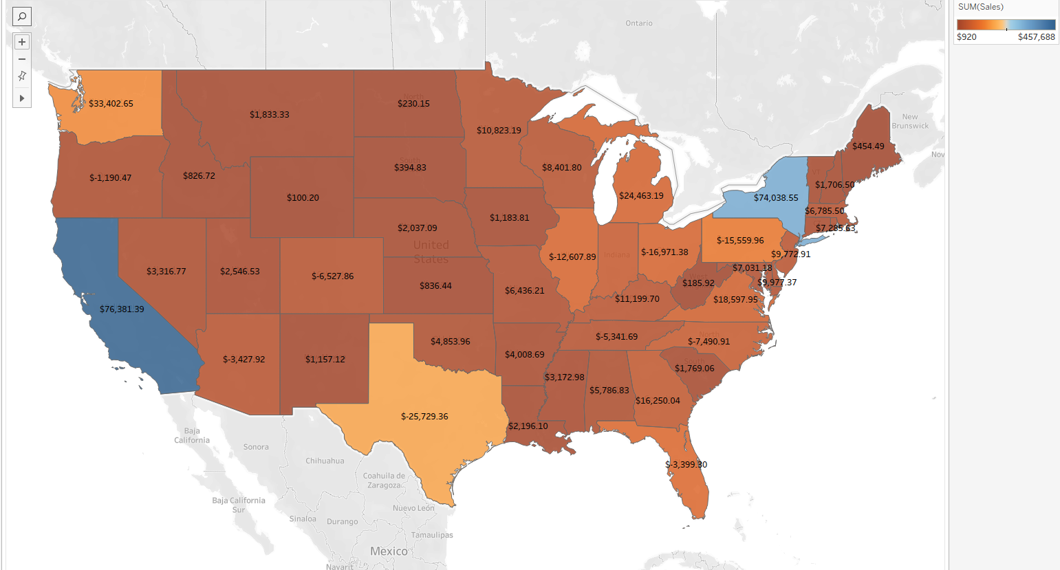
A Map View
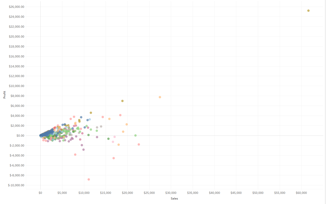
The Scatter Plot
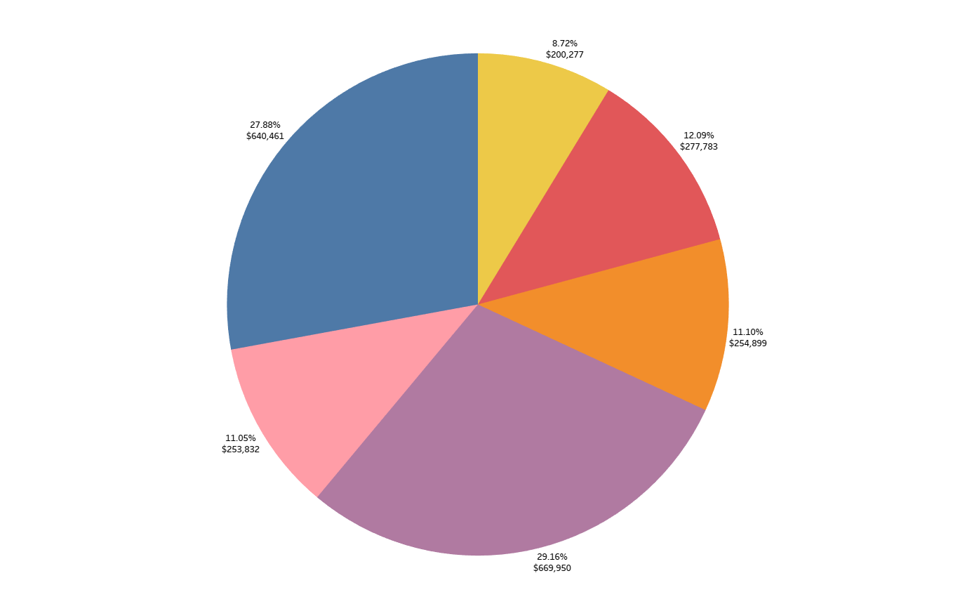
The Pie Chart
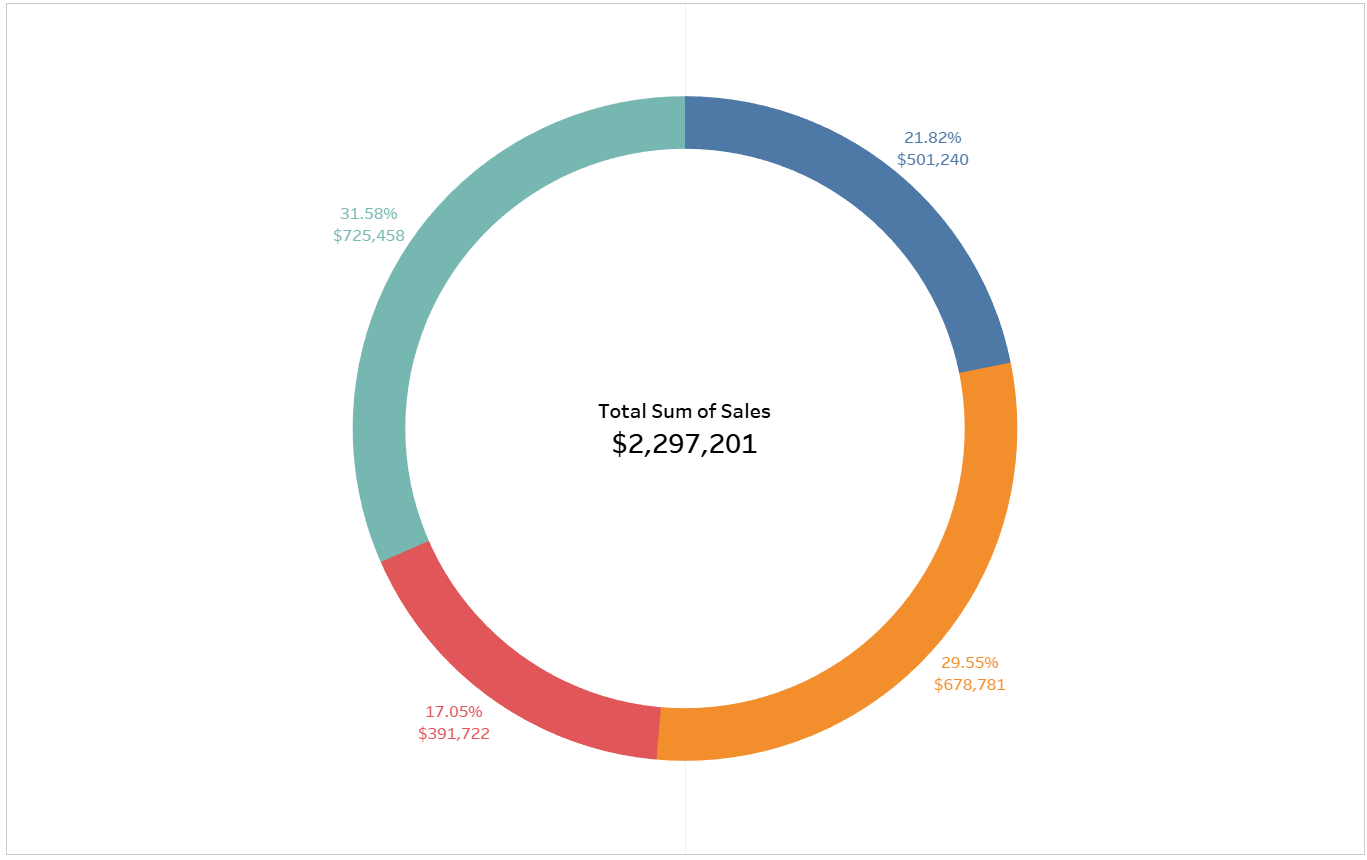
The Donut Chart
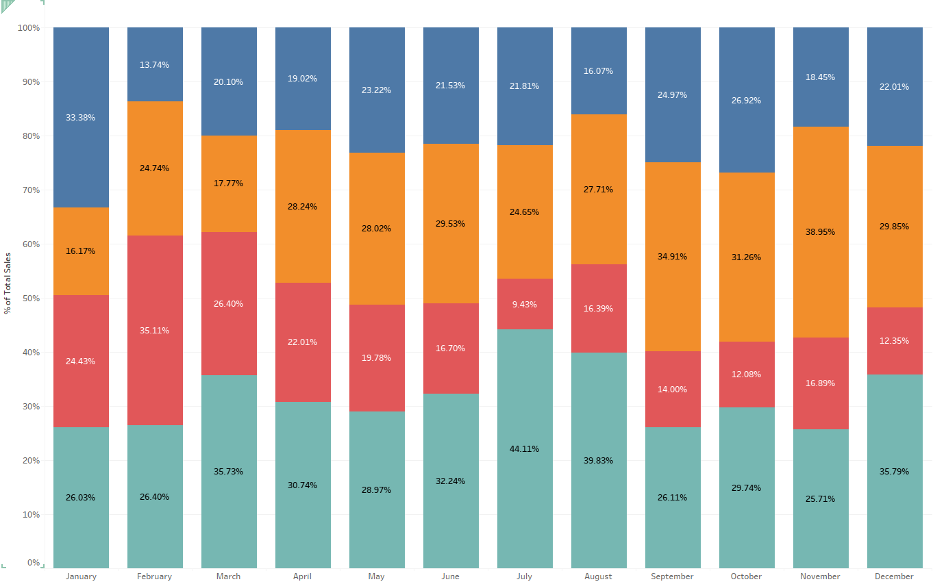
The Stacked Bar Chart
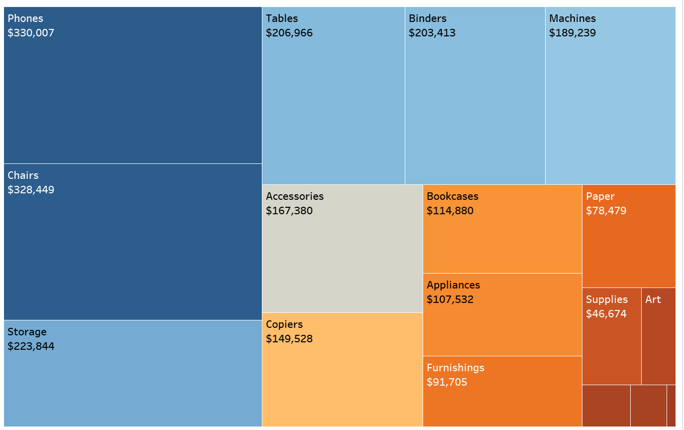
The Tree Map
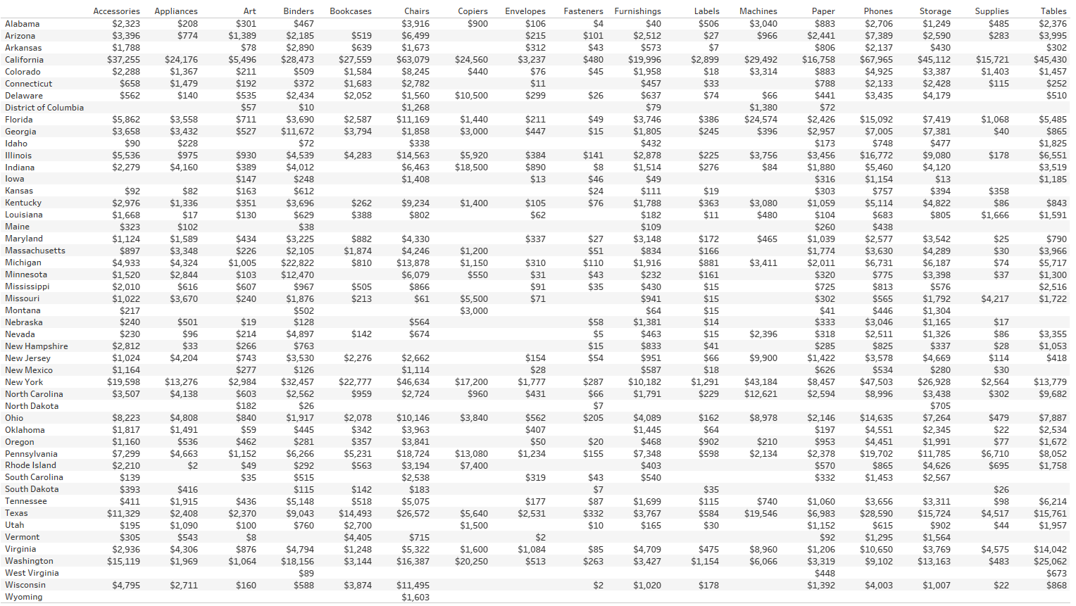
A Table
There are so much more different types of visualizations available, I haven't even scratched the surface! Having minimal knowledge on Tableau before coming into The Data School, I couldn't even begin to think on how to make these (looking at you donut chart!). However, in just one month of training, I can confidently recreate these charts! I can't wait to see how much more I can learn and expand my knowledge!