


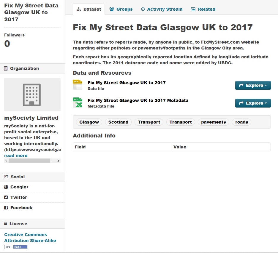
Accessibility Day!
Today, we were tasked in creating a tableau dashboard with many different accessibility features. That means creating visuals that account for the many different possible disabilities that can hinder a person’s ability to perceive the dashboard.
Features that fulfill that criteria:
- Using Colour-Blind accessible palettes
- Having easy-to-read text (no difficult font types, not too tiny, not too many variations of size
- Avoiding visual overload (Too many marks, colors, and categories)
- Having a caption to better describe the dashboard.
- Having descriptive text under titles to help people navigate the dashboard easier
- Having High-contrast colors to help people that have difficulty seeing.
- Being able to be read by a screen reader
- Having the ENTIRE dashboard be navigated with only a keyboard, or only a mouse.
Having said that, creating a dashboard that fulfills most (if not all) criteria will be an extremely daunting task.
We were given a dataset that described the location of hazards in Glasgow. These Hazards were Potholes, and Pavements/footpaths. It contained the longitude and latitude of each of these hazards as well as the name of the area/district.
Starting with my dashboard, I wanted to first create a map that showed the different points of where these hazards were located. Firstly I created filters that allowed people to choose between seeing potholes or Pavement/footpaths as well as filter on a specific district. The map will move according to the specified conditions. However there was a difficult issue that rose from this. For some districts, the map would sometimes zoom out to the entirety of Glasgow as well as do the complete opposite by zooming so far that it would be impossible to see where these potholes were. Not only that, but it was extremely jarring to see the map zoom in and out constantly.

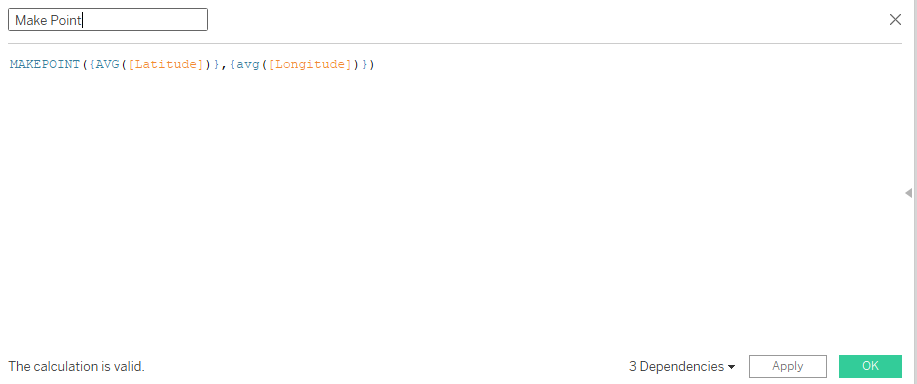
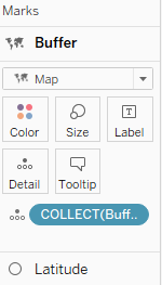
To resolve this issue, with the help of the core team, I created two calculated fields, a “Make Point” and “Buffer” field. The “Make Point” field would simply use the makepoint function and would use the longitude and latitude. The “Buffer” field would use the “Make Point” field as well as have a certain buffer distance around the point. I would then put the buffer as another map layer.
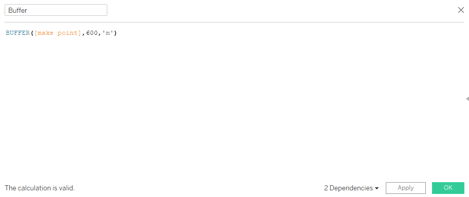
I would then disable the zoom extent on the latitude mark and have the buffer mark as sort of an “anchor” to have the zoom level remain fixed. As a result, whenever I changed districts, the zoom would not zip around like before.
Another accessibility feature for the dashboard was having a screen reader be able to interpret it. This meant instead of using sheets as text, we instead have to use actual text containers in order for the screen reader to actually read it. This comes at a cost however, the text would unable to be dynamic, should the data be uploaded.
You can see my Dashboard here