


As boxplots are not a default visual in PowerBI, creating one often requires downloading 3rd party created custom visuals where there's a chance it will not work as you want.
To overcome this and provide the option of the box plot having a drill down we can create this by heavily formatting a different default visual.
First we must calculate the components of a box plot: the median, 25th percentile, 75th percentile, interquartile range, upper whisker and lower whisker.
The following calculations will be working on a salary distribution across an organisational hierarchy - for now let's look at the calculations:
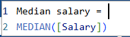
To calculate the median, simply use the median function
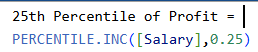
To calculate the 25th percentile, use the PERCENTILE.INC function and repeat this step using 0.75 for the 75th percentile
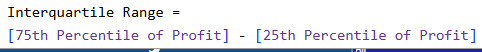
The IQR is simply the difference between the 75th and 25th percentiles
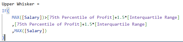
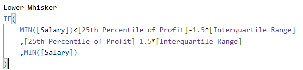
For the upper and lower whiskers we need this to dynamically show the extremities within the data without having to manually check ourselves - hence we set up the following IF statements. To understand what is going on let's focus on the upper whisker. The first part of the IF statement is the condition to check if the MAX salary is greater than the 75th percentile + 1.5 * IQR (which is the typical calculation for the upper whisker in box plots). If so, it should return the second condition which is the 75th percentile value + 1.5 * IQR. If the condition is not met, it will return the last condition of the statement which is the MAX salary. This calculation allows the box plot visual to dynamically alter its upper and lower whiskers based on the according data.
Now we have all the components required to build a box plot.
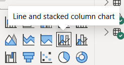
Add a stacked line and stacked column chart to your canvas:
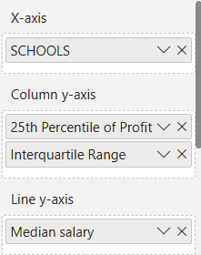
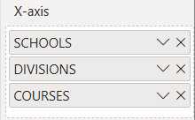
Next in the visualisation pane, add the highest level of your hierarchy you will drill through on the x-axis (we will work with just the highest layer for now for simplicity). On column y-axis add your 25th percentile calculation followed by your interquartile range calculation. Finally on your line y-axis drag on your median salary.
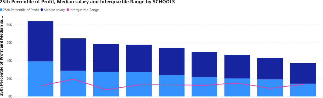
Once you have done this your visual will look something like this:
To get this visual to look like a box plot we will format it:
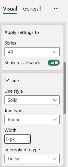
Open the line formatting options and change the width to 0 pixels
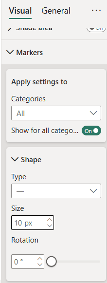
Next, open the markers drop down, turn the markers on and select the "-" shape, increase the size to what you want 10-20 pixels works best here, and choose a colour just below this to whatever you want (darker colours work best here):
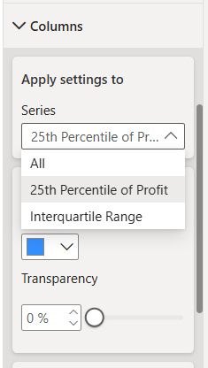
Next open the columns drop down, just below will be the colours drop down. Select 25th percentile from the series options dropdown and make this 100% transparent. Then select the interquartile range and select a colour and a transparency you want so it is easy to see the hyphen marker from earlier:
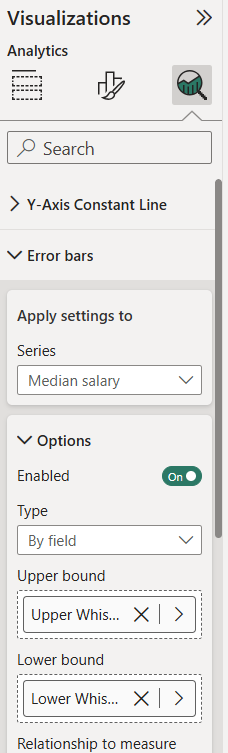
Finally, open the analytics pane on the visual, open the error bars drop down, turn the error bars on and add the lower & upper whisker calculations to the upper and lower bound options:
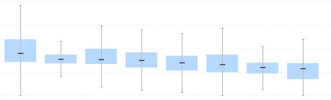
Once you have completed these steps your box plot, at the highest level of hierarchy will be constructed:
To build the drill down drag the subsequent layers of your hierarchy in order under your highest level on the x-axis in the visual:
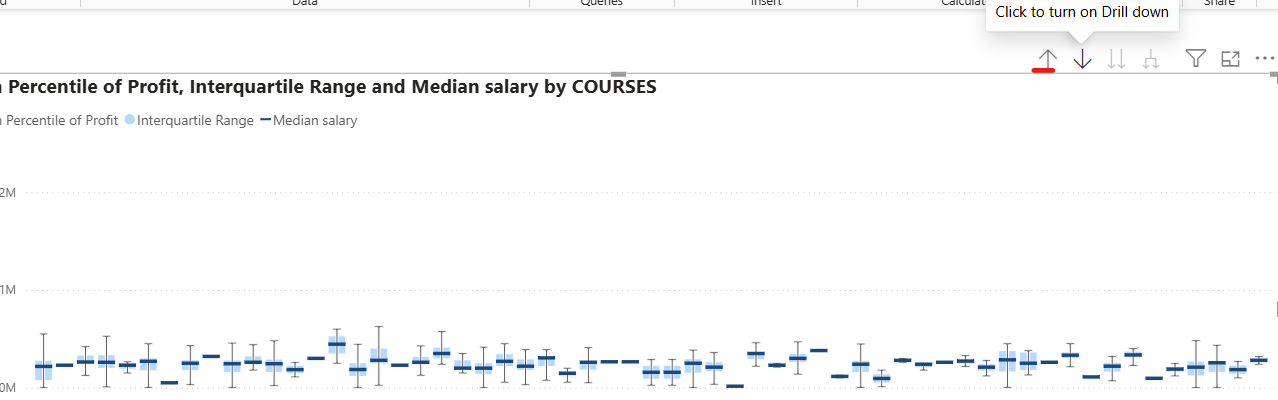
This will blow up your visual, but don't panic, simply turn the drill down option on and drill back up to the top by clicking the up arrow underscored in red below:
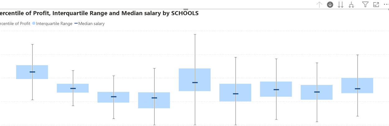
Once you have drilled up to the highest layer you have your multilayer drill down boxplot for your data:
Make sure to edit and format your axes, title and legends as you see fit!
The nice thing about this visual is you can turn your drill down off at any layer and turn the visual into a filter so for example, I could drill down to divisions and then filter other charts by a selected division for further exploration.
Now you know how to create a drill down boxplot in PowerBI without having to download custom visuals, have fun building these out yourself!