


A bump chart visualises how a metric for a particular category has changed ranks over time. In this example we will look at how sales by region has ranked over the year for each month.
We will first construct the rank calculation based on sales for each region (Central, East, West, South):

The constructed calculation totals the sales for each region and ranks each region accordingly.
To construct the chart we will select the Line Chart visual in the visualisations pane:

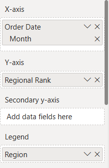
We will then drag order date onto the x-axis; our created calculation, regional rank, on to the y axis and region on to the legend.
Finally we will format the chart to obtain the visual we want:
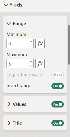
First format your y-axis: the range has been extended so that the entire visual is seen in the chart view, the axis inverted so the highest rank is at the top rather than the bottom:
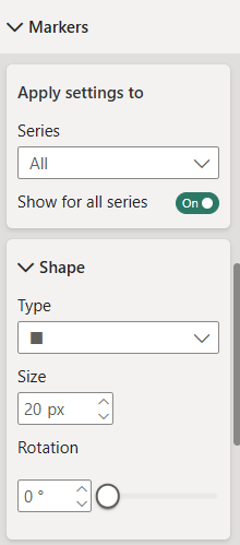
In the visual pane we will turn markers on and select a shape of choice for each rank marker:
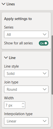
We will format our line to make it as clear as possible in the visual:
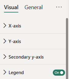
Turn on the legend if it isn't on already so it is clear what region is which:
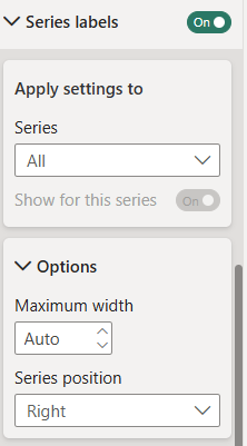
Finally we will format the labels so we can see what region is ranked where at the end of the year:
Once all the formatting is done you should have a bump chart showing how the regional sales ranks for each month:
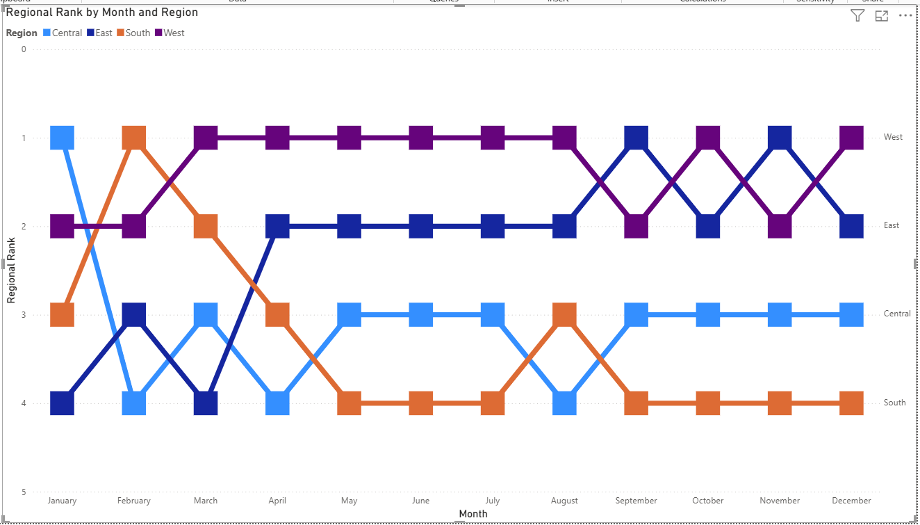
Alter the formatting as you wish for your use case and once your chart is created, you can select a region on both the visual or legend to highlight that regional fluctuation over time.