


I’ve recently been deep-diving into a personal HR analytics project using a "Real World Fake Data" set. My goal was simple: practice my dashboarding skills and understand how to extract meaningful DE&I insights.
I built three primary charts to work together:
- An Ethnicity Bar Chart (the main engine for insights).
- A Gender Donut Chart (the first level of filtering).
- An Attrition by Department Chart (the second level of filtering).
The Challenge: When Interactivity Breaks the Math
The complexity wasn't just making the charts talk to each other, it was making the labels and tooltips smart enough to keep up. I wanted them to adjust instantly to reflect whichever specific population was selected, without the numbers "breaking" or showing the wrong context.
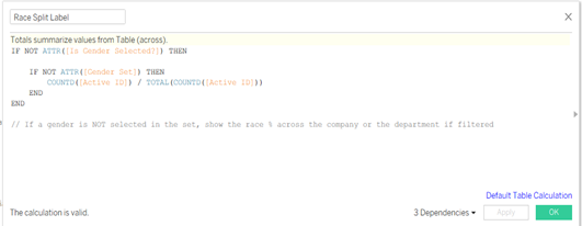
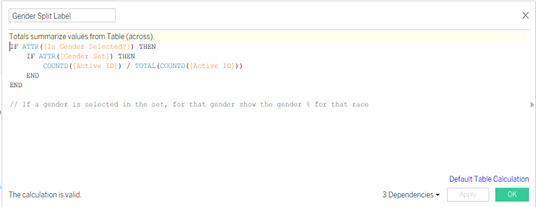
The "Label" Hurdle: Down vs. Across
I used proportional brushing on the ethnicity bars. If you click "Female" on the donut chart, the ethnicity bars highlight the proportion of women within each ethnic group.
This created a logic puzzle for the labels:
- No filter? Show a Table Down calculation (Ethnic makeup of the whole company).
- Gender selected? Show a Table Across calculation (The gender split within that specific ethnicity).
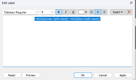
To solve this, I had to create "Dual Labels", two separate calculations sitting on the label mark that "hand off" to each other depending on the view.
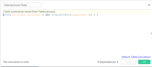
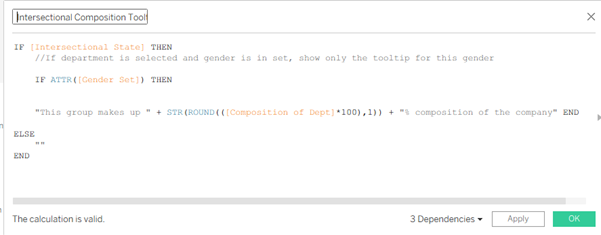
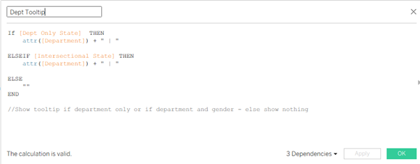
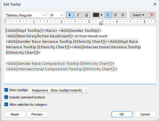
The Tooltip "Brain": 11 Calculations for 1 Experience
With three charts interacting, the data gets dense. I wanted to show how a department's diversity compares to the company average, but I didn't want to clutter the UI. The tooltip was the only way to go.
Almost every word in my tooltips is a calculation. I needed 11 separate calculations just to handle the "State Logic." The tooltip has to ask itself three questions before it speaks:
- Am I looking at the whole company?
- Am I looking at a specific gender, but the whole company?
- Am I looking at a specific gender within a specific department?
If the state is true, show the value. If not, disappear. Even the word "Department" only appears if you’ve actually filtered by one!
The Takeaway
In the two weeks I spent on this, I spent two full days just refining these labels and tooltips. It might seem like overkill, but in analytics, context is everything. Raw numbers are fine, but showing a manager exactly how their department’s gender divide compares to the company average, accurately and instantly, is where the real value lies.