


Often it is useful to highlight specific fields in your dashboards using colours.
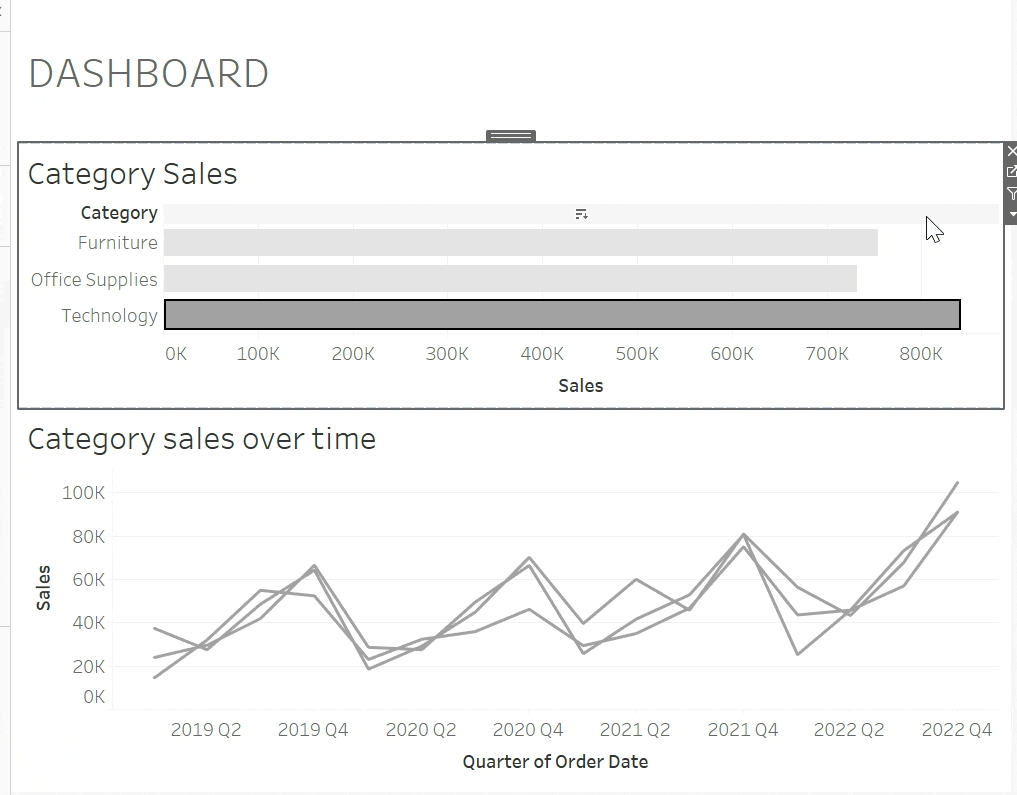
In this example, when you click on a category from one sheet it will highlight the same category from the other sheet.
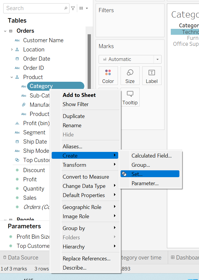
Once you have created the charts, right-click on the field you have chosen and create a set.
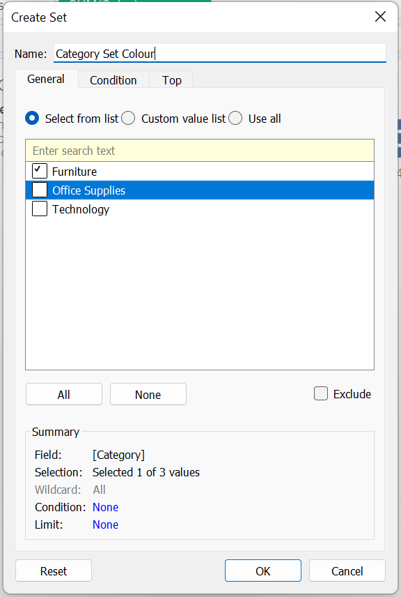
Next, tick one of the names in your field and rename your set.
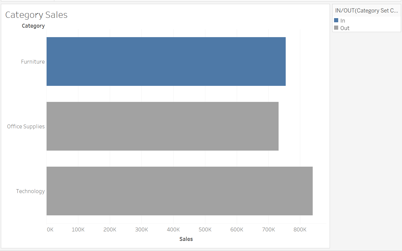
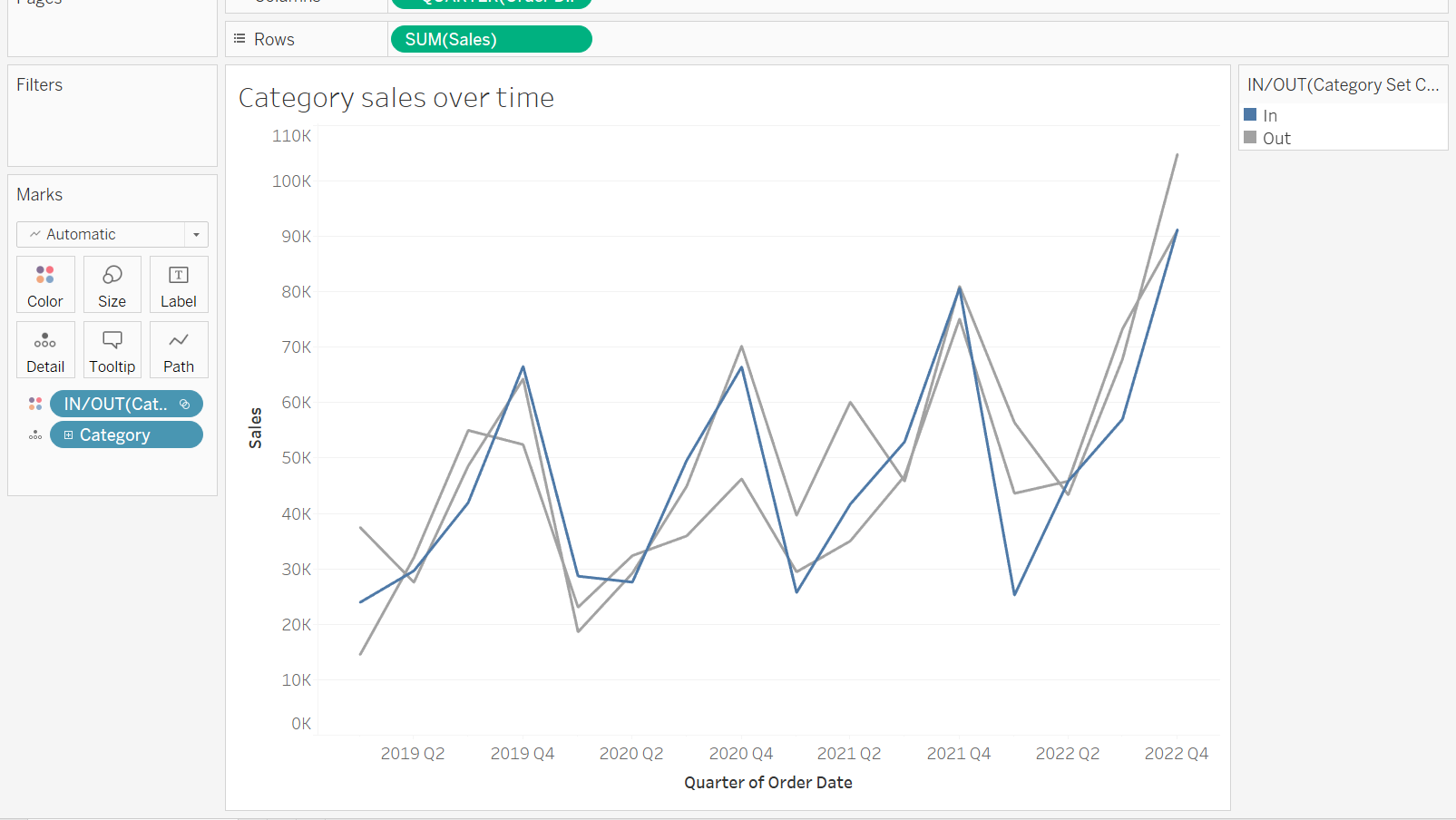
Then, drag your set onto colour. You should see the selected name marked as 'In' and the other names marked as 'Out'.
Add the same set onto colour in your second sheet.
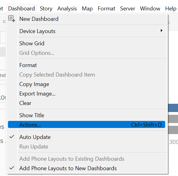
Once your dashboard has been created, click on dashboard and actions.
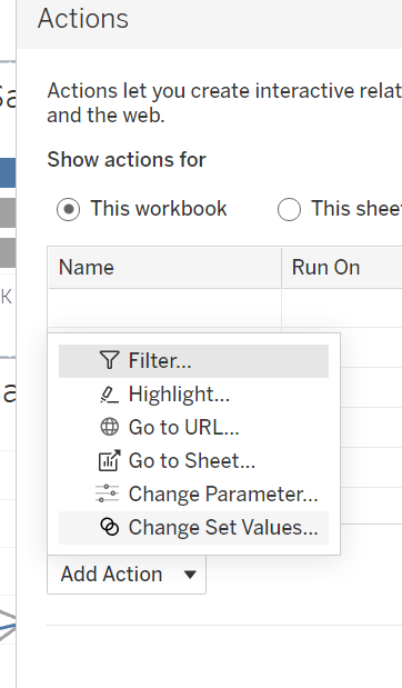
Next click on 'Change Set Values' .
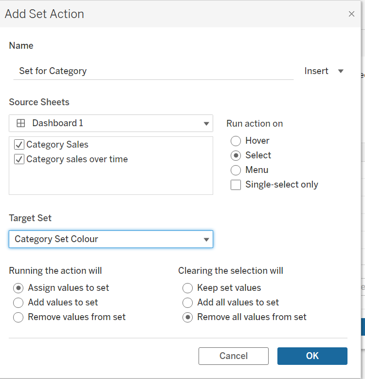
You now want to tick the sheets this set action will affect and select the set you want to target.
Next, click on 'Assign values to set' so that when you click on a name within your chosen field it will assign this value to the set.
For the final part you can either tick 'keep set values' which will keep the previous name highlighted after you have clicked off or 'remove all values' which will show no highlighted name unless you have clicked it.
Now when you click on a field name it should highlight the colour in both sheets!