The task was to create an interactive personal profile dashboard, but there was no dataset provided. Instead, we had to build our own data model from scratch and use the visualisation tool opposite to the one we worked with yesterday. Since I spent yesterday in Tableau, I was using Power BI.
This was a really interesting challenge, with a personal aspect which gave us a chance to enhance our CVs and create something visually appealing.
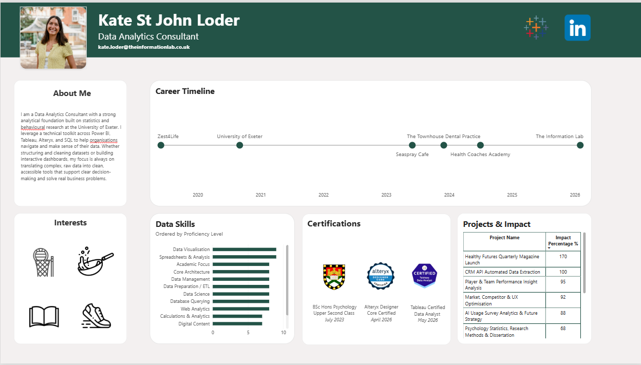
Creating the Data Model
The first challenge was deciding how to structure everything. I used Gemini to create a mock dataset, feeding in my CV, as well as adding in additional information about projects I have worked on at The Information Lab. I made sure to be careful to exclude any specific client names.
I generated three tables:
- Experience - a timeline of my education and professional roles, including my Psychology degree at the University of Exeter.
- Projects - individual projects with details such as hours invested and measurable outcomes.
- Skills - my current proficiency levels alongside targets for the next 12 months.
One thing that made a huge difference was avoiding vague text descriptions when recording project outcomes. Wherever possible, I used measurable figures instead. Examples included:
- 95% client satisfaction for a football club analysis project
- 35% reduction in reporting time for a banking project
- 170% increase in website traffic
Having clear numerical metrics made it much easier to build meaningful visualisations in Power BI.
Designing the Dashboard
The most frustrating part of building in Power BI was creating a clean career timeline. Getting the dates onto a simple horizontal timeline was straightforward, but positioning labels without creating clutter took a lot more trial and error than expected.
At one point I experimented with a DAX calculation that staggered points above and below the timeline. It worked technically, but the result looked messy and distracted from the clean, linear style I wanted.
I ended up figuring out how to have the labels on each circle representing the company I worked in, and then relying on tooltips for additional information about the role.
I wanted to add things like a percentage metric to depict how much impact I had made based on each project I have worked on throughout my career.
I also wanted to include a personal touch - so I added in a section about my interests, using icons to show these and activating tooltips.
To include some interactivity, I used the career timeline to select an employer to filter the data skills bar chart, showing the data skills obtained in that role.
What I Took Away
The biggest lesson from today was how important data preparation is. Most of the work happened before I even started building visuals.
Taking the time to structure the data properly and create clear relationships between tables made the dashboard much easier to build. Once everything was connected correctly, cross-filtering worked seamlessly. Selecting a skill instantly highlighted the projects where it had been used, making the dashboard far more interactive and useful.
I received some feedback about changing my data skills by chart to be ordered by how long I have had the skill, rather than a fictional score about proficiency level.
Overall I really enjoyed this project, and surprisingly really enjoyed building it in Power BI. The personal element of the experience made it really enjoyable to generate data on and then visualise.