For Day 3 of Dashboard Week, we were challenged to build an inclusive tourism dashboard for Chloe, a representative from the Mayor's Office who has dyslexia and dyscalculia.
The brief focused on a problem that many dashboards don't really consider: how overwhelming dense visualisations can be for people who struggle with processing large amounts of text, numbers, colours, and data points at once. Typical city planning dashboards often rely heavily on percentages, crowded tables, and complex layouts, which can make them difficult to use.
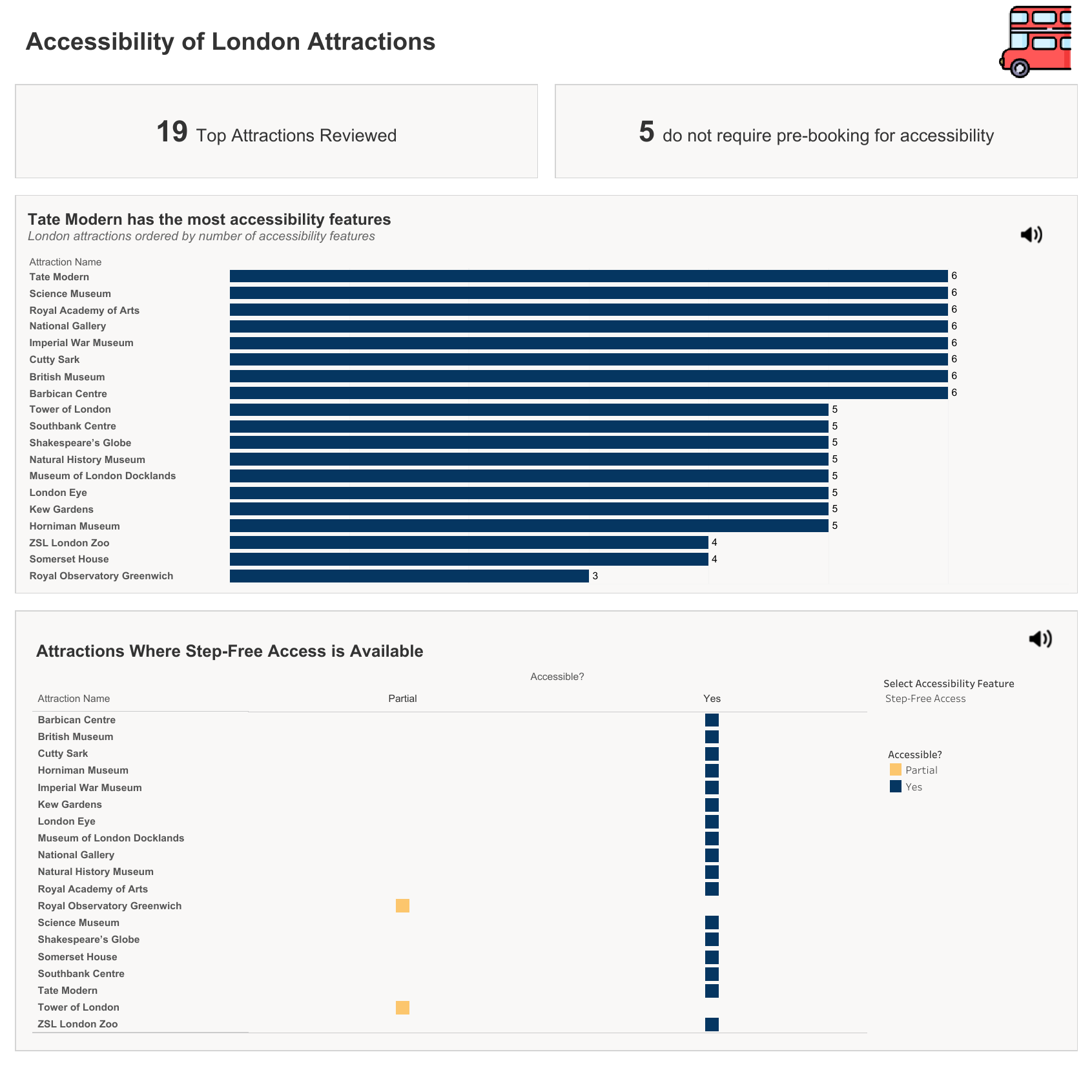
Using a dataset of London's top 19 attractions, my goal was to create something that was easy to navigate and understand without sacrificing useful information.
My Approach
Rather than focusing on exact numbers, I wanted the dashboard to communicate information visually. Since Chloe may find it difficult to compare figures or interpret decimals quickly, I relied on visual cues instead.
The dashboard ended up being built around two main components:
Overall Accessibility Ranking
The first section is a horizontal bar chart showing the attractions with the highest number of accessibility features. To keep things as simple as possible, I removed the X-axis entirely and let the length of the bars do the work.
Feature Switcher Matrix
Below the ranking chart, I created a checklist-style matrix. Using a parameter dropdown, the user can select an accessibility feature such as Step-Free Access or Wheelchair Hire. The matrix then updates to show whether each attraction offers that feature.
I used a simple colour system:
- Navy blue = Yes
- Soft orange = Partial
- Light grey = No
This made it easy to scan the information without needing to read through lots of text.
What I learnt
One of the biggest lessons from this project was learning when to stop adding things.
Originally, I included a third chart showing the distance between each attraction and its nearest public transport station. On paper, it seemed useful because it highlighted attractions with shorter walking distances.
Once it was added to the dashboard, though, it became clear that it wasn't helping. It added more rows, more information to track, and made the overall layout feel much busier.
In the end, I removed it completely.
I included it in my presentation and explained why I chose not to use it. That decision actually sparked some good discussion around cognitive load and how every element on a dashboard should earn its place.
With more time, I would find a way to incorporate this chart, in a way that is not too visually overwhelming, as it is a useful chart.
Presentation Feedback
The presentation went really well, and the feedback was largely positive. People liked the thinking behind the layout and felt it addressed the accessibility brief effectively.
One piece of feedback that stood out was about my dashboard title.
I had written a title suggesting that Tate Modern had the most accessibility features. While that was technically true, several other attractions had exactly the same score. By highlighting only one attraction, the title was unintentionally misleading.
A better title would have been something like "London's Top-Tier Accessible Attractions" because it reflects the data more accurately.
It was a good reminder to be careful of oversights, particularly when time is tight and it’s easier to brush past these things.
Final Thoughts
Going into this project, I expected accessibility features to feel like a box-ticking exercise.
Instead, it ended up being one of the most interesting Tableau tasks I've worked on so far. I learnt about screen readers, colour contrast, accessibility standards, and design decisions that I'd never really thought about before.
The biggest takeaway for me is that good accessibility often leads to better design overall. When you remove unnecessary clutter and make information easier to understand, everyone benefits - not just the people you're designing for.