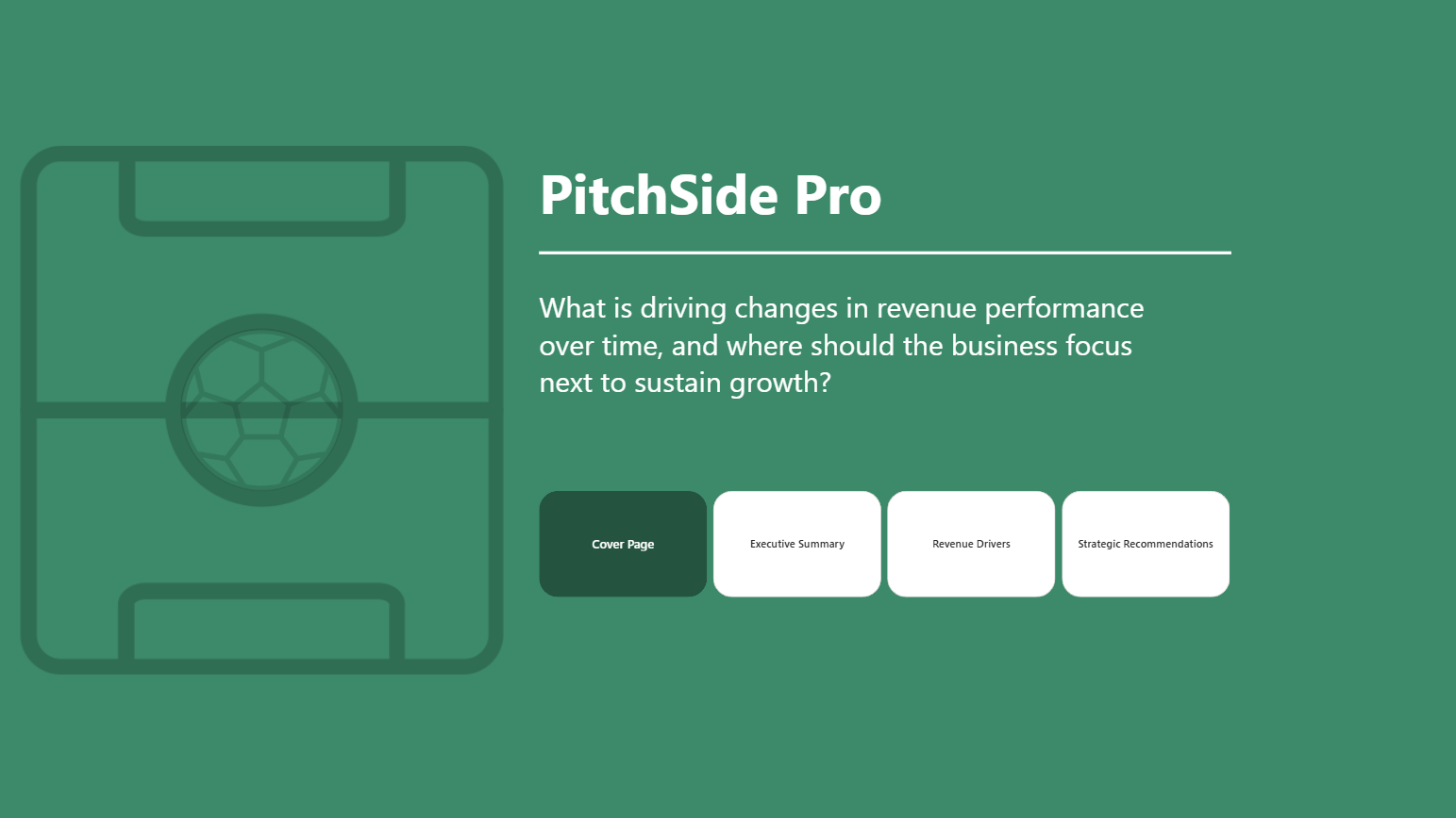
Over the past two days, our first challenge of dashboard week was based on Round 1 of the Power BI Dataviz World Championships, a competition designed to challenge participants to create impactful, business-focused dashboards using Power BI. The challenge centred around a fictional global football e-commerce retailer called PitchSide Pro, which sells football boots, kits, national team merchandise, fan collectibles, and other football-related products.
The objective was to answer the following question:
What is driving changes in revenue performance over time, and where should the business focus next to sustain growth?
This project gave me the opportunity to work through the full analytics lifecycle, from understanding the data and building a model, through to dashboard design, storytelling, and presenting insights.
Understanding the Data
The first stage of the project was understanding the dataset and data model. There were seven tables provided in total, consisting of:
- Two fact tables
- Five dimension tables
Before building anything, I spent time identifying the granularity of each table and understanding how the data related together. Establishing this early was important because it allowed me to create a clean model and avoid relationship issues later in the project.
Fortunately, the dataset itself required very little preparation. However, I did encounter an unexpected challenge with the date fields.
When Power BI imported the data, it incorrectly interpreted the date format. Initially, everything appeared normal, but once the dates passed the 12th day of the month, Power BI began treating the values incorrectly because it assumed a different regional date format. As a result, converting the column to a date data type generated numerous errors.
After experimenting with different approaches and reloading the data several times, I was eventually able to resolve the issue and successfully import the dates without errors. While it was a relatively simple problem in hindsight, it was a useful reminder that even straightforward datasets can present unexpected technical challenges.
Planning the Approach
Before creating any visuals, I focused on understanding the business problem.
Rather than immediately building charts, I wrote down the key question that the dashboard needed to answer:
How has revenue changed over the last five years, and where should the company focus next to sustain growth?
From there, I broke the problem into a series of smaller questions:
- How has revenue changed over time?
- Which products are driving revenue?
- Which regions are performing best?
- Which acquisition channels are generating growth?
- What customer behaviours influence revenue performance?
- Where are the biggest opportunities for future growth?
Answering these questions helped shape the overall structure of the report.
I sketched out several dashboard ideas before settling on a three-page analytical story:
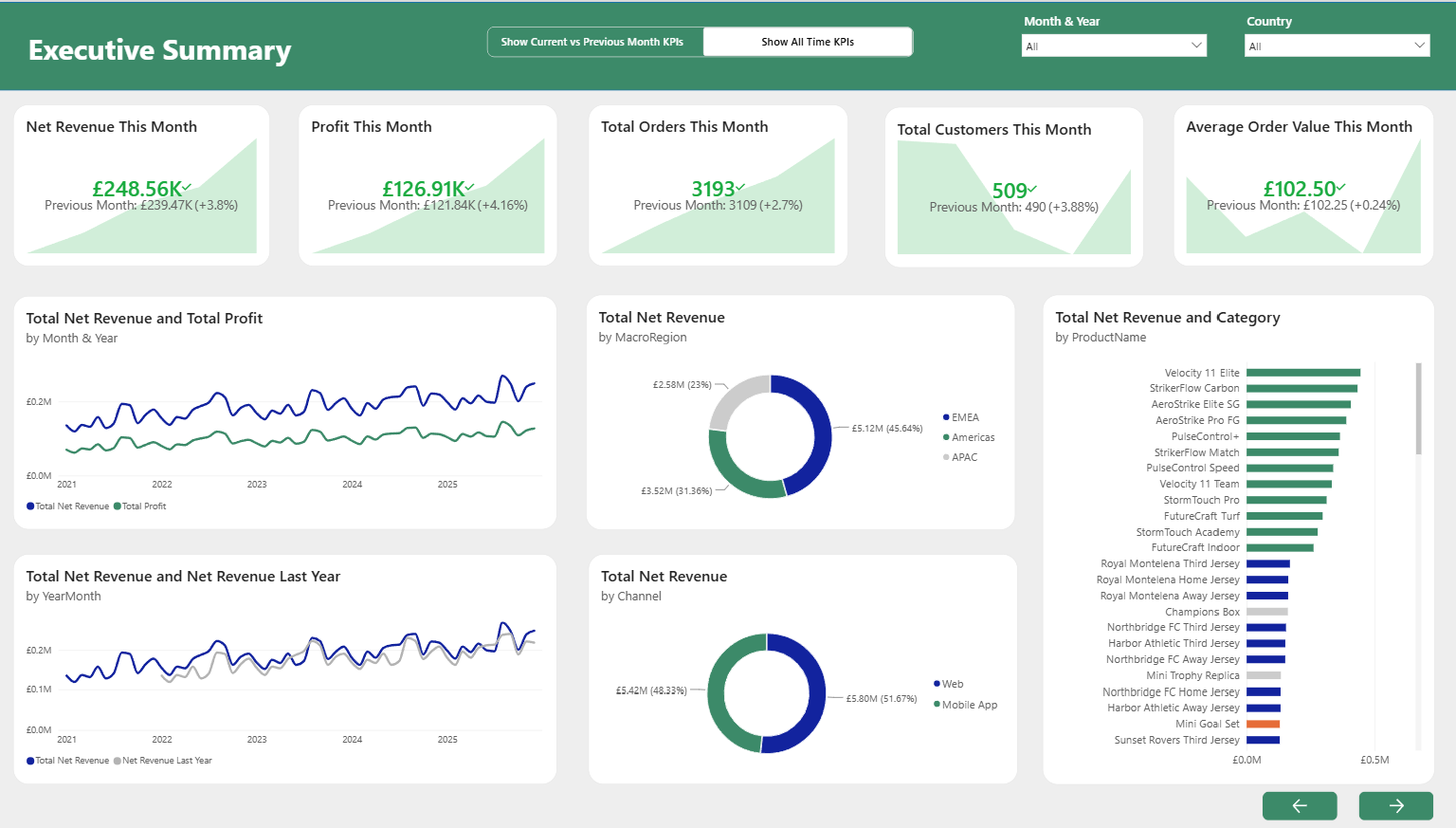
1. Executive Summary
A high-level overview of business performance including:
- Total Net Revenue
- Total Profit
- Total Orders
- Total Customers
- Average Order Value
This page was designed for executives who wanted an immediate overview of business performance.
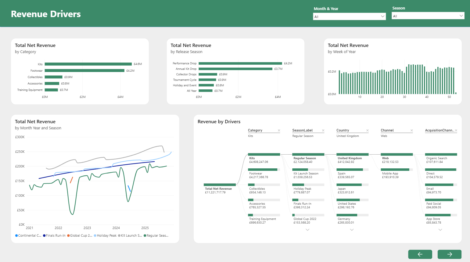
2. Revenue Drivers
The second page focused on understanding why revenue had changed.
This included analysis of:
- Product performance
- Regional performance
- Acquisition channels
- Revenue trends
- A decomposition tree for interactive exploration
The decomposition tree became one of the most valuable visuals in the report because it allowed users to drill into revenue and identify key contributors across countries, product categories, and channels.
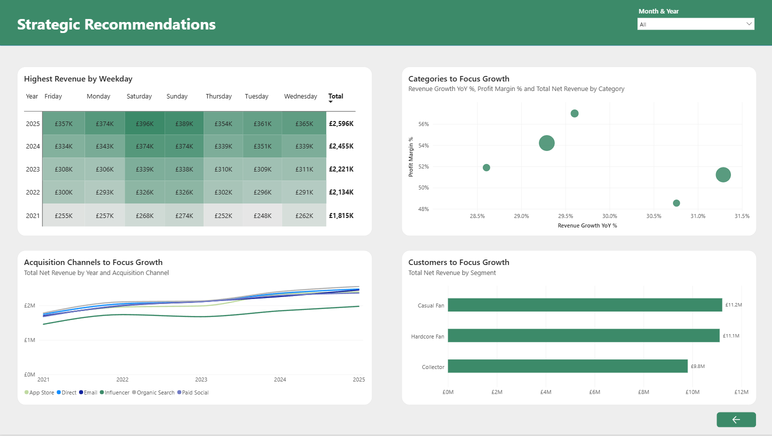
3. Strategic Growth Opportunities
The final dashboard focused on future growth opportunities.
Rather than simply reporting performance, this page was designed to help answer the second half of the brief:
Where should the business focus next?
This page explored traffic trends, conversion behaviour, acquisition channel performance, and strategic recommendations based on the findings from the previous pages.
Building the Dashboards
Once the planning was complete, I began building the dashboards in Power BI.
The majority of the report development went smoothly, but I encountered several challenges when creating measures and KPIs.
Many of the metrics required complex filtering logic and time intelligence calculations. Comparing current performance to previous periods, creating KPI calculations, and ensuring that measures responded correctly to filters all required a significant amount of DAX.
Some of these calculations became quite complicated as I worked around issues related to context and filtering behaviour. However, after several iterations and a fair amount of troubleshooting, I was able to get all calculations working correctly and ensure the reported figures matched expectations.
One of the most satisfying moments was seeing the dashboards begin to tell a coherent story rather than simply displaying individual charts.
Final Report Design
The completed report consisted of:
- A cover page
- Three analytical dashboard pages
- Navigation buttons between pages
- Published report available through Power BI Service
I wanted the report to feel professional while still reflecting the football theme of the business. The overall design remained executive-focused while incorporating branding and visual elements that suited the football retail industry.
Presentation and Feedback
Following completion of the report, I presented the project and received valuable feedback.
One point raised was that some of the line charts did not begin at zero. This is something that Power BI does not automatically enforce, and while the charts were technically correct, adjusting the axis improved readability and reduced the risk of exaggerating trends.
Another area for improvement was increasing the visibility of interactions between visuals. Although cross-filtering was already implemented, there were opportunities to make the interactivity more obvious and encourage deeper exploration of the data.
These were relatively small adjustments, but they reinforced the importance of designing reports not only for accuracy but also for usability and communication.
I made these adjustments before submitting my report to the Power BI competition.
Key Takeaways
Perhaps the biggest takeaway for me was how much I enjoyed using Power BI.
While I expected to enjoy the analytical side of the challenge, I was surprised by how much I enjoyed the process of dashboard design and storytelling. Turning raw data into a clear narrative that helps answer business questions was one of the most rewarding aspects of the project.
Overall, this was an enjoyable and challenging experience that strengthened my skills in data modelling, DAX, dashboard design, and business storytelling, and it has definitely encouraged me to continue developing my Power BI skills in future projects.