


Power BI becomes especially powerful when you move beyond simple aggregations and start combining iteration functions with dynamic visual formatting. One of the best examples of this is building a scatter plot that automatically highlights performance categories using measures such as AverageX.
In this blog, we will walk through:
- What iteration functions are in Power BI
- Why AverageX is useful in analytical visuals
- How to create a scatter plot using iteration functions
- How to apply conditional formatting to colour points dynamically
- How to segment customers into performance quadrants
- Best practices for building readable and scalable visuals
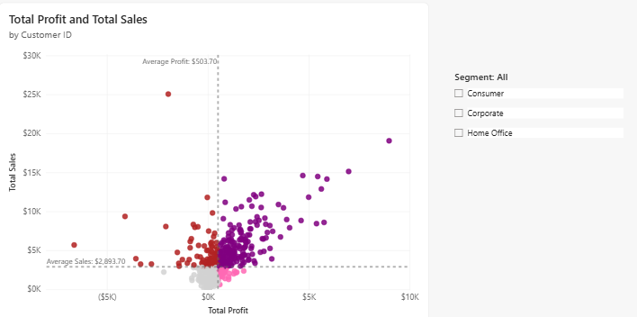
The final result is an interactive scatter plot where each customer is coloured based on its relationship to average sales and average profit.
What are iteration functions in Power BI?
Iteration functions in DAX are commonly referred to as X-functions because they end with the letter X.
Unlike traditional aggregation functions, iteration functions evaluate an expression row by row over a table.
For example:
AVERAGE(Sales[Profit])
calculates the average of a column directly.
Whereas:
AVERAGEX(Customer, [Total Profit])
iterates through each customer and evaluates [Total Profit] before calculating the overall average.
This difference is critical when building analytical visuals such as scatter plots.
Why Use AVERAGEX in Scatter Plots?
Scatter plots are ideal for comparing two measures across a category.
In this scenario:
- X-axis = Total Profit
- Y-axis = Total Sales
- Details = Customer ID
Using AVERAGEX, we can dynamically calculate:
- Average profit across all customers
- Average sales across all customers
These averages become benchmark lines that divide the chart into meaningful business segments.
Building the Core Measures
Step 1: Create Base Measures
Start by creating the core measures for Sales and Profit.
Total Sales =
SUM(Orders[Sales])
Total Profit =
SUM(Orders[Profit])
These measures will drive the scatter plot axes.
Step 2: Create Average Measures Using AVERAGEX
Now create the benchmark measures.
Average Sales =
AVERAGEX(
ALL(Customers[Customer ID])
, [Total Sales]
)
Average Profit =
AVERAGEX(
ALL(Customers[Customer ID])
, [Total Profit]
)
Why VALUES?
All (Customers [Customer ID]) creates a virtual table containing unique customers.
AverageX then iterates through each customer and evaluates the measure for each one.
This produces a true customer-level average rather than an average across individual transaction rows.
Creating Customer Segments with Conditional Logic
Now we want to dynamically classify customers based on whether they are above or below average for sales and profit.
Create a new measure:
Quadrant Colours =
IF([Total Sales] > [Average Sales] && [Total Profit] > [Average Profit],"Purple",
IF([Total Sales]<=[Average Sales] && [Total Profit]<= [Average Profit],"Lightgrey",
IF([Total Sales]>[Average Sales] && [Total Profit]<=[Average Profit], "FireBrick",
IF([Total Sales]<=[Average Sales] && [Total Profit] > [Average Profit], "Hotpink"))))
This measure evaluates each customer against the average benchmark lines.
Applying Conditional Formatting to the Scatter Plot
Power BI allows us to use measures for dynamic colour formatting.
Step 1: Add the Scatter Plot
Populate the visual with:
X-axis = total profit
Y-axis = total sales
Values = customer ID
Step 2: Add the colours
Go to format visual and under 'markers' select 'colour'.
In here, select the fx button
Format style = field value
What field should we base this one? = Quadrant Colours
Step 3: Add Analytics Lines
To create the average lines:
- Select the scatter plot
- Open the Analytics pane
- Add an X-axis constant line
- Set the value to
[Average Profit] - Add a Y-axis constant line
- Set the value to
[Average Sales]
These lines divide the visual into performance quadrants.
Add Slicers
Segment slicers allow users to dynamically filter customer groups.
Examples:
- Consumer
- Corporate
- Home Office
As filters change, the averages recalculate automatically.
This makes the analysis fully interactive.
Final Thoughts
Iteration functions are among the most important concepts in DAX because they allow calculations at the correct analytical level.
By combining AverageX with conditional formatting, you can transform a standard scatter plot into an interactive analytical tool that instantly communicates business performance.
Using iteration functions and dynamic visual formatting helps users understand patterns faster and uncover insights more effectively.