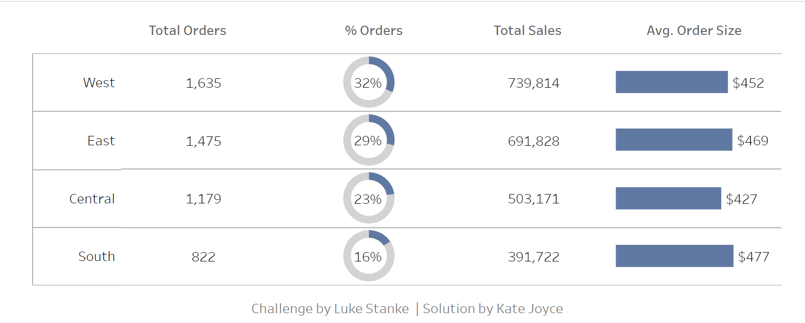
The inspiration for this blog comes from Workout Wednesday 2023 Week 2. The aim of this was to create multiple charts within the same view.
When I first seen this challenge I struggled to wrap my head around how to approach it, let alone solve it. The solution is actually pretty simple. The trickiest bit is actually the pie chart!!
This challenge utilises a lot of Tableau skills including LOD's, placeholders, Table Calcs and tricky formatting. The first thing I did was made a simple table to view the data I already had. I created a Fixed LOD to find the Avg Order Size.
{ FIXED [Order ID]: SUM([Sales]) } and called this Order Size. I dragged this into my rows and made it the average.

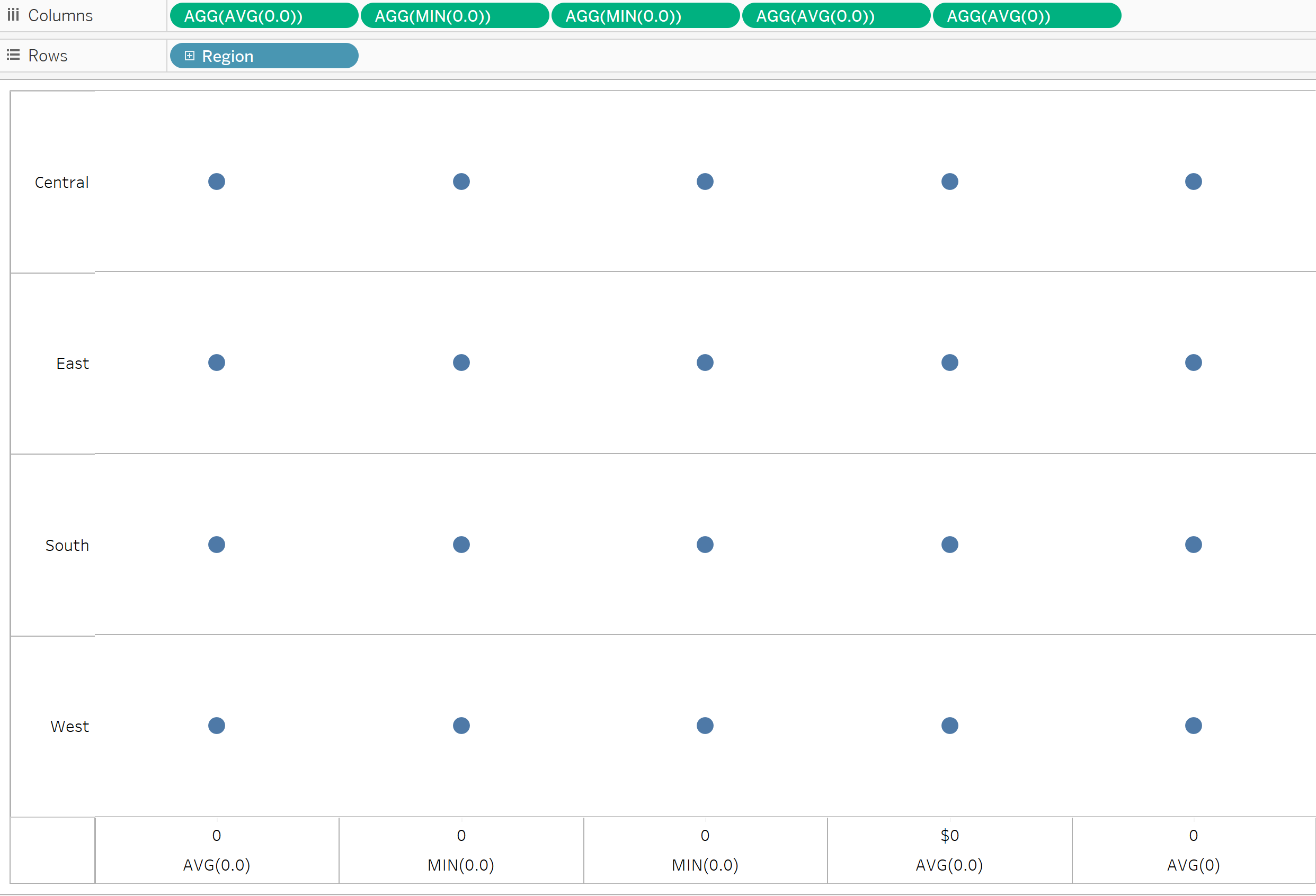
Now I could start to visualise how my chart would come together. I knew I would have to make use of some placeholders like Avg(0) and Min(0) in order to get the position of my charts correct so my next job was to plot out how these would look on the sheet. The challenge has 5 different charts within the one worksheet so I made 5 separate marks within my sheet. I also dragged my Region to the Rows shelf.
Note: later I change the last mark to my Avg Order Size.

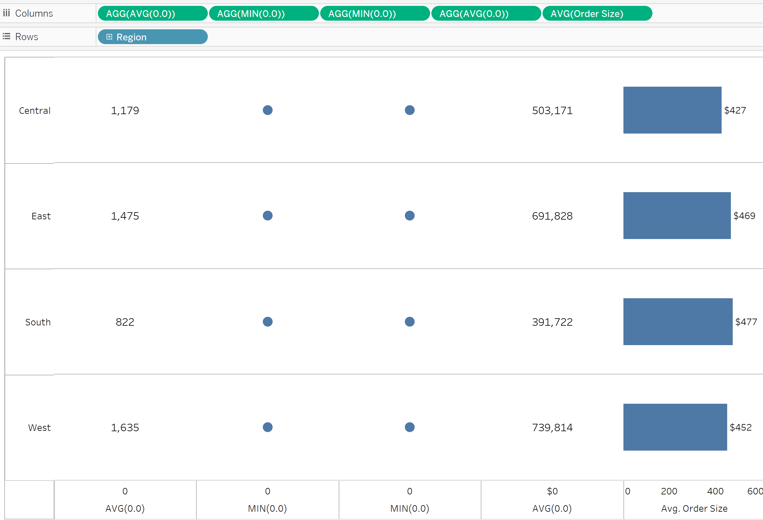
On your first Agg(Avg(0.0)) Marks card, change this to text and right click and drag Order ID onto text. Make this Count Distinct. Next I added my Sum of Sales to my next Agg(Avg(0.0)) Marks card and change this to Text also. This should be your 4th marks card. We will come back to the pie chart at the end. Next you can remove the last Agg(Avg(o.o) and replace it with the Avg(0rder size). Change this to a Bar and Drag the Avg(Order Size) onto the Label. Your view should look like this.

The Final and trickiest bit before formatting is making your pie chart. Before we get into making it there is a few calculations that need to be made in order to get the right percentages. The first I called Total Orders and it was:
COUNTD([Order ID])
The next was Percent of Orders :
[Total Orders]/TOTAL([Total Orders])
The next, I called 1, and was simply:
1-[Percent of Orders]
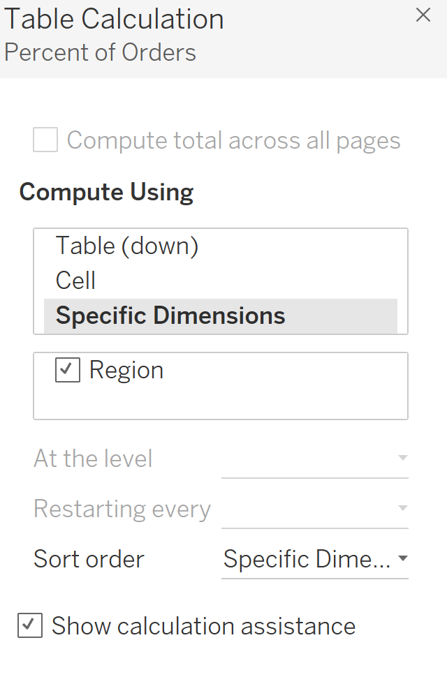
Once these are made you can start making the Pie chart. On your first Avg(Min(0.0) change the mark to a Pie Chart add your Measure name to colour. Next Drag your Measure Values to Angle. Now on the Next Avg(Min(0.0), change this mark to a smaller white circle and include the Percent of Orders Calc on the text. Make sure you Table Calc is configured like below.

Dual axis these 2 marks and make the white circle smaller if needed. That is it! From here, you just need to format it so that it looks like the original.

