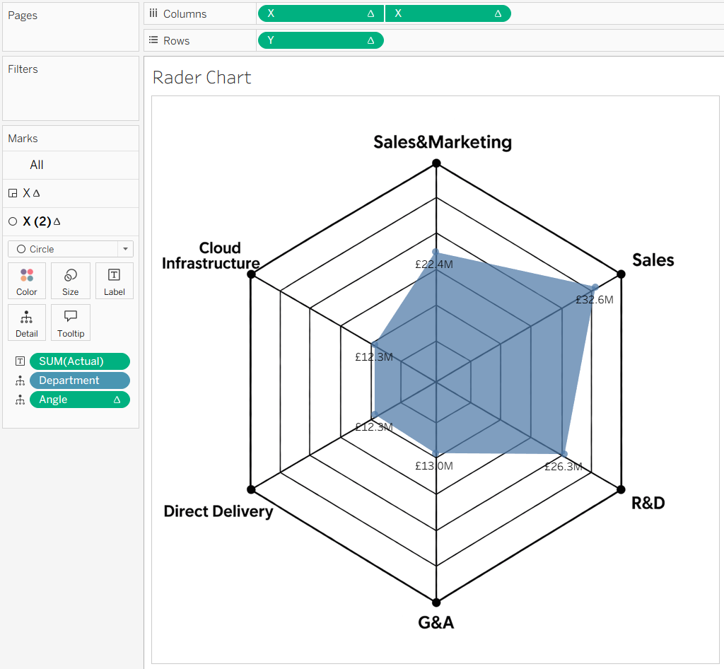
A radar chart in Tableau is a powerful way to compare multiple performance metrics at once, making patterns, strengths, and weaknesses easy to spot. Creating a radar chart in Tableau is quite simple, so let’s dive in and build one step by step.
Creating calculated fields
4 calculated fields are required to create radar chart
- Angle calculation
I use Department to define each category around the radar chart.
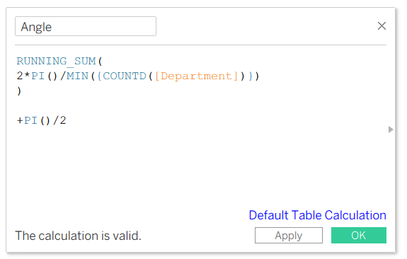
RUNNING_SUM(2*PI()/MIN({COUNTD([Department])}))
= Divide a 360° circle equally among all departments, give each department its next position around the circle
PI()/2 = Rotate all of them by 90 degrees
- Distance from the centre
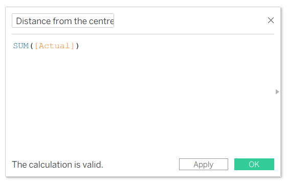
This is to calculate how each data point is positioned from the centre of the radar chart. The higher the value, the further the point appear from the centre
- X coordinate
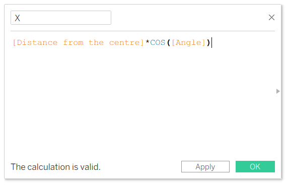
This calculation converts each point's distance and angle into an X-coordinate, allowing Tableau to position it correctly along the horizontal axis of the radar chart
- Y coordinate
Similarly, the Y coordinate uses the point's distance and angle to position it correctly along the vertical axis of the radar chart
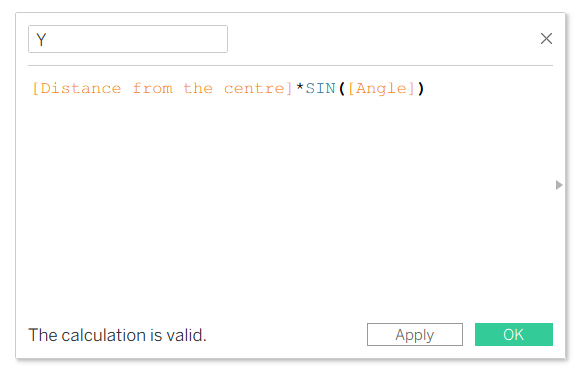
Building the chart
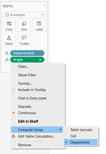
Put Department and Angle onto the Detail on Marks card
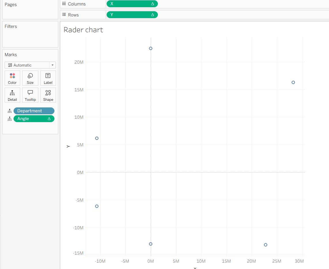
Put X and Y in the chart
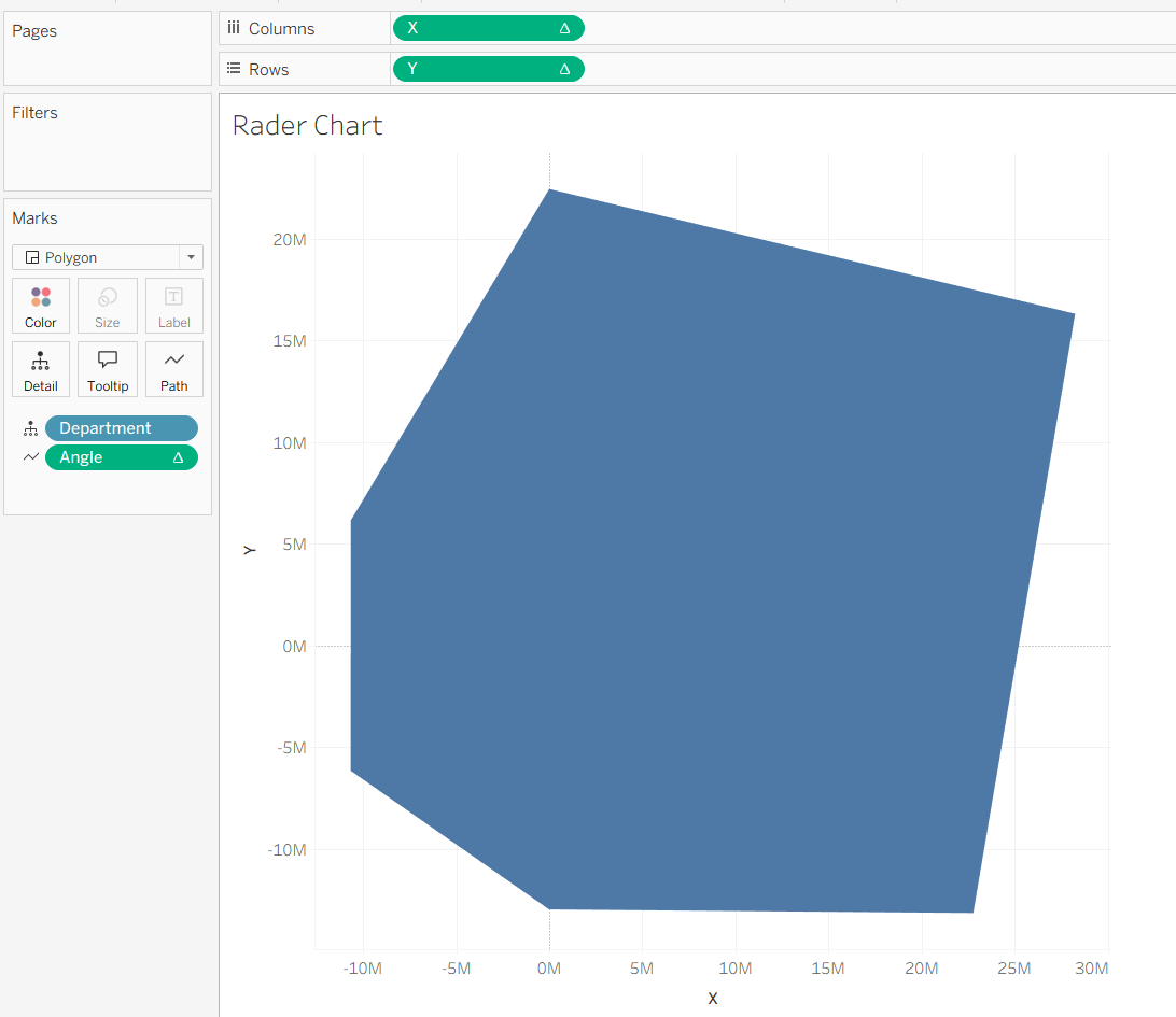
Change the chart type to Polygon, change the Angle to angle to path
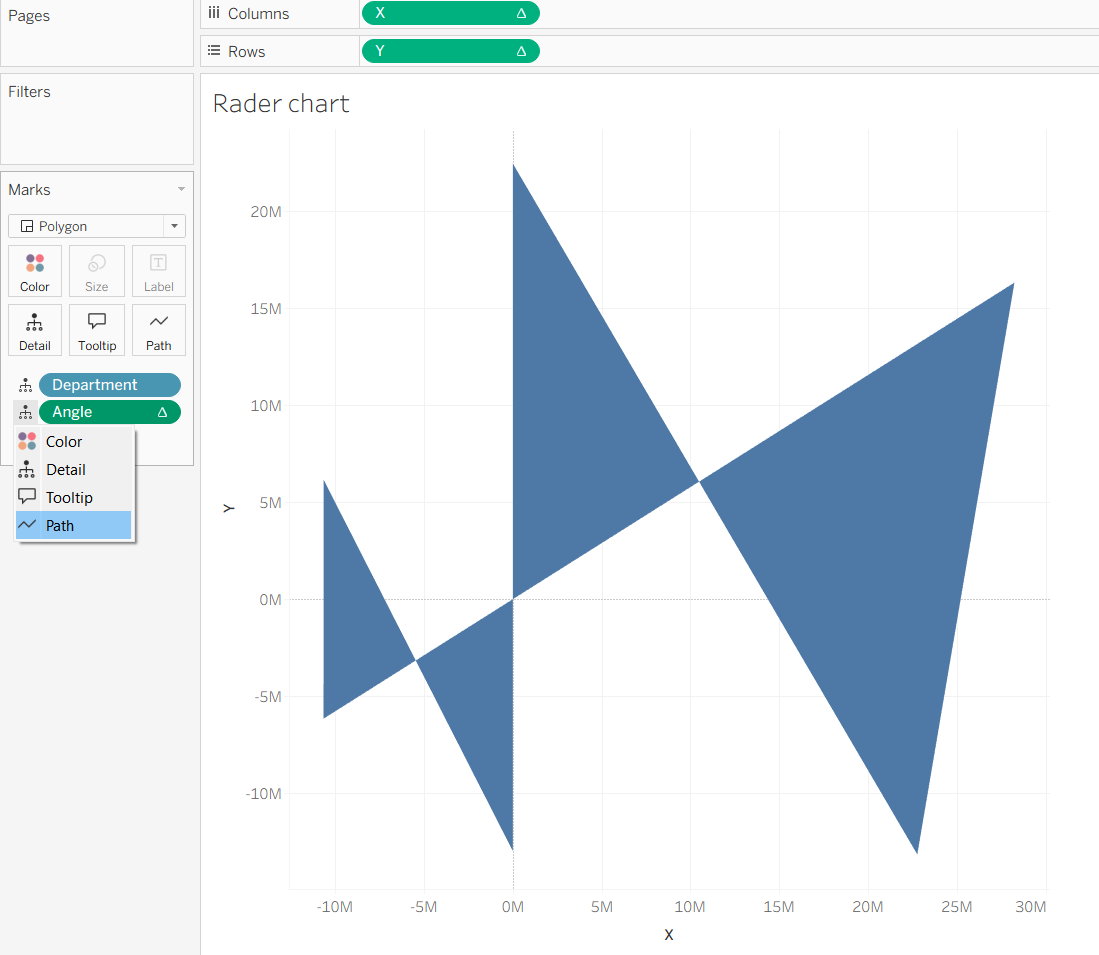
Then it looks like this
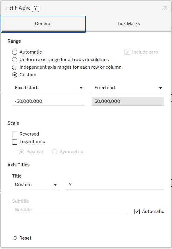
Change both the X and Y axis ranges to the maximum value for each department. In my case, 32M was my maximum value in one of the departments. In my example, 1.5* max value worked well, so I put -50M and 50M as the range
Now the radar chart is almost done! Let's put a background image to make this easier for the user to understand.
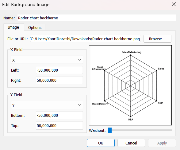
I created an image to create the background of the chart.
Map -> Background images -> click the data source
When the pop-up comes up, click Add image...
Add the coordinate that you put on the X and Y axis
With a bit of formatting, it's done!