One of the powerful features of Tableau is the ability to use parameters to filter your charts and data. This allows you to quickly and easily switch between different views of your data without having to create multiple charts or manually change filters each time. The benefit of using parameters to filter your view as opposed to filters, is parameters are dynamic, meaning they can be applied to any variation of chart once made.
I will use an example taking data about Rugby games and statistics on the players and their teams. I want to make a filter to allow the end user to adjust a scatter plot for a range of variables.
First I want to create a parameter to include all the different variables I want to filter by. For example, I want to filter by the different types of statistics available for each player, and give the end user the option to change the X and Y axis to each variable.
To create a parameter in Tableau, first go to the Data pane on the left side of the screen and click on the drop down arrow in the top right corner, then select “Create Parameter”. This will open the "Create Parameter" dialog box. In this box, you can specify the name of the parameter and the data type, as well as the list of values that you want to be available for filtering.
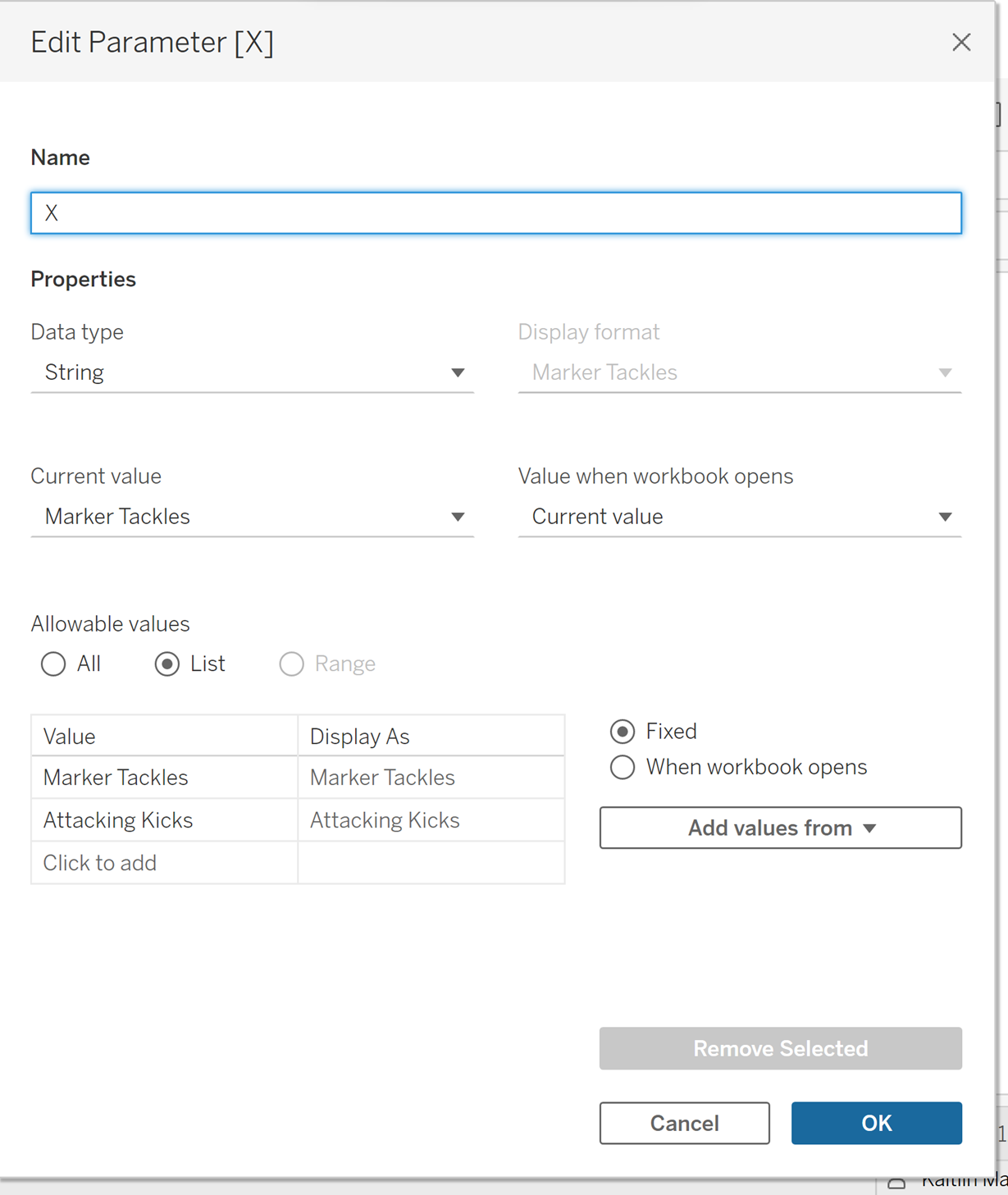
For my data set, I want to create a parameter to adjust the X axis first. I am going to rename the parameter as X. I am then going to change the data type to a ‘String’ as the list of filtering options are words. I am then going to select list under ‘Allowable Values’. This should open a table below. From here I want to add in the ‘Value’ column all the possible measures I want to filter by.
Once added, your dialog box should look like this:

Next, click ok.
To add a parameter for the Y axis, do the same as above, but name your parameter ‘Y’.
Now your two parameters have been created you should see both in the data pane under parameters, as X and Y.
Once you have created your parameter, you can right click on it in the data pane, and select ‘Show Parameter’. This will create a visible filter for the end user to interact with.
Next, to link the parameter filter to your chart, you can create a calculated field.
To create a connecting calculated field, first go to the Data pane, click on the dropdown arrow in the top right corner, and select ‘create calculated field’. From here name your calculated field.
To first create a calculated field corresponding to our ‘X’ axis parameter, I will first name it X.
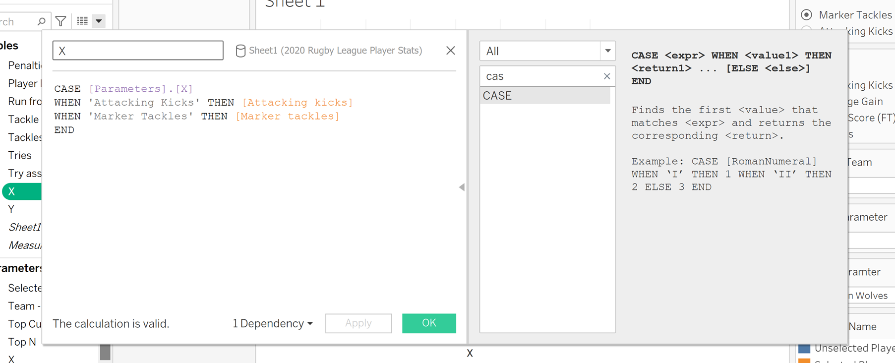
I will then use a ‘CASE’ statement to link each value in you parameter to a measure or dimension. This function is similar to using an if statement, but slightly more efficient. After searching for ‘CASE’ using the side panel. First double click it to input it into your calculation. Next, specifiy which parameter you want to refer to, which for this is the X parameter. Then type when, and one of the values in your list of values in your parameter. Next, type ‘Then’ and the corresponding variable.
Continue this for all the values in your list. Finish the calculation with ‘END’. Your calculated field should look like this.

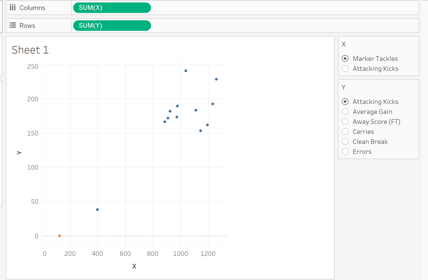
Click ok, and drag the new calculated field to your columns. This should allow your parameter filter to adjust your view on your scatter plot.
Do the same process to create a calculated field for the Y axis, and add it to your rows. It should end up looking like this:

If done correctly, this should make your parameter filter interactive, and allow you to dynamically change your view for different combinations of data types. Using parameters in this way can save a lot of time and make it much easier to explore and analyse your data in Tableau.
Give it a try and see how it can improve your workflow!
