


Today we were tasked with using SQL on Snowflake to prepare our data before using Power BI to analyze the data.
I began with understanding how the tables in the dataset were connected.
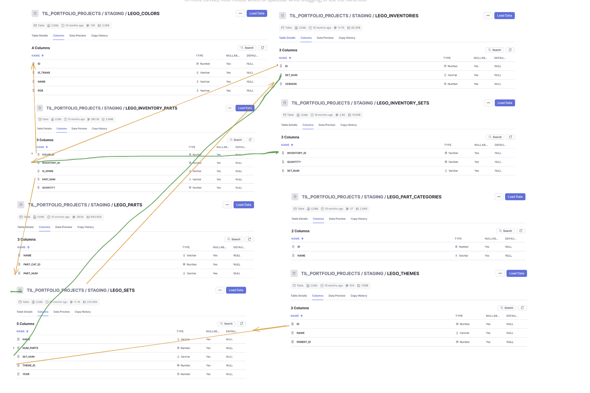
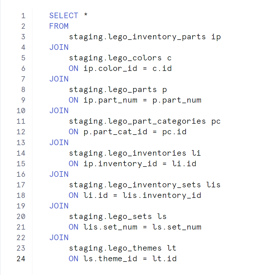
Initially, I faced challenges as I found that connecting all the data resulted in the loss of many rows.
This was original query:
I decided to focus specifically on color data in my the analysis.
When thinking about user stories I got inspired by an accessibility session on color blindness from yesterday. So I aimed to identify which LEGO sets were the hardest to use for people with Deuteranopia (a type of red-green color blindness).
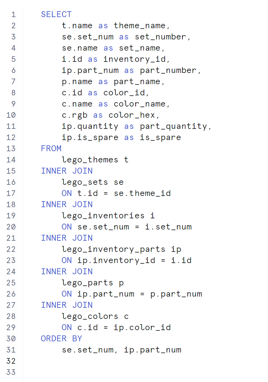
First, I wrote the necessary SQL code to extract the relevant tables.
Then, I exported the color data and used RGB values to classify each color as dominantly red, green, or other. This classification was assisted by ChatGPT (LLM), which helped define the dominant colors based on red hue in them.
Next, I related the color data back to the main dataset of LEGO sets. During this process, I discovered that LEGO has its own color naming system where some colors provided by LEGO were recognized differently by other internet tools. For instance, the color named by LEGO "glitter trans-clear" mostly recognized as white (also represented by the hex code FFFFFF).
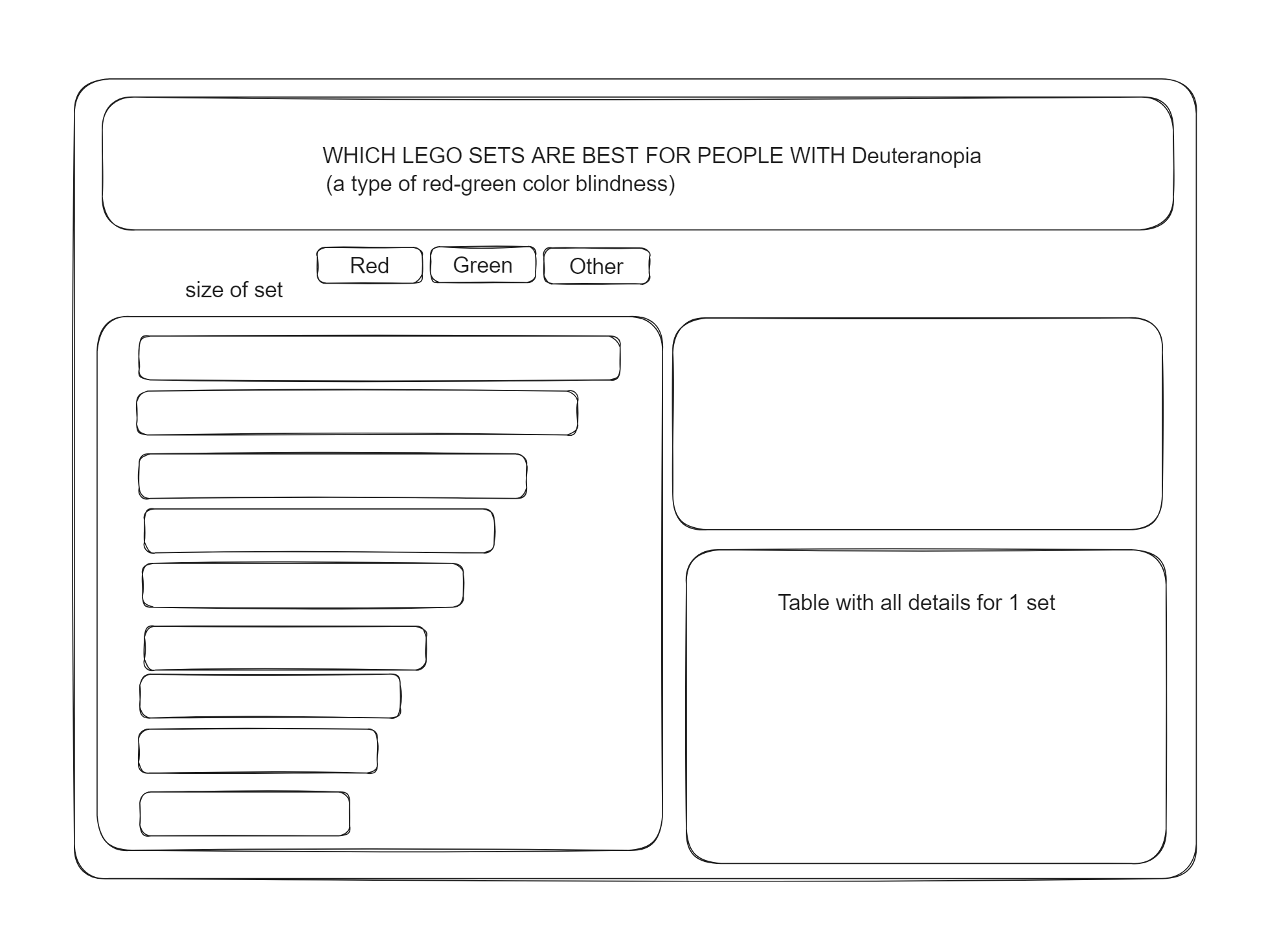
At this point I had my idea and made a quick sketch of how I wanted the dashboard to look.
The final step involved calculating the right percentages using DAX in Power BI. This was particularly challenging as I needed to ensure that the percentages of red, green, and other colors were accurately reflected and I just came from Tableau project and was thinking in different computer language.
Here is my final result.
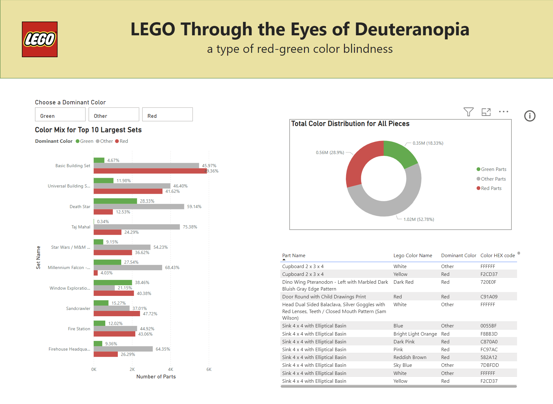
here is the info from the tool tip: This chart is designed to help identify LEGO sets with the highest number of pieces, specifically highlighting the quantity of red and green pieces. Use the chart on the left to select a set, and the table on the right will display the pieces in more detail for the selected set. Additionally, the donut chart shows the percentage distribution of red, green, and other pieces within that set.