In a previous blog, I've demonstrated how to make a simple 2 layer sunburst chart using 'dummy' pills. Sunburst charts functions as a pie chart but provide a deeper layer of detail breaking. This is especially useful when it is used to visualize how much a segment and its sub-segments contribute to the full picture.
As a recap, the simpler first method uses 'dummy' pills where we 'artificially' input a number on our column/row and change the mark type of the chart to fit as a pie. Then we duplicate it and make the two pills synchronized dual axis. The method I'll be using demonstrating uses map layers and geospatial calculations. The example data will be superstore as well, where I'll be making 3 layers (or more) with the highest level (outside) to the lowest layer (inside).
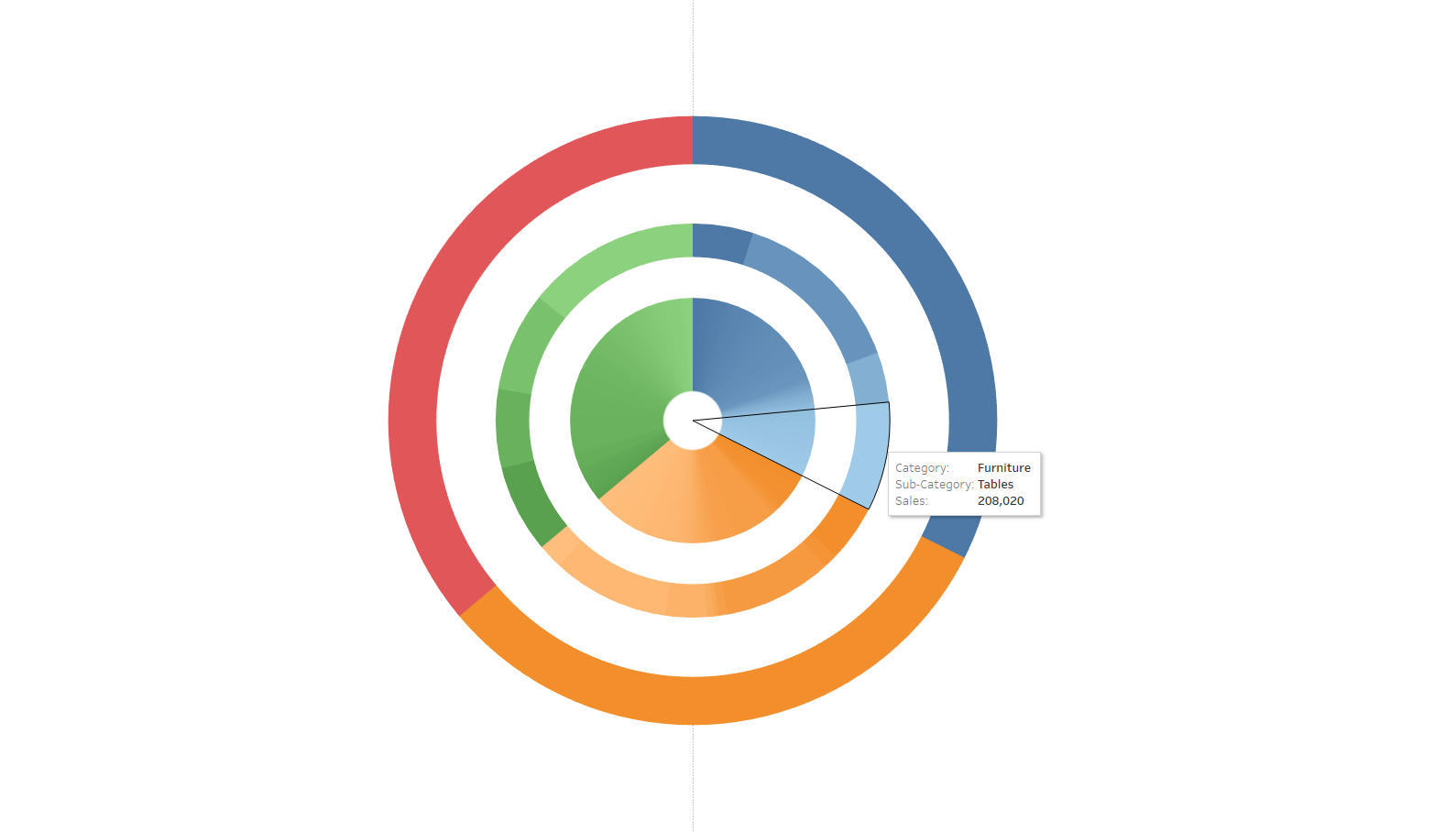
Method two: Map Layers and Geospatial Calculations
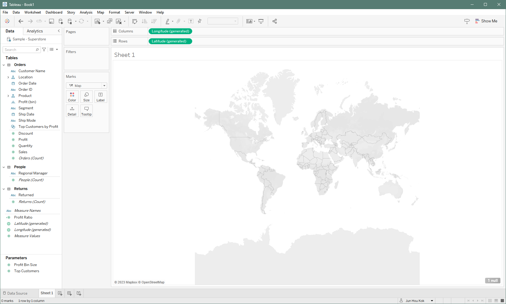
Start with changing your mark type to "Map", then find the auto-generated Latitude and Longitude pills. If you're unsure where the pills would go on columns or rows, simple double click on each of them and Tableau will pull them up for you. At this point, you should have an empty map.
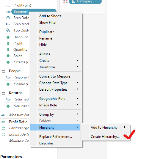
Since this chart type works best with showcasing hierarchies, I recommend making a custom hierarchy so that you can sort how your preferred hierarchy works and sense check on how you want this chart to turn out. If you're unsure of how to create a hierarchy, you can simple start by choosing the highest level pill, right-clicking and navigate to 'create hierarchy'.
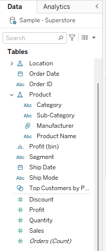
For this example, I will be using the "Product" hierarchy which is built into Superstore when you open it on Tableau Desktop. This will consists of "Category" at the highest level, followed by "Sub-Category", "Manufacturer" and "Product Name".
Now that we have our hierarchy identified, we can start building the chart. To be able to utilize the map mark, we'd have to create a dummy field using a calculated field with a spatial function. Use the MAKEPOINT function and set the x & y coordinates to 0.
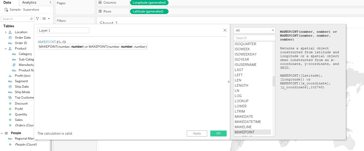
Then drag this layer onto map layers and turn the mark back into a pie. At this point, the calculated field dragged will appear as a detail within the mark. Build the chart as you would a pie chart. Continue by dragging your hierarchy on color and your measure on angle.
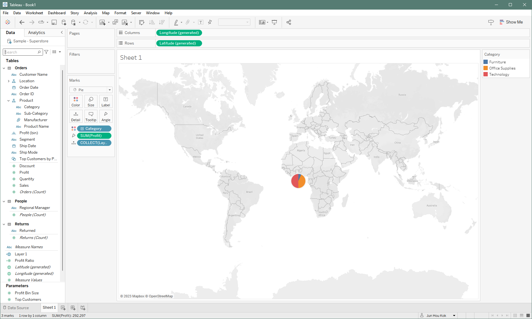
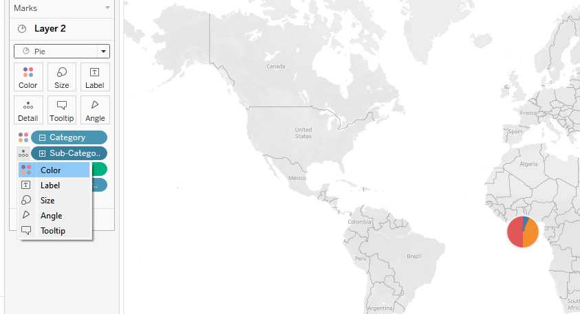
Next, drag the same spatial calculation on to the map again as a marks layer. Again, change the mark type into pie and add your measure into angle and hierarchy into color. This time however, click on the "+" sign in front of the highest level pill and expand it. This will then reveal the second level of your hierarchy as detail, click on the detail and change it into color.
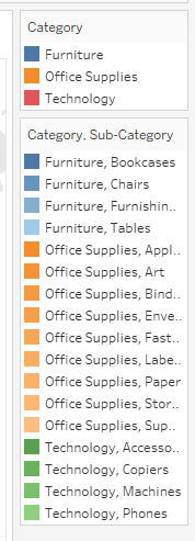
Once you've changed it to color, your legend should look like this. By default, Tableau will color it based on the breakdown of the hierarchy you've selected to display. From here you will have the option to carefully change all the colors one-by-one.
Once you have your layers mapped out, simply remove one of the pills on your columns or rows to enlarge the sunburst chart. You should then have something that looks like this.
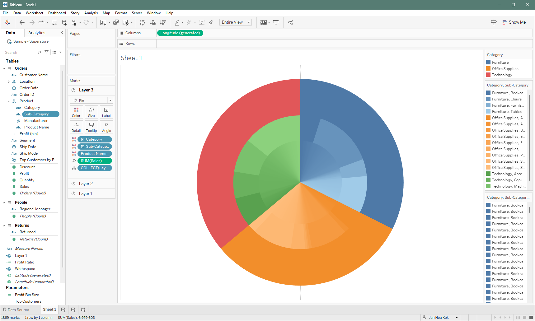
Since the colors looks similar and makes it hard for the eye to distinguish, you could either precisely change the color to maybe highlight a certain segment/sub-segment. One useful method of giving the colors more space to breathe is to create another dummy spatial calculation. In my example, I'll be naming it "Whitespace", where it would also be inserted as a marks layer but changed to a circle and colored white. Once that is configured, your sunburst should look like this.
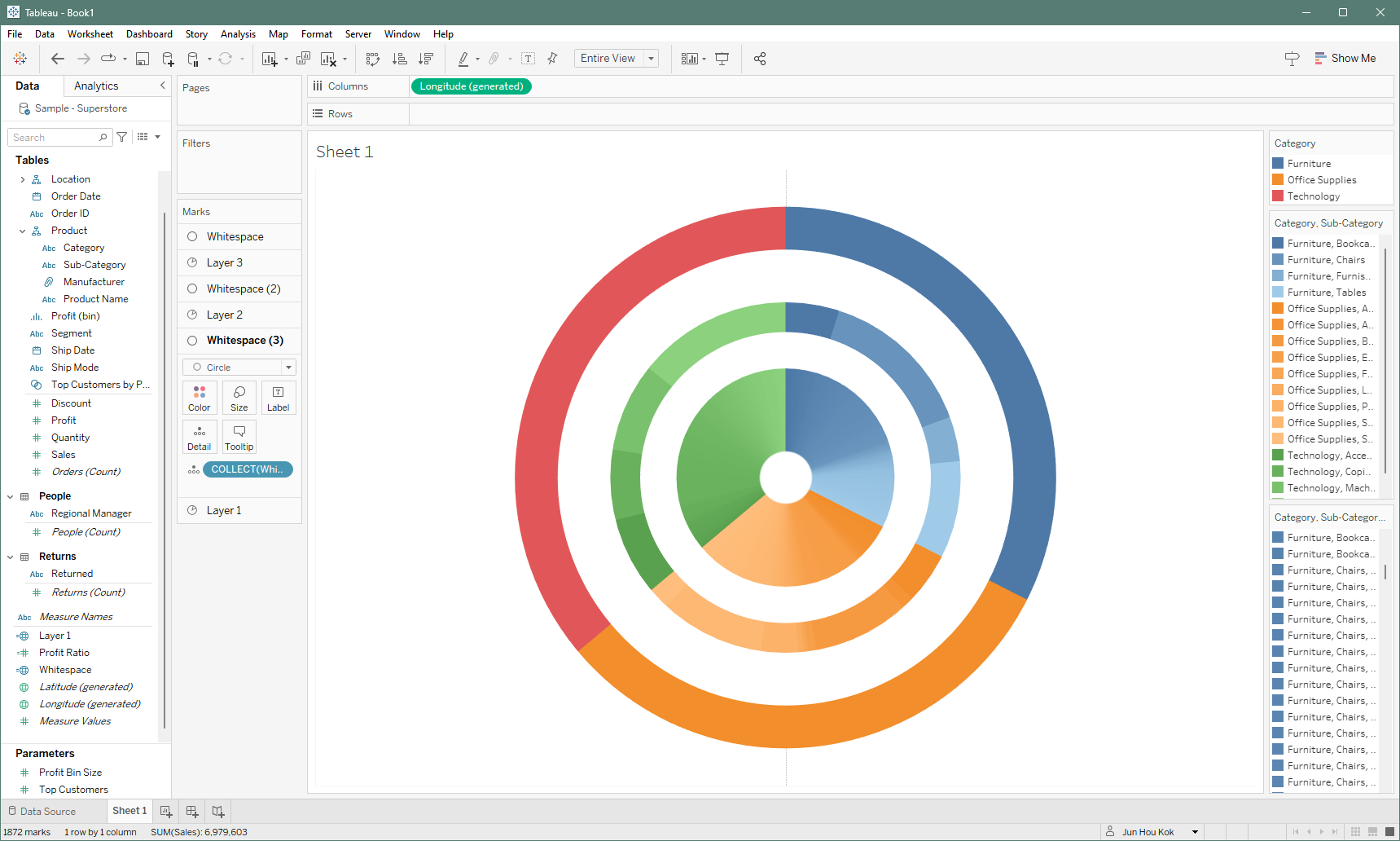
And there you have it, a multilayer sunburst chart!
