


Sunburst charts are particularly effective tools for visualizing and understanding hierarchical data. They present data in a series of concentric rings, each of which represents a different level in the data hierarchy. This allows us to get a clear and detailed overview of the complex structures within their data, for example, layers of a sunburst chart can take on dimensions such as ranges of time, categorical values and much more.
In this 2 part blog series, I'll talk about two ways you can build sunburst charts on categorical level, meaning each layer is a categorical dimension. The first way to build a sunburst chart is by using "dummy" pills on your columns and rows. The second way involves using map layers and geospatial calculations. For this example, I'll be using superstore data and demonstrating how the layers drill out from the highest level (outside) to the lowest layer (inside).
Method one: Using "dummy" column pills.
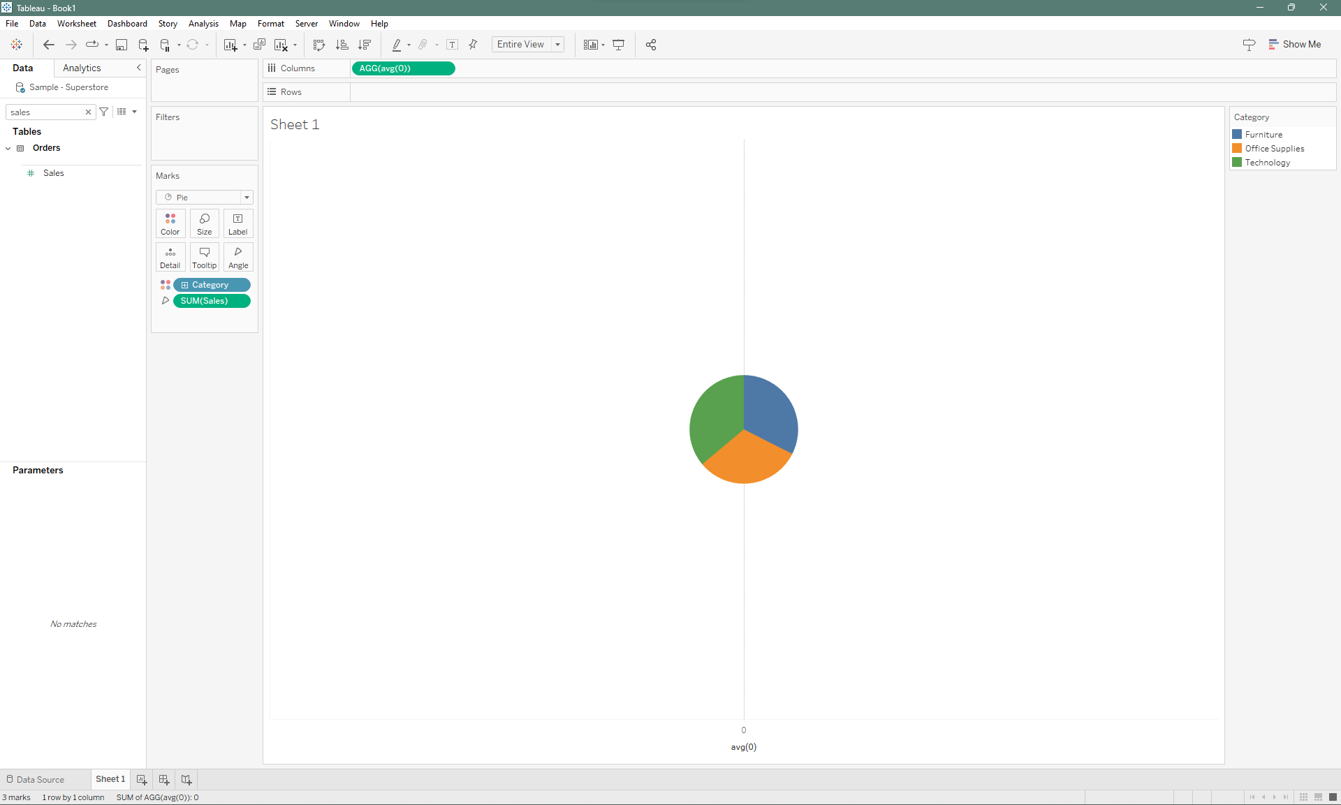
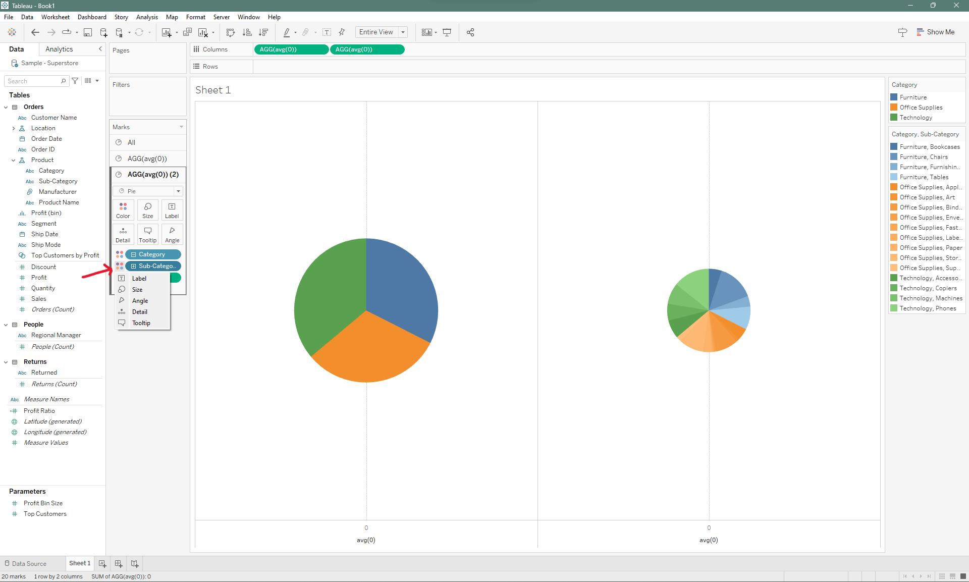
Start with creating a "dummy" pill on Columns. Double click on the Columns and simply type in AVG(0), this will make a dummy axis appear the on canvas so that you can fix something on it. Now drop the first layer within your hierarchy onto color on the marks card. Change the mark type to pie, and make sure you have a defining measure to use as your "angle".
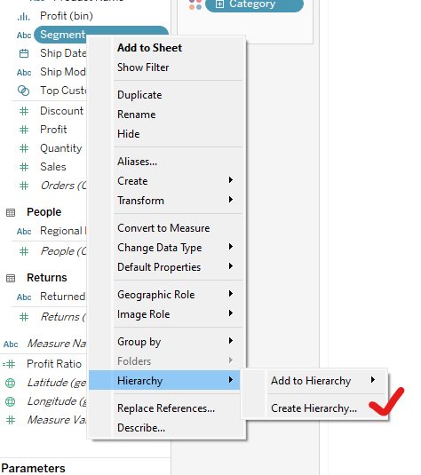
If you don't have a hierarchy set up and intend on using hierarchies, you can do that simply by right clicking on a dimension pill and selecting "create hierarchy". It's also important to note that you can also add the pill selected to an existing pill.
Now you'd just want to duplicate the AVG(0) olumn pill. This will give you two marks card and two pie charts. You can do that by double clicking on columns and typing in AVG(0) again or you can simply hold down the Ctrl/Command key and dragging the column pill.
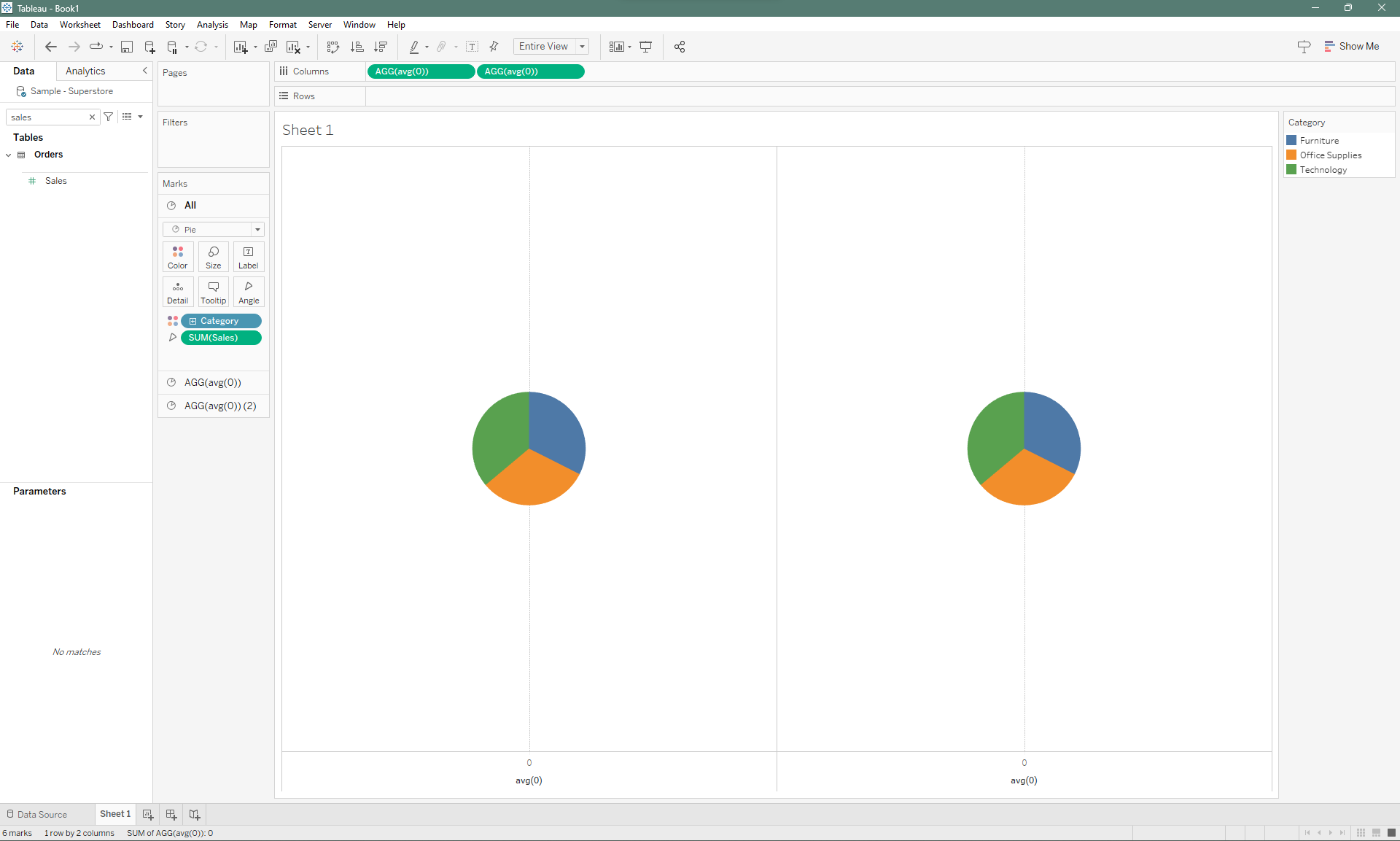
Since the second pie chart, lower on the marks cards layer (top-to-bottom), will always be the layer on top. The first pie chart should always be sized larger than that so that we can distinguish it visually.
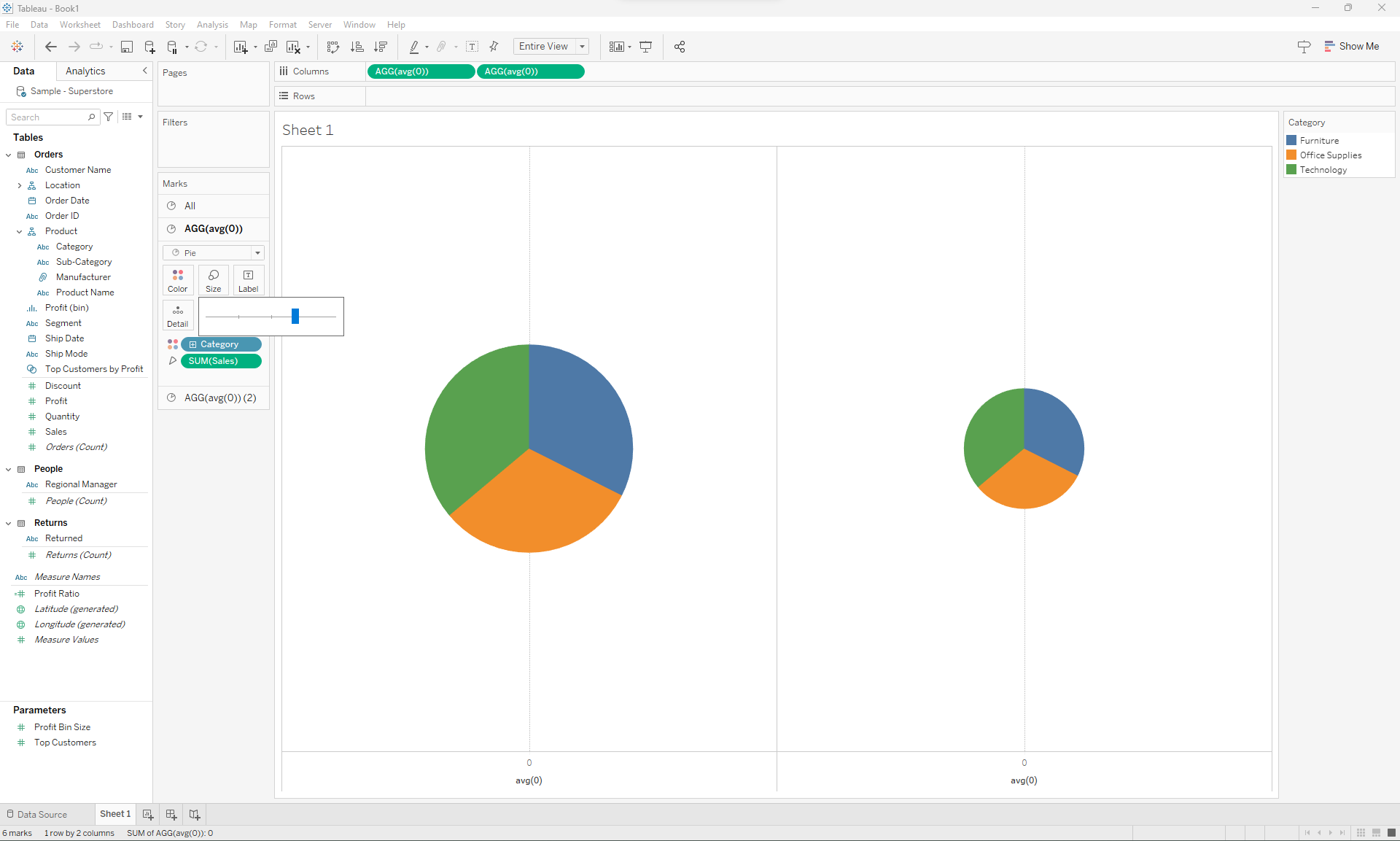
Next, the lower level of detail will be applied to the pie chart of your liking, I'll be using the smaller pie chart to display my second layer of detail. Simply open the second mark card and tap on the + symbol on the "Categories" pill. This will then expand and show you "sub-category" as a layer of detail. Click on the details symbol and then change that to "color". This will then provide you another layer of colors to work with.
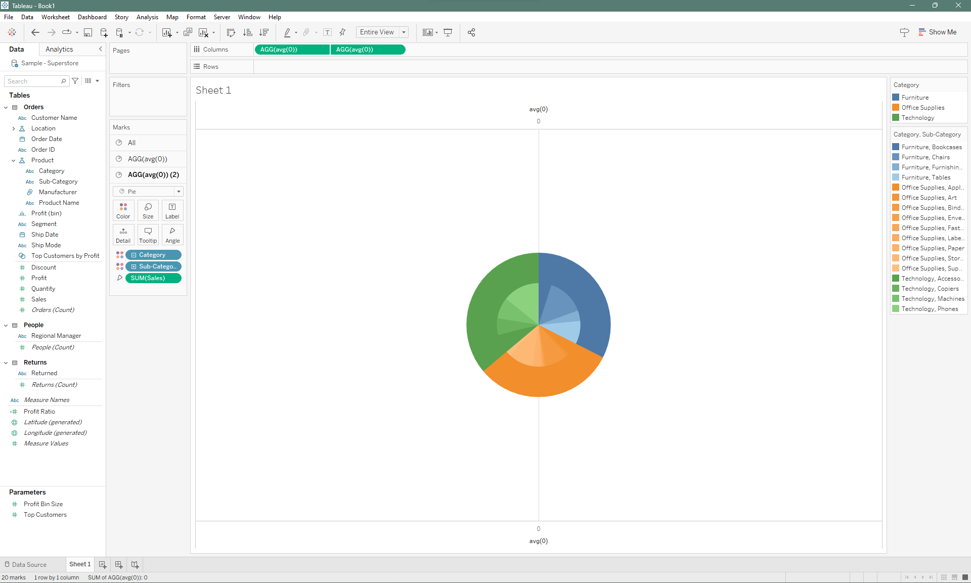
Once you're happy with the colors, you can then click on Dual Axis by right clicking on the column pill up top and combine the two pie charts, and tadaa— you have your sunburst chart!
This example is an easy way to visually showcase drilldown between two dimension. In part 2, I'll demonstrate how to build a multi-layer sunburst chart, where you have more freedom on setting the number of layers you want and even putting in whitespace between the charts.