


Today's challenge was to read in survey data about candy. The twist was to prep and build in the web editor.
The data was incredibly dirty and the main issue most of use ran into was that the 2017 data would error and we couldn't output a publish data source. Some of us ended up limiting the data due to issues and time.

There were four years of data and the attempt was to pivot the data into a standard format and then union.
After bringing the data into Tableau, I grouped the candy in a way that makes sense, such as data that had similar fields with different naming conventions. I also noticed that there was a category for multiple colors of M&Ms so I grouped them together. Finally, I pulled out all of the items that were not candy, such as: Vicodin, hugs, and board games.
The data had information about the year the survey was taken, the score of emotion (did it bring you joy, despair, or just meh?), and traits about the respondent (gender & location). I wanted to build a dashboard that focused on people's favorite candy.
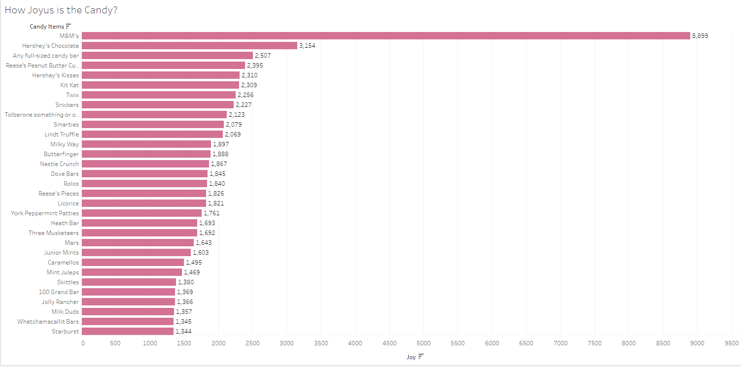
Here is a bar chart to show which candy provided the most joy. M&Ms look to be the most popular, but they were included in the survey multiple times. To alleviate this issue, I created a hierarchy to be able to drill down to the subcategories.

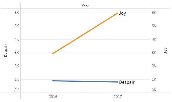
I used these bars as a filter to see the change in joy/despair over time. I used a slope chart to visualize the change in feelings. Here is a screenshot of the slope chart filtered to just M&Ms:
The next chart I built out was a bar-in-bar. this chart's purpose was to show the overall feeling of a candy. If the orange was larger than the blue, then the candy overall brought joy (M&Ms and Reese's peanut butter cups), if they blue was larger, then the candy brought overall despair (licorice and jolly rancher).

Lastly, I wanted to break down the survey data by gender. Keeping with the theme, I used bar charts to compare the gender's feelings about different candies.
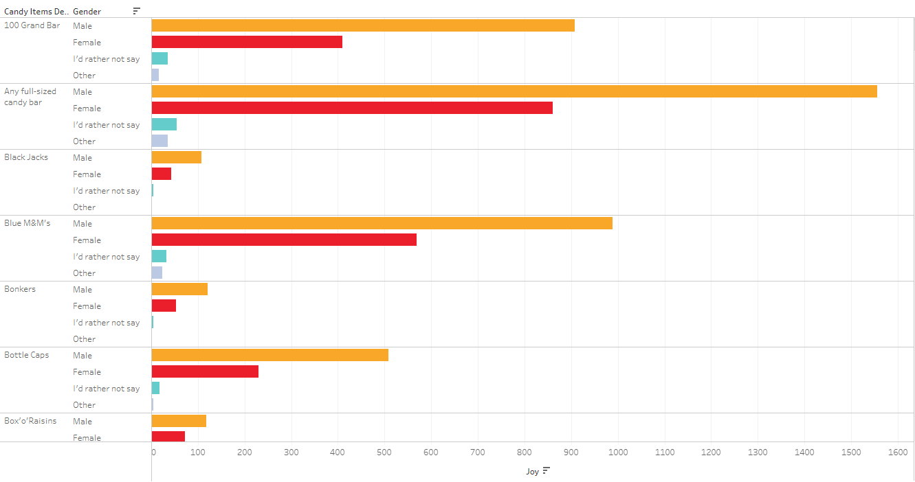
To make this dashboard better, it needs more percent of totals. I am uncertain if more men voted for the top candy items, or if more men participated in the survey. Having percent of total will help normalize the data to understand the comparisons more clearly.
The challenge:
This was my first experience with web edit. I kept trying to close my browser window to open Tableau desktop and not being able to find my workbook. I also missed some formatting options that you don't get in web edit, such as grid lines and match mark color. Although it is not much different, it was hard to adjust to.