


Quick Accessibility Tips
Somethings to consider as you are building your dashboard:
1. Create meaningful titles
2. Use colors that are distinguishable to color blind people
3. Provide a secondary mark type to “double encode” or reinforce the information (e.g. shape points on top of line marks)
4. Using bigger, bolder fonts
5. Include grid lines & axis headers
6. Provide a color legend
7. Make all the text darker to introduce more contrast
8. Include helpful subtitles and captions
9. Limit cognitive load
10. Simplify animations and movement
Keyboard Using Only Tips – How to make Tableau work with the screen reader
1. Putting the KPI BAN in a sheet title
1. Consider the “focus order” (the way the tab key navigates through the dashboard)
2. Include directions in white text to be read aloud
3. Include controls that can be navigated by the keyboard (e.g. clicking “tab” on your keyboard and selecting a drop down menu of filters instead of clicking on a mark to filter)
Universal Design
Universal Design is the idea that the design is usable by most of the general public. We discussed today that push doors are helpful for disabled people who cannot grab handles as well as being helpful for people who are carrying packages. I decided to look up the concept for universal design to be able to implement this in future dashboards.
1. Equitable use
2. Flexibility in use
3. Simple and intuitive use
4. Perceptible information
5. Tolerance for error
6. Low physical effort
7. Size and space for approach and use
You can read more about these principles here.
Finally, let’s get into today’s project
We were given the Fix my Street Glasgow dataset which includes coordinates in Glasgow for reported potholes and footpaths/pavements. To get started I opened up Alteryx for data prep.
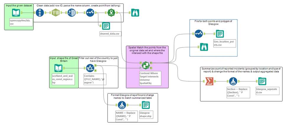
This is how my workflow ended up. I had two inputs: the one provided and a shape file of Glasgow. I created points from the lat/long and spatial matched them to the shape file. I also decided to aggregate the data up to the constituencies provided in the shape file. This was intentional for the purpose of accessibility, because I believe this is better for cognitive load. The original dataset had nearly 4,000 lat/long plots which is more difficult to interpret than 7 sections.
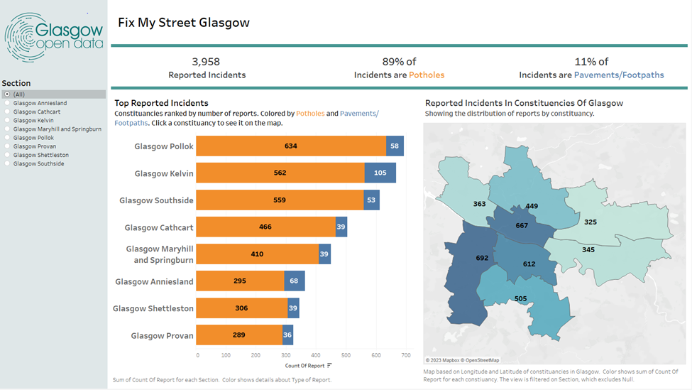
My dashboard ended up looking like this. For this challenge I increased my font size, used Tableau generated colors and put my BANs into sheet titles. I decided to have descriptive titles, subtitles, and Tableau generated captions. I provided a left hand menu bar to put a filter for the section of Glasgow. On the bar chart, I included grid lines, labels, and axis labels. Additionally, I included some boarders to help visually differentiate between each section of the dashboard to assist with interpretation.