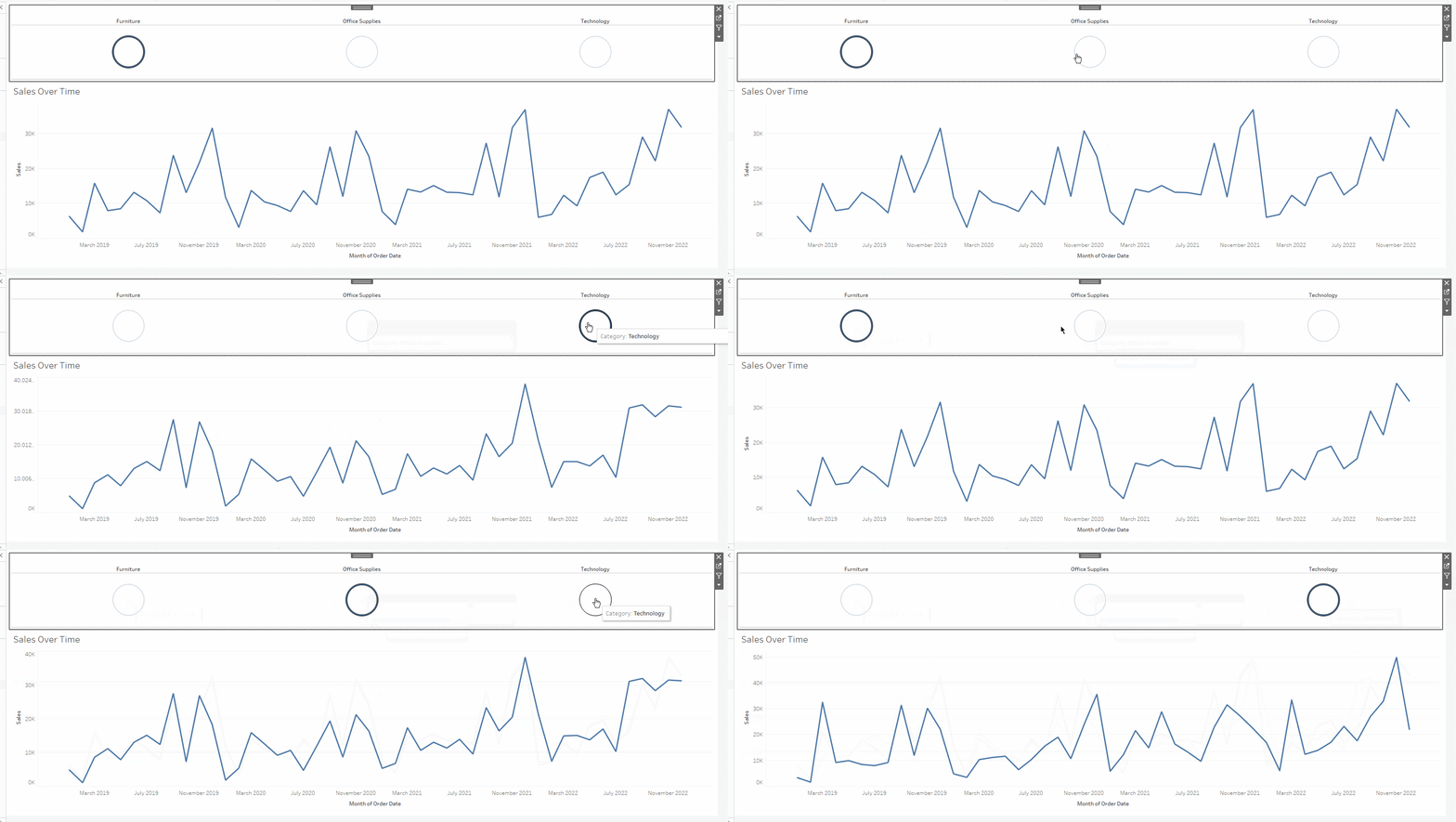
When creating dashboards, sometimes you’ll want to add bottoms. A bottom can allow you to change a dimension, change the view of the graph, and set a specific value to see, and they can be applied to a field or a measure in a visualization.
Using the super store data, you create a simple visualization showing the sales over time.

For this visualization, you can add a regular filter for categories like this:
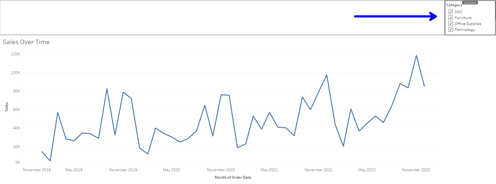
This can work, but then the user must select and click to see the filtered view they want. But what if we add buttons on the top of the visualization instead to make the graph more interactive?
In order to create buttons based on category, you have to do the following:
- You have to create a set on Category.
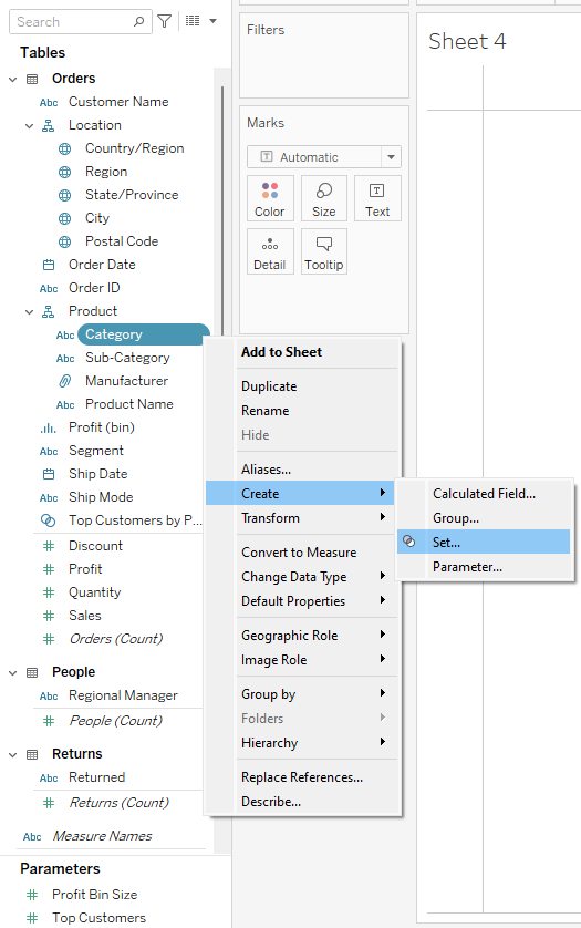
After you click on set, then you'll click okay.
2. You will then drag the Category pill into Columns, and change the marks dropdown into shapes. It will automatically create circles
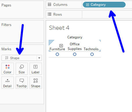
3. Make the visualization fit the entire view and change the size of the circles to make it bigger.
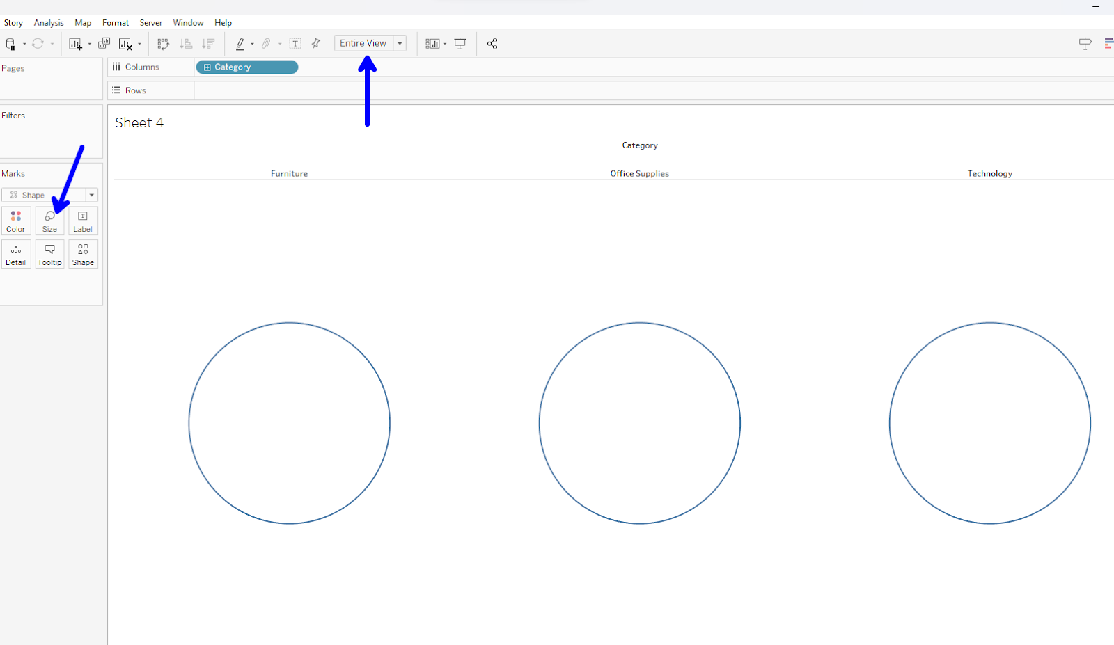
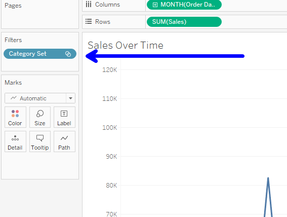
4. After you will drag the Category set pill we created earlier into the filter pane of the sales over time chart.
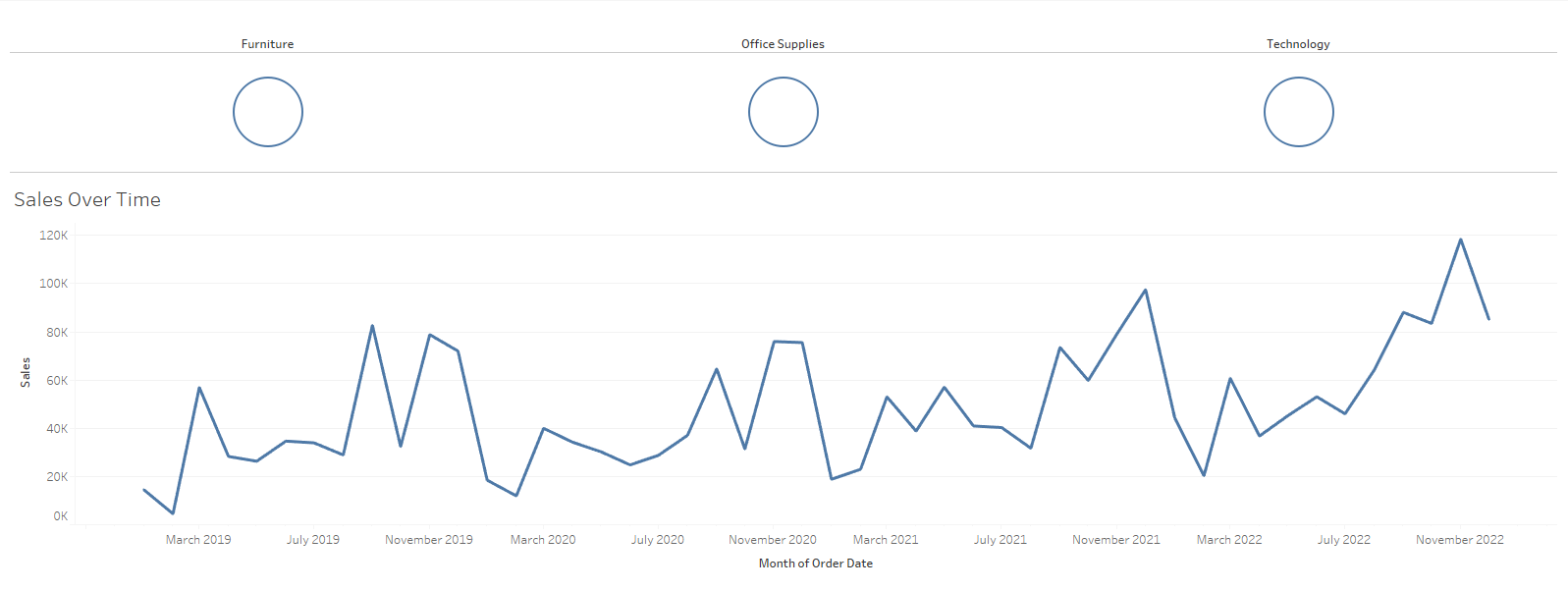
5. Bring the buttons sheet onto the dashboard.
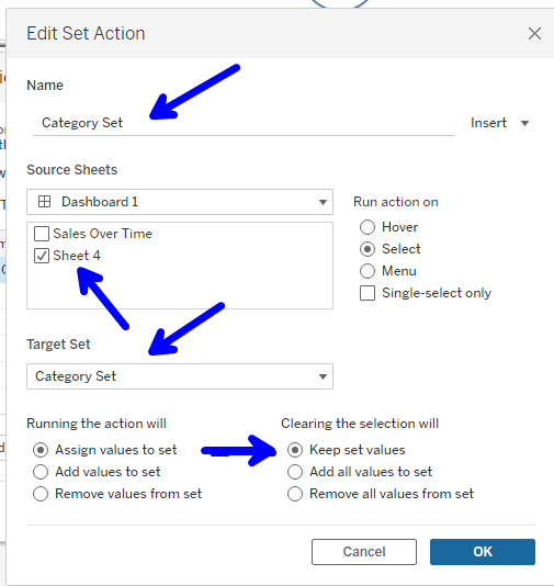
6. The next step is to create a dashboard Action, and on the dashboard action, you'll click on “Add Action” and “Change Set Values”
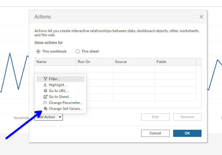
7. After you click “Change Set Value,” on the new window that is opened, you can rename the action to “Category Set,” on source sheets, select the sheet where you have your buttons; on target set, choose category set, and on the section that says, “clearing the selection will” choose “Keep set values.”
8. Test and see if the buttons work.
This is the end result.
