Rounded. Bar charts. Just look at those curves. As a newcomer to Tableau the discovery of rounded bars is ground-breaking. Making your first rounded bar chart feels like you’ve transcended from using your Grandad’s clunky square bars to the world of sleek, futuristic bars. They’re just so much prettier. In fact, why ever stop using rounded bars? Well, here’s a few potential reasons why.
Precision
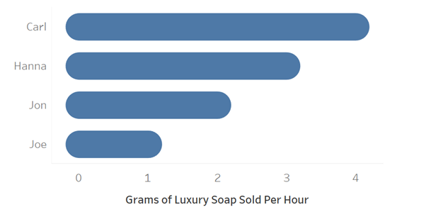
In order to produce a rounded bar chart you must first sacrifice precision to the visualisation Gods. Take a look at the image below.

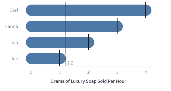
Now, what if we want to ask the question “exactly how much soap did each person sell?”. The correct answer to this for the above graph is each person sold a whole number with Joe selling 1 gram, Jon 2 grams, and so on. However, each bar goes past their actual value and makes discerning this very difficult to tell. This is demonstrated below, where each bold line shoes where the bar should end, and the reference line shows where it actually ends.

What’s more, each bar extends below 0 into the negative range!
Proportionality
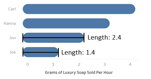
The other main issue of rounding your bars is it misrepresents the proportions of each value. Consider the sales of Jon and Joe. Jon sells 2g of soap an hour whilst Joe sells 1g. You’d expect Jon’s bar two be exactly twice the length of Joe’s. Well, it if we actually measure these bars we see that isn’t the case.

Not only do both lines have a length that doesn’t match their values but instead of Joe’s line being 50% of the length of Jon’s line, it’s actually about 58%. At first glance this makes Joe look like a better soap salesman than he is.
In Summary
So, rounded bars are pretty and they definitely have their place. However they should only be used appropriately and with care. Do you need to represent a value with precision? Don’t use rounded bars. Do you need to represent the differences between bars accurately? Don’t use rounded bars. Neither of those issues a problem for you? If it’s aesthetically appropriate then go for it!
